Designers have never been so spoilt with choice for tools. As the role of the designer changes each year, our tools rapidly evolve in order to stay useful in what has become one of the most competitive marketplaces around. Even for a company as big as Adobe, with $9 billion revenue, it’s been no different.
The growing importance of design in business, along with its rise to the boardroom saw a new wave of tools emerge that focused for on a simpler workflow for designers. During this time, Adobe launch XD with a focus on prototyping, designing, sharing and collaborating.
Our tools are shaping the role of the designer.
💙 Click to Tweet
Over the last year though, we’ve seen design tools starting to shape the role of the designer more than ever. Tools are taking on the responsibility to help designers think in terms of code, components, and design systems. They’re helping to broaden the role of design within organizations. XD’s new releases over the last year have shown this too. Not only has it caught up with the more mature offerings in the marketplace but it has also started innovating beyond them. New additions include powerful features for creating and maintaining design systems, and prototyping for wider use cases with the addition of gamepad input, voice prototyping, and much more.
In this article, we’ll take a look at how XD has improved and what’s new with their big May release:
Contents
- 🧩 The rise of design systems: How design systems are enabling designers and teams to work together better.
- 🛠 Prototyping for Wider Experiences: The progression of XD from web and app design to games and voice assistants.
- ⌨️ Keyboard UI Design for Desktop ⌘⇧/: Why keyboard shortcuts are important, and how they affect the use of products.
- 🎮 Game Design: Using gamepads as input devices in XD.
- 🎙 Voice Prototyping: A quick overview of voice prototyping in XD, and where it’s heading.


Letter
1. 🧩 The Rise of Design Systems
Collaboration between design and development has evidently been a focus for design tools since the addition of design to developer handoff features, and code export to help us move towards a more collaborative workflow. However, over the last year, we have progressed in strides through the wide adoption of Design Systems which get everyone working on the same page.
A design system is something that’s closely connected to code, going beyond handoff, towards the creation of an integrated workflow that’s shared across teams. According to Brad Frost, it should comprise of living breathing UI components – much more than just a Sketch file or style guide. There are many definitions, but one of the best comes from designer Audrey Hacq:
“A Design System is the single source of truth which groups all the elements that will allow the teams to design, realize and develop a product.” 💙 Click to Tweet
She outlines a design system to comprise of a whole array of tangible and non-tangible elements:
- Identity (colors, fonts, sounds and images)
- Principles (purpose and objectives)
- Best Practices
- Components and patterns (design and code)
Importantly though, all parts of a design system should work together – both in design and code. The result is that designers can learn to think in terms of code, and developers can become more invested in design assets. We no longer work in a siloed environment – everybody in the team is contributing to the same thing, whether the person be a designer, developer or even product manager.
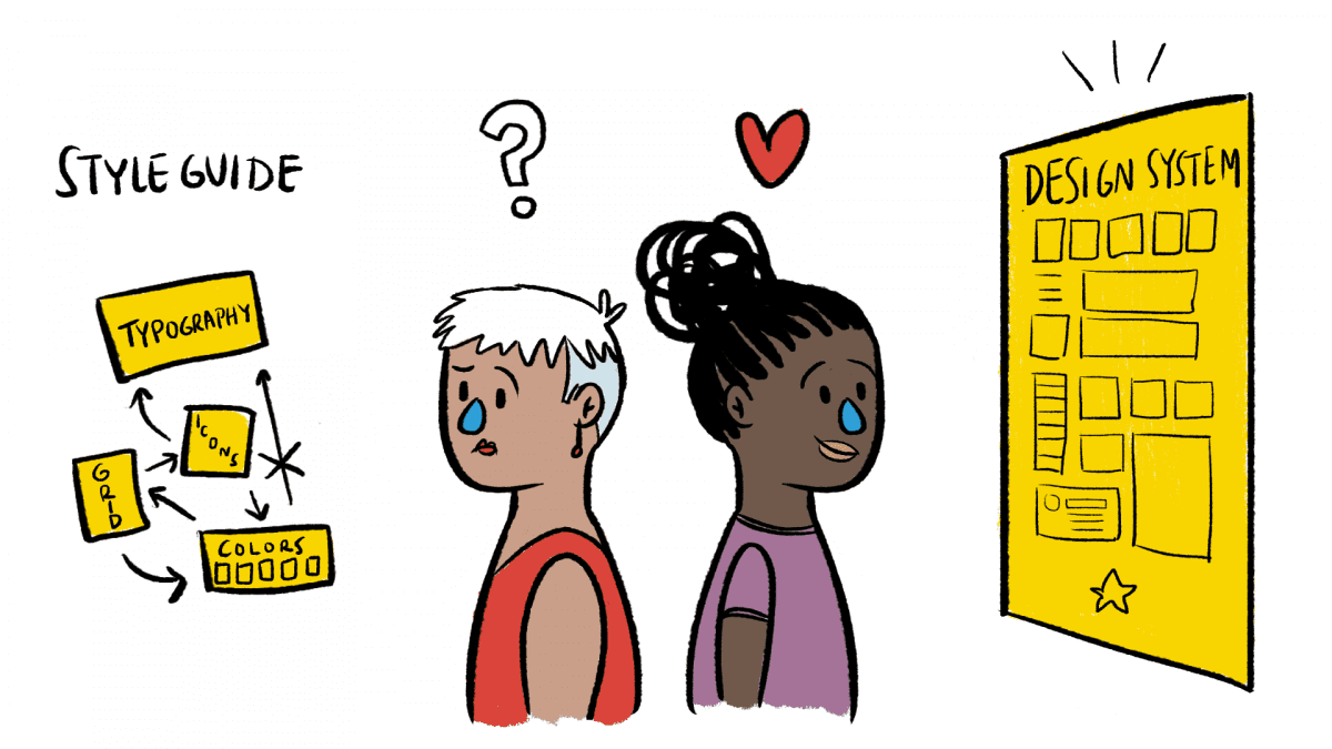
Going from style guide to design system
Previously, it was common for designers to create style guides for developers to refer to. Those guides would consist of things like color schemes, typography guidelines, icons, and basic components. However, compared to a design system, style guides are limited in a number of ways as suggested by Igor Syvets:
- ❌ Style guides only document a limited number of components. This can result in new components existing in a codebase that haven’t been designed.
- ❌ There is no clear way to see the relationship between components. For example, how can we see which variations of a button inherit and share properties?
In comparison, a design system is more complete, and also helps designers think differently – more programatically:
“Design systems enable faster design iteration, team and product scalability, and programmatic thinking.”💙 Click to Tweet
With that, XD has been listening, adding new features to encourage us to adopt a more unified workflow between design and engineering. Let’s dive into what those are.

Design Systems in Adobe XD
Two powerful, yet intuitive additions to XD that take things to the next level when creating and maintaining a design system are ‘Components’ and ‘Linked Asset Libraries’:
Components
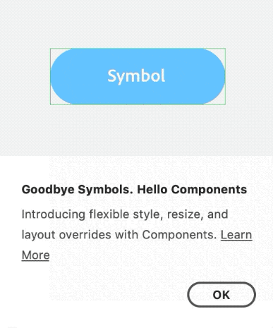
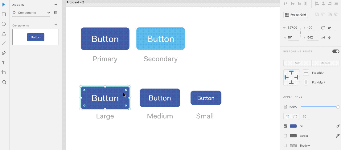
Components in XD replace Symbols to introduce a more scalable approach to reusable elements, tailored for building design systems. Previously, Symbols in XD let us save design elements, and reuse them anywhere in our prototypes. Whilst they saved us time, they become limited as there is no clear relationship between elements created from symbols. Components fix this by providing a way for our reusable elements to inherit properties and override one another.
In all, components in XD enable designs to scale efficiently, ensure consistency, and even translate well to code. Here’s a quick walkthrough to show how components work, and highlight how useful they are:
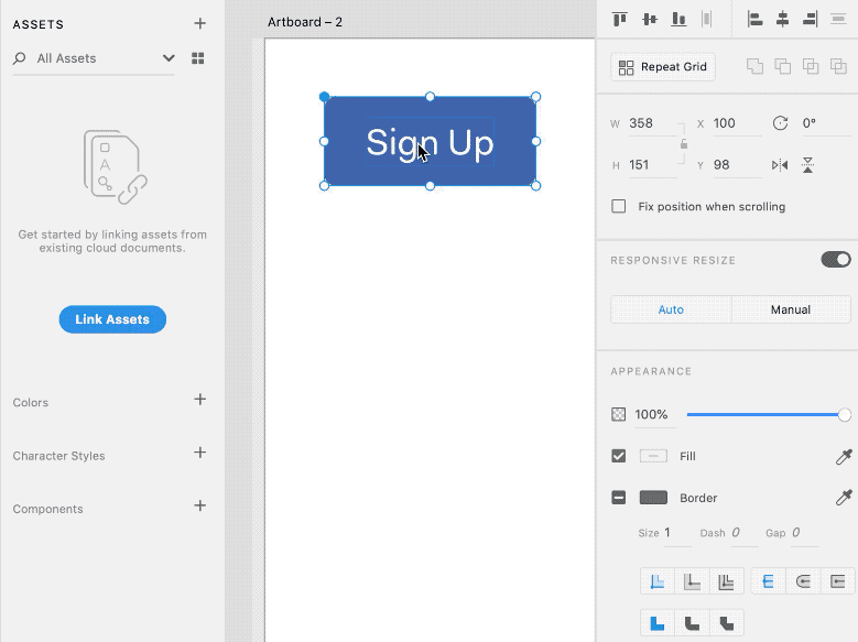
Master Components and Instances
Master components are new in XD – they control the base styles for other components to inherit from. Here’s how to create one:
- Create a master component by right clicking an element and choosing ‘Make Component’ (or shortcut: ⌘+K).
- Next, drag and drop the component from the assets panel to make instances of that component for different variations:
Modifying Component Instances
When the master component is modified, all instances update automatically. This is effective because base properties are inherited from the master component, whilst any unique changes to the instance override the master:
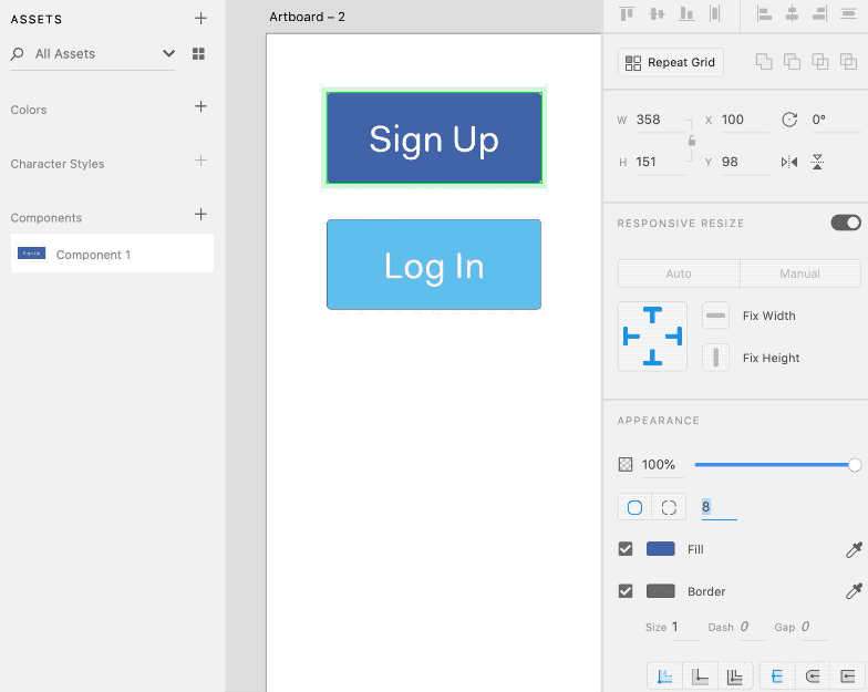
Eventually, end up with a large library of different variations of a button, but still quickly change inherited styles, regardless of how many you have:
Design Components to Code Components
When it comes to code, a component based development (CBD) methodology has been popular amongst development teams for a while. In this component based workflow, code is modularised into reusable chunks intended for multiple purposes, saving developers from writing the same code twice whilst speeding up the creation of related elements.
It’s noticeable that the benefits outlined here are very similar to those enjoyed by designers when creating components in XD. In fact, the workflow is so closely related that every coded element could be traced back to a design component, reinforcing a shared language between design and development.
Linked Asset Libraries
Components go a long way to creating a design system and aligning teams, but another new feature in XD that helps is the Linked Asset Library, which acts as a place to show the big picture and keep teams in sync. Components, colors and character styles can be curated and added to the assets panel, then shared with teammates so that everybody can contribute.
Sharing is easy too – it’s as simple as clicking a button and inviting team mates via email. Upon doing so, the design system saves as an Adobe Cloud Document and collaborators can then link it into any of their own projects to make use of the components in the system.
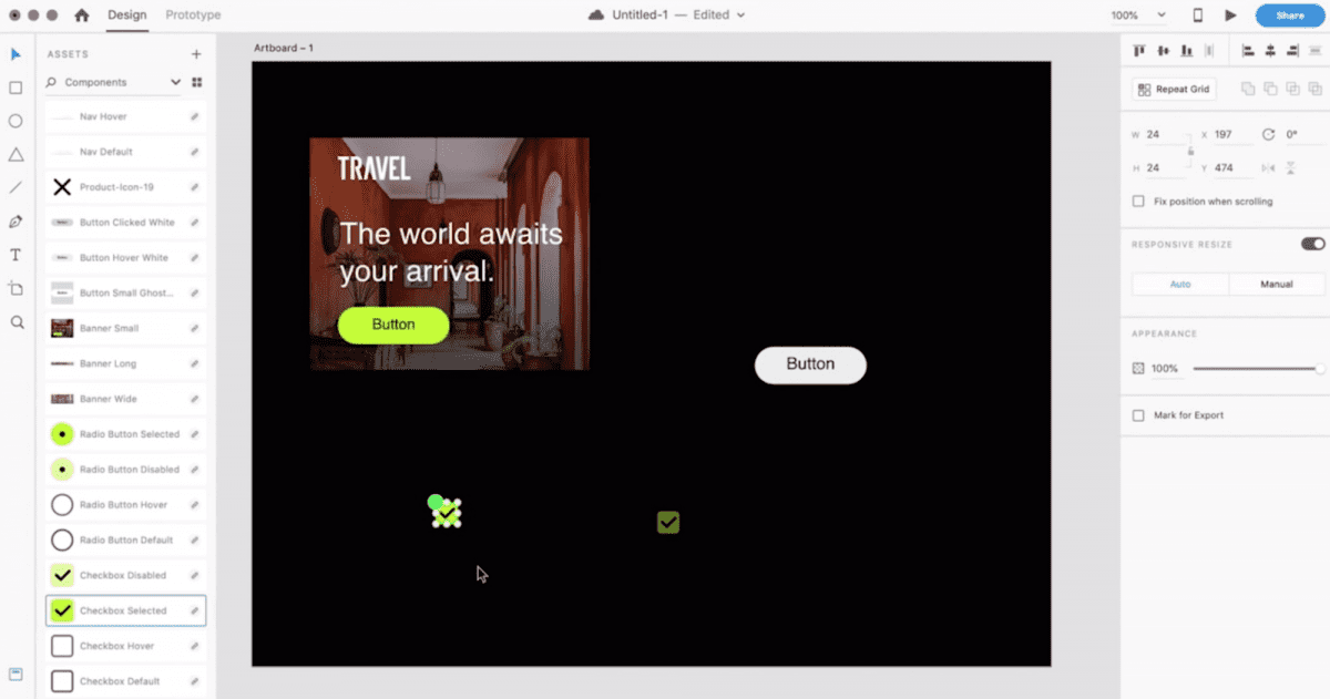
Furthermore, Linked Asset Libraries ensure everybody stays up to date with the latest version of the design system, as collaborators are notified of new changes when they occur, and can import them as they wish.
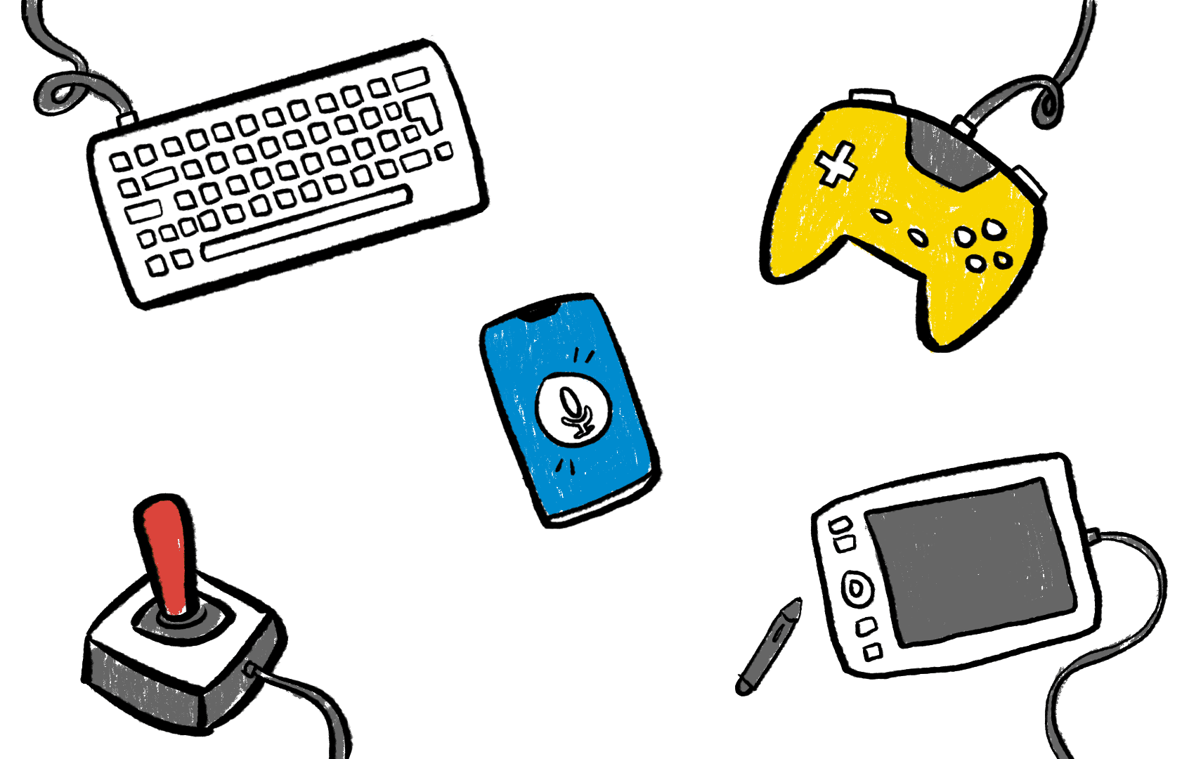
🛠 Prototyping for Wider Experiences
As well as enabling us to work together better through design systems, the latest version of XD also empowers us to design for a wider range of application types through the arrival of brand new input device controls. These new input triggers can be key when designing the experience of a product since each type of input device inherently brings a different level of user interaction.
To demonstrate, imagine designing a Mario Kart game using a keyboard, as opposed to prototyping it with a real gamepad; or being restricted to touch/keyboard input when prototyping a voice assistant. Few prototyping tools go beyond touch gestures and mouse pointers, but XD now equips designers to prototype games, voice assistants, and even improve desktop experiences through keyboard shortcuts. New inputs methods include:
- ⌨️ Keyboard input for keyboard shortcuts in desktop applications.
- 🎮 Gamepad input for game design
- 🎙 Improved Voice input for prototyping voice assistants
Let’s now look at how each input can give designers more control of an experience, starting with keyboards:
1. ⌨️ Keyboard UI Design for Desktop ⌘⇧/
A powerful example of how user input can influence experience is the keyboard command shortcuts used in many web apps and even design tools themselves.
“The keyboard is an essential input device for entering text, navigating, and initiating actions.” ~ Apple 💙 Click to Tweet
NNGroup defines command shortcuts as combinations of keys typed to enable users to perform frequent commands quickly. One common example of effective shortcut design is simply the copy, cut and paste:
⌘+C = Copy | ⌘+X= Cut | ⌘+V = Paste
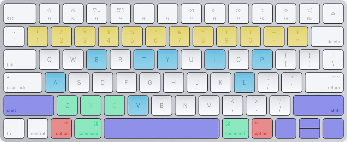
The X and V keys are immediate neighbors to C, and directly above the ⌘ key, making these connected commands fast and logical to use together. Power users depend on speedy shortcuts like these, so they can’t be ignored when designing complex applications with repetitive tasks. For instance, here are just a few used in Adobe XD itself (from shortcuts.design):
“Watch any experienced designer using Photoshop and you will see the amount of keyboard shortcuts they use.” 💙 Click to Tweet
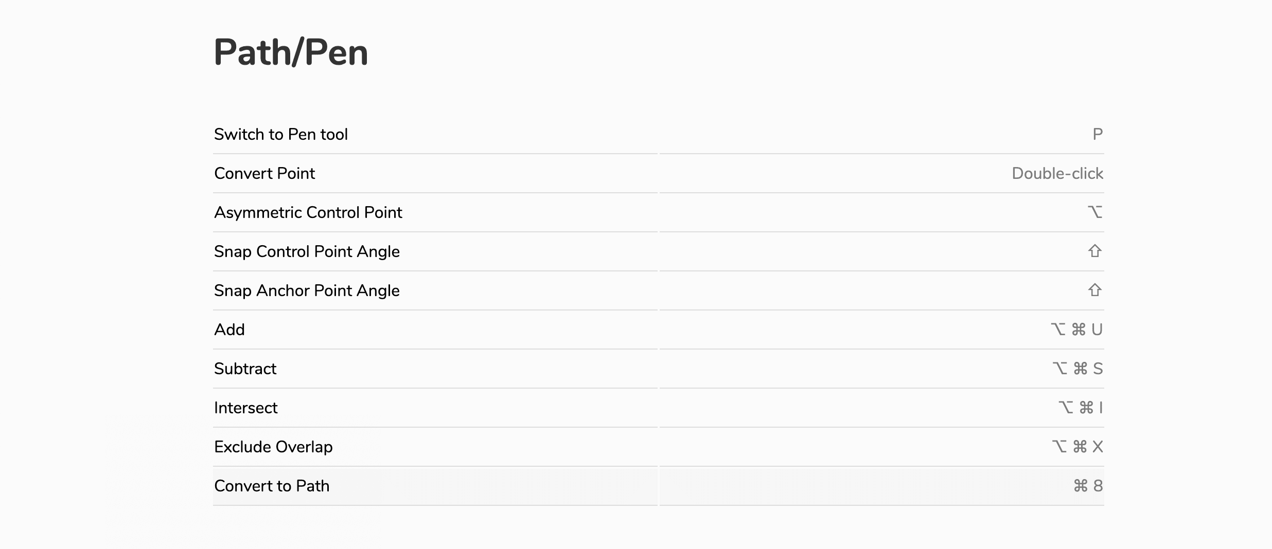
Keyboard Shortcut Guidelines
A good starting point to design keyboard shortcuts are the guidelines provided by Apple and Microsoft. They cover best practices as briefly summarised in this table:
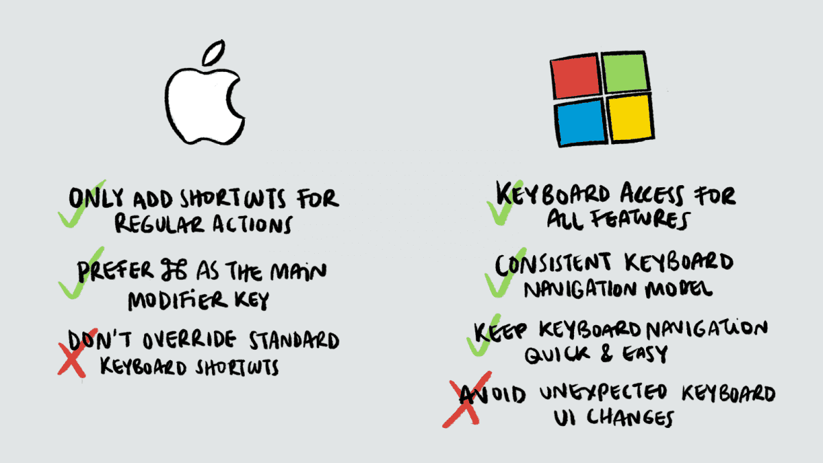
Check them out here:
Creating Keyboard Triggers in XD
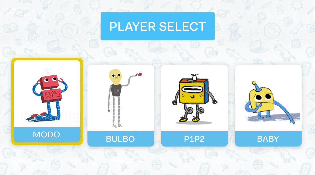
It’s now obvious how important to the user’s experience shortcuts can be, so we can see why XD is enabling us to design for them. Here’s an example of an XD prototype with keyboard shortcuts in action. The user is navigating an email inbox:
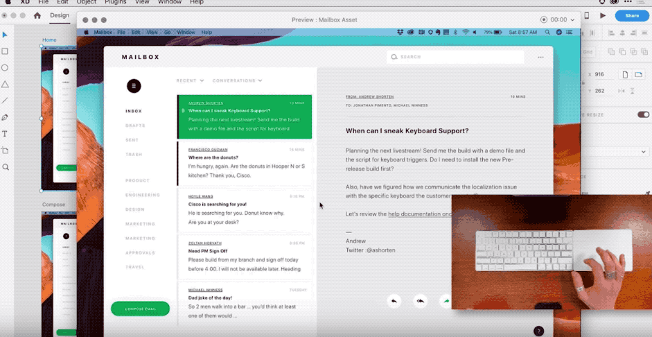
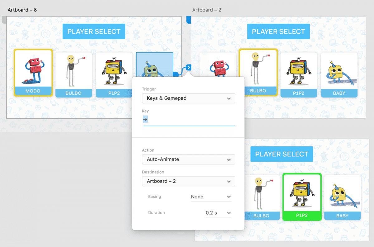
Creating a keyboard shortcut is as simple as adding a triggers in prototyping mode. Instead of using choosing regular click or drag triggers, we just choose ‘Keyboard and Gamepad’:
💻 Creating Keyboard Triggers
- Add the trigger: To add a keyboard trigger, drag a connector from an element in one artboard to another.
- Choose Keyboard and Gamepad: From the dialog that opens, select ‘Keyboard & Gamepad’ from the trigger menu, and add the key combinations you would like to use for the trigger. This is the shortcut the user must press in order to trigger XD to move to the next screen in play mode.
Gamepad input works in the same way, as you’ll see in the next section with a clear example.
2. 🎮 Game Design and Gamepad Input in XD
Like websites, game designers benefit massively from prototyping and have also started adopting design tools such as XD to help them. The process of designing games might sound a long way from that of creating a website, but the difference in the process can actually be fairly minor as highlighted by Toronto-based graphics and game designer, Henry Faber:
“All the same issues apply, but in different forms. Responsiveness to dynamic view ports is as prevalent on PC games as it is in mobile or web development. Information density and player affordances for different control schemes – based on either input type or progressive development of skill with the game’s interface systems – are very similar to designing professional-use applications.”
He goes onto say that prototyping in XD can help explore gaming concepts such as menu option screens, inventory systems, and even help work on specific micro mechanics in a scene.
Furthermore, XD provides the ability to explore game layouts across different screen sizes, which is also handy given the range of devices gamers use. This is demonstrated by Maple Media, who used XD to create the Tony Hawkes mobile game:
“On Android, there’s no consistent device size whatsoever, so we have players there who are playing on the latest and greatest devices that are streaming faster than the average computer, to devices that are four or five years old and have a screen size half the size.”
The above examples show how useful XD already is for game design, but it has just got even better. With feedback from the XD User Voice program, the XD team added support for game controller navigation, which works as you would expect:
Gamepad Triggers
The same flow outlined above to add Keyboard shortcuts can be used to add Gamepads as input devices:
🎮 Creating Gamepad Triggers
-
- Add the trigger: To add a gamepad trigger, drag a connector from an element in one artboard to another (see image below).
- Choose the Gamepad command: From the dialog that opens, select ‘Kepad & Gamepad’ option from the trigger menu, and add the gamepad button you would like to use.
Gamepad Input Guidelines
Just like keyboard shortcuts, the design of gamepad button inputs need to be intuitive for users to press. Apple has a useful guide to this here.
3. 🎙 Voice Prototyping Input
The final of the 3 input types that we’ll briefly touch on is voice. Voice triggers were introduced last year along with the rise of voice assistants such as Amazon’s Alexa. Find out more about how to prototype for voice in XD in our previous article.
Since we covered this last year, XD has continued to improve voice prototyping. Through their User Voice program, new features for voice include extra language support and accent support have been added. They’ve also gone a step further in adding Voice Prototype Notifications. Learn about those here:
Try it out
Throughout this article, we’ve explored some key new features XD have recently launched, but also just as importantly, we’ve seen why these features are necessary for product teams. In all, it’s clear that XD really is listening and innovating around the needs of its users, whilst helping to progress and shape the role designers play within organisations.
Even with this lengthy overview, the crazy part is that we’ve only touched on a few of the latest improvements. There have been many more over the last year since our previous review. These are as follows:
List of new updates
- New: Artboard Guides — Add guides onto any artboard by simply dragging them from the top and left sides of the artboard.
- New: Linked Symbols Assets — Import components, colors, and character styles from any shared XD cloud document into your working document
- Improved: Customize Components with Overrides — Customize any property of a component, or add or subtract elements within a component, while retaining the ability to override any global attribute.
- New: Polygon Tool — Quickly create a multitude of shapes — triangle, rhombus, pentagon — with up to 100 sides directly within Adobe XD
- New: Uppercase, Lowercase, Titling Case and Strikethrough Typography — Type style support now includes uppercase, lowercase, titling case and strikethrough, not only in the XD design application, but in web and mobile previews as well.
- New: Request Access Private Prototype or Design Spec — Request access to a privately shared prototype or design spec. From there the owner of the link can approve or deny the access request.
- Improved: Customize Components with Overrides — Customize any property of a component, or add or subtract elements within a component, while retaining the ability to override any global attribute.
Check out Adobe’s blog post for an overview of each. Also, you can try all these updates in the latest version of XD for free!
This is part of a sponsored series, but all opinions expressed are our own honest thoughts.