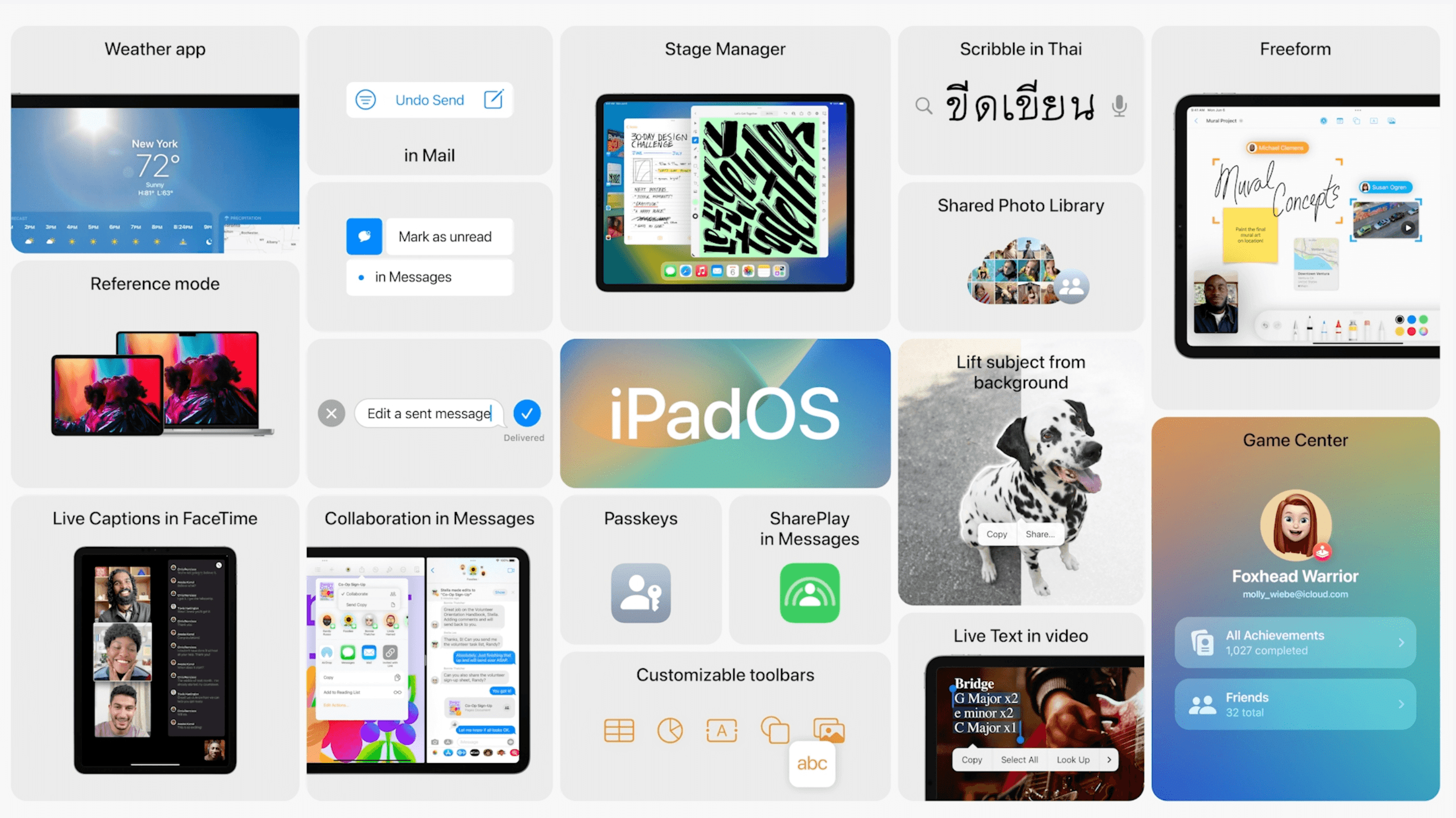

I was happy when my MacOS upgraded to Monterey from Catalina but soon I encountered a usability issue that I never expected, at least from the Apple Design team.
The upgrade manifested a usability glitch or what I simply call a UX bug!
Though it is a minor one but worth an inspection and analysis.
The Story behind
Before the upgrade, the login screen would appear after MacOS Catalina would load fully. If it's bright around, then no issues but in case it's dark (room lights are off or dim), I would increase the backlight of the keyboard to make letters on keys visible. This would help me enter the password easily and then log in to macOS. Since OS would fully load by the time the login screen appeared, this functionality was available when logging in.
After the upgrade, the screen shows faster as OS doesn't load in the beginning and it works fine when it is bright around. But when it's dark, I am unable to get my keyboard backlight ON as OS hasn't loaded making this functionality unavailable and making entering a password bit difficult.
To reach my goal as a user I have to use an external source of light to see the letter on keys which essentially is a not a good experience in my journey of entering into MacOS.
Earlier I had to wait a while for MacOS to load but there was no 'backlight' UX bug as far as login was concerned. It feels good at first that screen shows up fast but I have to wait for OS to load later in the user journey, which now happens after entering the password.
Speed vs Usability
This is not one case in the entire UX space but one of many. It reached the design space of a company like Apple is something concerning. This 'Speed over Usability' rules many design minds, even big and popular ones.
When 'Speed' of Interaction between humans and computers hampers 'Experience' in a negative way, either wholly or just a use case that only occurs sometimes, it is time to rethink and redesign systems so that there are no 'UX bugs' waiting to be unearthed when the system becomes faster and better or appears to be one.
Making interaction quick and fast might give a feeling of 'really good' or even great UX but the question we need to ask ourselves is if UX is about speed or usability. I understand it is about both but sacrificing usability for speed is a mindset that will take the product and its experience in a direction unfavorable to people using it, somewhere down the line.
A Case of 'Illusory UX'
In the current user journey, the wait time for OS to load and Home Screen to appear is still the same and the only thing that has changed is that the login screen shows up quickly giving an illusory experience of a faster system. In reality, it is the same journey where the OS loads once the password has been entered. It makes us feel the system is fast and quick but in reality, the wait time remains still the same, and it also brings with it the 'backlight' UX bug too which wasn't there before.
Such a UX which gives an impression to the user of making them achieve a goal ( faster system here) but in reality does not do so is what I call 'Illusory UX'. For example, most social media platforms and products show as if they want to connect the world but in turn tear apart individuals, families, and societies. More on this later!
Coming back to Apple's usability glitch I believe such UX changes are not worth the bargain as it was better before. I may not be completely right in saying so but before this upgrade, I could at least key in a password even when it was dark around. My journey as well as UX was much simple, better, and more friendly.