Issue 11
By Design.
By Design is a fortnightly letter reaching ~170,000 people following the Prototypr publication. Written by Sophie Clifton-Tucker, we unearth unheard voices, and break down the barriers in design and development.
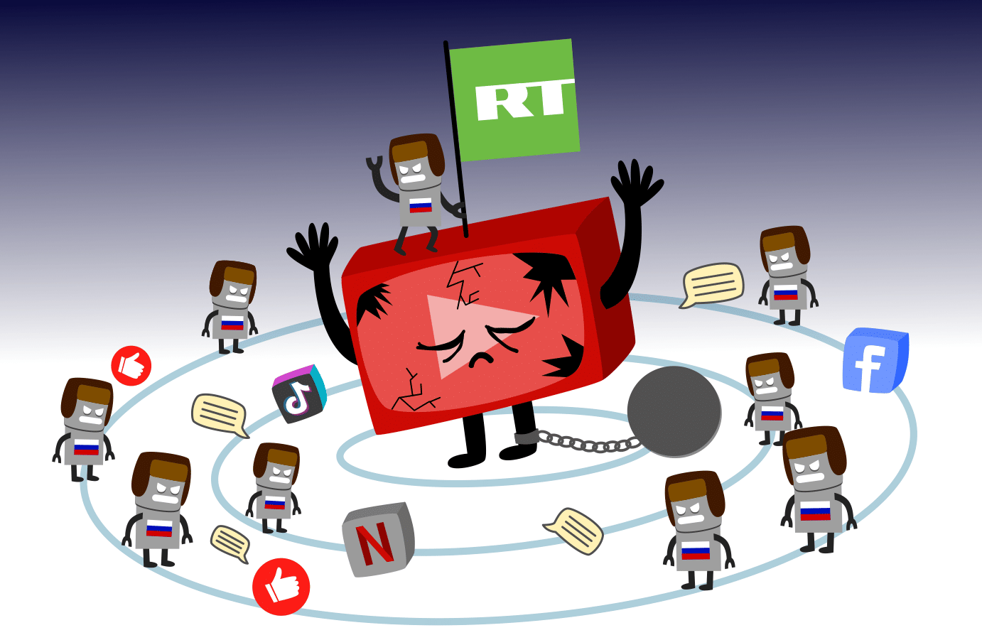
Tech giants like Facebook, Google, Apple and Amazon idle along in the background of most of our online interactions, slyly listening in on our everyday lives. Earlier in July, Kashmir Hill found it almost impossible to remove them from her life in an experiment she ran on tech site Gizmodo, which was later picked up by The Guardian. As consumers, we’re evidently swept along for the ride by big tech and there’s not much we can do. But as designers and product people, we do have a choice on the work we do: the path to environmentally-friendly, sustainable tech, or the path to profit… but can those paths intersect at some point?

Hot off the Press
🗺 Slow Ways: Google Maps is a great tool… if you’re in a car. There’s been many a time where selecting ‘walking’ has led me into a dodgy part of town. Or up to a brick wall.
“We live in a time when our phones will show us the quickest route to almost anywhere — if we are driving, that is. Walking? Well, that’s a different matter.” — david sillito for BBC News
Google Maps’ foot routes aren’t necessarily the best routes. Geographer Daniel Raven-Ellison is offering a solution; a new map created by volunteers during lockdown to show the best walking routes between all of Britain’s main towns. Are you an avid walker? Perhaps you can join the 9,999 other people needed in order to test out the routes on this new ‘slow map’.
🔋 No Charger — Sustainability or Profit Margins?: A million tonnes of external power supplies are made each year. And how much of that winds its way into landfill? I’ll give you a clue: It’s a lot. In a bid to reduce e-waste (or is it?) and reduce the company’s carbon emissions by 2 million metric tonnes, Apple is supposedly doing away with chargers and EarPods — that is, unless you’re in France, where it’s illegal to not include some form of hands-free headset with a fine of €75,000 for not doing so.
But let’s be quite honest; Apple’s primary concern has never been the environment. They are known for being green-fingered for an entirely different reason altogether. M.G. Siegler spills the T as he compiles a list of more likely reasons, in order of importance, and they include: boosting profit margins (necessary after the inevitable drop of investing in new technology such as 5G), decreasing shipping costs, transitioning us iSheep into the world of wireless charging, and… okay, for the environment, at least a little bit.
In hot pursuit (or is it in the lead?) of Apple, Samsung will also reportedly be omitting chargers with some phones as from next year.
↩️ Medium U-Turn — To Distribute, or Not to Distribute?: Medium have always professed that “It is free to publish on Medium, your content is always yours, and we will host it for free, indefinitely. This applies whether or not you choose to make money by putting your articles behind the Medium paywall or make them completely free”. So you had a choice. But it was Hobson’s choice, as forgoing the paywall meant Medium wouldn’t distribute your article — and what’s the point in that?!
Medium have since done an about-turn: All posts are now eligible for further distribution across Medium, whether they are paywalled or not, so when you publish, you’ll only need to decide whether you want your post to be eligible to earn money through our Partner Program, which anyone can join (subject to availability by country). I don’t know about you, but I haven’t been this confused since Boris told me to go to work whilst working from home. (For all our non-Brits, Google the spectacle that is ‘BoJo’ for that reference.) That being said, this is undoubtedly a positive move — bravo, Medium!
Whilst we’re here, what do you think of Medium’s efforts to reduce UI clutter, and the unveiling of their new logo?
In Medium’s new logo, “the distorted ellipsis,” each circle represents a writer being squeezed by an ever-changing business model pic.twitter.com/uDzipz5rSv
— Casey Newton (@CaseyNewton) October 14, 2020
📱 Path to an Interoperable Internet: Back in ye olde days, the internet was a fast-moving, open, and decentralised system. Today however, big platforms are ecosystems unto themselves, where the success of a new generation of apps is often at their mercy. “Since ‘big tech’ controls the infrastructure that others rely on, the platforms have unilateral authority to decide who gets to use it, and in what way.” EFF highlights some ways that can help us break out of the big platforms’ suffocating hold on the market.
Another place to start though, is by not using big tech at all. In a past newsletter, we highlighted the pros of investing in your own platform; relying on the tech giants to do the distribution side of things for you is easy work, but the caveat is it could stop — at any given moment. Stéphanie Walter is throwing back to 2000 and making RSS happen. It’s an easy and concise way to get specific content curated for you — all the UX-related blogs and people you want to follow in one place. Similarly, this month we launched Prototypr Circle, a curated feed of design-related articles with an aim to encourage independent blogging. Pop your RSS feed into the typeform, and your articles and profile will be added to the Prototypr network.

Prototypr Roundup
Designing for Children ≈ Designing for Adults: Carlos Yllobre has made some interesting observations about the increasing way in which we seem to be designing products ‘to satisfy what seems to be an increasingly younger audience’. He boils this reasoning down to three main points: simplification, frictionless, and safe spaces. “There are clear signs that a part of our relationship with technology is eroding hallmarks of maturity…If design is contributing to this process or if it is just a reflection of it, is a question still to be answered.”

Usability Heuristics for UI Design: Jakob Nielsen came up with 10 Usability Heuristics for User Interface Design (‘heuristics’ because they’re broad rules of thumb and not specific usability guidelines) that should be kept in mind when designing to ensure a seamless user experience. Alison Quaglia delves into each one, and provides an explanation and review for each.

Vignette Sketches: Ben Crothers has a simple but really effective technique to get better design feedback — and he’s going to share it with you. Firstly, it’s important that everyone gets the context of the design, from the people familiar with the project to a fresh pair of eyes. Knowing the backstory to the design is the key to effective feedback. But how to get a bunch of information across succinctly? Visuals! Or, more specifically, vignettes. A vignette is a small scene (usually in literature, film or TV); a brief, but evocative description or moment in time. By sketching a vignette for your product, you’ll provide a clear snapshot of what your product is, who it’s for, and when and where they’re going to use it.

Memory Imperfect and Individual Difference: It’s the age-old story; I go to log into my Netflix account, only to find I’ve forgotten my password — again. But how am I supposed to remember it when they ask for 8 characters made up of numbers, symbols, hieroglyphics and the blood of my firstborn? And then when I proudly enter my new chosen characters, they tell me “Sorry, new password cannot be the same as old password.” Can’t win. (Just kidding, I’m never logged out of Netflix.) Understanding the limitations of our puny human memoryboxes can help with UI design. Belanna Zhou believes that it’s the designer’s duty to help their user remember essential information from one moment to the next. Asides from avoiding long strings of arbitrary digits, we can achieve this by providing visual echoes and providing recent search history to help alleviate the burden on the user’s working memory.


Available for Hire
Are you looking for a designer? That’s lucky, here are 5000 of them! If you’re looking for work, head on over to our Prototypr People page and sign yourself up. Don’t forget to click ‘Available to Hire’, and add your Ko-fi badge for some extra pocket money.


 Buy me a coffee


