Nobody said finance was easy.
If you’re in UX, you’ve probably heard people say time and time again:
“simple is better!”
“just make it easy for the user!”
But, this is definitely not the case when it comes to fintech. Financial apps are not like others, for two reasons. [1] Managing your finances and investments is an absolutely vital function because it guides your life through your spending. [2] Many people struggle with understanding finance, and opt for hiring a financial advisor. For these reasons, financial apps should be treated with caution because of how much is at risk. Should everything about these apps be “easy to use” or “effortless”? No.
“The gem cannot be polished without friction, nor man perfected without trials.” — Confucious
Instead, fintech apps should carefully and intentionally use friction in their apps in order to slow down the user’s process and make them think about what they are doing. Using friction in your fintech is an opportunity to:
- build trust with your users by showing you have their best interests at heart
- give your users confidence to invest, as they are being properly educated along the way
- prevent users from making grave mistakes, such as in the next example
Grave Consequences
A sobering example from Robinhood
In some cases, bad fintech UX can be life or death. A 20-year old Robinhood customer died by suicide after seeing a $730,000 negative balance on his Robin hood account [source]. The kicker? The balance did not accurately show what the customer owed — it was just a temporary balance while his money settled into his account. The customer’s suicide note stated that he had no idea what he was doing, and wondered why he was even given the power as an uneducated, young investor, to trade so much money so effortlessly.
Creators of apps with this amount of responsibility have a duty to deeply educate investors about where their money is going.
As I see it, a few things could have prevented this horrible result. Robinhood should have provided a cautionary message before the customer made the transaction that the funds would not be settled immediately. Another solution would be a trigger that if there is a negative balance, Robinhood explains why the balance has gone negative, or estimates what the true balance is. As a last ditch effort, the app should have a “help” feature that pops up, which allows the user to chat with somebody or call a direct number in stressful cases such as these.
Good Friction
Payment Transfers
Everyone has heard that horror story about accidentally transferring money to the wrong person, or accidentally adding an extra zero.
Venmo
Venmo seems to have learned from these errors because they added an extra, subtle step to the process of paying somebody.

First, you enter the payment amount. Secondly, on the same screen, you press “pay”. Finally, you have to click “Pay Night Hawk $1.00” to actually complete the transaction. Notice how step 3 explicitly spells out the exact name of your friend and the exact balance you want to pay them. Venmo without a doubt made this decision to prevent a mistake on behalf of the user.
Paypal
Paypal also thought this through in their online money transfer portal. Let’s look at the interaction of entering a balance to send your friend.

Notice how you enter the value from right to left, instead of left to right. The decimal point stays in one place and the values entered begin on the right, with merely pennies. At first, this seems a bit counter-intuitive. If you type into a plain text file, you type left to right, so wouldn’t you expect to enter a balance this way as well?
Paypal did this intentionally so that it takes longer to type a large balance. This prevents the likelihood of somebody accidentally entering (and paying) $1,230 instead of the desired $123. Can you imagine the panic?
The button at the bottom also says “continue”, instead of “pay”. Paypal takes you to a confirmation page so that you can double check all of the information. On that page, there is a button “Send Payment Now” when the payment finally goes through.
Bad Friction
Onboarding User Flows
Onboarding the user is one area there should not be any friction. When somebody first signs up for an app, they typically want to explore and get comfortable before reaching for their virtual wallet. The onboarding process should educate the user on the feature’s of the app, sell the app’s best value propositions, and then end to give the user full autonomy over their own financial decisions.
The onboarding process is not the place to demand personal information, such as addresses or credit cards.
If you ask for the user to link their bank account during onboarding, the drop off will be about 50%. The customer may then go to a competitor that isn’t so demanding.
The best way I’ve seen fintech services onboard the user is by using a chatbot, which asks questions about the user’s goals, with simple “yes” or “no” answers. This doesn’t ask much from the user, while still capturing enough data to personalize the experience. Habito and KBC Ireland are two services that utilize a chatbox in order to effectively onboard their users. Smooth onboarding will also wait to create an account until the end of the onboarding process, once the user has developed trust with the app. Easy sign-up through a google or facebook account is a plus.
Good or Bad Friction?
Login Security
One big pet peeve for many users of fintech apps is the level of verification they have to go through in order to login to their accounts. Some apps will require you to go to an email address or your text messages every time you try to re-login to your bank account. Some password requirements can be so strenuous (20 characters long, 3 special characters, 6 numbers, 3 different languages, and your deepest darkest secret) that you are almost guaranteed to forget your password. Of course it is important to verify the user given the sensitivity of personal banking information, but can this process be too intensive and time-consuming?
On IOS, face-id or easy password keychain storage helps solve this problem. Some apps (like acorns) will allow you to set a pin to allow for a faster login. While this is an improvement, you still have to remember your pin!
Monzo Bank has a unique solution to this problem, by not requiring a pin or passcode at all. Instead, the bank simply asks for your email address, where they proceed to send you a link to login through your email.

Although this process is unconvential, it only requires 3 steps for the user to login every time, and never requires the user to remember their password or have to verify their account.
I don’t believe there is yet a clear solution to the issue of login security for financial technologies. Financial companies need to continue to experiment, innovate, and come up with new ways to make this process more secure, while not sacrificing the user experience.
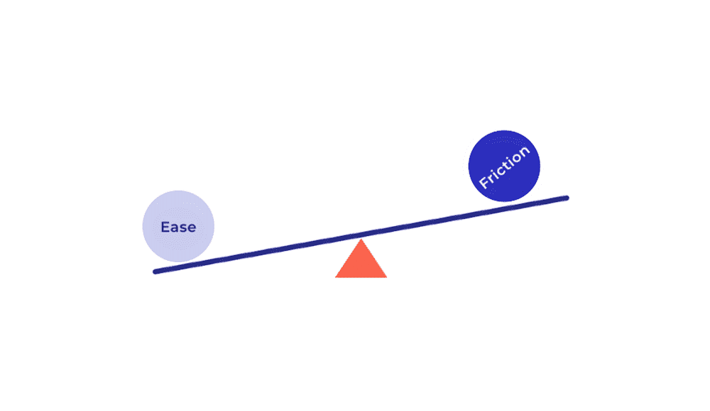
How much friction is too much?
A balancing act

I’m not saying fintech apps should be incredibly difficult to use. Of course not. Fintech apps should still overall be perceived as comfortable, intuitive products, with speed bumps before important actions (such as large investments or transfers) and intermittent hand-holding throughout. But these occasional, well-placed points of friction, are vital to the success of the overall experience.
For more design rambles and thoughts, follow @alexandragrows on Twitter.
Or check out her website, here.