Design Systems are great, aren’t they? They solve all of our problems with consistency, speed of implementation, and overall business agility. We can now drag and drop our beautiful, well-documented lego bricks and create new screens, new features, and new ways for our company to grow.
For these reasons design systems went mainstream and now even small, MVP-stage startups are considering them. Or at least a design library to speed up that part of the process. Imagine their joy when they realize the time and money saved by a predefined, pre-coded set of reusable components.
It’s magical! How could they ever have lived without it?
The design systems trap
And while Design Systems are a great addition to an already established, strong brand, they can be a trap for a small startup with big hopes and dreams. But to better understand the reason why, let’s go back to the „mother of all design systems” – Material Design.
It was the first popular design system that went mainstream with adoption. Developers loved a clear set of rules. Businesses started adopting it left and right, both in their Android apps and in their web-based SaaS products.
The problem with Material Design, however, is that it has no „soul”. And it’s not supposed to have one. It’s just a set of objects from which you build the end product. But having a tool that powerful early on can lead to relying on it a bit too much.
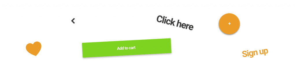
Most material design products look the same.
Now let’s explore this in a bit more detail. First the good:
If things look the same (or similar) the barrier of entry lowers, as people like the familiar. They’re comfortable with all the patterns and they „feel at home”. So in terms of pure usability that design system-induced clone army wasn’t that bad.
But we as humans need something else too. We need to have an emotional connection with a product to truly love it. Otherwise, it’s just a tool, that we can easily switch for another tool at any time.
We need that „delight”
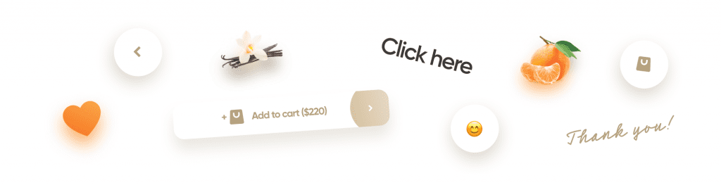
What products seem to often be lacking is that delight and their own, unique style. Something you remember and get attached to right away. It can be the way they present the data, it can be an organic background shape, or it can be the way the screens transition.
As long as it’s not something everyone else does the same way, it will help the startup stand out. But things like that cannot be systemized. They are not mere templates to annotate and document. They’re organic in a sense of existing as a completely separate layer. The „delight” layer.
OK, but why?
We see it left and right with startups all the time. They have a groundbreaking new idea™ and they want to quickly put together an MVP. They use Material, or Bootstrap (or both) and build a crude, but working demo. They show it to some people, but unless it can launch people to Mars and make coffee at the same time, most come out unimpressed.
This can be misinterpreted by the wrong PMF (Product Market Fit). Maybe the value proposition in the product is simply not resonating with the customers? That can be, but before you jump to conclusions, ask yourself a question. If you were to test a groundbreaking new product, which one would feel more groundbreaking to you?
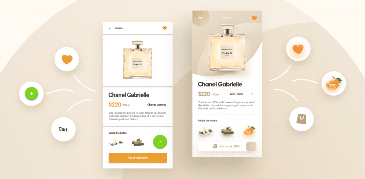
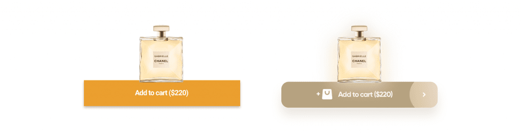
The one on the left, or the one on the right?
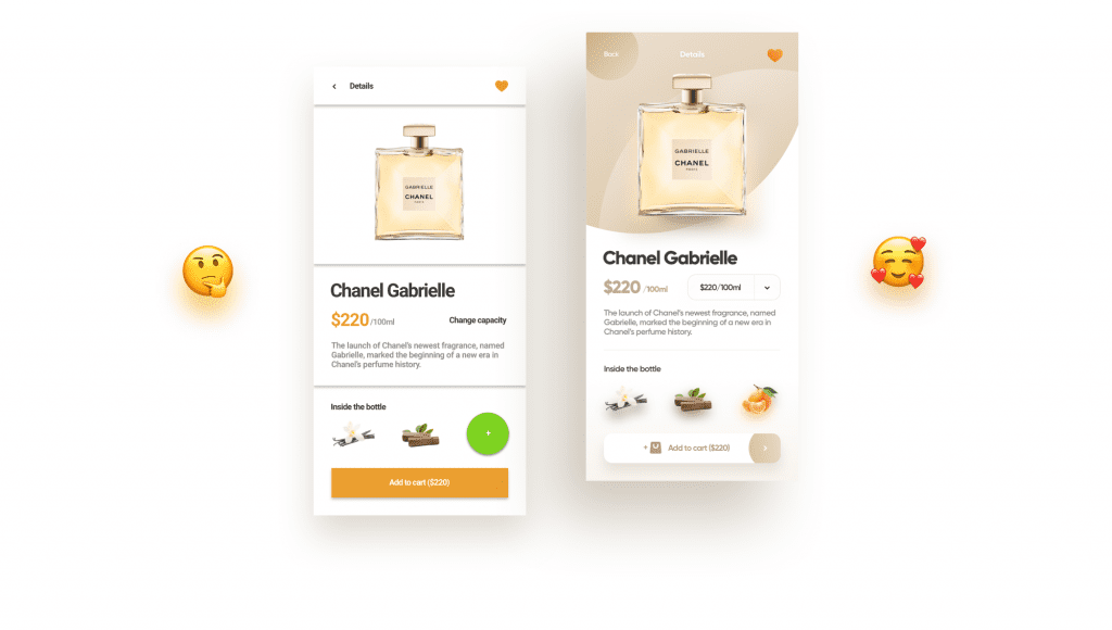
Without that defining feature, that spark that makes you identify a product right away, you may not get the proper results of a user test.
Users are people too, and when they see something that looks like a wireframe, they don’t “get it”. They don’t understand it’s just a mockup of functionality. They think it’s an ugly, unrefined product. And they perceive it as such which can dramatically skew the results.
How the brain works
Our brains group and systemize all the information we see. They have to do it, otherwise, we’d be overwhelmed by stimuli and unable to focus on anything. And while this principle works great combined with a design system, it also blends these experiences together for a boring, forgettable outcome.
That stand-out element goes beyond that mental drawer our brain puts all “typical UI’s” in. If done right it gets coded right into our emotions and evokes a positive feeling about the brand even if seen elsewhere.
Let’s delight your users!
So while consistency and precision of a design system are definitely the right way to go, let’s not forget about what makes our product “ours”. Because that emotional, sometimes irrational component is also what is going to delight the users and keep them engaged with what we do!