
In January 2008, a worldwide famous fruit juice brand, Tropicana, launched new packaging for its best-selling product — Tropicana Pure Premium — with sales revenue around $700 million per year.
The consumers did not receive the design well, making sales fall by 20% in the following two months, corresponding to approx. $30 million in losses. Eventually, the company had to return to the original version.
But why did it fail? How does a $35 million rebranding project fail?
One of the main reasons for rebranding/redesigning is for brands to reconnect with existing consumers and reach out to new ones.
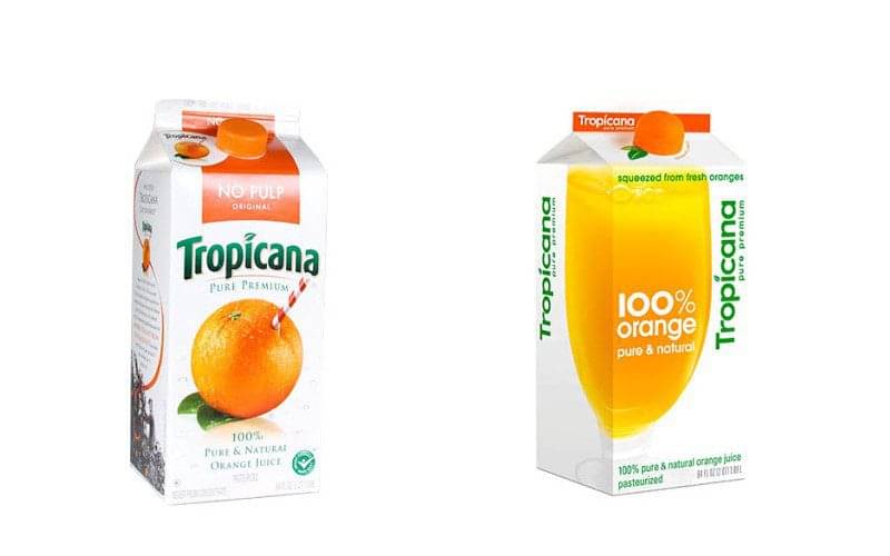
Tropicana’s redesign consisted of replacing the popular orange with a straw, with a generic glass of orange juice replaced. Tropicana’s orange juice became generic, and customers stopped relating to it.
The rebranding failed to strengthen customers’ deep emotional bond with the original packaging; this clearly identifies the importance of a brand’s visual identity. Even if the final product remains the same, if the brand’s look doesn’t consider appropriate customer research and feedback, it can impact the brand significantly, in a negative way.

The design stopped resonating with the audience. Purchase decisions are highly emotional. That’s why it is essential to spend time with customers and consider their opinions and preferences.
But why does design play such an important role?
Packaging is the last point of brand communication for a company with its consumers in the purchasing decision process. Its design and content have the power to influence a consumer to invest in a product at the very last moment.
When doing a redesign, one should keep in mind that the design should maintain the intrinsic qualities that previously connected customers with the brand.
Check out this example:

Although the package in the example was given a new look, with improved clarity of messaging through visual hierarchy, and refreshed illustrations and colours, the intrinsic qualities that connected customers to the brand are still present!
In Tropicana’s case, what was initially an attempt to modernize and rebrand an essential food item, was turned into a debate, where loyal customers developed trust issues about the product inside the carton. The product identification attributes and the connection between consumers and the brand were taken away.

Conclusion
Tropicana’s original packaging had rich colours and a strong visual hierarchy. On the other hand, the new packaging failed to impress the consumers, with clean lines, a lack of visuals, transforming the once indistinguishable orange juice into a “generic store brand” product.
This case study shows the impact design can have on a company. Design has the power to impact and drive sales in a positive direction when done right. But the opposite can happen too. Therefore, companies should give due weightage to design and not underestimate customers’ deep emotional bonds.