Want to get on the same page as your users? Then you need to have their mental models down. This post looks at the best tips and examples to get you started
The key to a great user experience? Understanding how your users think – it’s as simple as that. The technical term for how people think about any concept or process is known as a mental model.
We could say that mental models are one of the main pieces in the user experience jigsaw puzzle that UI-UX designers face on a regular basis. User testing and research establishes who your users are and what tasks they want to achieve. Discovering their mental models is about finding out how you can help them achieve those tasks.
In this post, we’re going to look at how we can apply mental model theory to UI design. We’ll also take a look at some techniques for how we can match our users’ mental models, as well as some classic examples.
What are mental models?
It was Kenneth Craik, the Scottish psychologist and philosopher who first coined the term “mental model” in 1943 when he noted that people build “small-scale” models of how the world around them works. To understand how these models apply to UI design, we should first take a reality check and see how they help people interpret facts about the real world.
Mental models in the real world
To start with, let’s examine how language, one of the main faculties that differentiates humans from other animals, helps shape our world.
When learning Japanese, English speakers are often left perplexed by the lack of a future tense, while at the same time, being amazed that there are tenses they’d never conceived of in English. That right there is a mental model in action.
Then you have the example of Wittgenstein’s Lion who can speak English (and maybe Japanese!) and yet no one understands it. This is because, even though the lion speaks the same language as us and uses the same words, its concepts of the world differ vastly due to its perceptions. A lion relies much more on smell and operates purely from instinct, with zero abstract thought.
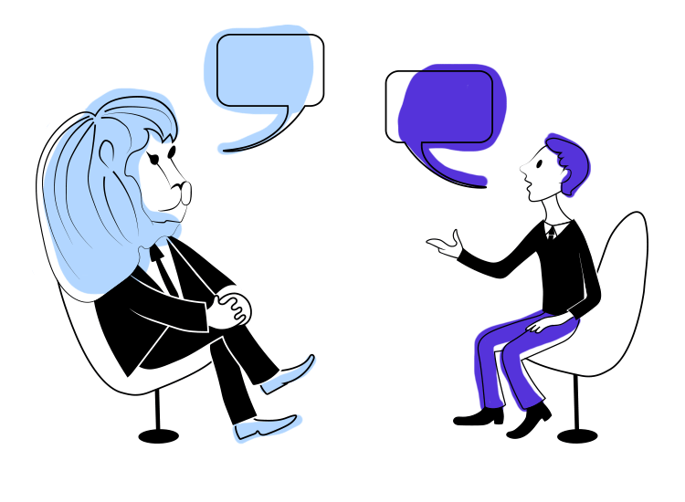
If you asked it about its day, it might run off something like this:
“Apathetic. Tongue is heavy (tiredness), only sedimentary rock (I don’t smell any leads on my next meal)…come closer (you’re my next meal!).”
Perception of reality and how things work
Although mental models might sound like some complicated psychological concept, the truth is, they’re actually quite simple: people learn from past experiences and apply that knowledge to whatever task they encounter. The above examples of language illustrate quite well how people apply knowledge they’ve already learned to the world.
In short, a mental model is someone’s current grip on events, their perception of reality and of how something works.
Applying mental models to web design
One of the whole reasons that UX design exists is to cater to people’s mental models to help them carry out tasks with the best experience possible.
The real question though, is how do mental models apply to UI-UX design? And how can you leverage this psychological element of the user’s experience to build more user-friendly products?
Charlie Munger famously came up with the “man with a hammer syndrome” analogy that perfectly sums up mental model mismatching. The man holding a hammer sees everything as a nail.
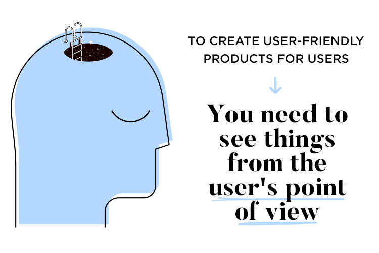
If you want to create truly user friendly products, then you need to see things from your users’ point of view and the only way you can do that is with user testing data. Or you can try and adapt the user’s mental model to your website’s feature.
Let’s first look at how we can create something that agrees with users’ mental models, by avoiding mismatches.
Avoiding mental model mismatch
As designers, we’re all probably guilty of having had an overly ambitious idea for an awesome UI and throwing in all our design experience to let the user do everything but take over the world. Only, for the users themselves, it isn’t so practical. They might as well have jumped inside the cockpit of a crashed UFO ship and started trying to learn how to fly it!
This is a classic example of a mental model mismatch, where the user doesn’t have the design experience you do and therefore finds it too complex and overwhelming. They don’t understand what the onscreen elements do nor how they relate to each other.
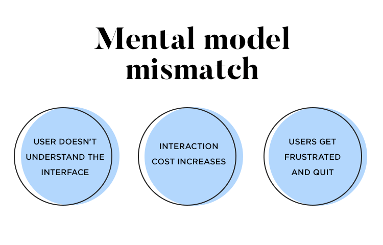
When you get a mental model mismatch, that increases interaction cost, which can frustrate your users and cause them to abandon ship (our UFO ship?). This problem is more common than you would think in the design world, and even large design teams can make these critical UX errors. Sometimes the best designers can over, or underestimate their users’ mental models and ability with too little information or understanding.
Matching users’ mental models
The first point we must understand is that most of the time, your users are viewing and using websites or apps that aren’t your own. Then they come to your website with the understanding of the average website they’ve used.
If the elements in your UI design and the information architecture on your site fits their mental models, they’ll have no problem navigating your site and finding what they need.
Mental model matching techniques
Discovering your user base
The best way to start, if you want to match your users’ mental models, is to first find out who your target user base is. Not all users across the board will have the same mental models!
A good rule of thumb is to carry out some user testing. Gathering data from your user research and creating user personas is a brilliant way of achieving this goal. When you have your user personas coined, you can then design your UI in a way that suits them and then test it on them to see if its features really do fit with their mental models.
For example, let’s say that your website is aimed at people who are generally over 80. They might not be so familiar with the hamburger menu option. Here you’ll probably be better off coming up with an alternative and testing it to check your assumption of their mental models.
Learning from big sites
As we mentioned above, most of your users will be using sites that aren’t your own. That might tempt you to look to some of the most popular names in the industry for ideas. For example, you might go about checking out popular brands’ websites, such as Apple, Netflix, Hubspot or Youtube. These are successful brands, so why not just copy what they do, right?
You should always err on the side of caution when it comes to copying the big players, as they are operating under a different context. While it’s true that many big brands have websites that are a shining example of great usability, they too can make mistakes. The difference is, they can afford it and their users are more likely to forgive them.
For example, maybe you were looking to copy the function of a certain UI element on Youtube without realizing that it doesn’t work well and they were on the cusp of doing a feature reboot! Or maybe they were just testing the waters for a new UI design.
This is why it isn’t unusual to see smaller websites and companies with brilliant usability and marvelous UX, precisely because they can’t afford to risk losing new users. However, there are ways that you can get inspiration from the big boys without the risks and one of those ways includes user testing on these sites themselves.
If you must copy from the high fliers, the right way to do it, would be to carry out third-party user testing on a famous site. For example, you would simply ask your users to carry out a series of exercises with those features of the website whose elements you wish to replicate. Measure the results you get back and see for yourself if it would work before you make an expensive mistake!
Card sorting
Card sorting is a useful user testing method for understanding your users’ mental models regarding navigation and how they would find their way around your site.
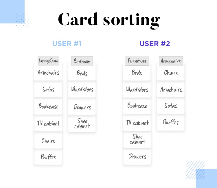
By performing card testing, you can design your site’s information architecture to ensure it fits in with their expectations. This will result in them having an easier time finding what they need and reducing interaction cost.
Wireframing and prototyping
Another way of discovering what your users’ mental models are is to put together a wireframe or prototype with a prototyping tool like Justinmind. You can design the screens with the features, elements or components that you want to test and have users do a think-aloud session. This will let you discover their habitual thought process and learn how they naturally interpret your UI.
For example, are they more likely to hit the back button on your site to reset a feature on the page? In that case, you might want to make the alternative instructions clearer, or perhaps alter your product to ensure that the feature does reset when they hit the back button.
Copying design trends
Additionally, when you are designing your UI, you may or may not want to follow certain trends, depending on what your users’ needs are and your budget. You also need to use your budget to ensure you’re getting the maximum UX out of your design.If you’re looking for an easy way to keep up with the ever-evolving world of UX design, check out this list of the best UX design blogs on the web.
For example, let’s say you want to follow a UI trend that is based on loud colors or really graphical animations. Depending on the age group or the type of industry your web design will reflect, you may decide to hold off on that trend as redesigns can be expensive.
However, many web design trends seem to be based on improving UI elements for better usability, such as doing away with skeuomorphic design, in favour of flat design. Many trends like this one happen due to a need to improve usability, and should always be taken into account.
Adapting users’ mental models
Skeuomorphic design was popularized by Apple in an attempt to get people to convert to the digital world. To do this, they created iconography that closely imitated items in the real world.
A typical example of skeuomorphic design would be the trash can for deleting files. However, as the global population gradually became more technically literate, skeuomorphism was no longer necessary. This is an example of adapting users’ mental models in a helpful way, with a guiding hand.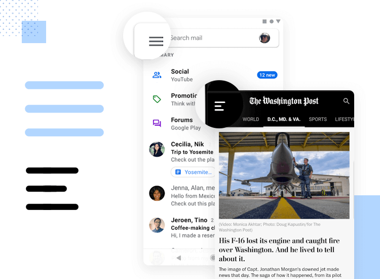
Camera icon by Gary Wilkerson
Most of the time you’ll find that it’s best to adapt your UI to the users’ mental model because it is a failsafe method. However, there may be times when you need to try to adapt your users’ mental models slightly to something new. When it comes time to do this, you should always make sure that your users’ learning curve is kept as shallow as possible to avoid too much interaction cost.
When it comes to special product, website or app features, short, sweet and clear instructions are the way to go, especially when it comes to form design. For longer features, you might try creating walkthroughs and demos, or even comic strips! The latter three options are a form of visual storytelling and are a great way of boosting learnability and helping users understand features in an exciting, natural way through their emotions.
Real mental models examples in web design
So let’s look at a few examples of some common user mental models out there. These examples show how users build up an understanding, independent of us designers about how websites and apps work.
1. Google search bar
One of the most prominent and talked about examples of a typical user mental model is Google’s URL search bar.
Initially the URL bar at the top of the browser page hadn’t been intended to function the same way as the Google search bar. It was meant for entering the full domain to take the user straight to the site in question.
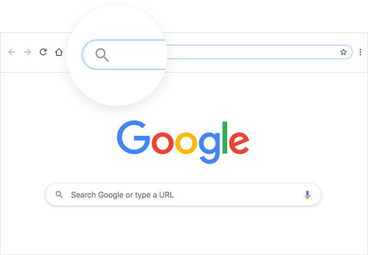
However, Google quickly noticed that many people expected it to function the exact same way as a search bar, and only veteran internet users realized the difference. Due to this, they decided it was best to cater to the mass user mental model.
Google gave the URL bar the same functionalities as the search bar and even added in the magnifying glass search icon, something typical of search bars all over the web. It still maintains the same function of the old URL bar, by taking users directly to site domains, but also can display lists of search results in the same way as the search bar.
2. Modal windows
Another great example of a user mental model is the classical modal window that pops up, typically asking the user if they like cookies (web cookies!) or want to sign up for their stuff.
Many users still think that by pressing the back button on their browser, the page will reset and the modal window will disappear. When their browser navigates them away from the page entirely, to them it feels like they’ve gone back two steps.
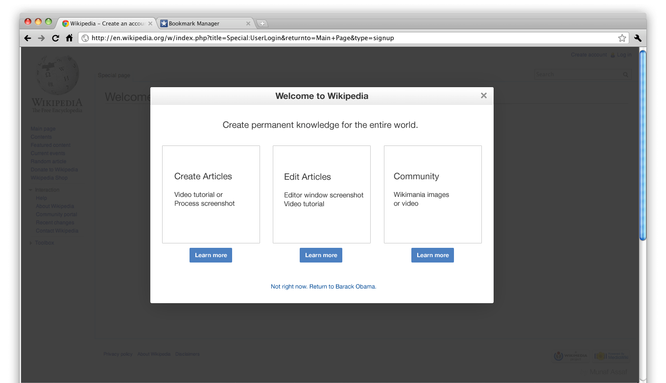
In reality, they’re actually just going back one step because the modal window is a feature of the same web page that needs to be deactivated with the close button.
3. Images with unclickable buttons
Then the next example that we have is something more obvious, that unfortunately does still happen in today’s world of UI design: including a button on an image, that is part of the image.
In cases like these, the entire image or card is clickable but the button isn’t. This obviously goes against most people’s mental models because to them, a button should be clickable. Yes, it still works, but in that case, you might just be better off simply making the card look more clickable.
The bottom line is that, if elements like buttons don’t appear to behave in the ways people are accustomed to, they’ll be less likely to trust the UI design of your site and believe it to be full of bugs and glitches.
4. Checkboxes and radio buttons
Another great example of causing a mental model mismatch (and your users’ heads to explode) is to misuse checkboxes and radio buttons.
Most users have internalized that checkboxes include lists of items or options to be selected, of which multiple can be checked at a time. Radio buttons, on the other hand, are a different kettle of fish and can only have one button selected at the same time.
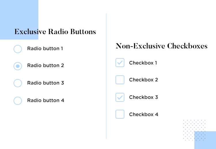
Now, if you were to include a list of radio buttons with multiple selection, where you would normally include checklists, this would go against most mental models formed since the dawn of internet forms – not smart!
5. Calendar date pickers
This one can be argued based on your user personas, but the calendar that comes with most date pickers is a great example of a universal UI element that attempts to cater to most users’ mental model of dates.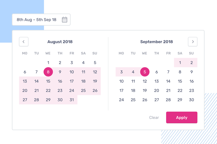
Date Picker by Nat Hayward
Choosing days, months and years from drop down lists is possible, but often it’s safe to say that most users will have an easier time of picking dates from the traditional calendar display.
To sum up – mental models
As designers, we might know a lot about UI design. Nonetheless, there are still a lot of important lessons we can learn from our users. If we want to know how to design the most user-friendly UI, we need but turn to them and how they think.
Even if it means watering down what we think would be an awesome design, creating for the user means harnessing our design knowledge to produce something they understand, or risking complete failure.
Sometimes, all that’s needed is a bit of testing to save time in the long run!