As I was redesigning This Too Shall Grow’s website, I came to question the primary colour I had been using until then. That bright green was starting to give me a headache, and I even considered dropping green entirely. I bounced that idea off my friends: Tamara was half-sceptical, half-excited. Marie was her super supportive self. Noemi asked me if I was redesigning the website I had just finished a year ago (yes, this precise website, thank you Noemi).
Because I deeply love both UX research and colours, I set out to understand what would be the best choice for This Too Shall Grow.
Preparing the test
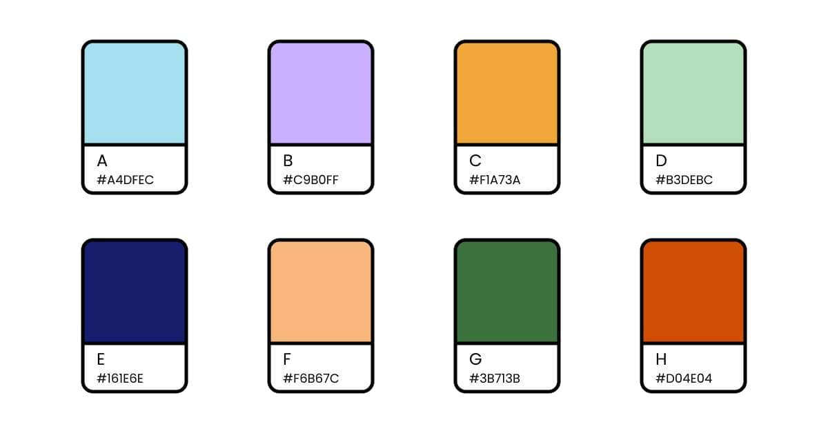
I started by defining my hypotheses. I selected 8 colours that I liked, and I checked them for contrast, using https://contrastchecker.com. After some tweaking, I had 8 propositions, 6 of which could be used as a background, with either black or white text. 2 colours didn’t have good enough contrast to be used with text. I decided to keep them, and would have used them in borders, icons, etc.
UX research on branding colour is something I had never conducted, and it’s honestly quite abstract. I skimmed the web for articles on that topic, and found those 2 resources:
- Caitlyn Hampton‘s article on research for a brand’s secondary colour: https://medium.muz.li/ux-design-research-an-approach-to-researching-color-85212a35cfd3
- NNG’s article on testing visual design: https://www.nngroup.com/articles/testing-visual-design/
Yes, that’s a good start, but it’s not much.
Side-note to designers and researchers: please, let’s share more of what we do. Openly sharing our work, experiences and insights is the best way to progress together. Writing this article, I went from ‘I don’t know what I’m doing, it’s shit’ to ‘I will make it interesting, personal, sincere, I will woman-up and disclose my UX research process for people to have a look’, and everything inbetween. Everyone else is as self-conscious as you, everyone sometimes feel that they’re faking it, so I guarantee you can go ahead and share your work.
Now, back to the research and the articles I found. With that newly acquired knowledge, I started outlining my research questions and my research protocol. Your questions serve as a broad indicator of what you want to find out by conducting these interviews:
- Is the meaning behind the name This Too Shall Grow understood?
- Is the studio’s activity understood with just a few keywords?
- Among the selected hypotheses, what is the best option to use as the primary colour for This Too Shall Grow?
- How are these colours perceived? Meaning, symbolism, emotions, etc.
Have you ever heard of a testing test? Yep, it’s a preliminary test designed to put your testing protocol to the test. Test test test. OK, I’ll stop.
I organised one of those with my SO, because let’s be honest: even though he matches my target audience, the main reason he would read my articles is not because he enjoys the topic or the colour, but because he’s my boyfriend.
A testing test (sorry) is a great opportunity to have a user test on your testing protocol (sorry again). You try it on somebody and see how solid it is, how well it can take punches, especially when the interviewee is being his shamelessly unfocused and chaotic self (he agreed to those words).
This test proved to be very useful, so I tinkered with the protocol and the assets to make my upcoming interviews bulletproof.
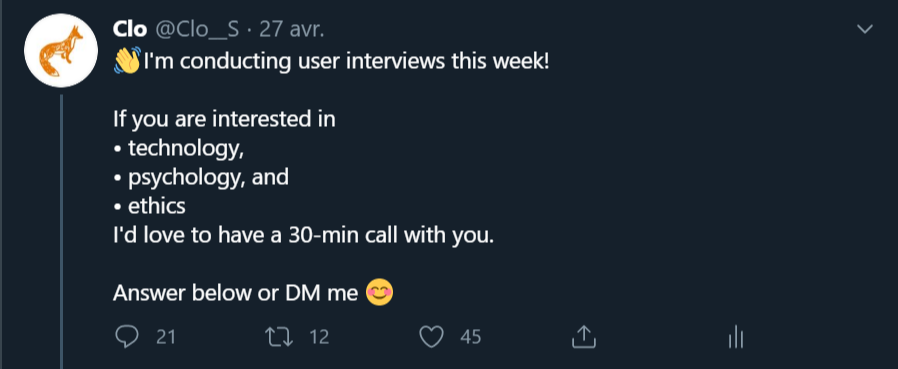
Now, let’s talk about recruitment. I sometimes see research led without any filtering of the participants. Allow me to be very clear: interviewing ‘anyone’ doesn’t make sense, because your target isn’t ‘everyone’. In my case, I want to talk about conversational UX, UX research, UX design, psychology, mental health, ethics in tech, and all of their stakes and implications. Because Twitter is This Too Shall Grow’s main social network, its main point of contact with people, it made sense for me to recruit there. I posted a tweet on a Monday morning, with a simple recruitment criterion representing the studio’s activity: I was looking for people interested in tech, psychology and ethics.
When someone showed interest, I moved to private messages, and screened a bit more by asking how they personally related to those 3 subjects. If they were a good match, we moved on to a timezone-and-calendar consideration, trying to find a 30-minute slot that worked for the both of us. These one-to-one discussions are great for knowing people better and recruiting the relevant respondents, but it’s not the best scheduling approach when you’re booking 20 people at once. Next time, I might try something like Calendly.
I ended up booking those 20 interviews with people from 5 continents and 12 different countries: Brazil, France, Germany, India, Ireland, Israel, Nigeria, Portugal, Senegal, Singapore, Spain, and the USA. Participants were between 22 and 43 years old, averaging at 29. The gender ratio wasn’t too bad considering tech is far from perfect in that matter, with 12 out of 20 people going towards ‘male’.
Conducting the interviews
After some tweaking and tinkering, the final version of my protocol went as follows.
Introduction
I started by asking respondents about their day, and if they had already taken part in UX research, in order to make them feel comfortable and progressively ease them into our call. I told them I was going to share my screen, and ask them a series of questions about their perception and impressions. I like explicitly stating that there is no wrong or right answer, and that they are very welcome to be brutally honest throughout this whole interview. Participants preoccupied by being nice and not hurting the interviewer’s feelings will skew your research.
In terms of privacy, I explained that I was not recording audio nor video, but that I would love their permission to share some information about my research in article-form: not using any name, but countries and ages for instance. After getting explicit agreement, we could start the interview.
Question 1
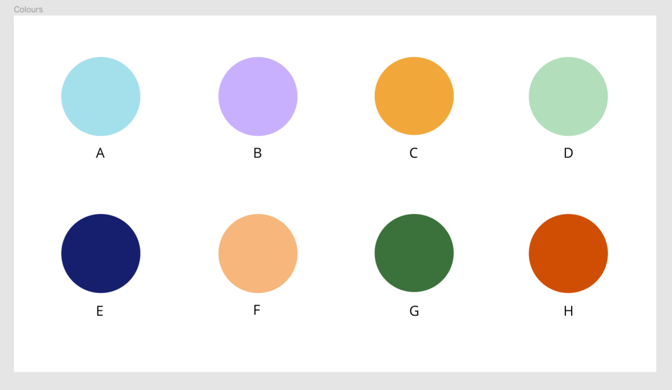
I presented respondents with the following frame, composed of the 8 colours of my hypotheses, and asked them to rank those by order of preference. The placement was randomised for each interview. This question allowed to create a first contact between participants and the material, and to get them thinking about colours.
Question 2
Once the ranking was done, I retained their top 3 colours, and asked participants to tell me what they liked about them. This pushed them to consider why and how they relate to colours. I have to admit that it also satisfied my natural curiosity (that’s what research is for after all).
Question 3
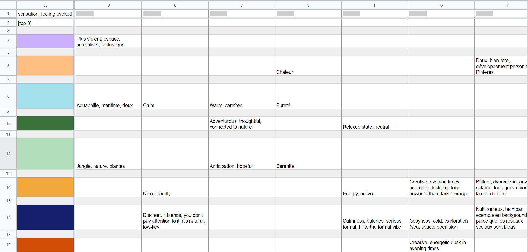
Getting deeper again into colours and their meaning, I invited respondents to give me 2-3 adjectives or sensations of what each of those 3 colours evoked in them. With this question, I gathered the ideas, vibes, and symbolisms attached to my hypotheses.
Let’s tackle the topic of notes, for a bit. Efficient note-taking is essential to UX research, especially since I was not recording anything and conducting the interviews alone. I usually create a grid for this purpose, optimising both for convenient typing during the interview and practical analysis afterwards. For question 3, I created a column for each participant, and a line for each colour. Instead of typing down ‘[name], [colour]: [answer]’ on the spot, I simply had to enter their answers in the right cells. Once all interviews had been conducted, the lines repartition allowed me to easily find all answers for a specific colour.
Question 4
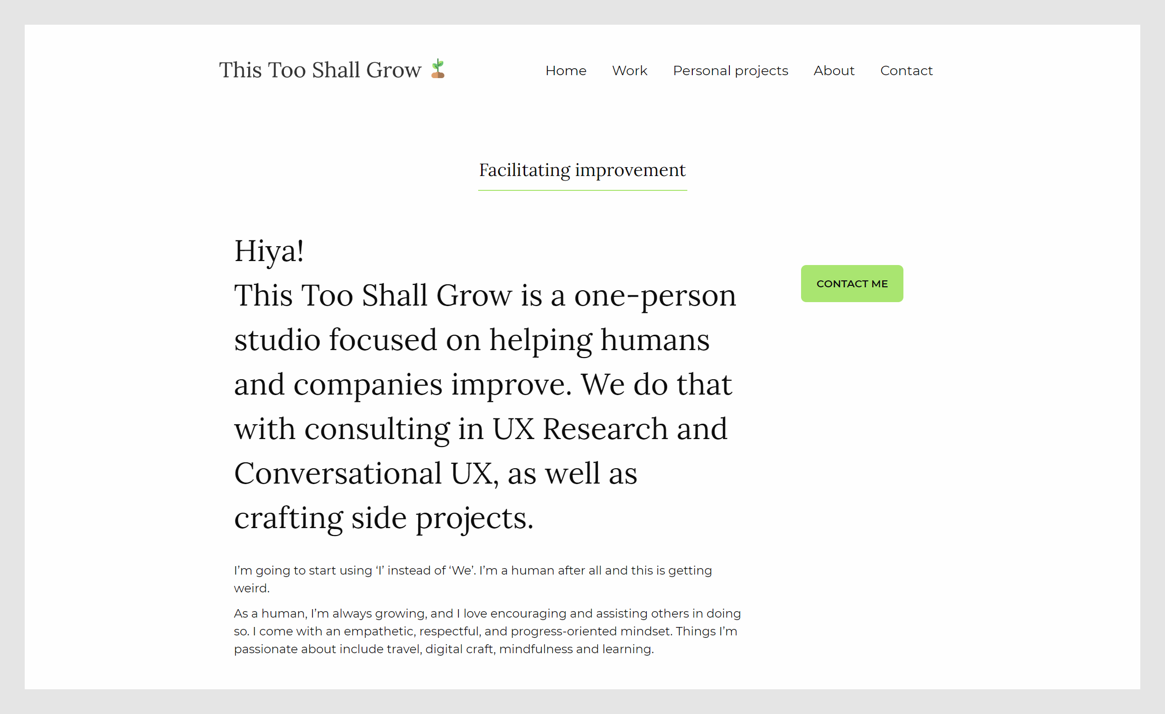
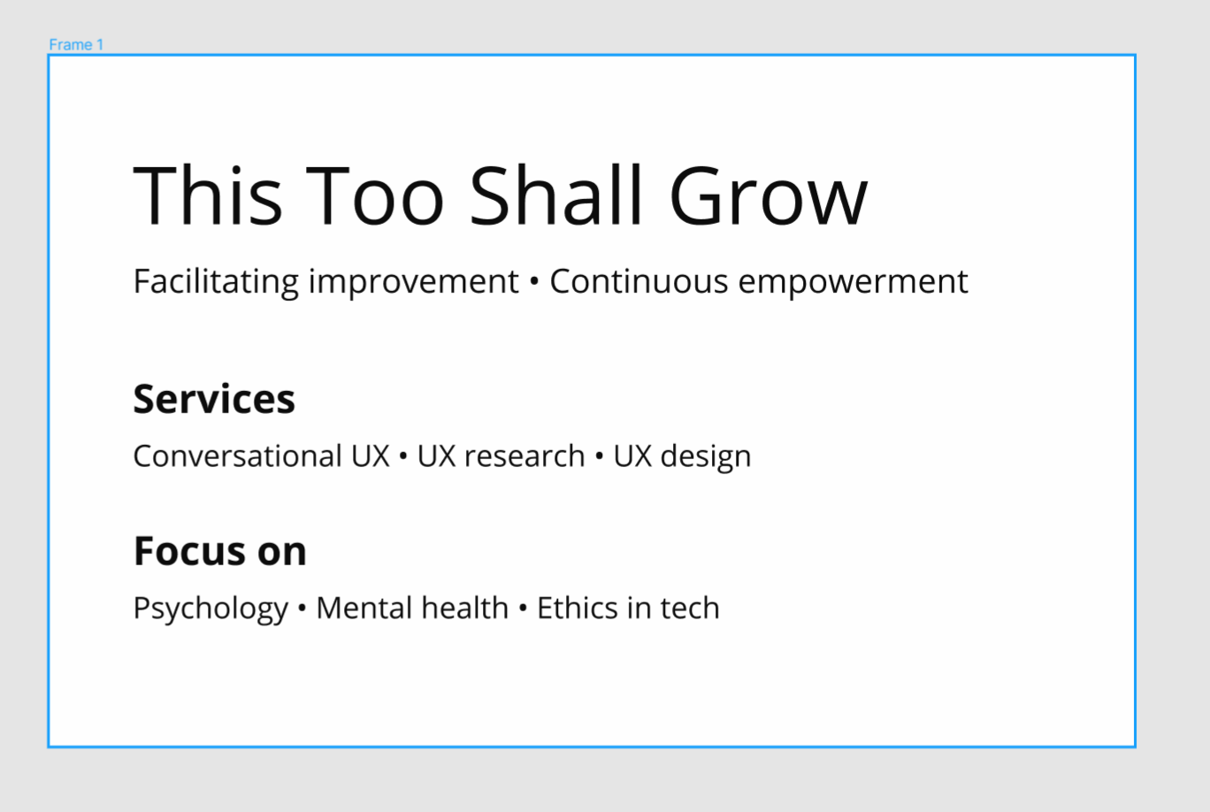
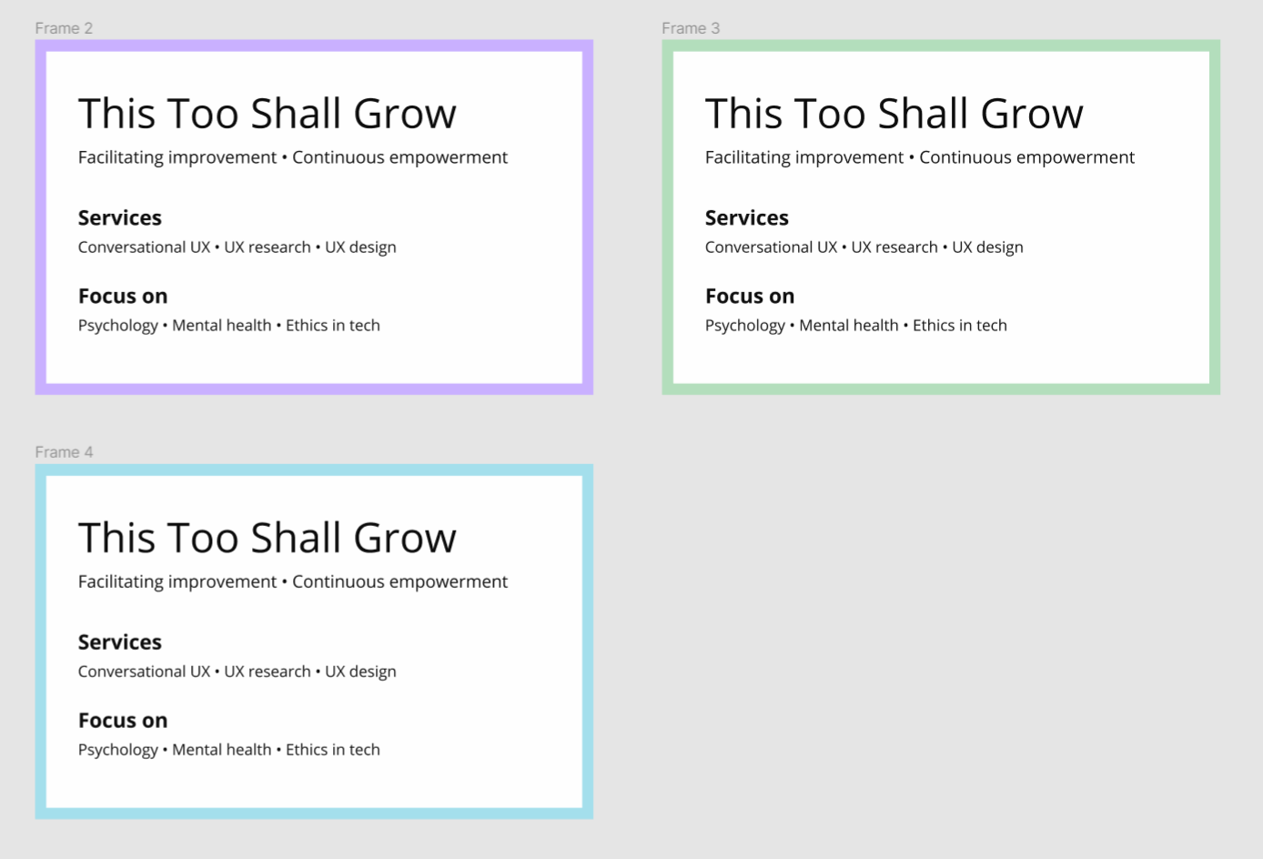
At this stage, we left the colours aside, and moved on to a frame presenting information related to the studio. With this question, I aimed to go over my participants’ understanding of what This Too Shall Grow is and does.
The frame displayed the following:
- A name: This Too Shall Grow
- A tagline: Facilitating improvement • Continuous empowerment
- Services: Conversational UX • UX research • UX design
- Focuses: Psychology • Mental health • Ethics in tech
Here’s what I wanted to find out:
- What do they understand with ‘This Too Shall Grow’? What does the name convey? Once I explained the backstory behind this name, does it make sense?
- What do they understand with the tagline? What does it lack? I was already dissatisfied with it when I asked the question.
- What do they understand of the services? How would they be provided (consulting, mentoring, etc.)?
- What do they understand of the focuses? How do they concretely come into play for This Too Shall Grow?
Once I had all my answers, I could share that this was a one-person UX studio, representing me as a freelancer and my professional activities, because I don’t want to use my real name. The services were clearly understood by everyone, but the focuses part was more blurry. I explained that focuses were notions that I carry with me through my work, things I keep in mind and pay attention to throughout a project. They are also areas that I’d love to work into more. Additionally to that freelancing aspect, I pointed out my intention to write about those 6 topics and the way they intertwine.
Question 5
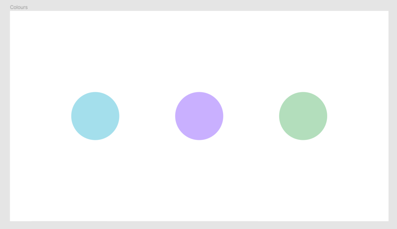
It was now time to mix things up. I took the 3 previously selected colours, and associated them with This Too Shall Grow. At that stage, I asked the respondents if, based on what they knew of the studio and what the colour represented, this association made sense or not. Is it logical to see them together? Do they have similar meaning, symbolism? Or are they contradictory, incompatible?
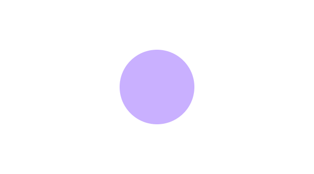
As I said above, I couldn’t use all colours as backgrounds for contrast reasons, so I opted for a border. I deliberately avoided presenting them in website form, because I want the colour to be able to outlive any specific item and layout. It needs on live on the homepage, on articles, on social media profiles, on sharing cards, etc. I didn’t want to create bias towards a specific page, so I went for a more abstract representation.
After trying out their top 3 colours, I asked respondents if they wanted to test any of the other 5. I was afraid to prime them towards the 3 colours they had already chosen, but 5 out of 20 ended up picking a colour that wasn’t among their 3 favourite. On top of that, several people asked me on their own to try some of the other hues, before I even suggested it.
Question 6
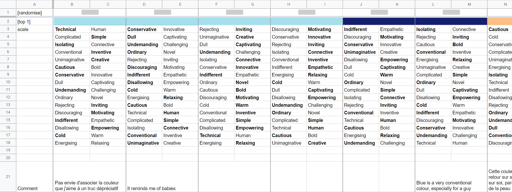
Now that they had made up their mind, I wanted to dig deeper into their perception of the colour. This is where I went overboard. I took the AttrakDiff, which is a quantitative research tool used for analysing the hedonic and pragmatic qualities of a product. I ditched the 7-point scale, removed some items, added some other ones, and ta-da! All participants had their own randomised list, and for each pair below, I asked which of the 2 adjectives matched the most with the colour:
- Conventional vs. Inventive
- Technical vs. Human
- Unimaginative vs. Creative
- Discouraging vs. Motivating
- Undemanding vs. Challenging
- Disallowing vs. Empowering
- Isolating vs. Connective
- Energising vs. Relaxing
- Ordinary vs. Novel
- Conservative vs. Innovative
- Complicated vs. Simple
- Cautious vs. Bold
- Dull vs. Captivating
- Cold vs. Warm
- Rejecting vs. Inviting
- Indifferent vs. Empathetic
Some answers were very surprising. For instance, somebody perceived the pastel orange as human and empathetic, as well as isolating. Someone else told me their favourite pick (lavender) was complicated, indifferent, and rejecting. But they still loved it, both on its own and associated with the studio. However, what I expected the least were some answers to the cold vs. warm question: 7 participants stated that a chromatically cold colour (green, blue, purple) was warm to their eyes. This is the perfect reminder that UX research is about not relying on your assumptions.
As to my grid, I kept the columns for each respondent, and added a cell that I could easily switch to the colour in question, to keep it right in front of me. Below that, I had already prepared the pairs in their randomised order, and just had to bold the selected words.
Before finishing the interview, I asked a few demographics questions, to ensure I had a diverse pool:
- Age
- Gender
- Current country
- Country in which they spent the most of their life
This 4th point aims to account for cultural background, since somebody’s current location doesn’t necessarily represent that. And yes, I’m well aware that a lot of people – including me – carry several cultures.
Now, I need to talk to you about gender. More explicitly, I implore you to leave your assumptions behind and ask people their gender. Even if you think it’s obvious. Even if you already know them. If they’re hesitant, you can remind them that there’s nothing mandatory. Make it very clear that whatever their answer is, they are welcome, they can feel at ease with you, they can be themselves. And I’m obviously not just talking about UX research, but this definitely applies here, where participants accept to come into your space and open up their mind for you.
Conclusion
To finish, I thanked the participants, and asked them if they had any question. I always like doing this, changing the roles and putting them into the questioner’s shoes. Most of the time, the call ended there, but sometimes it led to fascinating discussions in which I found myself connecting deeply with somebody’s thoughts, worries and interests.
What did I learn?
And now, delivering the juicy results. Here’s what I found out about each research question.
1. Is the meaning behind the name This Too Shall Grow understood?
The name is intriguing and original, which is appreciated. The idea of growth and improvement gets through, but apart from that, it’s not clear what it is or does. Several people correctly linked it to the idiomatic expression ‘this too shall pass’ but had a hard time interpreting it with the idea of growth. It is easier to get for English-speaking people, but once I explained the name’s meaning, it made sense and was appreciated by everyone. This correlates with what I’ve been experiencing so far, when I explained signification of ‘This Too Shall Grow’ to clients who didn’t get it at first, but then loved the idea behind it.
2. Is the studio’s activity understood with just a few keywords?
The services were clear to everyone, apart from ‘conversational UX’ which is not a mainstream term yet. People easily understood that I provided them in the form of consulting. However, the focuses were less explicit: it wasn’t obvious whether those were industries in which I worked, tools I relied on, elements I took into account in my work, or all of the above.
3. and 4. Among the selected hypotheses, what is the best option to use as the primary colour for This Too Shall Grow? How are these colours perceived? Meaning, symbolism, emotions, etc.
The last 2 contenders were the pastel green and the lavender, the latter being a bit more in the lead. However, when I looked at the ideas associated with them, the lavender made more sense. On top of that, connecting green to the idea of growth felt a bit too cliché and obvious. The purple has more character, it feels more original and more memorable.
Thank you all for reading, I hope you enjoyed it! Any question, remark, observation or love letter, I’d love to chat with you on Twitter.
Again, I’m extremely grateful for each and every participant who granted me a bit of their time and insight. You helped me a lot, and I’d love to return the favour.
Finally, thanks to lp1, Marie and Tamara who helped me review this article before hitting ‘publish’.
This article was originally posted here.