This month, Adobe XD announced a raft of new features for us to get our heads around: Coediting, Component States, Document History, and more. Whilst these additions have been highly anticipated, could this increasing number of features lead to a bloated product? As outlined by Dre Zhou, cofounder at Askable.com, it’s common for products that grow in features to become more complex to use:
“It’s easy to add features to a design or product. It’s really really hard to do that without also making the product more complex.”
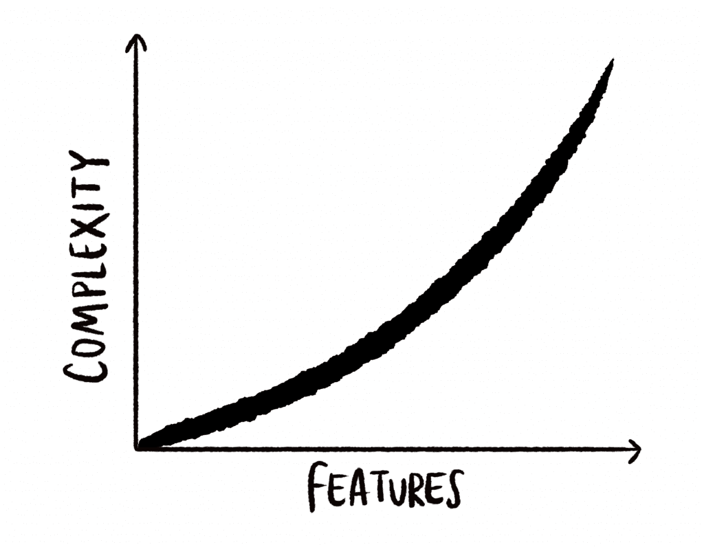
This growth in capabilities is also known as ‘feature creep‘. VP at Nielson Norman Group, Hoa Loranger, highlights this when writing that higher numbers of features can increase the effort to use a product, causing dissatisfaction. Here’s a fun extreme of this:
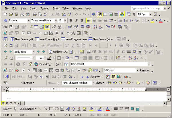
“As the number of choices increases, so does the effort required to collect information and make good decisions. Featuritis can be an exhausting disease for users.”
Hoa Loranger, NNGroup
For design tools, where speed and ease of use are key features, any extra complexity introduced would be a huge setback for the experience of the product. Therefore, in this product analysis, we’ll see how the XD team tackles this issue when introducing features. Contrary to the regular trend outlined above, we’ll see how new additions lead to a reduction in complexity for the user. Then to conclude, we’ll consider where all this complexity may have ended up 🤔, as it can’t have just disappeared.

XD: More Features = Less Complexity 🧐
The nature of being a design tool means that a lot of complexity can form as a user’s design document gets larger. Adding more Artboards, shapes and layers can quickly become very messy. For that reason, any new features can simplify the use of the product by making those unwieldy design documents easier to manage. And that’s exactly what many features in XD aim to do:
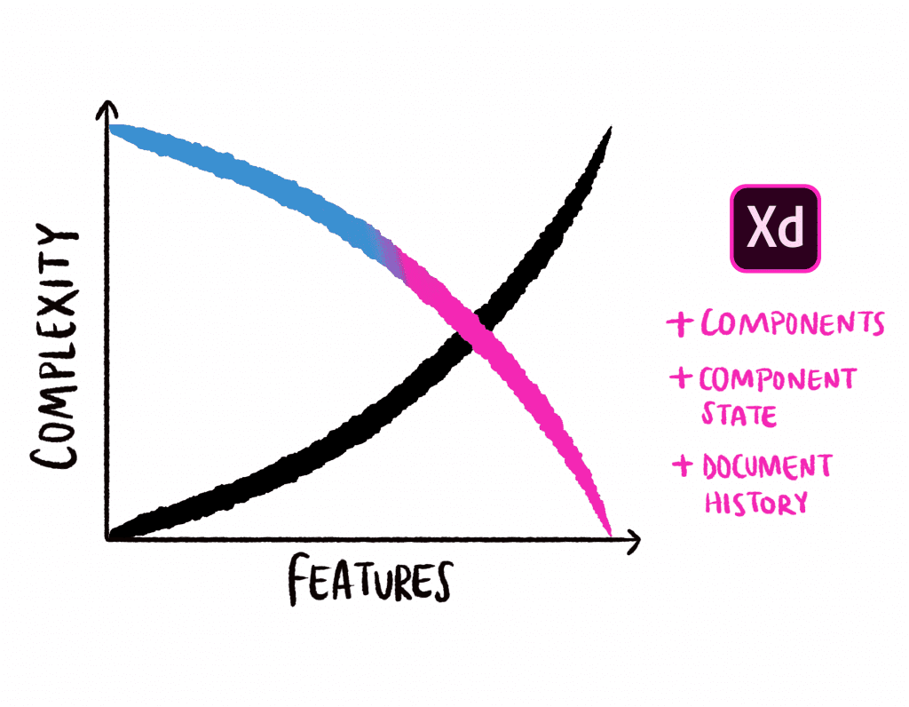
In contrast with many other Creative Cloud products such as Photoshop, XD started out with a minimal feature set, tailored specifically for UI design. The XD team has taken a light-weight approach to building the product from the beginning to ensure it does that one thing really well, and to make it easy for beginners to pick up, yet powerful for experienced users:
“Every new feature we add to XD is considered from an end to end workflow perspective. Whether you’re a beginner or a pro, new features should progressively add to your skill set in a way that’s intuitive and powerful.” –
Talin Wadsworth, Principal Designer Adobe XD
As the product has matured to where it is today, we’ve seen the number of features grow impressively. 3 of the most notable additions this release are:
- ✨Coediting (beta)
- ⚛️Component States
- 🕰Document History
Let’s see how each of these help make the product simpler and more fun to use, starting with Component States.

1. Component States
Before ‘Component States’, ‘Components’ in XD were first introduced as a more scalable approach to reusing parts of a design. They help you quickly create and maintain repeating elements, whilst making it possible to vary each instance. Components and Component States dramatically decrease the complexity of a design document, even as more elements and artboards are added:
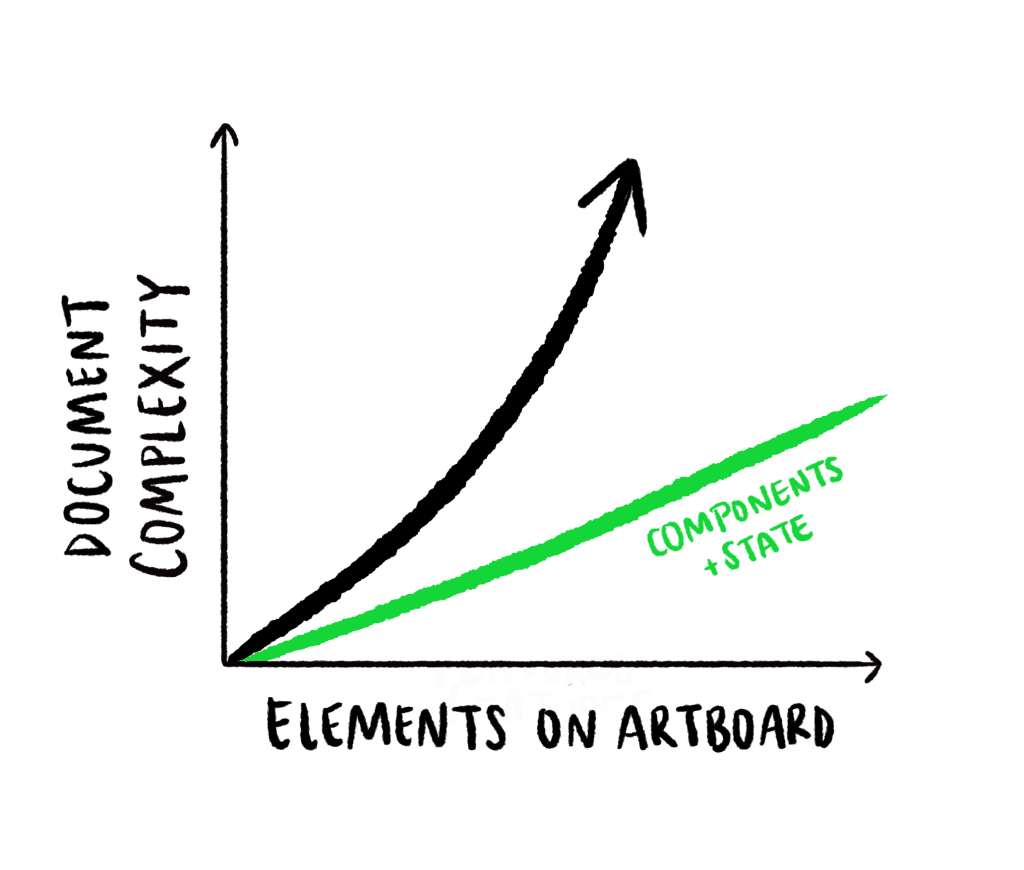
This user found that a prototype made up of 86 artboards in one design tool could be created with just 1 artboard using Component States in Adobe XD:
- Components saved a great deal of time and confusion when managing a project by grouping repeating elements, and enabling us to make mass changes to elements sharing similar traits, just by editing the Master Component (learn more about Components here):
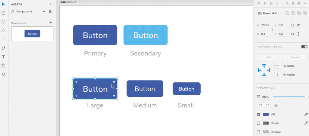
- Component States took this a step further. Each button instance above could still have a wide variety of ‘states’ (e.g. hovered, pressed, disabled). Creating those states individually for each instance would have left us with a growing design document that might look like this:
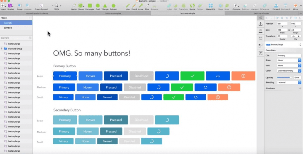
That’s a lot of buttons to manage! The Component States feature adds a new option, whereby you can add custom states for each component. Each of the States get inherited by the component instances too, helping reduce the complexity of a project massively, so it’s even easier to manage.
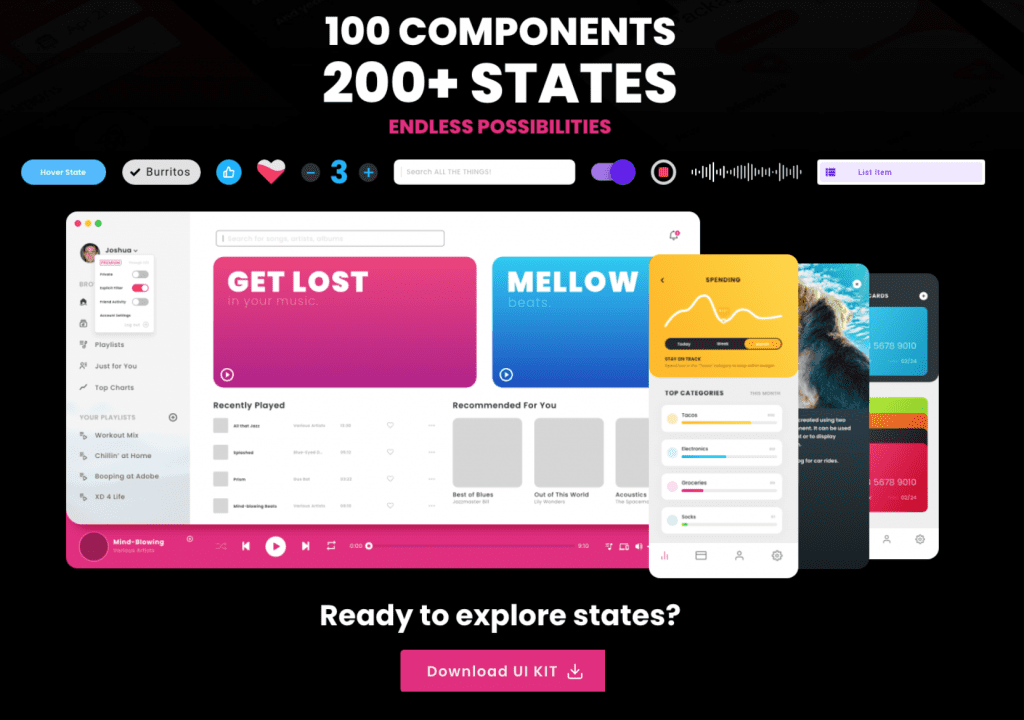
One more new addition that goes hand-in-hand with Component States is the new Hover Trigger. This lets you simulate actions when a user hovers an object – a good chance to switch button states! To get started right now with Component States, grab this resource of 200+ States from Howard Pinsky, Senior XD Evangelist:

2. ✨ Coediting and Easier Collaboration
“Real-time is moving from being an attractive feature to one that must be included”
Lauren Plews, Smashing Magazine
Coediting (beta), or the ability for multiple users to collaborate on the same design in real time, has been one of the most requested features of XD’s UserVoice programme with 650 votes.

The rise in live collaboration tools since Google Docs has seen coediting move from being a useful feature to something that’s almost expected of any product used in a team. For a design tool, it gives us another way to be in the “same room” and collaborate synchronously, which is especially important with the rise of remote teams.
At the moment, it’s important to note that Coediting in XD is an ‘opt-in’ feature, as it’s still in Beta. This gives you a chance to try it out and send feedback to the XD team before the official production release. In all, this addition should lead to less friction between designers, and therefore a simpler and faster process to collaboration – no more passing files around on Slack or by email. Just invite your teammates to your design:
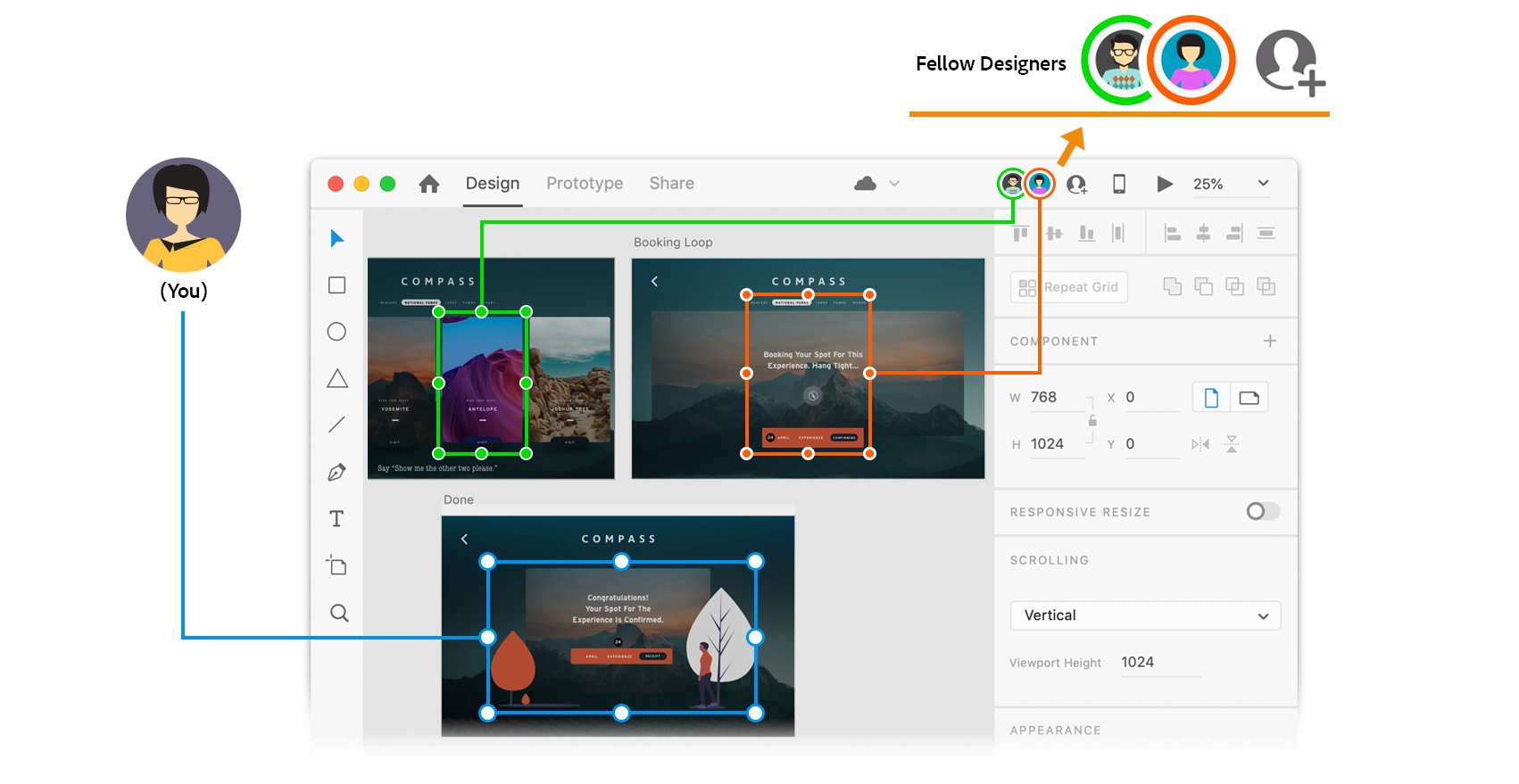
The importance for XD to facilitate collaboration across disciplines has been evident with previous features such as Design Systems, Specs, and Style Guides. These facilitate hand-off between design, developers, and other stakeholders. Coediting now makes it easier for designers themselves to work with each other, whilst maintaining a single source of truth in the one file.
Another feature for teams is the new Share mode that lets you share documents for review and development, streamlining review cycles and collaboration.

3. 🕰 Document History: Version Control for Designers!
Building upon the need for a single source of truth, we all may be guilty of this this familiar problem:
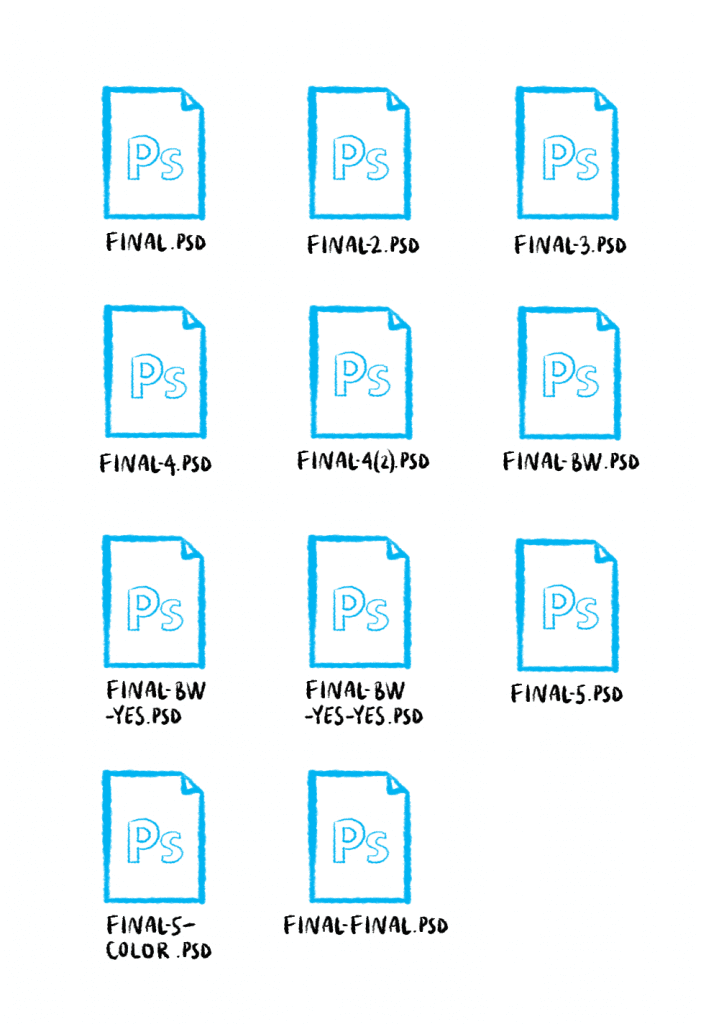
Document History in XD lets you see a history of edits made to your documents, and who made them. Finally, version control for designers is here, within your design tool! You can track changes, jump back and restore a historic snapshot of your design, whilst at the same time maintaining a clear master version to keep everyone on the same page.

More features, same learning curve and faster prototyping
For new users, terminology like “Components” and “States” can sound like yet another new thing to learn, but XD is still easy as ever to jump in and use, like the first ever version. For that reason, the learning curve for XD doesn’t really increase much despite the many new capabilities.
As design documents start to unwieldy grow, users are lead to discover and make use of the new time-saving features that can untangle the complexity.
“Complexity is about entwining many parts together, making it harder to understand them as a whole because of their increased amount”
Julien Zmiro, Intercom
Where does the complexity go?
Overall, a lot of complexity is being tamed by XD’s new features, to make prototyping a lot faster, and less painful:
- Component States create a simpler mental model for users when dealing with large numbers of elements, making documents easier to manage and understand.
- Document History takes care of managing versions for users, reducing yet another burden.
You could look at XD as Ralph Ammer depicts designers in his story, “Make me think!”. He explains how designers and engineers have been taming complexity for us, making “extremely sophisticated technology appear simple and easy to use.”:
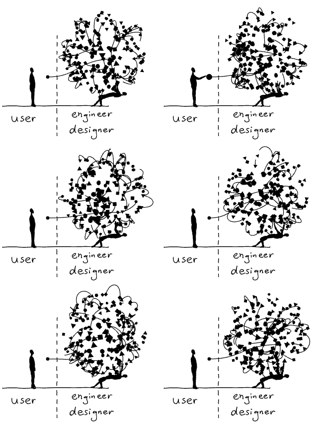
From this perspective, let’s hope things aren’t getting too complex for those on the other side – the team building the product so that XD can continue to scale so well for users.
“Look one step ahead when making design decisions; think about the user first, but don’t forget the impact of complexity on the team, or you might doom the product to slowly growing paralysis.”
Julien Zmiro in The Hidden Cost of Design Complexity
*Sponsor Note: As a team of just 2 people working on a self funded project, Prototypr needs support to keep things running. This article was sponsored by the folks at XD, and it’s entirely our own opinion. We cover tools we really like for free, so contributions such as this help us stay sustainable.


