Hamburger Footer: Reaching the Bottom of Infinite Scroll
Are UI Tips the New Clickbait for Designers?✨
UI Tips are everywhere – Do’s and Don’ts of UI Design. Are they clickbait, or are they misleading beginners?
Using CC libraries with Adobe XD
This first part of the series I’m going to focus on building out a design system as my new journey as an Adobe XD Ambassador.
A New, Revolutionary UI is just Around the Corner — Here are the Signs
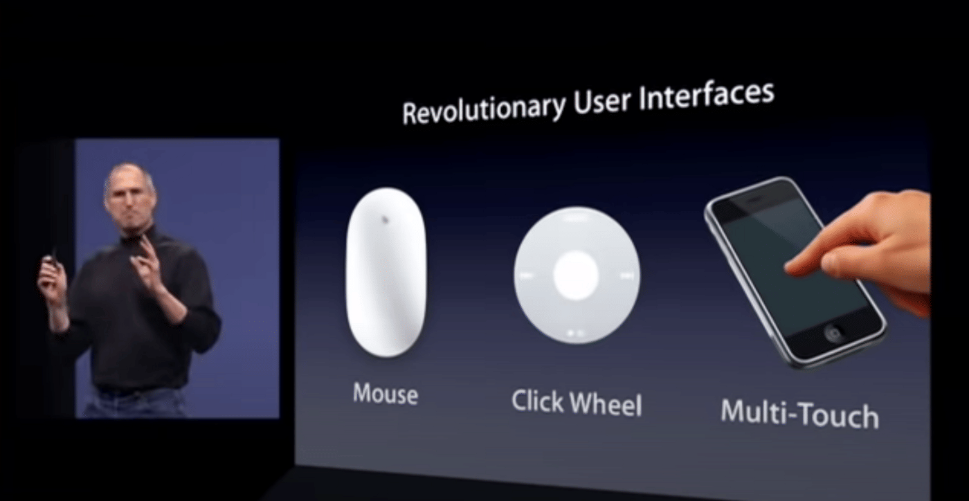
We all remember when the 2nd one happened. Back in 2007, Steve Jobs famously started his keynote presentation with this historic line… “This is a day I’ve been looking forward to for two and a half years.” What was he so excited about? An R&D project that was kept under such tight secrecy from the public, only to be revealed until it was ready — Multi-Touch was Apple’s second revolutionary UI in the 21st century as it introduced itself to the world through iPhone. Moments after the reveal, Jobs reminded us of Apple’s track record of leadership in creating new, disruptive technologies that were often complemented with a groundbreaking UI.

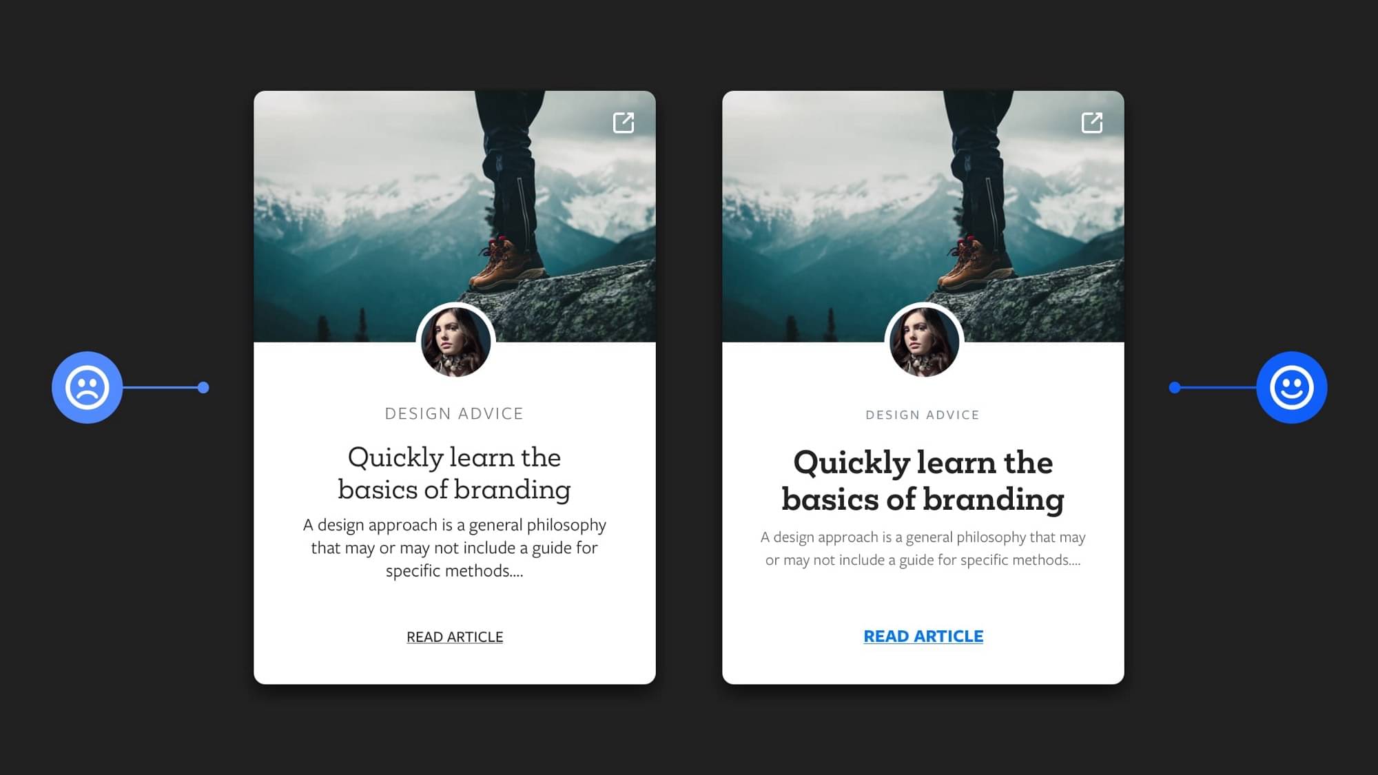
UI & UX Micro-Tips: Volume Two
When creating efficient, accessible, and beautiful UIs for your projects sometimes it takes only the smallest of adjustments to help quickly improve the designs you’re trying to create. In this follow-up article I’ve put together another selection of easy to put into practice micro-tips that can, with little effort, help improve both your designs, and the user experience.
How to Use Interactive Components in Figma
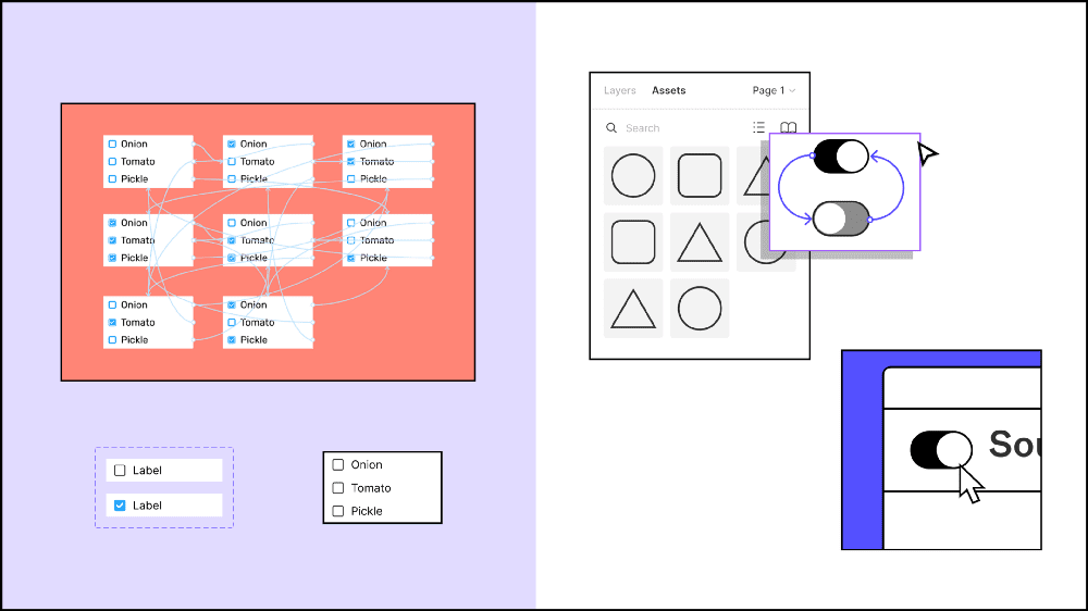
Interactive components have just launched in Figma (in beta)! This feature has been highly anticipated since being announced last year at the official Figma conference, Config Europe 2020. Interactive components allow you to quickly and easily create reusable prototpye interactions, without having to link up tons of frames. Whenever you hadd an instance of an interactive component to your design, the interaction is set up and ready to go.
Practical Tips for Pricing Design
Pricing is a challenging thing, especially for the designers who start their professional journey. However, pricing is essential not only for your work. It often determines the quality of your life. In the article, I will show your factors that affect pricing. We will review various pricing methods and make some practical tips. I will give you also my personal recommendations and show you other designers that know how to price their work!

