We all remember the 2nd one. The 5th one is on its way.
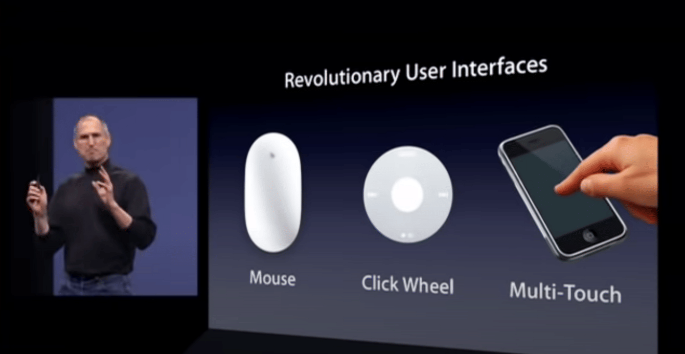
We all remember when the 2nd one happened. Back in 2007, Steve Jobs famously started his keynote presentation with this historic line…
“This is a day I’ve been looking forward to for two and a half years.” — Steve Jobs
What was he so excited about? An R&D project that was kept under such tight secrecy from the public, only to be revealed until it was ready — Multi-Touch was Apple’s second revolutionary UI in the 21st century as it introduced itself to the world through iPhone. Moments after the reveal, Jobs reminded us of Apple’s track record of leadership in creating new, disruptive technologies that were often complemented with a groundbreaking UI.
“We’ve been lucky to bring a few revolutionary user interfaces to the market, in our time…[Mouse (Computer), Click-Wheel (iPod), Multi-Touch (iPhone)]. Each of these UI’s has made possible a revolutionary product…”
— Steve Jobs
… and the rest is history.
Fast forward to 2021 and we’re already seeing the signs of the 5th.
While the first (Click-Wheel) and the second (Multi-Touch) completely disrupted industries, the third (VR) and fourth (AR) only served niche markets.
For those of us keeping up with disruptive, innovative companies, it’s difficult not to notice the signs that point to the next radical new interface and experience model on its way because of their efforts.
The signs — what are they?
So, what are the signs that point to a new form factor on its way for designers to devour and sink their teeth into? What are the events in recent history that suggest the tech sector will have a moment likened to the all-screen, iPhone reveal? What are the signs that tell us this new UI will not flop or only serve a very niche purpose like VR?
Here they are.
Sign #1: Mercedes-Benz showing the world what’s technically possible with the VISION AVTR concept car in 2020
If there was a year that’s largely recognized as the “year of the future” — it’s 2020. So what better year for a company to demonstrate that it’s always thinking ahead, than to display cutting-edge experiences never seen before than 2020? Well, Mercedes-Benz did just that by unveiling its new concept car that envisions what the future driving experience could be like.
Skip to 0:58
While you may have already caught a glimpse of this beauty from this past year, what you’ll notice in the interior space is what I want to draw your attention towards. Have a look at this sinful masterpiece.

This wheel-less, display-only, analog-free form factor (if we want to still call it that) which completely drapes over the front dashboard like a layer of skin, is central to the notion of adapting to new contexts. Sound familiar? Why yes — this is the same idea as the all-screen iPhone display that was a complete departure from its competitors in the space had going.
Whether it’s viewing the speed limit, the odometer, or switching contexts to watching Netflix, then switching back to playing Call of Duty, the UI can serve just about any purpose regardless of what the driver so chooses to do with the centre console.
The Naysayers say…
“But Jon, this is still just another concept car… this isn’t going to appear in real life. How do we know Mercedes, or any other car manufacturer for that matter is even serious about building this for the mass market? What about driving regulation? Is this even street legal?
Oh my god, Jon… Oh my god!”
*flips table*
Admittedly, Mercedes does not plan to put this into production. They have even gone on to say that they plan on building one that directly rival Tesla’s Model S with the Vision EQS (has a steering wheel).
This won’t go beyond a concept.
So why is this concept car important then?
What this event shows us however, is that it’s possible. We live in a world where the vision for a UI of that caliber and that kind of experience is in the realm of possibility. The technology is there to make this happen.
The question now is…
What are the use cases out there today that would necessitate this kind of context-switching, all-screen, dynamic UI experience for a driver just going from point A to B?
Great segue into the next sign…
Sign #2: Elon Musk’s vision of an autonomous future through Full-Self Driving (FSD)

Musk is one that popularizes and brings to reality many ideas that are regarded as too grand or audacious. But here we are — FSD is carving its path into the mainstream.
What is this vision exactly? This future vision is centred around the idea of autonomy. It’s the idea that society will eventually transition to a modality of transportation where the driver does not need to be fully engaged to move from point A to B — the car moves on its own. This is made possible through Tesla’s Full Self-Driving (FSD) capabilities deployed today to all of its vehicle owners through over-air software updates.
Why is FSD important? How might a driver benefit from it?
Imagine for a moment the entire duration of your dreaded, total commute (let’s say 2 hours a day), where you’re sitting, road-raging, honking, and flooring it on your way to work — you now don’t have to think about any of that. You would just be sitting in the interior cabin of your vehicle. What would you do? What could you do?
- Watch full episodes of the Queen’s Gambit on a paid monthly subscription
- Play Fortnite with your friends
- Listen in on video conferencing calls with remote workers from India
- Complete a presentation deck of the user testing results to stakeholders
… All on your way to work in the “driver’s” seat.
Given all of the said unique use cases, the interest in a superior UI will also be born out of necessity. Even today, it’s no secret that Tesla’s UI for their infotainment systems can be improved upon. Ben Sullins (an avid Tesla fan and investor) remarked on Twitter a couple of months back. Shortly after, Musk himself replied:

Oh my god, Jon…. Oh my god!”
*flips table*
Naysayer, that is actually a legitimate nay… If the third sign didn’t happen. But it did. Here it is.
Sign #3: Apple announces Hyundai as a manufacturing partner to create an autonomous vehicle by 2024.

Yes, this just happened. But let me rewind a bit.
Back in 2014, the codename for Apple’s own mass-market vehicle was titled Project Titan. Like any R&D project, it is largely damned to sworn secrecy until an official announcement. While many rumours have repeatedly surfaced around a launch date for the new Apple car, many have been debunked. Fast forward to 2021 and the news comes of a partnership between both Apple and Hyundai to not produce a Hyundai car running Apple software, not create another EV, but an autonomous vehicle with FSD capabilities slated for production in 2024 — leveraging all of Apple’s design and technology prowess.
A revolutionary UI purposed to bring delight to the autonomous driving experience and disrupt the entire automotive industry.
Every foray into a new market, Apple’s entrance has almost (I’m looking at you Watch) always been coupled with a revolutionary UI. With a project that’s been in the works for 10 years, I’m certain Apple’s own FSD vehicle will disrupt the automotive space with a superior, revolutionary interface that will completely upend experience models of their contemporaries (including Tesla?). If we’re reminded of Apple’s track record of disruptive innovation and the noise surrounding FSD, the signs point to it happening yet again.
What will this new UI be like?
That’s obviously really difficult to say. Will it be a wildly different form factor? Will it like the one we’ve seen Mercedes-Benz put out? We don’t know. What we can infer, is how much Apple is in it to win it. There is no in-between. There is no middle of the pack. If we know anything about Apple, is that even a 10-year project in the running that has a probability of failure will more likely be scrapped altogether than to advance into partnerships such as the one we’re seeing now happen with Hyundai — in short, they’re confident.
What we also know, is that it will be a UI that accounts for the user’s full and complete experience when they aren’t driving in FSD. Even under Cook’s leadership, any morsel of his predecessor’s ambition to bring to the market a product that represents the state of the art, stands a good chance to be successful. I’m going to wager that Cook will say something to the affect of…
“This is a day I’ve been looking forward to for 10 years.”
Mark my words.
Originally published on Medium.


