From Instagram’s controversial logo change in 2016 to Facebook’s numerous feed iterations over the years, if one thing is clear as day it’s that we don’t like change…at least not at first.

As with most things, changes to apps and platforms we use on the daily can take a little getting used to. Although that doesn’t stop us from having a visceral reaction to every single one (followed by a passionate rant in 280 characters or less).
But in reality, most of these changes prove that they’re worth their salt in the long run - except you, Snapchat, nobody likes you. Although that might just be my age showing, as the company’s recent growth - especially after the banning of TikTok in places like India - has seen Snapchat’s daily active users grew by 20% in Q4 against the same period in 2020. Facebook’s Q4 results weren’t quite as promising in comparison...
Nobody likes change. Everybody likes improvement.
Let’s take a look at a few of the platform overhauls in recent years from some of the biggest players in the arena, and how they were received by users:
Hot or Not?

Letter
📷 Instasavvy Move
Rejoice fellow Reel lovers and Story-ers! At the time of writing, Instagram has freshly unveiled their new typeface, ‘Instagram Sans’ - a contemporary remix of grotesque and geometric styles that incorporates the platform’s favourite ‘squircle’ (square & circle) shape, that we also see in the Instagram logo. Designed to be an accessible font, Instagram Sans is usable globally, adapting beautifully to a number of different scripts.
Slipping in under the radar was also a little logo refresh, but unlike the controversial rebrand of 2016, changes are minimal, only slightly tweaking the gradient to make it brighter.
This follows the announcement of full-screen marketing layouts (great as if I needed more convincing to buy slipper dusters and rotatable colanders) and home feeds, which may remind you of a certain rival platform…⏰
It’s still early days, but the response from users has been generally positive, although some have contested the use of Instagram Sans in the logo mark itself due to its awkward I shape.
“Instagram’s new brand typeface ‘instagram sans’ is full of fun squircle-inspired curvaceous glyphs, captivating letterforms, and interesting ligatures. i don’t like it so much in the logomark (‘Jnstagram’) and a bespoke font seems like an odd thing to prioritize, but it’s neat." - @jeeveswilliams

🖱️ Figma: Come to the Dark (Mode) Side
Design tool Figma added Auto Layout back in 2019. Before that, it was a free-for-all as we laid out elements willy-nilly on a free canvas with no intelligent restrictions. Now, by the power of Auto Layout, resizing buttons with their text is a breeze, lists can rearrange themselves when items are moved around, and elements can be nested to create complex interfaces which respond to their content.
Okay, obviously we loved this one right off the bat. The response to this feature was overwhelmingly positive, even in the Twittersphere.
Until…
This month, Figma updated its popular Auto Layout, which - surprise surprise! - was initially met with a bit of trepidation.
💀 💀 💀 Cheers to everyone who has to learn how to use Auto-Layout in Figma again…- @jamesm
I still cannot get used to redesigned auto layout in #figma and find the old one more convenient to use simply because of natural mapping." - @IrinaLediaeva
But of course once people had a little tinker with it, all was well once again in the world of Figma.
The new update was announced in Figma Config 2022, introducing some much-anticipated features including dark mode, new auto layout panel, canvas editing, new smart animations, and variable fonts.
My design speed doubled since the new Figma update. Thank God for auto layout 🙏 ... Thank you @figma ❤️- @theUI_guy

🏚️ Airbnbusted
Also this month, Airbnb rolled out their biggest changes in a decade, including Airbnb Categories, Split Stays, and AirCover for guests. And whilst these are arguably useful changes, some people are not so convinced…
How about just good customer service and refunds for people that end up in literal hellholes. - @mrdanielschwarz
When are you going to address the fact that AirBnB are partially responsbile for rental prices/inventory spiralling out of control in major cities? - @bchesky
Why is my single home no longer searchable. Not even coming up on the map in a general search! What did yall do! I am livid… - @ABreezy703
...They changed icons, added categories and renamed their “protection” policy - that took a decade?... - @Mladen09016000
It seems the rental giant’s announcement didn’t quite have the desired effect, opening one Pandora’s box as people took the opportunity to air their grievances about the platform’s unaddressed inefficiencies.

📺 Netflix’s Season Comes to an End
Last week we learnt the unusual news that Netflix fired over 200 employees, 150 of whom were working on building and promoting projects focusing on marginalised communities. Escándalo!
What a great day for Netflix to announce they’re giving Ron Howard, a millionaire with no experience in animation, full control of an animated movie, while simultaneously snuffing out projects specifically focusing on marginalized groups. Funny timing, huh? – Matt Acuna, Animator for Bob's Burgers
Netflix have been steadily losing long-term subscribers due to its shoddy selection of shows, and decidedly uncompetitive monthly fees of up to $20, seeing them lapped by Apple’s reasonable $4.99. Tough break for the 1 person in the family who pays the Netflix fees.
Who'd have thought a policy of 'Unceremoniously cancel every show after season 1 or 2 to avoid having to pay out bigger contracts' wouldn't be a viable, longterm strategy?” - @AleshaGrauso
Instead of hitting the chalkboard and coming up with some fresh new ideas to recoup funds, Netflix chose Option B: unceremoniously fire people instead. This is one platform that could have really benefited from some change.

🐦 Twitter’s New Daddy
Hooo boy, this one’s a doozy. Back in April, business magnate and possible lizard person Elon Musk bought Twitter for around $44 billion. “Twitter has tremendous potential — I look forward to working with the company and the community of users to unlock it," Musk rather ominously said at the time. I think you know what sort of reaction this news garnered:
Does it make me a bad person if I want to see Elon Musk lose all his money and go broke in his attempt to buy Twitter?- @ErieNotEerie
Ripples were felt through the celebs quarter, too, as some (such as actress Jameela Jamil) tweeted their goodbyes in an attempt to boycott the platform following Musk’s acquisition. He professes that he wants to make the “least bad public square [Twitter] a lot better" by “getting rid of the bots, scams and spammers", and build more trust with users by open sourcing the algorithm so users can see how it works, and suggest improvements and changes. Fair. As for what he really has in store for the communications platform, we’ll just have to suck it and see.
Edit: Musk is now potentially backing out of this deal, which now has less than a 50% chance of going through, and Twitter’s stock has tumbled by 8%. Gulp…

🗣️ That’s So Meta
From one lizard man to the other, Mark Zuckerberg has been under more fire than usual following the big ‘Meta’ reveal at the tail end of last year. This rebranding for Facebook apps and technologies is all part of his master plan to rule the world create the ‘metaverse’; a virtual world based on AI and VR technology in which users will spend an increasing portion of their lives. The company announced plans to spend $10 billion on making this dream a (virtual) reality over the following year.
Although there’s some concern that we may slowly lose grip on actual reality and risk becoming some living parody of the inept humans in WALL-E, there are some undeniably cool features being proposed for this alternate reality. Work conferences without having to brush my hair? I’m there!
Previous changes to now-Meta platforms include the great Insta icons divide of 2020, and Likesgate of 2021:
- Facebook Just Changed Instagram and People Are Mad
- Facebook’s empty promise of hiding “Likes"

🖼️ WTF is up with NFTs?
In January, Twitter rolled out NFT profile pictures for iOS users, easy to spot thanks to their ‘soft hexagon’ shape. Essentially, this allows users to connect their crypto wallet and upload their desired NFT for their profile picture.

Reactions were mixed, with Twitter’s (potential) new owner weighing in on the debate and poking fun at the NFT community by changing his profile picture to a collage of Bored Ape images. Others were more welcoming, and at the time of writing there is a steady community of people utilising this function on Twitter.
And then this month, we learned that Meta will begin testing NFTs on Instagram, as well as future plans to roll them out on Facebook, and to allow users to display and share them as AR stickers on Stories. This new ‘Digital Collectibles’ feature will give people the ability to connect a digital wallet, share collectibles, and allow automatic tagging of both the creator and collector.
Anyone else suddenly miss the days of sharing shitty photos of our food with the 1977 filter over the top?

🍎 Designs Under the Knife
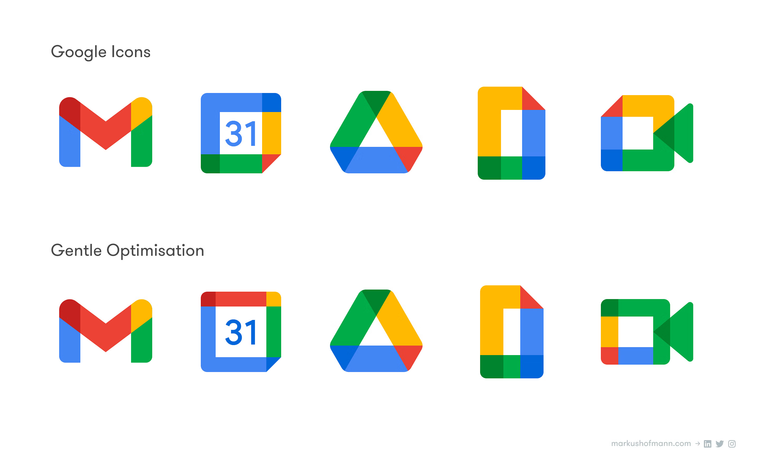
From big rebrand facelifts, to little nip ‘n’ tucks, we’ve seen them (hated them) and welcomed them all. Remember Google’s attempt at visually unifying the apps in their suite back in 2020? What a fun idea to make them all look so bloody similar!

This year, Google announced their first update to the Chrome logo in 8 years, doing away with its familiar shaded overlapping design in favour of a more 2D icon. And…you guessed it, opinion was divided once again as the design fell ‘flat’ (ba-dum-tsh!) with some.

More please
Boots not quite filled? Here’s some more reading to sink your teeth into:
- How did Tropicana lose $30 million in a packaging redesign? - Catalina Almeida for Prototypr
- Nobody likes change - Diego Marcos Treviño
- Why People Despise Company Rebrands According To Designers - Adam Gowen
- 14 Companies That Reversed Their Horrible Attempts At Rebranding - Mallory Russell for Business Insider


 Buy me a coffee
