We can define easing curves for the transitions and animations on our websites to give them a more natural and subtle feel. But it’s not just animations that benefit from easing curves. Any time there is a transition between two states an easing curve will make that feel more natural and less harsh.
For animations and transitions these easing curves are built into CSS. But there are other parts of our UI that also benefit from using easing curves: gradients and box shadows. Luckily there are ways to approximate these for both.
Built-in easing: transitions and animations
First a little explanation why we have easing curves for animation in the first place. When we add animations and transitions to a site, we usually do that to get a more natural feel and for that you’ll want to use an easing curve that isn’t linear. A linear transition starts at full speed, moves at full speed and ends abruptly, which is just not something that happens in real life. If you drop something it doesn’t fall full speed immediately, and if you press the gas pedal on a car it accelerates before reaching the speed you want to drive at. Both of these are called “acceleration curves” and in CSS we call that easing.
Using an easing curve for your transitions and animations will make them feel more “real” in a sense. To get a better feel of what that means you can play around with different curves on Cubic-bezier.com and compare them to the linear transition.
Neither gradients nor box shadows let us define an easing curve for them in CSS currently but there are ways to get a similar effect for both.

Letter
Gradients
Just like how a linear transition can appear harsh, so can a linear gradient. Especially at the edges it will often feel like the gradient ends abruptly. Unfortunately, linear gradients is all we can do in “normal” CSS. We can only linearly transition between two (or more) colors and that means that gradient can end abruptly or feel uneven.
To combat this, the concept of easing gradients was introduced by Andreas Larsen. Using the same type of curves to transition not between two states of animation, but to transition between two colors. The difference is quite noticeable:
See the Pen povaOod by Kilian Valkhof (@Kilian) on CodePen.
The way this works is that rather than a true easing curve it approximates the curve by calculating what the color would be on a set number of steps. The multiple steps then give the effect of an easing curve. Read the blog post linked above for a more detailed explanation.
All the gradients on the Polypane website use easing gradients through the PostCSS Easing Gradients plugin and it gives them a more natural transition between colors.
It’s currently also a CSS-WG proposal but it’s not entirely clear that it’ll end up getting implemented directly in browser.
Box shadows
Looking at it abstractly, box shadows are a type of gradient. And the way box shadows are implemented on the web is similar to gradients. They don’t use a linear transition like gradients but a Gaussian blur, which I guess looks slightly better, but still not great. Real shadows on the other hand tend to be much more nuanced. They’re much darker near the object and then fade away on a curve.
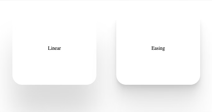
Though you can’t define an easing curve for box shadows, you can give an object multiple shadows and use that to create the steps in your curve. And the difference between these is pretty big:
See the Pen YzPeOXz by Kilian Valkhof (@Kilian) on CodePen.
This technique is called “smooth shadows” or “layered shadows”, and they’re just another form of easing. For more information on this technique, check out the blog post Smoother & sharper shadows with layered box-shadows, and then head over to this online box-shadow playground to create your own.
There isn’t a PostCSS plugin for this yet, so I’m using this on the Polypane site by manually creating the box-shadows. If you want to build a plugin that would be much appreciated!
I think both of these would be good targets for a CSS Houdini script as well but I haven’t come across one yet.
Create better looking websites
By using easing curves for your box shadows and gradients they will look more natural and subtle without actually influencing the gradient or shadow themselves. A gradient will still go from color one to color two and a box shadow will still spread for the same amount of pixels. But in between the beginning and end the transition will be much better.
This won’t work for all instances, just like there are legitimate uses for linear animations. But it’s a great tool to have in your toolbox.


