Everyone has had the thought at some point in their lives: “How do I start a blog?” Simple enough question, but the answer seems so technical, even though it’s not.
In a really fast overview, the steps are as follows:
- Pick a blogging platform such as WordPress, Wix, SquareSpace, or Blogger.
- Find a custom domain name or subdomain name you enjoy which reflects your topic of choice.
- Start writing!
The real trick to creating a blog with a great user experience is the design aspect. How does one design a “good blog”? To answer that, we first need to decide what a “good blog” is.
What is a “Good Blog”?
This article will assume that you are looking to start a blog that will get your thoughts or goals out into the world. It has the goal of building a following; likely to make some money through selling something or paid advertising.
The first step is making sure your blog can be found by its target audience. This involves name, branding, and their approach to the desired topic.
Once found, a valuable blog will retain readers for more than a few seconds or one page view. It will build even more interest in the topic at hand for the reader, guiding them from idea to idea.
This isn’t a matter of having just the right links and the perfect header or featured image — it’s deeper than that.
Whitespace guides almost everything on the page, including readers’ eyes. Color theory plays a large role in understanding a blog’s layout. An eye capturing call to action (CTA) at the bottom seals the deal and works to keep visitors on site or converting into whatever your blog aims for them to become (subscriber, customer, sharer or loyal reader).
Online, attention spans are generally dropping each year over. Design is the ticket to breaking their habit of skimming information and heading back to Facebook or Twitter.
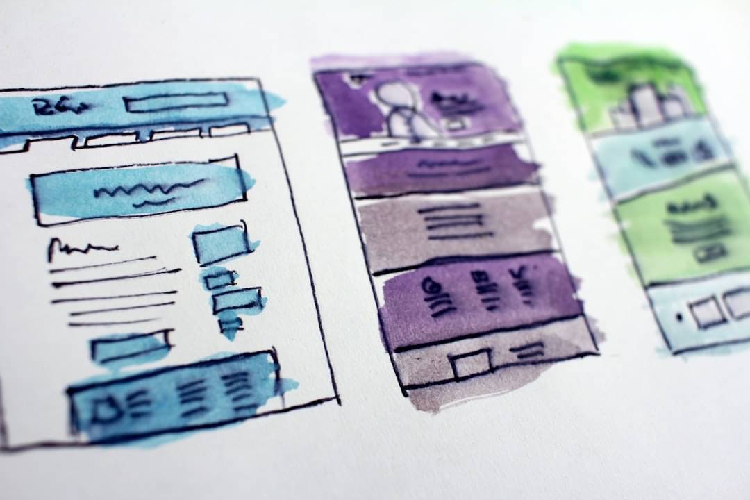
What Makes a Good Blog Design?
Unless you’re writing a blog with addictive content (think tabloids, gossip publications and other sources of sensationalism), you will have to rely on designing your blog around the trends that human behavior follows.
Whitespace
I won’t get into why whitespace is important to design in general as many others have already done so. However, I do need to state that whitespace guides eyes.

No one wants to stare at a blank space, but conversely, no one wants to read a webpage that’s busier than a newspaper. That means having nice margins on the sides of the page that keep your copy contained and easy to read.
The average laptop today will come equipped with a screen the width of approximately 1,200 to 1,300 pixels. Blog copy should have a width of 900 to 1,100 pixels to accommodate for this.
It’s okay to stray away from this convention, but be sure not to fill the screen with large blocks of text from edge to edge as it’s overwhelming. It’s also fine to be even thinner than that, but be sure you don’t overdo the margins and end up with bloated page lengths as a result.
Color Theory
When the whole site is customizable, it’s easy to find yourself pouring hours into picking colors. This is more of a branding issue, but a strong blog will build a strong brand. Therefore, it makes sense to invest a little time here.

Be sure the colors chosen complement each other well for the site over all. When it comes to guiding users around the page, it’s found that three colors work best. Two colors closer to each other than the third which should pop out. This third color will be used for drawing attention to CTAs, but we will get to this later.
The main takeaway for this section is that you want to use colors that easily retain attention. This can include fonts color, but outside of headers and titles, using simple black or gray will do the trick. Rather, consider the color of the whitespace surrounding the text!
Use an unobtrusive color to act as the background of the page layout your articles will be found on. Add that second color for depth, possibly for the header, navigation menu or the text container itself to act as a great pairing.
The third color should be used to draw attention as mentioned above. Use this color to signify related content and conversion points. With a little CSS, this color can also be used for hyperlinks within your text, if you’re feeling fancy.
When handling the objects that will appear on a blog page, be sure not to use the third color too much. Remember: One color to act as foundation, another for depth and a third to accent and draw attention. (Black, Gray, Yellow / Eggshell, Tan and Burgundy)
It should be noted that when using a dark font, such as black or dark gray, using a white or a light gray as your base color is perfectly acceptable. There’s no law stating you can’t roll with a classic black on white aesthetic. Just be sure you have that third color to break up the monotony.
A smart design will keep readers on the journey you want them to follow after finishing your great article.
Calls to Action
The crucial element of keeping readers on your site is telling them where to go. If after finishing your article with no targeted follow up, they may explore a seemingly random page. If not, they’ll likely leave your site entirely.

Either action results in your blog’s potential value being lost and the readers’ journeys coming to an end. The lack of smart design will lead to more marketing you’ll have to do to get them back.
All it takes is one large, eye-catching button or card that says, “Read More”, “Download Now” or another action-oriented phrase. Consider what a next step would be towards keeping their viewership — a singular next step.
It’s okay to have multiple text links in your article page’s layout to various places on or off site. However, when working to add reader value through your design, don’t provide options for which path they go down. This results in a messy user experience and is better suited for a choose-your-own-adventure book.
Remember what the goal of your blog is. Consider how each article plays into that goal and let the content drive your design. If you are informing readers of a solution to a problem they are having, use a CTA to lead them to a further article on how you can help them implement it.
It’s your job as a designer to guide readers to more information. They need help realizing that your blog is the most valuable to them. If their journey ends after one page view, then the design has potential to improve.
Boost the chance of readers taking the path you’ve laid out for them by adding that third color to your CTA for some visual appeal! This brings the path out of the static or showcases it within the white space.
Smart CTA design will retain more of your audience over time. This leads us to our next topic in blog layouts…
Trends and Audience Feedback
This seems weird to include in an article about design. After all, you have full control over how your site is presented, correct? Well, the answer is yes and no.
You can try what you think seems cool and genuine, but audience behavior will tell you what ultimately works or not. You are trying to keep visitors of a certain post on your site or within a specific section of your site. Once you notice a trend of visitors either bouncing or leaving for another section, you’ll know that there’s an issue.
Within the design realm, it’s possible your guidance isn’t strong enough to keep users on track. Experiment with A:B tests to find a color scheme, or CTA position that works better than others.
For example, develop a system of monitoring behavior to see which design techniques lead to higher percentages of newsletter subscriptions. After all, a large email list is a sure sign of a “good blog”.
Design the Best Blog
Through these crucial blog design elements, you will ascend from just another WordPress or Blogger site to a valuable information hub that has blog pages dedicated to retaining visitors. The writing may have always been good, but there is no stopping informative content and a clean, well thought out design to guide readers through it all.
Balanced whitespace, comforting color theory and gripping calls to action will help build a layout that guides your audience on a journey. Keep in mind that you can go overboard with any of these aspects. As time goes on your audience will tell you what works and what doesn’t.
Keeping your layout design clean and simple will lead to efficiency and effectiveness in audience retention. Engagement rules the blogspace, but design ultimately controls engagement.