If you live in India or Sri Lanka, you must be familiar with those green and brown dots on the food packages. For those of you who don’t, Packaged foods, cosmetics, and toothpaste sold in India are required to be labeled with a mandatory mark to distinguish between Lacto-vegetarian and non-Lacto-vegetarian category.
Unfortunately, this is one of the many challenges Indians with disabilities are facing when it comes to making informed food choices due to the decades-old labeling laws. Let’s take a look at some of the areas where we can improve to make them accessible.
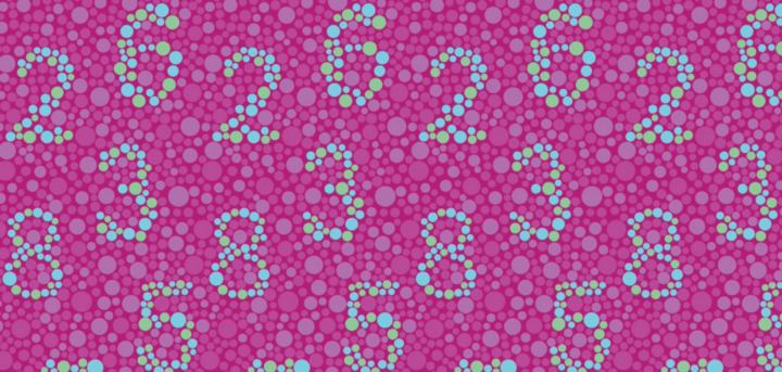
Making Them Color Blind-friendly
Red and Green dots will not be distinguishable for the people with color blind issues, By providing two different shapes along with a clear label would be the right approach. Even though New govt guidelines mention providing a different shape for veg, its far from implementation.


Providing Enough Contrast

The Image above shows nutritional info of an energy drink in yellow color against the red background, which provides a mediocre contrast ratio of 2.12:1 which is far from the minimum required contrast ratio of 4.5:1

Letter
Font Size and Legibility

Even If a person has a 20/20 vision, it would be difficult to read the above ingredients of the ketchup bottle. The ingredients list should be of a readable font size against a white background with a minimum font size of 6 points.
People with low vision, dyslexia, or other vision-related disabilities are at a massive disadvantage If the text is italicized, small size, lack of spacing, etc. One possible approach here is to keep the label info separate from branding, so you don’t have to cramp everything in a corner.
Using braille on packaging

It’s a fact that not all blind people can read braille script, but providing braille on the products would sure help a lot of people. Today more than 150 million people in the world use this script. And in the EU providing braille on drug packages is required by Law.
Other tactile-labeling technologies

A UK based startup called Mimica uses a unique tactile technology: the bio-reactive food label. The label works as a tactile warning: if it feels is solid and smooth it means that the food is perfectly edible, alternatively, when it is soft and bumpy it indicates that the food is rotten as the gelatin melts and decays with the food exposing the bumpy surface.


