Microsoft Paint has always been there for us, so when I heard the ‘Microsoft Designer’ announcement, there was a natural excitement. Combine that with AI, and the hype was real - Microsoft are bringing AI to the masses! Not only with Microsoft Designer, but they're sprinkling AI onto many Microsoft products.
For example, even old Bing search already has an Image Creator. Microsoft are mass onboarding people to a new way of working with computers via robotically phrased 'prompts'. But how will it all work?
There’s an art to writing the string of prompts that can produce what you want from ChatGPT, DALL-E 2, and Midjourney. (Fast Co)
If you’ve tried any AI image generator before, as well as ethical concerns of AI generated art, you may be aware of how unpredictable the image creations are. It can also take ages to generate an image with the right look and style. Sometimes it requires a lot of trial and error when creating the right instruction for the AI – a process known as ‘prompt engineering’, or ‘prompt design’.
Principles for User Prompt Design
With the unpredictability of AI generators, and the nuances around prompt engineering, this article observes Microsoft’s approaches to guiding new users to creating prompts that get more reliable outputs, without wasting much time.
You might look at it as principles for user prompt design, or a starting point for them (since AI is still early, and more examples will follow). Either way, the observations can help guide you if you’re creating an AI-powered app of your own - especially when tackling onboarding and introducing new concepts.

Microsoft, DALL-E 2, and the User
To start with, it’s useful to know the technology and audience involved. The AI aspect of Microsoft Designer is not new technology from Microsoft, but yet another implementation of OpenAI’s DALL-E 2:

Microsoft Designer itself is a tool geared towards marketers who create social media banners - it’s like Canva but sprinkled with AI – nothing near Figma or anything a UI designer would use for app and web design.
As well as MS Designer, Microsoft are also launching Microsoft Bing Image Creator. It’s like Bing Image Search, but you generate images from prompts instead of searching for them.
Here’s some techniques for Microsoft use to introduce prompt design and AI for new users:
1. Provide a familiar context (Familiarity Heuristic)
Humans often associate new things with risk and uncertainty, and an AI image generator might create those feelings being something new.
Humans innately prefer things we're familiar with whether they're words, products, or experiences. (App Cues)
To make it more familiar, Microsoft Designer shows the AI image generator as an option along with other methods of uploading images:

Here's the options:
Upload from your device
Your phone
Open your media
Generate one with AI
In this way, the AI fits within a similar flow that might have been used even if it wasn't there. It’s almost like an image upload.
Instead of diving headfirst into algorithms, think about how people do the task today
In the case of Bing Image Creator, AI features are made to feel just like using a regular search engine that people know Bing for. However, the search bar is used as a prompt input, and the generated image results feel like a search results page. The whole thing just feels like search.

2. Be transparent: AI is not magic
Many tools don’t obviously mention the AI technology they use to generate images and text - you have to do a bit of digging to find out.
Microsoft Designer displays the very technology they use at the information tooltip right where you create the prompt:

Despite DALL-E 2 sounding like unfamiliar jargon, it seems a sensible approach to include it, in contrast to referring to the AI as some sort of 'magic'. It can also convey Microsoft's understanding and concern for the ethical use of AI technology in showing what's behind it.
Today, too many people view artificial intelligence (AI) as another magical technology that’s being put to work with little understanding of how it works. - AI is Not Magic, IBM
Finally, putting this information behind a tooltip also means the technical jargon doesn’t get in the way, but it’s still easily accessible as the style of the option is different, and the icon attracts attention.
3. Emphasize ethical use of AI
AI is new and uncertain, and can easily be used unethically. What is considered ethical is also still unclear, as the space generates new use cases and applications from one day to the next. Artists are still outraged about their styles being stolen, yet AI art generators don't slow down.
To help prevent DALL∙E 2 from delivering inappropriate results across the Designer app and Image Creator, we are working ourselves and with our partner OpenAI, who developed DALL-E 2, to take steps and will continue to evolve our approach as needed.
With this uncertainty, Microsoft Designer’s tooltip is repeated on the next step at the point of generating images, asking for feedback and making expectations realistic:

Bing Image Creator follows the same approach - a help icon is shown near all AI generated images, which links to a FAQ including ethics:

4. Explain the results
Following on from the ethical concerns, and according to the UX of AI primer, enabling the user of your app to trace an AI-generated image back to data points, or somehow understand how its made also helps with transparency.
If you aggregate data from multiple sources, break them down to let the user reproduce the result. This information should be available as part of the user flow through a consistent interface. (UX of AI)
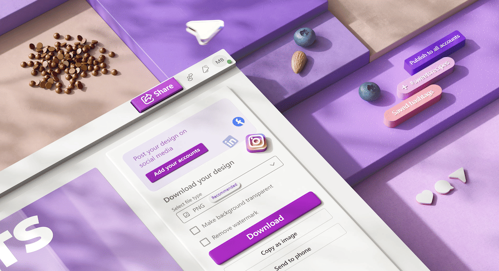
Most AI sites, from OpenAI’s own DALL-E app, to Prompt Hero (a prompt inspiration site), show the original prompt used to create each image openly on the image. Microsoft Designer does it in the same way. When you hover any AI generated image or example, the prompt used to create it is shown:

On the right side of the wizard (in the previous image), copy and images are used to emphasize that too. The text ‘We use your content and AI to generate designs for you’ goes some way to illustrate where inputs for images come from.
However, they don’t show the data points used to create the images, or how the AI works. Here is a good example of how AI results it can be explained, but it’s probably not possible with DALL-E 2, and out of scope to display in a UI of a commercial product.
5. Steer the user with suggestions
AI prompt writing can be a bit alien, as prompts must be written in a style that the AI can be effective with. OpenAI even provide a guide of 'best practices for prompt engineering, with rules of thumb for GPT-3 being:
Be specific, descriptive and as detailed as possible about the desired context, outcome, length, format, style, etc
Articulate the desired output format through examples
Start with zero-shot, then few-shot, neither of them worked, then fine-tune
Auto-complete
When using AI for the first time, prompt writing is unfamiliar, so another useful thing Microsoft Designer does is providing auto-complete prompts:

Like the familiarity heuristic, we're also used to search suggestions, so we know that these are recommended for better results.
One technical observation here is that there must be a lot of work and examples going on behind the scenes to create such suggestions - maybe they're using ChatGPT for those? 👀
6. Keep the user in control
Even though steering the user helps, it should be done in a way that keeps the user in control. As long as the product doesn’t entirely depend on AI, it’s good to allow users to skip any interaction with it. The user should be able to work with the AI, and use it improve their workflow when needed, rather than having AI take over.
For example, the user may prefer to continue creating and using their own images if AI doesn’t fit their needs. In MS Designer, as well as uploading your own images on the first screen, there’s always an option to get out. Here, even where generated results are displayed, there’s still an option to ‘start from a blank canvas’:

It’s even possible to use the app without AI as the general flow is the same as most social media banner creators.
On AI Design Principles
Even though I’ve called the above ideas principles, they are more like concepts and examples to follow as inspiration, rather than reinventing the wheel if you come to design for AI.
AI is still very early, so best practices will still be forming as apps become more useful. For more UX in AI, check out the awesome primer by Lennart Ziburski which was used as a guide throughout this article.
If you have any more resources, please share them too. We haven’t got comments on Prototypr yet, so feel free to write a post on the platform!


 Buy me a coffee