Build Design Systems With Penpot Components
Jul 21, 2:15 AM
Penpot's new component system for building scalable design systems, emphasizing designer-developer collaboration.
smashingmagazine.com

Design + Sketch App — Medium | Riel M
I’d probably assume that most of us started in UI design with the littlest knowledge or nothing at all. But even though the odds was against us at the start, we managed our way through numerous design books and articles to understand how colors, typography, layout etc works.
Thus in this article, I’ll be sharing a list of things I’ve learned from different designers, things I’ve learned in designing user interfaces, and new discoveries I found along the way:
When faced with content that needs font hierarchy, making the text bigger to give emphasis and importance usually doesn’t solve the problem, just like the one below:
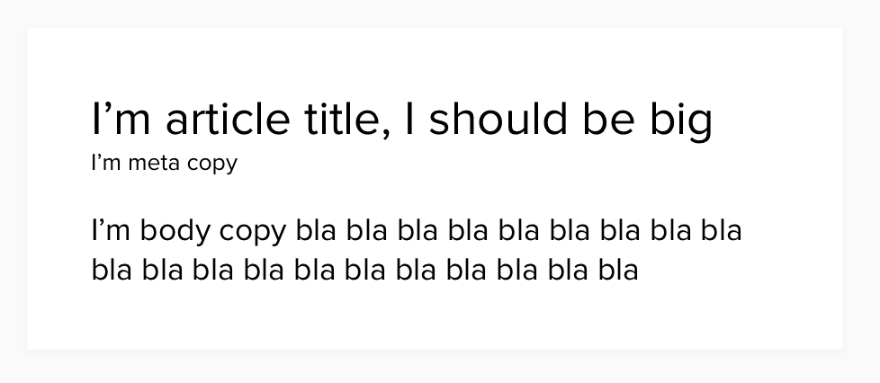
Font hierarchy is just not about small to big font sizes. It is about the right mix of size, weights, and colors which creates contrast. Bigger contrast, the better.
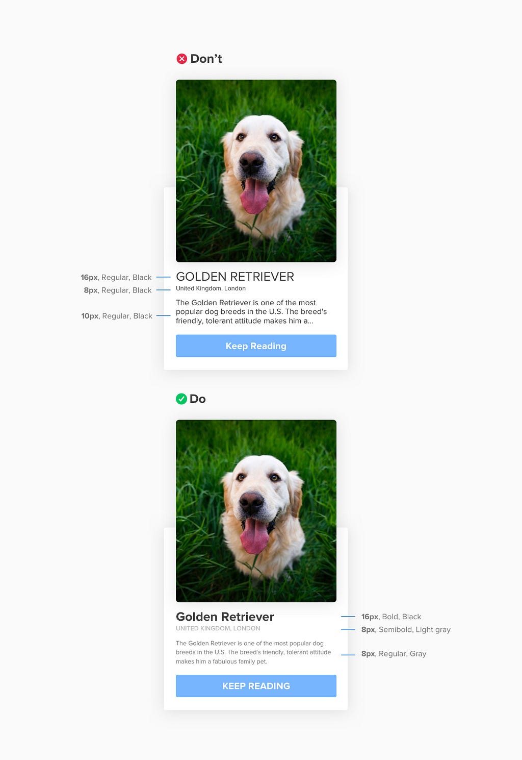
 from my base color, I move darker for headlines and lighter for ancillary content.
Don’t make your life difficult by moving your color picker up and down to produce different shades of black.
We all know that using black text color (#000) causes eye strains for readers, and so we tend to create darker colors as an alternative. But instead of color picking 3 or more hex color values, we can use black with different opacity as a solution:
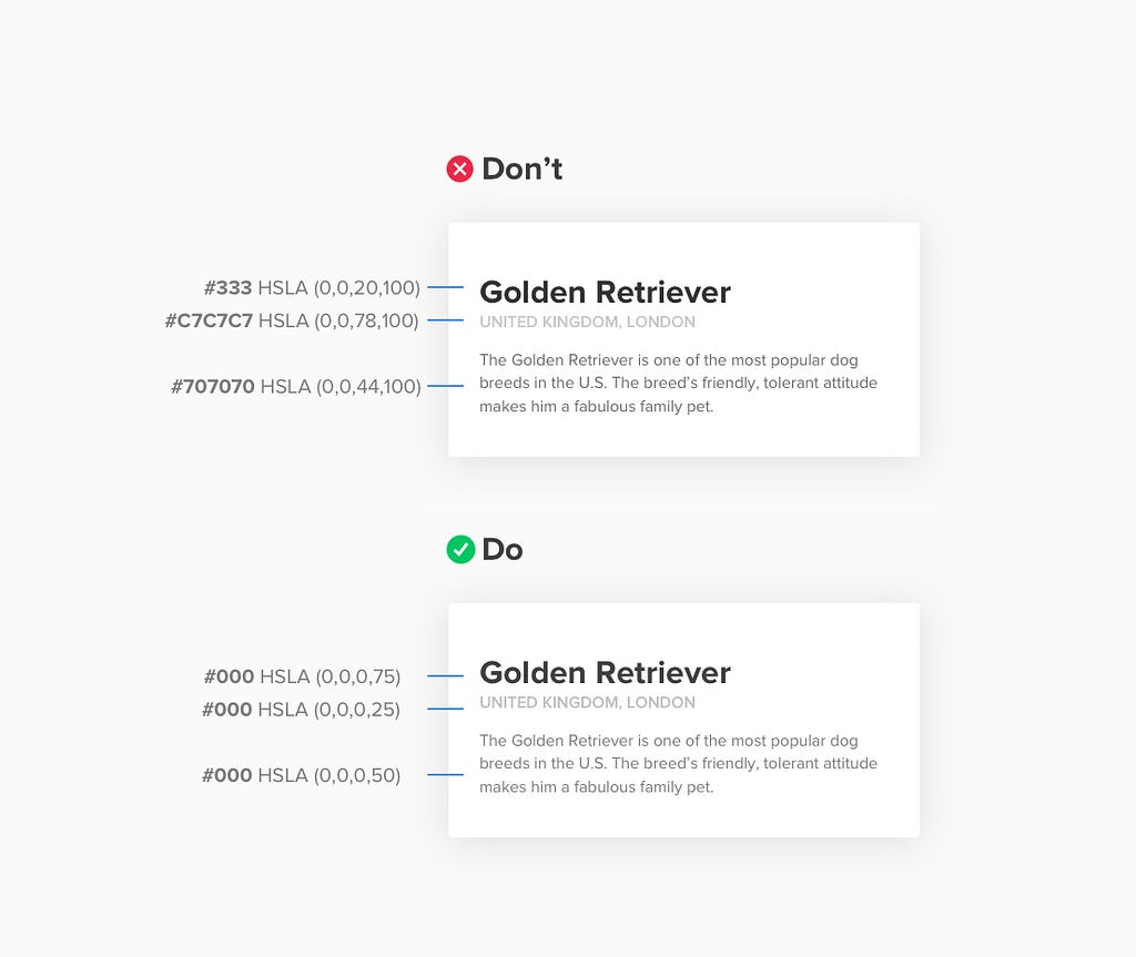
In my example above, I used black as my primary color (#000) and decreased its opacity depending to where it will be applied (i.e. primary content, secondary content, etc)
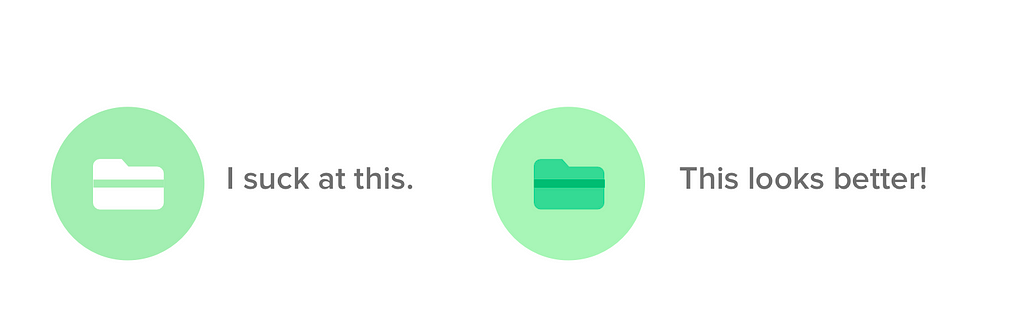
Most of us suck at picking the right color combinations, and whenever we see a design with a well orchestrated color palette, we question ourselves “How the F they did it?” (just like the one below):
 taken from momoandspirits
Until I learned that understanding colors is not just for people who has the gift of design since the beginning of time, that a simple addition and subtraction at the Hue, Saturation, Lightness (HSL) will do the magic (we will be using HSL for this formula instead of RGB). You can easily get rid of the boring white over colored backgrounds and turn it into a Picasso work like the one below:
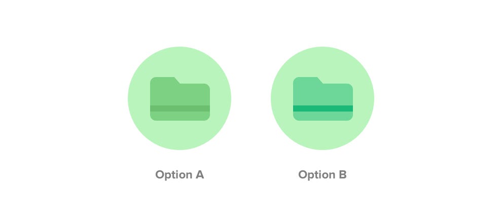 Two approaches for understanding colors
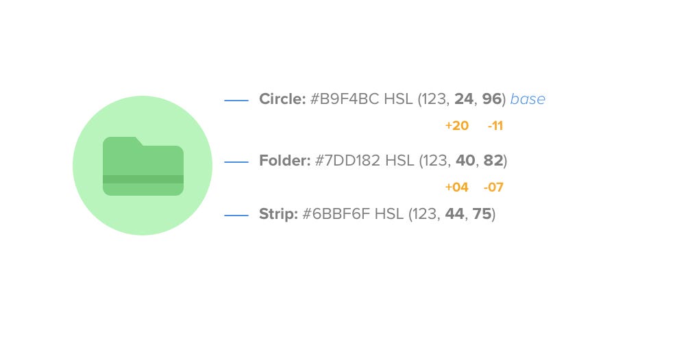
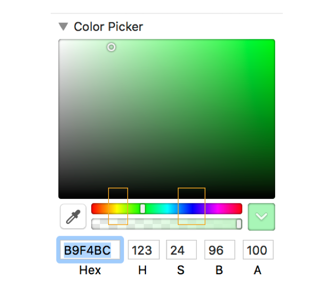
There are actually two approaches we can do and as we can see, both options has the same base color #B9F4BC (circle background) and differs when it comes to the folder and strip color, but still arrives us to a good and pleasant color contrast. As we start, always remember that the first number corresponds to Hue, followed by Saturation and lastly, Lightness.
 Option A
In Option A, we can see that we kept the Hue value 123 all through out the shapes (circle, folder, strip) while the Saturation and Lightness is where change happens.
Now, as we focus on the Saturation of the base which is 24 and its lightness, 96, both values changed when we created darker green for the Folder. From Saturation of 24 it became 40 (increment of +20), and from Lightness of 96 it became 82 (decrement of -11) which shows us that a change in saturation whether incremental or decremental needs an inversely proportional adjustment to lightness in order to create a good contrast (vice versa). Thus, leads us to the formula:
Darker Value = Increment in Saturation is a decrement in Lightness
Lighter Value = Decrement in Saturation is an increment in Lightness
This formula helped me every time I’m in wonder of what right colors should I use on my designs. I learned that the most important starting point is having my base color, and from there I start the magic by adding and subtracting in Saturation and Lightness while keeping the Hue value the same.
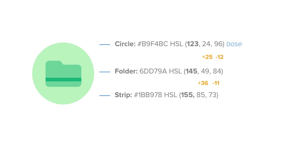 Option B
In Option B, the same principle is still applied (the formula we had above) but the Hue values change. Thus in this approach, the color terminologies RGB and CMY will be important.
RGB stands for Red, Yellow and Blue, while CMY is Cyan, Magenta, and Yellow. These terminologies haven’t made any importance for me when I first started, until I came across this discovery of using RGB and CMY for color combinations.
If we want to have a darker variation of the base color, all we need to do is move our color picker to the direction where the nearest Red, Green, or Blue is located in our color palette, or move it the direction of Cyan, Magenta, Yellow for lighter variation. For example:
 Color Picker
Since we want to create a darker variation of our base color #B9F4BC (circle background) for our Folder icon, we need to move our color picker to the direction (which is right) where the nearest RGB is located (which is Blue in this case) . But if we want to have a lighter version of our Folder, we will be moving our picker to the left, near CMY (in this case Yellow).
After moving the color picket to our desired variation, the same formula we had in option A will be applied, which results us to having this color combinations:

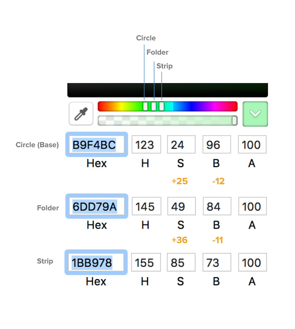
Red, Green, Blue (RGB) = Darker variation
Cyan, Magenta, Yellow (CMY) = Lighter variation
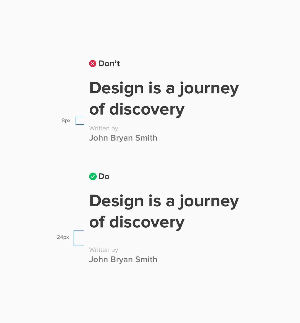 Be a generous space giver
Aside from adding a line between two groups to show separation, using a generous space between is a better and easier solution.
As what the Law of Proximity states:
Objects that are near, or proximate to each other, tend to be grouped together.
From my example above, my goal is create a separation between my title and its writer by using a large space gap between them which is 24px.
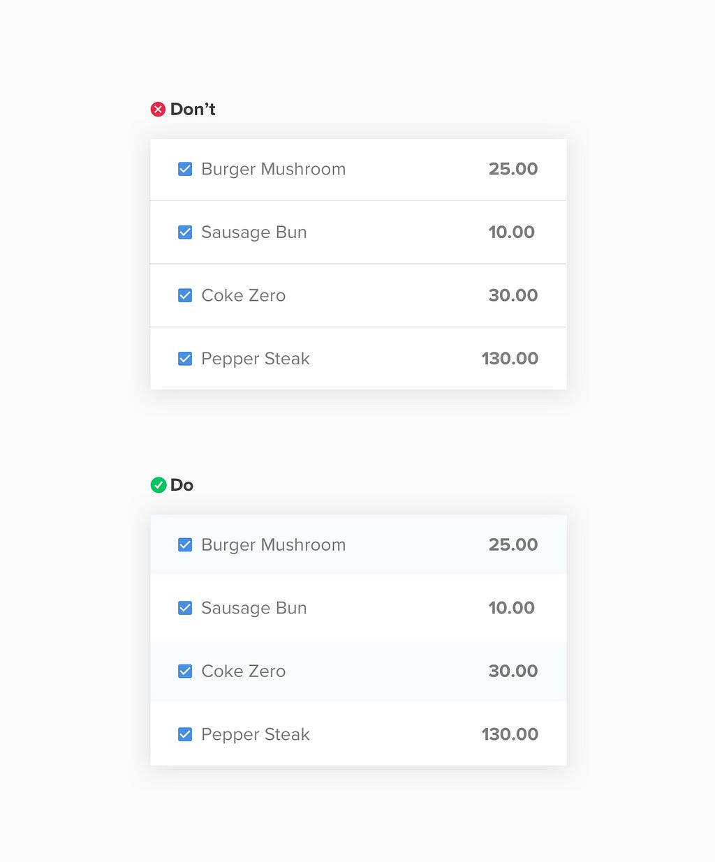 Colors as separators
Doing row interfaces could be boring at times to design, since it only requires duplicating the component for n times. But on the user side, reading them can be difficult specially if there’s no great distinction between one row to the other. Thus aside from using lines, adding color background in rows can be a lot helpful for users in reading, and also will be more enjoying to do for us designers 👍
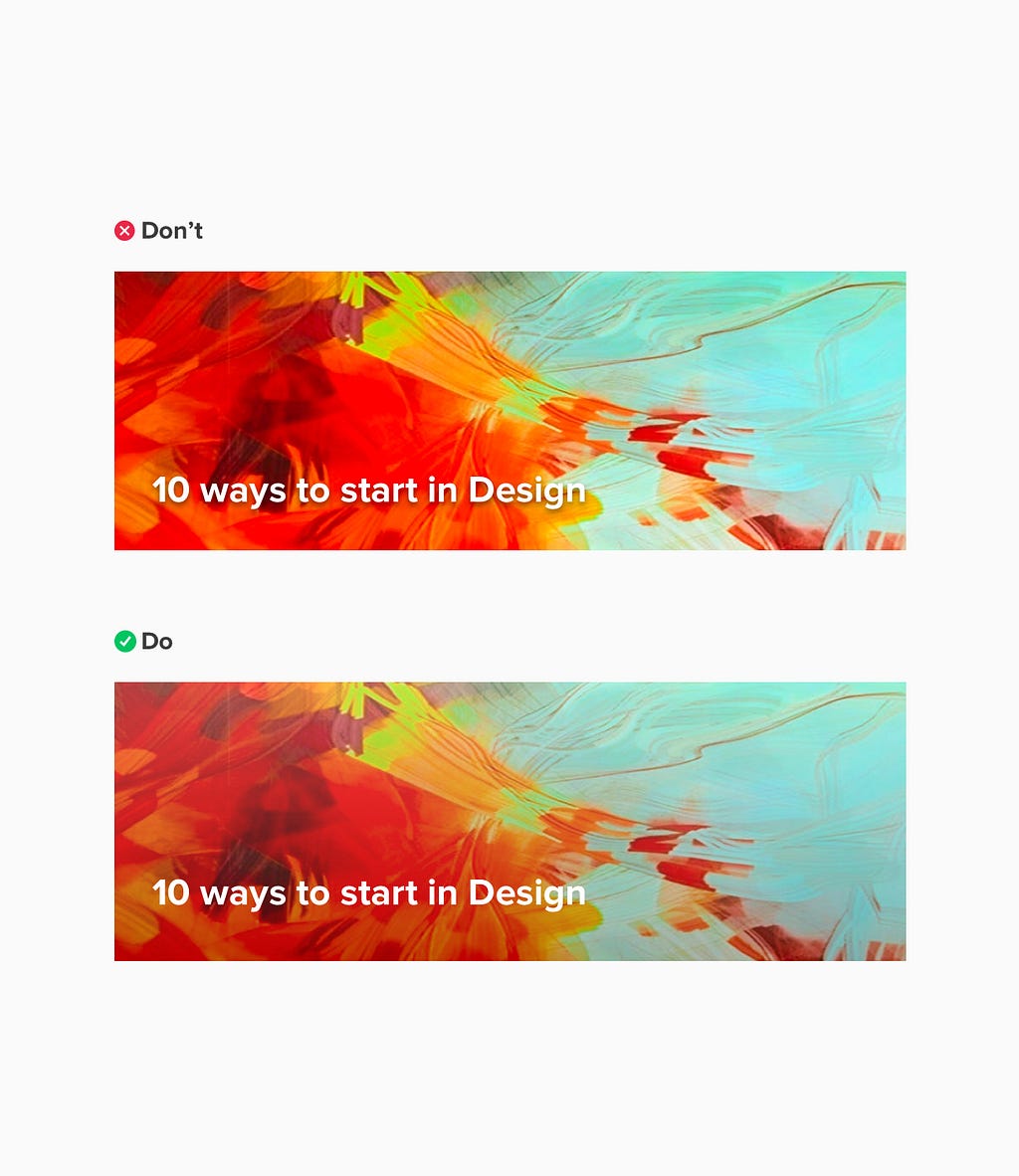 Header design
It’s quite challenging designing header components or adding text over an image specially if the image background will be dynamic (or can be changed from time to time).
Usually the common solution for text with dynamic image background is adding drop shadow, but it doesn’t help user’s readability. It adds more visual clutter around the letters and words because they fill up the spaces in between them.
For some, black/white color overlay is the solution which is a helpful hack for these kinds of designs. But recently, I’ve discovered about using Multiply as blend tool for a gradient fill.
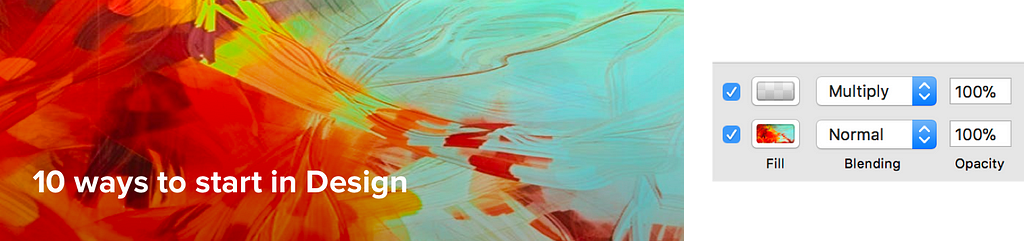 Specs for Multiply blend options
Doing it is much easier than creating a black background over the image and lessen its opacity. Also, having it grayed scale makes the other part of the image retain its natural color, and makes the part where the text is located a little bit darker, for text readability.
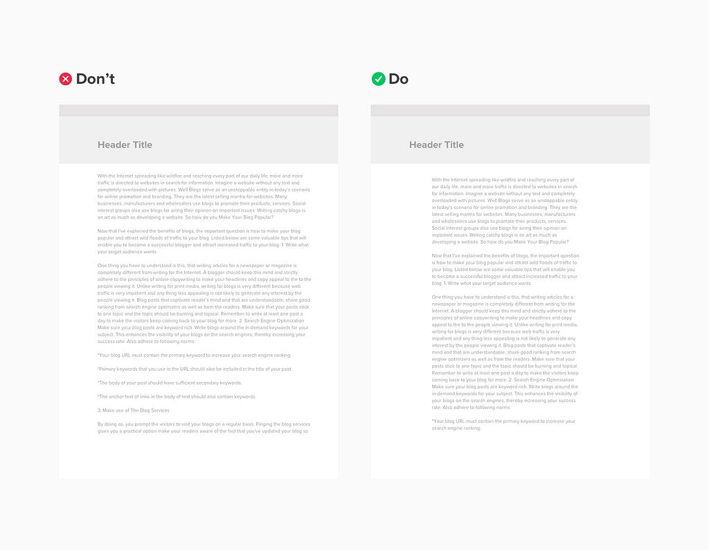
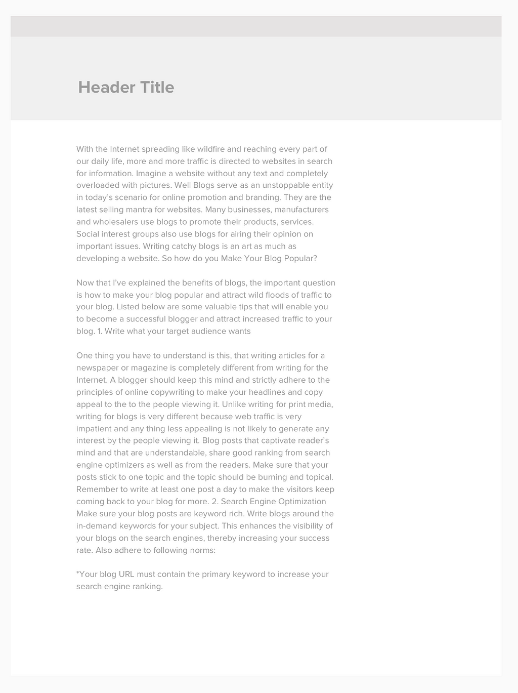
The common thing most designers do is making the line length longer so that it may fit its container. But doing so, creates eye strain for our users unlike having a 45–65 characters per line which is the ideal.
If you ever came across the dilemma of making the length shorter to make it ideal but will result to a big white space at the right side like the one below:
 with big white space at the right
Don’t hesitate to do so, and make the whole text column center aligned to its container, so that you can remove remove the white space.
 centered content
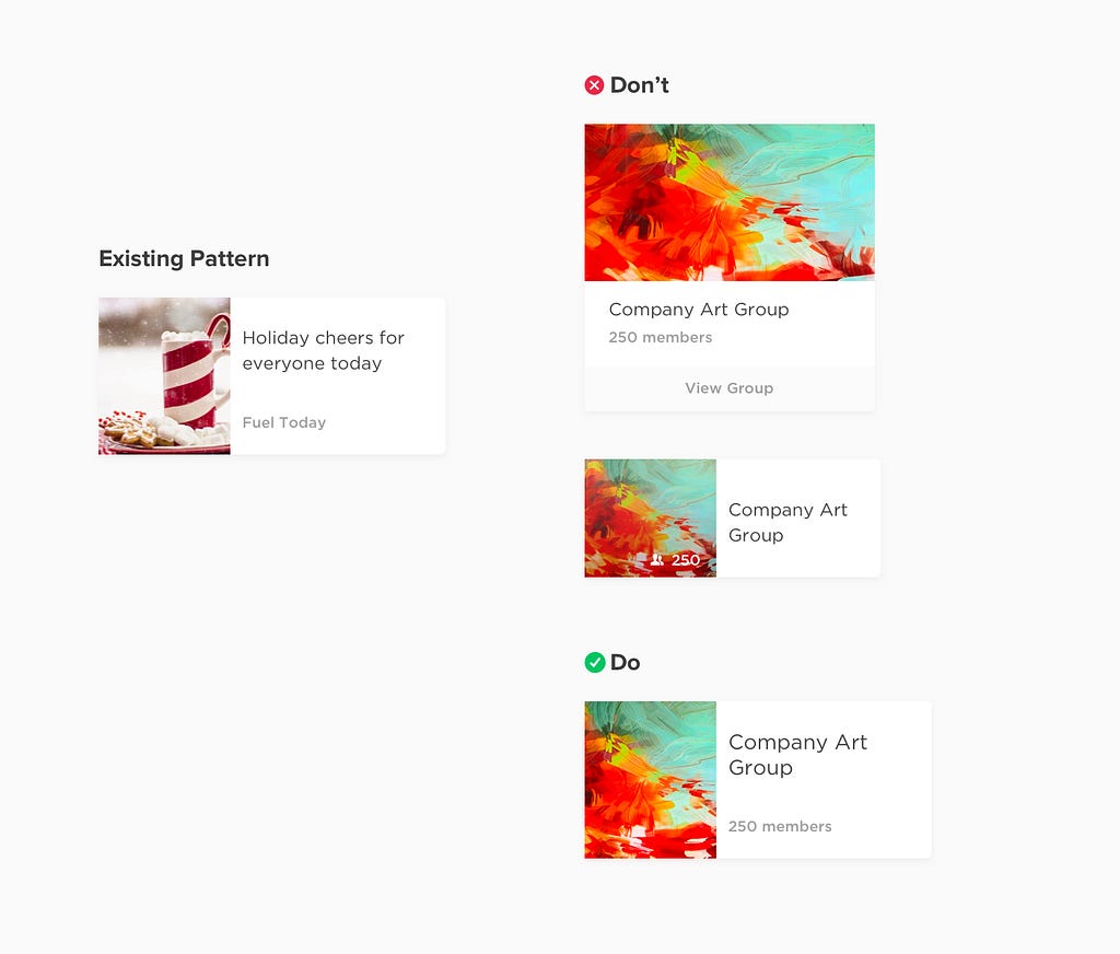
What makes a design inconsistent is when it is not component based. It is when you came to realize that you’ve made 5 kinds of card interface, 10 buttons, 5 heading title styles etc.
Before you start creating an interface for a specific content, try to look around your previously created designs, for you might see a pattern which you can recycle and use.
Instead of reinventing the wheel and create another card for an Art Group (example above), we can use the Article card and replace it with the Art Group’s content. This will save time for designers and also make the interface consistent.
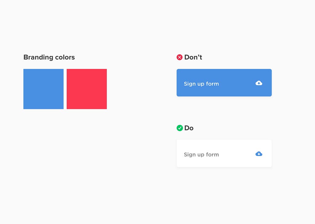
We usually think that branding colors must occupy a big chunk of our interface colors. We are having a hard time where to showcase our client’s shocking neon yellow, orange, and pink branding colors in our clean and minimalist layout. The answer? use them as accent colors.
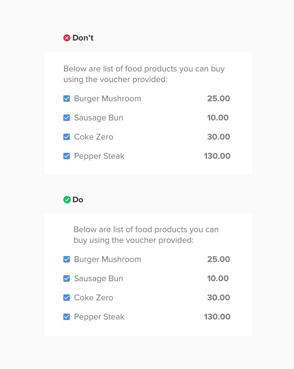
And lastly if you are creating a list design like the one above, make the bullets, glyphs, or number sit in the margin to highlight the list. This will make the user readability flow uninterrupted and more legible.
There’s still a long list of design cheatsheets I would like to add, but for now I hope these 10 design tips will help you in creating design interfaces. Also, feel free to add your cheat codes in the responses 😃
*This article is inspired by 7 practical tips for cheating at design and by tons of design articles I’ve read 🙂
For any questions, ping me at [email protected]
 giphy
giphy
10 cheat codes for designing User Interfaces was originally published in Design + Sketch on Medium, where people are continuing the conversation by highlighting and responding to this story.
AI-driven updates, curated by humans and hand-edited for the Prototypr community


