Build Design Systems With Penpot Components
Jul 21, 2:15 AM
Penpot's new component system for building scalable design systems, emphasizing designer-developer collaboration.
smashingmagazine.com

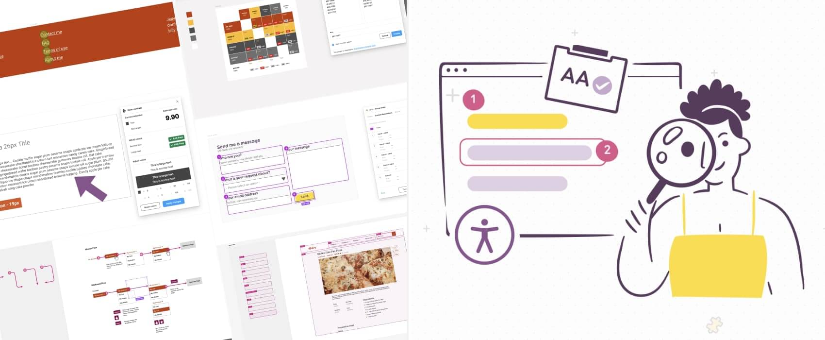
Accessibility in design is crucial for making digital products inclusive for all users. In this article, Stephanie explores how to address accessibility issues at the design stage, specifically focusing on tools and techniques to enhance accessibility in Figma mockups. By incorporating best practices in color usage, contrast ratios, text legibility, and more, designers can ensure that their designs are user-friendly for individuals with diverse needs.
Color Usage: Avoid relying solely on color to convey information.
Text Resizing: Design text elements to be scalable for users who need larger text sizes.
Form Elements: Make form inputs accessible and navigable for all users.
Keyboard Interactions: Implement smooth interactions for users navigating via keyboard.
AI-driven updates, curated by humans and hand-edited for the Prototypr community


