Build Design Systems With Penpot Components
Penpot's new component system for building scalable design systems, emphasizing designer-developer collaboration.
medium bookmark / Raindrop.io |

The tech, music, and film festival that is largely responsible for Austin’s boom matures with a standardized logo for 2017 and beyond while allowing each year to have its own graphics.See original post
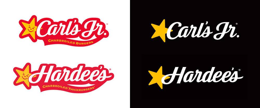
Not the largest burger chain in the world but a significant enough change to the logos that drop the smiling stars and 1950s diner aesthetic in favor of something more contemporary.See original post
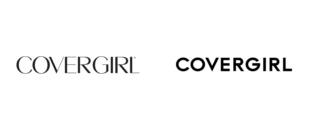
Not the most interesting or relevant of changes but the update was also part of a change in tagline, of which Cover Girl had one of the most recognizable.See original post
Ditto on being neither the most interesting or relevant of changes but the thin lowercase of Calvin Klein was a classic and the only interesting thing about its replacement is that it was designed by Peter Saville.See original post
This was the first big story of the year with the racing giant changing its 40-year-old logo to something with a little more pep in its step even though the lines are somewhat confusing in their thicknesses.See original post
Pinterest dropped its highly recognizable script wordmark in favor of the boldest weight font they could find because business.See original post
Like many other companies, Audi went flat but did so more successfully than most.See original post
Like Audi, Movistar went flat but stayed blobby and breathed new life into a monogram that didn’t have much hope otherwise.See original post
Medium changed dramatically only two years after it had changed dramatically. I look forward to seeing them again in this list in 2019. Dramatically,
of course.See original post
At a time when the we need the ACLU most badly, the organization went through a significant and bold change.See original post
Given the amount of foreplay with this redesign — the process, you might recall, was done in the open and started in June of 2016 — the climax of the reveal was actually worth the wait.See original post
One of the most recognizable (and whack) real estate logos went with the let’s-strip-this-off-of-any-personality route. The balloon redrawing was an improvement, though.See original post

YouTube’s play button finally became the center of attention as the primary icon and the overall redesign of YouTube got a nice boost.See original post
Ebay dropped the multi-colored logo in favor of a spare aesthetic that, although relatively nice, is another example of stripping a brand off of its personality.See original post
Kickstarter doubled down on its boldness with an extra bubblegummy wordmark and a crisp — perhaps too crisp — website redesign.See original post

Not a huge change by any means — only the “NBA” typography changed — but for the biggest, most popular, mainstream sports organization in the world any change is a big deal. That it looks bad-ass is a major bonus.See original post

Dropbox may not be as mainstream as other brands in this list but for this audience of us it’s probably one of the most used brands in our day-to-day operations. The design was interesting but perhaps too much of too many things, particularly retina-assaulting color combinations. See original post
Of all the redesigns this year this was probably the most drastic in terms of leaving behind any equity or tiptoeing around with an evolution. Formula 1 made a hard turn and introduced a bold, daring new logo.See original post
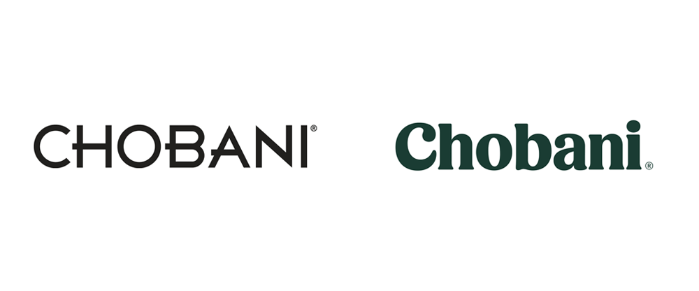
This has been one of the most liked, major identity redesigns in recent years… who knew there were so many people so passionate about Greek yogurt. Spoiler: Chobani does make it into the “Best Of” list (but in which spot?!).See original post
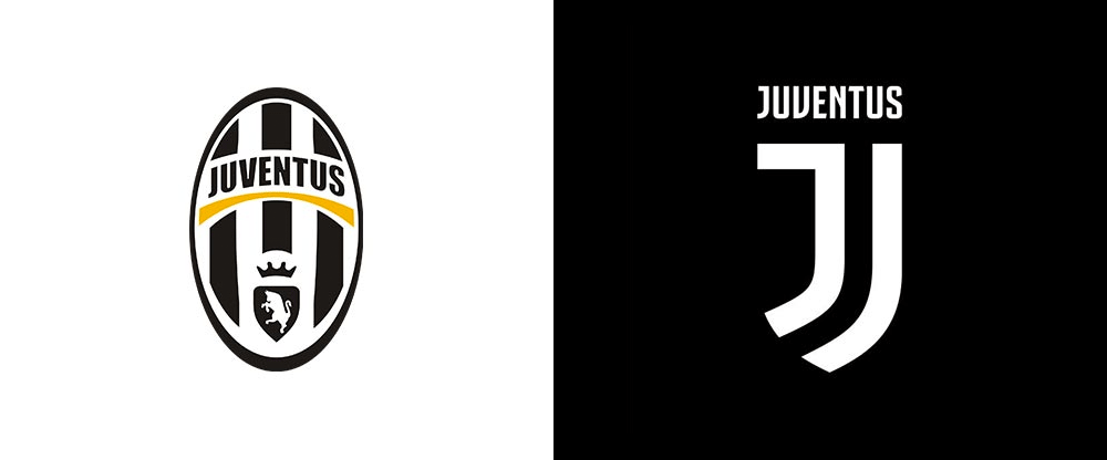
The redesign of Juventus nearly brought down our server with Italian visitors. This post had the biggest pageview count of all posts in 2017 and, regardless of whether people hated it or loved it, the new Juventus logo signaled that, perhaps, the end is nigh for all those crest logos soccer fans so passionately love and hold in such inflated regard.See original post
AI-driven updates, curated by humans and hand-edited for the Prototypr community