Build Design Systems With Penpot Components
Jul 21, 2:15 AM
Penpot's new component system for building scalable design systems, emphasizing designer-developer collaboration.
smashingmagazine.com

medium bookmark / Raindrop.io |
UI/UX Designer. Learning to unlearn. Astronaut of the psyche and french-fry enthusiast.
Forms are a part of everyday life, and honestly, they aren’t always the best of experiences. Whether it may be confirming your plane tickets for a getaway or checking out items for your shopping cart. We all have wished that forms could be designed just a little bit better.
Even though we now have more options of introducing emerging tech, bots, biometrics and more into our interactive designs, the fundamental structure and purpose of forms have changed very little from the paper forms that we still have around today.
Essentially, forms need to be Communicative and Accommodating.
Communicative forms help users understand why they are there in the first place, and it also makes them feel like they are having a conversation with you, not an interrogation.
Accommodating forms help users feel they are getting the right amount of attention. When they make mistakes in the form-filling process, good forms help them find their way back, or make things easier. They consider designs that assist in various disabilities.
Below are three good practices that can inform your next form-building project for your work or your own website.
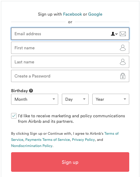
In the example above, Airbnb allows users to sign up with their e-mail, but with minimal fields and absolute ease for the customer. I know it‘s sometimes impossible to get rid of some items in your form (for many reasons) but we should always strive for minimal fields. To make my design process abit more organised, I will ask some of these questions below:
Unless we were all fortunate enough to allow for single-click social media sign-ins or integrating Google Sign-in to our forms, we will need to consider this ‘necessarily-minimal’ approach. This take-away certainly rings true to Antoine de Saint-Exupery’s famous quote:
“Perfection is achieved not when there is nothing more to add, but when there is nothing left to take away”
There have been several form interaction designs that have been circulating around, but they should be used for a good reason and for a specific intention in your design.
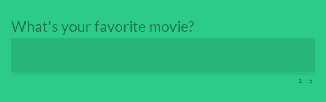
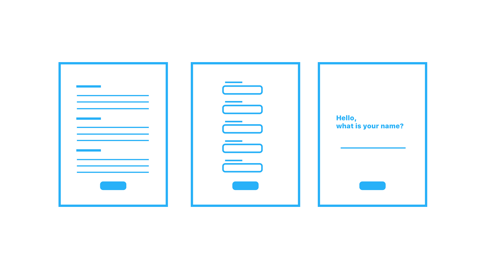
Dynamic Single-Form Field Design
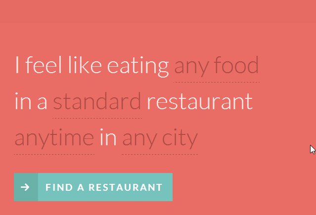
Natural Language Form Design
The micro-interactions included in these examples are fun! They bring a smile to you and your customers, and it could also increase your conversion rates. There are lots of different things that you can do in your form. Among plenty of awesome examples of text-input designs online, here is an amazing resource.
However, you need to keep in mind the audiences which you are designing for and if some microinteractions are appropriate for your project. You also might not want to make interactions that makes the task more complex than it should be.
This is probably the most challenging, but the most rewarding form design practice you could implement into your workflow. Designing better forms does not only stay at the element, component-level but rather it has to address the uncomfortable/challenging (often unspoken) question of what the high-level purpose of your form actually is.
It may seem straightforward to say that ‘we want our customers to sign up for our newsletter’, or that ‘we want users to create an account as soon as they arrive on our site’ and that’s okay, but what are the implications of having them do those things at that time? What are the possible strategies that are involved when you include your form at certain stages of the customer journey?
Thinking about the strategy of your forms and how it fits into your overall design will truly benefit the work that you do, your team/organisation does, and most importantly the experience of your target audiences.
I am by no means an expert on form-design, and I’m on a continuous path of exploration and learning in the field of design.
Additional readings (these helped me):
In-depth on everything Form-related (foundations in print, but many concepts are transferrable): The Form Book
Good guidelines for Form Usability: Website Forms Usability: Top 10 Recommendations
Types of Form Design: Form Design for Complex Applications
Form Label Design: Float label pattern in UX form design
Good questions in form design: A simple approach to improving form design
Open to questions and healthy discussions about form-design (because we love it so much) or your design process.

Also, I have a website.
AI-driven updates, curated by humans and hand-edited for the Prototypr community


