Build Design Systems With Penpot Components
Jul 21, 2:15 AM
Penpot's new component system for building scalable design systems, emphasizing designer-developer collaboration.
smashingmagazine.com

UX Planet — Medium | Jason Zhou
If you are on a team with no design system yet, setting up your design system can be an exciting, yet colossal task to complete.
In early 2016, the SafetyCulture design team set up our own design system — we spent around one and a half months redesigning our products and putting together a style guide, with everything needed to make a design system.
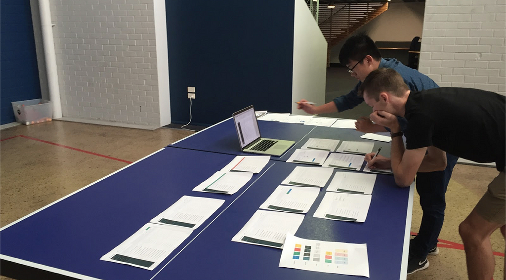 Grant Zanni and Jason Zhou were reviewing SafetyCulture design systems on a ping pong table
However, things didn’t work out well in the beginning. We had many problems, but our two most significant ones were:
Here are 3 pitfalls we experienced that will make a big difference in the outcome of the design system:
When setting up a design system, people tend to include every possible UI component — Radio button, switch, checkbox, card, toast, table, etc. I know it is exciting to set up a foundation for everything, But do you really need all of them?
 We started our design system with every possible component we can think of, and it was ton of unnecessary work
We started our design system in the same way, including every possible component, and even invented some new components, this led to a complicated design system. It was not just complicated to build, but also complicated to use. The documentation was long and big, yet many of those components were rarely or never used in our designs.
The most significant problem of this approach is: Designing UI components without a real problem/user case to solve is like designing a poster without considering the content, it won’t achieve the best result to address your future problems.
In fact, those components will become a limitation in practical scenarios that make designers struggle to put together an interface with those pre-defined components because it doesn’t fit in to a solution.
Don’t think ahead too much: Build only components that are necessary for your current needs, and remove components that you are not using out of your design system. If your app currently only has two main pages that need to be redesigned, then just design the components that are necessary to build these two pages and add them to your design system.
 We removed many underused components out of the design system and left only necessary components, which makes our design system more lightweight and easier to be used
So the next time you have a new feature to design, try to validate whether existing components can achieve the purpose of your design/wireframes, if not, a new component can be introduced and added into the design system.
By doing this, you can be confident about all the components you put into the system and the problems each component is supposed to solve.
The design system is a productivity tool to help designers get to a good design solution faster, so making a design system to be easily accessible is essential.
When we started our design system, we spent a lot of time putting together a big, detailed, beautifully designed document — Like what other design systems do.
 Referring to a document every time you do design is painful.
The documents look amazing and people were impressed — yet no one really used it or read it afterwards:
All those failed experiences just told us one thing — Heavy documentation is boring and useless; What we needed was a lightweight system that can be easily accessed & updated during the design process by any designer, and the content had to be always up-to-date.
Luckily, inspired by Bunin, we found a solution to achieve this with some Sketch plugins:
 We use Lingo + Runner to build an efficient way to use our design system
One of the common problems you might have is: We designers sometimes have a tendency to reinvent the wheel, and thats when engineers start yelling — “Why the heck do you have two different drop-down selects? Aren’t they serving the same functionality, to pick up an item from a list?” Etc.
The reason behind this is not that designers want to be cool or different; They just don’t believe the component in the system is the best solution. Lack of a shared understanding of why/whether the components in the UI kit is the best practices is the primary cause.
Consider your design system as a collection of the best practices that your team has tried and explored for different problems/scenario, instead of just a UI kit that designers need to follow.
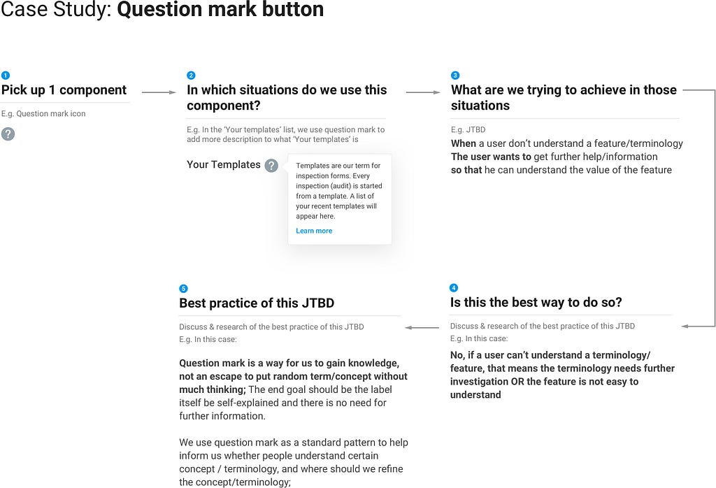
If you did something similar to us like not defining the JTBD for each component at the beginning, you will find yourself in a similar situation as mentioned above, a good way to mitigate this situation can be having a component deep dive process:
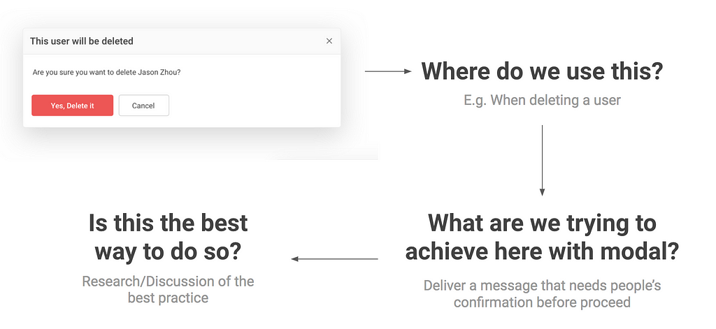 Component deep dive to find the best practice for each component.
Each week we have a dedicated 1-hour-session to gather all the designers together and pick up 1 component from the system to discuss what’s the best practice.
By doing this, each designer on the team reaches a shared understanding that for this type of situation, here is the best practice that we should use. Make sure every designer agrees with why those components in the system are the best practice, otherwise the design system is just a constraint rather than a productivity tool.
A lightweight design system means a system that has just enough components for your current needs, which is easier to setup, maintain and update, Our approach to achieving that is:
3 tips to make your design system easier to setup and maintain was originally published in UX Planet on Medium, where people are continuing the conversation by highlighting and responding to this story.
AI-driven updates, curated by humans and hand-edited for the Prototypr community


