Build Design Systems With Penpot Components
Jul 21, 2:15 AM
Penpot's new component system for building scalable design systems, emphasizing designer-developer collaboration.
smashingmagazine.com

Framer – Medium | Framer Team
These days, Framer offers a great starting place for fleshing out your product ideas. Whether you’re iterating on checkout scenarios or designing a new in-app calendar, chances are, you’d rather not start from scratch. That’s why we’ve released a series of iOS, Android and Web UI Kits, each containing all the native visual elements you need to quickly design screens and flows. And if you’re in the early stages of UX exploration, our Wireframe Kit provides all the foundational structure you need to kick off your process.

A New Beginner Tutorial
Get a feel for Framer’s new interface by opening up this tutorial, available in the welcome window. It provides an overview of how our adaptive layout and advanced vector editing make it a breeze to design everything from beautiful icons to multi-screen flows.

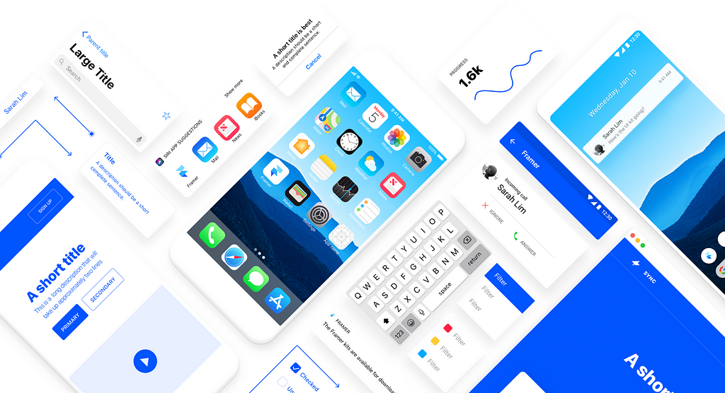
iOS UI Kit
This Framer-specific kit contains all the basic building blocks for iOS 11 apps, designed according to Apple’s guidelines. Consider it a template for mocking up screen flows or a way to grab and use specific UI elements. The kit comes packed with 8 different keyboards and modals, as well as 4 phone screen templates that offer everything from launch simulation to notifications and widgets. Native-level buttons, navigation bars, dropdown lists, sliders and typography — it’s all packaged in one handy starter kit.

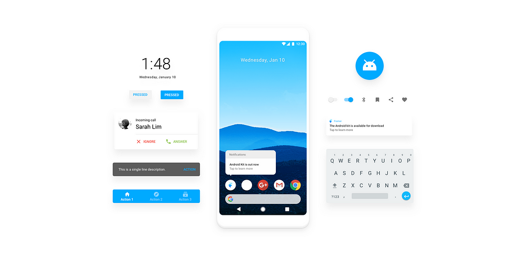
Android UI Kit
This robust kit has been carefully curated according to Material Design guidelines. It contains 8 different keyboard types, 4 modals and 4 different phone templates that each present a variety of scenarios, including launch, notifications, quick actions and lock screens. A key differentiator in our kit is that we provide you pre-made OS screens that mimic application behavior from start to finish. Putting utility and functionality first, the components of this Android UI Kit are easy to insert into any of your Framer projects.
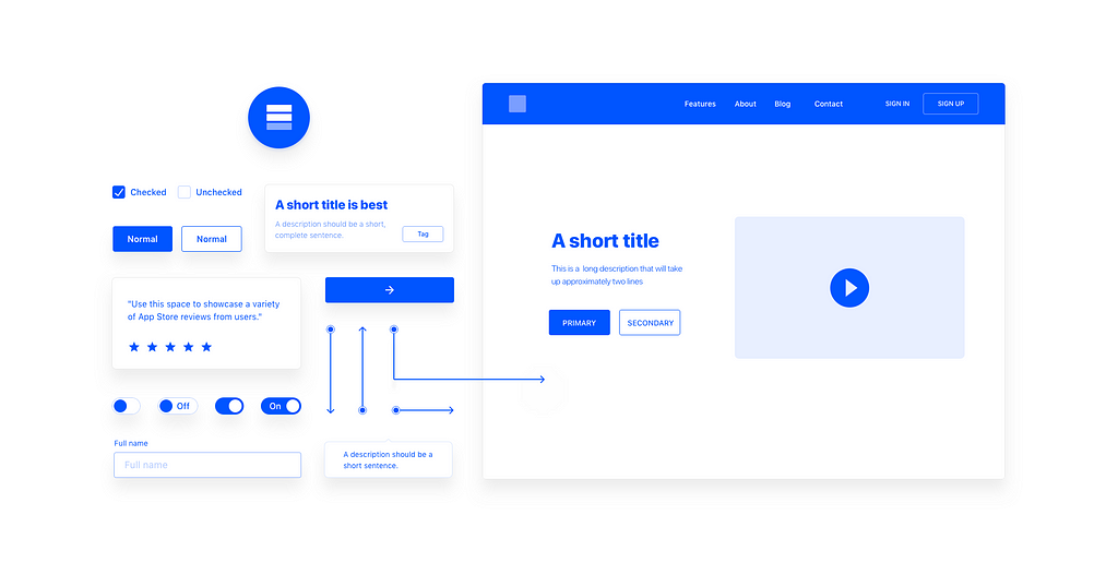
Web UI Kit
Whether you’re designing a simple product website or complex data dashboard, our contextual Web UI Kit provides all the readymade components you need to get started. From content blocks, form elements and various button states to navigation bars and input tables, everything is designed to be used together or pulled apart. Need to inject some personality? Select from over 1,161 icons, available directly in our in-app library.

Wireframe UI Kit
UX designers will love this robust kit that prioritizes functionality, behavior and content hierarchy above all else. We’ve included 3 different devices, stripped of everything but the essentials. Scalable arrows also indicate general flow directions and are a great resource for testing various sequences and scenarios. All-inclusive and responsive by design, we recommend this multi-platform Wireframe Kit as a starting point for any product design work.
You’ll find all of the above UI Kits available for download directly in your Framer Welcome window. If you don’t already have Framer, download our free trial and take these kits for a test drive. Once you’re ready to subscribe, join our ‘Refer a Friend’ program to get a special discount.


4 UI Design Kits To Kickstart Your Product Ideas was originally published in Framer on Medium, where people are continuing the conversation by highlighting and responding to this story.
AI-driven updates, curated by humans and hand-edited for the Prototypr community


