Build Design Systems With Penpot Components
Jul 21, 2:15 AM
Penpot's new component system for building scalable design systems, emphasizing designer-developer collaboration.
smashingmagazine.com

Design + Sketch App — Medium | Christopher Deane 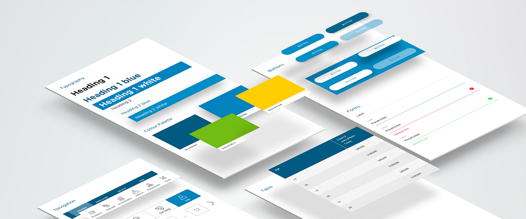
To quote Ara Abcarians, a design system is:
Everything. From typography, layouts and grids, colors, icons, components and coding conventions, to voice and tone, style-guide and documentation, a design system is bringing all of these together in a way that allows your entire team to learn, build, and grow.
For the last 5 years, design systems have been a way for the personal and client projects I’ve worked on get designed, developed and deployed more efficiently. Before this I’d design and code responsive sites using Photoshop, HTML/CSS and PHP before integrating them onto pre-built CMS’s like WordPress and Drupal. A process I’d go through every time I started a new project with little of it being reusable.
It was around 2010 that site building frameworks started to surface in online marketplaces like Envato’s Themeforest. Squarespace was maturing and it became easier to “build” a page in a site instead of designing or coding it from scratch.
The more I explored page builders the more patterns I would see. Aside from assigning a header and footer, you would build sections of a page like this:
I realised that designing like this needed to be done in reverse. As I researched this the phrase Atomic Design came up and did exactly that. You start with the smallest elements, wrap them in others then wrap them again and again until you end up with a system that can build almost anything you want.
Sounds amazing right? Well, there was one problem. We were still using Photoshop for design while coding modulated, option controlled sections inside sites like Curve Live:
Industrial Design & Product Design Magazine | Curve
In desperation to find a faster workflow I resorted to something a little crazy and crafted my first design system inside Omnigraffle 5.
Here’s what it looked like:
 Omnigraffle UI Kit displaying desktop modules.
Then something amazing happened…
Sketch. A scrappy design tool had been taking over UX/UI Design and after trialing it out on a small project we soon found that the workflow we had been dreaming of was here, even if it was really buggy at the time.
I created a Sketch UI Kit that included brand, colour palette, typography and a suite of symbol based modules, cards and elements.
 Sketch UI Kit with sections broken out into separate pages and shared styles.
Our designers and developers were happy and we could:
We had a design system and the next step was to turn it into a development platform.
The goal was to create a backend framework and align it with the Sketch UI Kit in a development led process.
Sketch was now a key part of a development platform, not just a tool for Experience and Visual Design.
When you have the Sketch part of this process already fleshed out into a UI Kit it’s easy to update it with a new clients assets:
What a great year for designers everywhere. So many amazing things happened in 2016:
Along with tools like Figma, Principle, Framer, Flinto, Marvel, Origami and Webflow (just to name a few) it had never been a better time to explore, try things out and have fun while you worked.
I changed companies and created a Responsive Web, iOS and Android Design System for a Fintech company based in Sydney. It included it’s documented counterpart in the form of a Digital Assets Portal that resembled Yelp’s Style Guide and other public design systems like Westpac’s Gel.
The web section was converted into reusable Web Parts inside Kentico CMS, were documented then delivered to the client to give them more control over their digital properties and the systems that built them.
The Design System we were using evolved every time our clients requirements couldn’t be met by the existing system. Continuous improvement became a methodology, where every update was absorbed into the overall design, development and documented ecosystem.
After a few months I started contracting for one of the “big four” Australian banks. It’s here where this article ends and our journey to an open source design system starts.
Design Systems: Preparation – software, services and plugins.
Follow me here at Medium, Twitter and YouTube.
5 years of Design Systems. A personal journey into scalable design was originally published in Design + Sketch on Medium, where people are continuing the conversation by highlighting and responding to this story.
AI-driven updates, curated by humans and hand-edited for the Prototypr community


