Build Design Systems With Penpot Components
Jul 21, 2:15 AM
Penpot's new component system for building scalable design systems, emphasizing designer-developer collaboration.
smashingmagazine.com

Design + Sketch App — Medium | Thalion 
Everyday users of digital devices interact with dozens of App Icons. In the other hand, some designers tend to treat the craft of icon design as the less important part of the project. Nothing could be more wrong! App Icons are the fundamental element of the solution that helps to design positive User Experience.
This story covers 7 useful tricks that will enhance your App Icon design process and its quality.
Note: I like to keep things clear. This article contains collected tips based on my experience as a designer. What’s more, I am also the creator of THE ICONIC — App Icon Compendium. A few of the hints below include references to this design tool, but are relevant if you do not have it.
It may seem to be obvious, but let’s explain the thing a bit more. App Icons are the visual representations of the apps. Usually displayed on the home screens or App Stores. They are not logos (and should not be treated as just the next place to add the logo), but they build the first impression and initial user experience of the solution — they are its primary branding element.
In most cases, App Icons are exported into the raster file formats — usually PNG. Every OS has own specific guidelines, so these icons are also an element of platform branding.
Now, let’s discuss how to apply simple tips that will increase the quality of App Icons.
As I mentioned, in the beginning, people see many of icons on the screen of their devices like desktops, phones, watches or even cars. What’s more App Icon is often the first thing user sees before they decide to download the particular solution. In the end, it is the App Icon that reminds the user of the existence of the application (it may be noticed on the home screen or near the notification).
These factors lead to the conclusion that these tiny elements are the fundamental and extremely important part of the app when it comes to delivering positive user experience.
There are many things to remember when it comes to the App Icon design. Crafting the high-quality asset may be a really challenging process. Let’s take a look how we may begin making them better.
When you think about the most important factor that may decide about the success of an icon may think that it should be visually attractive, simple and surely match platform-specific guidelines. These are all relevant points, but if your icon will not be recognizable… everything will fail.
Making App Icon recognizable is the most important goal to focus on.
Recognizability is often connected with uniqueness. It is good to make the competitive analysis of the solutions similar to yours. However, a too different icon may lead to the user’s confusion.
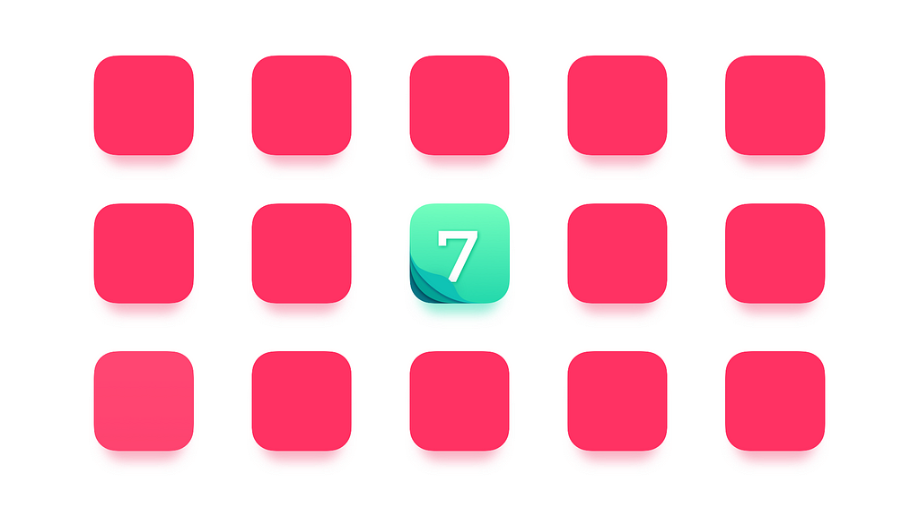
Testing recognizability:
When I try to be sure that my design will be recognizable I do a simple test, you can also try to do it:
First, Layout App Icons of the same category apps in the grid (it may be 5×5). Then, Place your icon in this grid somewhere. Next, show your icon to a few people. Next day, show them the grid with icons and ask them to find your icon.
Improving recognizability:
Recognizability helps to stand-out from the crowd, which is the first step to download or launch our solution. Finally, this factor leads us to memorability which is the next important thing.

App Icons are the doors to your apps. Sometimes, a user to visit them for the first time need some kind of assistance, but in time they should remember where to go and what “doors” open particular solution.
Testing memorability:
To test if my icon is easy to remember, I do a simple test that is quite similar to the one from the previous point. If you would like to do it follow these steps:
Show your icon to a few people. Next day, ask them to describe or to sketch mentioned design.
Improving memorability:
Memorable designs are hard to achieve. However, when we speak of App Icons it is one of the most important things to achieve.
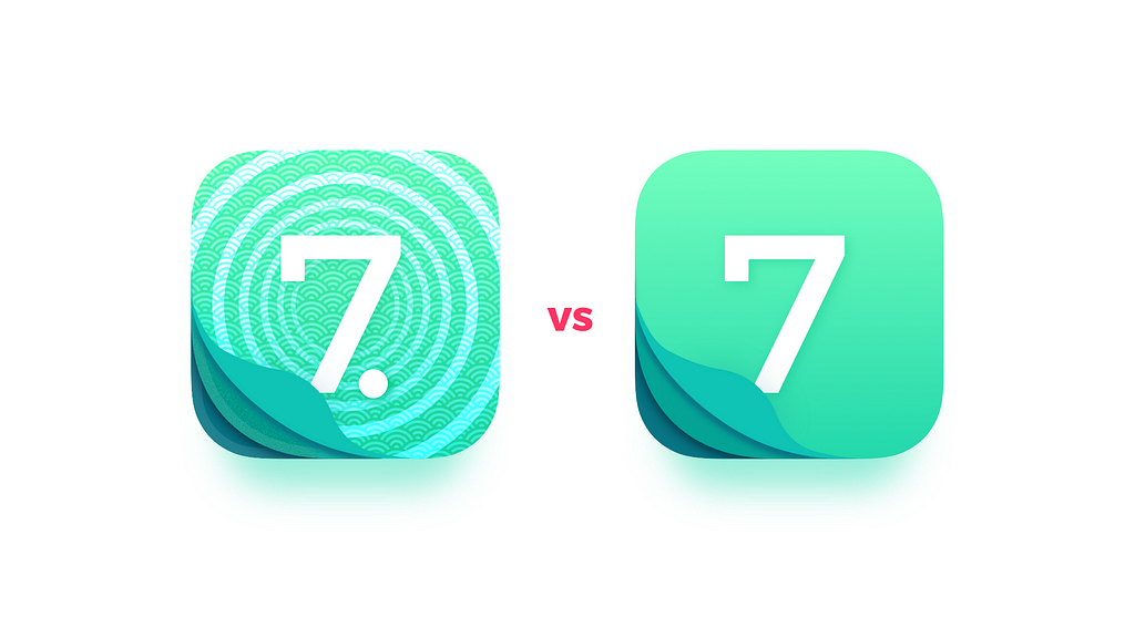
Simplicity seems to be buzzword nowadays. However, if you have in mind previous point you must know that the right balance of complexity may have the significant impact on your app success.
Testing simplicity
I have always repeated that good symbol should be as simple as the even 5-year-old child could draw it in a couple of seconds.
If you have kids show them your design. When they become familiar with it hide the icon and ask them to draw the symbol. If they have remembered all elements it is a good sign. If you do not have kids, you can as other people to do it, but give them only 30 seconds for sketching.
Improving simplicity
True simplicity may lead your design to great aesthetic values. However, you have to remember — simple does not mean primitive.
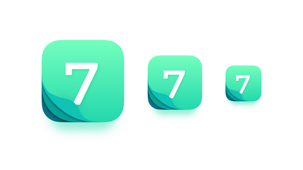
We work mostly in vector design tools. However, App Icon assets for multiple platforms are still raster graphics formats. Well, designed App Icons are the set of assets that look good in every required size.
Testing multiple sizes
To test if your design looks good, forget for a while about full-size artboard. It is perfect if your App Icon Template support preview of the icon in multiple sizes (note: every Sketch Template in THE ICONIC — App Icon Compendium contains all required previews).
Take a look at various instances of App Icon in your App Icon Template file. If you can use Sketch Mirror or upload the set of icons in various sizes into the device you design for it would be even better.
Improving appearance in multiple sizes
The App Icons purpose is to visually communicate with users. It should communicate the values of the solution. This is why the consistency of the design with app’s UI design and the company’s brand guide should be maintained.
Thanks to this your solution is building coherent experience. If you will try to be too original you may confuse users.
Testing consistency:
Like in the other test we need to ask some friends to help us:
Show your icon to a few people, then show them the app design (or website design). Show 2 or 3 more solutions (icons and apps). Ask match the icons with the solutions.
Improving consistency
Consistency is a key to user comfort. In the end, it makes icon easier to recognize and remember.
Every OS has its own principles. Following them while creating App Icons gives a sense of assets better quality. People quickly recognize things that do not match the environment, these elements make them feel uncomfortable. This is why it is important to follow guidelines if you would like to build good user experience.
Testing guidelines compliance:
It is hard to remember all of the points from every platform guidelines. This is why I have created a checklist of every element I should follow when I design an icon.
Use the checklist from THE ICONIC — App Icon Compendium, or visit every needed website with platform-specific guidelines and follow every point.
Improving platform guidelines compliance
Following platform guidelines may be tricky when it comes the recognizability or uniqueness of the icon. However, the best design shows us that it can be achieved.
When you design User Interface an app you have full control over the screen or canvas of the device. App Icon designers craft is hard because they have no such control. The icon will be displayed on multiple background wallpapers.
You should prepare your design to be displayed in the changeable environment.
Testing Icon with Multiple Backgrounds
To perform the test do following things:
Gather multiple backgrounds and prepare the file where the App Icon will be displayed on them to validate its appearance.
You can also use App Icon Validator file for Sketch (which is the part of THE ICONIC — App Icon Compendium). It contains background color schemes from most popular OS Wallpapers, so you can be more sure about your asset.
Improving appearance on multiple backgrounds
Meet THE ICONIC — App Icon Compendium
These 7 important points are the key to better UX of App Icons. However, when you design App Icons there are much more things to remember about — this is why I have created mentioned earlier tool: THE ICONIC — App Icon Compendium. It contains App Icon Templates for Sketch with multiple icon size preview, a special Quality Checklist with over 60 points, Icon Validator Sketch file to test asset with dozens of backgrounds and some more features.
2 more things on THE ICONIC
THE ICONIC – App Icon Compendium | UXMISFIT.COM
I hope this article will help you to create better App Icons!
If you liked the story, do not forget to 👏 👏 👏.
—
Thalion is a Designer, Team Leader, and Design Toolmaker. He runs the platform with time-saving design toolkits and articles with the different look at UX topics called UXMisfit.com.
7 Handy Tips for Better App Icon Design was originally published in Design + Sketch on Medium, where people are continuing the conversation by highlighting and responding to this story.
AI-driven updates, curated by humans and hand-edited for the Prototypr community


