When there are multiple actions a user can take on a page, it’s easy to fall into the trap of designing those actions based purely on semantics.
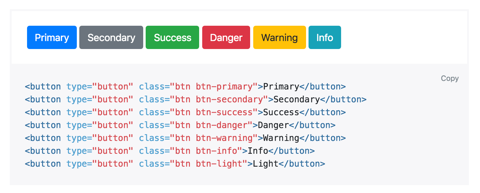
Frameworks like Bootstrap sort of encourage this by giving you a menu of semantic styles to choose from whenever you’re adding a new button:
“Is this a positive action? Make the button green.”
“Does this delete data? Make the button red.”
Semantics are an important part of button design, but there’s a more important dimension that’s commonly forgotten: hierarchy.
Every action on a page sits somewhere in a pyramid of importance. Most pages only have one true primary action, a couple of less important secondary actions, and a few seldom used tertiary actions.
When designing these actions, it’s important to communicate their place in the hierarchy.
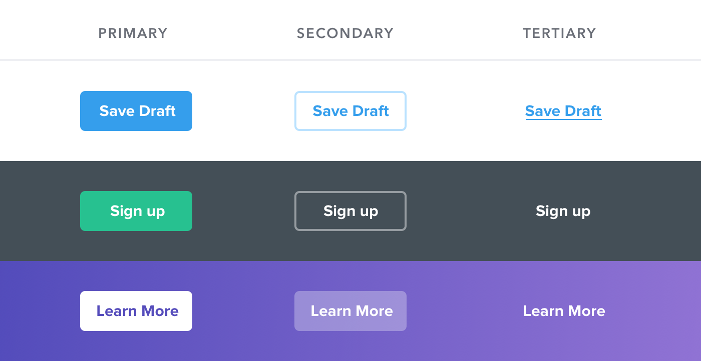
- Primary actions should be obvious. Solid, high contrast background colors work great here.
- Secondary actions should be clear but not prominent. Outline styles or lower contrast background colors are great options.
- Tertiary actions should be discoverable but unobtrusive. Styling these actions like links is usually the best approach.
“What about destructive actions, shouldn’t they always be red?”
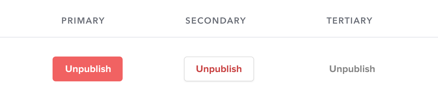
Not necessarily! If the destructive action isn’t the primary action on the page, it might be better to give it a secondary or tertiary button treatment.
Save the big, red, and bold styling for when that negative action actually is the primary action in the interface, like in a confirmation dialog: