Build Design Systems With Penpot Components
Jul 21, 2:15 AM
Penpot's new component system for building scalable design systems, emphasizing designer-developer collaboration.
smashingmagazine.com

uxdesign.cc – User Experience Design — Medium | Elaine Tran
I checked the time about 3 times today. First at 12:31pm to see how long the Monday meeting would last, the second time around 4:43pm (realizing that I normally take my break a lot earlier but I wanted to keep working), and the end of the day at 5:20pm. By then I compiled a bunch of sketches, got valuable feedback, completed both the low and high fidelity design, all of which was ready to be tested.
Ironically, I was told at the end of the day that the task got deprioritized and there it goes again — to the Backlog. I’ve learned early in my career as a User Experience Designer that not all of your designs live on and that’s okay (I have even created a folder for ‘failed’ designs during my first week!). Fail fast, fail early -right?
The process of diving deeper to really understand a user’s pain, thinking of solutions for what would make actions easier for our users and why -was ultimately very rewarding to me. Today, I caught myself in a state of Flow.
Mihaly Csíkszentmihályi’s concept of Flow in the Learning Theory is described as a “mental state of complete absorption in the current experience.”
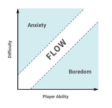
Flow occurs when there is a balance between how challenging a task is (Difficulty) and a person’s level of skill at the given task (Player Ability). A task that’s too difficult would lead to heighten anxiety/frustration while a task that’s too easy would lead to boredom.
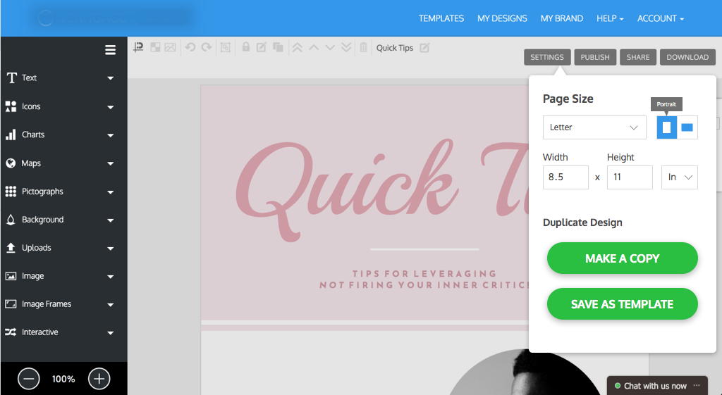
Example Task: Redesign ‘Page Settings’ modal to make it easier for users to change the page size of their design.
Make use of the people on your team who have direct contact with your users on a day-to-day basis. The sooner you do this the quicker you’ll realize how valuable this interaction is when it comes to understanding the people you are designing for.
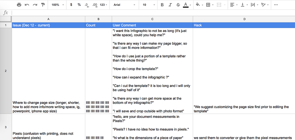
I used HelpScout, a help desk software to filter transcripts that users have had with our customer success team. We tagged these chat conversations by specific categories such as “page size ease of use”, “editor ease of use”, “feature requests” etc…
Before I jump into any design work, I want to first learn how users currently go about changing page size and if they are successful in doing so. I did my detective work and went through 4 pages of chats (over 100 transcripts) under the “page size ease of use” tag to understand a user’s pain through their perspective.
From these transcripts, I noticed trends which helped to categorize the issues on a spreadsheet. It was clear from here what the main issues were.
 Google Spreadsheet
Issues (related to the first iteration):
Takeaways:
From these findings, I came up with 3 end goals that I would target for the first iteration.
End Goals:
What would actually help your users get what they need done? Now that you have specific goals backed by user data, it’s time to think from your users’ perspective in order to derive possible solutions.
“If you want to put yourself in their shoes, you need to write a story from their side” (Nir Eyal, 2013).
At what point do your users interact with this feature? Why do they need to do this? What are they trying to get done? What’s stopping them — what are their pain points? (Hint: You should already know these from your user research in Step 1!)
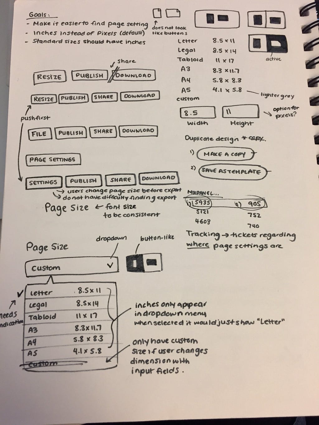 Page Setting Sketches
What are some things you missed out on? How can you account for these?
Several points came up when I went to coworkers for design feedback. I was asked about the option to change ‘inches’ to ‘pixels’ for current users who may be used to our pixel format. This may come up later as an issue with backwards compatibility since templates created prior to these changes are in pixels.
After the research component, sketching is where your solutions come to life. Your sketches are your blueprint, your essay outline, your user flow. If you make mistakes, make them here. It needs to make sense on paper and to other people on your team before any styling happens.
I used Sketch app for Mac, and the Craft to Invision plugin to create my Hi-Fi prototype. It was ready to be tested by real users.
I used usertesting.co, a usability test platform where users can test your designs from around the world. Use whichever platform works for you, I’ve used Usability Hub in the past.
My rule of thumb is to have a minimum of 5 users testing your design, if you can get in-person focus groups — that’s even better. It only takes a few people to poke holes in your design and for you to know if it’s a viable solution.
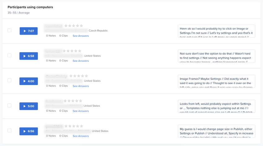 Usertesting Summary
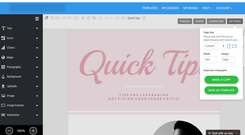 Current Design
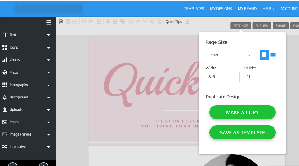 Proposed Design Solution
User testing is how you can fast track your designs rather than waiting to see after production if it worked.
Takeaways:
 Changes made after running it on Usertesting
Design Iterations:
The key to achieving Flow in UX is to challenge yourself to solve real problems, set clear goals and allow yourself to become fully immersed into the process of design.
Thanks for reading! If you are interested in chatting, drop me a message at [email protected] or connect with me on LinkedIn.
[This article is brought to you by Elaine’s subway outlines.]
References:
7 steps to achieving flow in UX design was originally published in UX Collective on Medium, where people are continuing the conversation by highlighting and responding to this story.
AI-driven updates, curated by humans and hand-edited for the Prototypr community


