
Build Design Systems With Penpot Components
Jul 21, 2:15 AM
Penpot's new component system for building scalable design systems, emphasizing designer-developer collaboration.
smashingmagazine.com

medium bookmark / Raindrop.io |

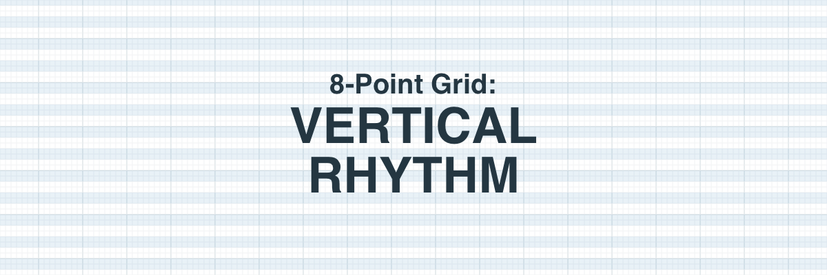
The 8-point grid is a powerful system for creating consistent and visually appealing user interfaces (UIs). This post is about how to establish vertical rhythm and set typography in an 8pt grid system. To get caught up, check out The Intro to 8-Point Grid Systems and get tricky with 8-Point Grid: Borders and Layouts.
Rhythm is achieved when the elements of your design are organized into repeatable patterns. This allows your final design to look deliberate, professional, and consistent.

Applying that repetitive spacing to our designs creates a familiar and predictable experience. Zell Liew’s article about why vertical rhythm is so important describes this excellently.
“Repetition breeds familiarity. It has the ability to make things feel as if they belong together. It gives the feeling that someone has thought it all out, like it’s part of the plan.”
You’ll often hear the term baseline grid thrown around in relation to achieving vertical rhythm. A baseline grid allows us to track the vertical distances between type and other objects in a design, and I highly recommend using one to achieve a consistent vertical rhythm. However, remember that native mobile experiences and web browsers measure typography in slightly different ways. This can lead to some confusion for designers and developers depending on the design tools and platform.
The baseline is where the letters rest. This is a common term in print design and many classic design programs are tailored for it. Native application experiences are generally built off of the baseline.
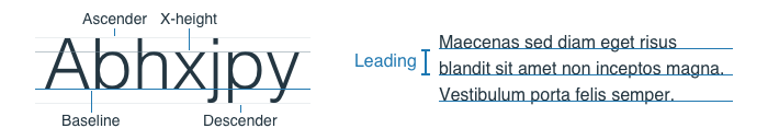
The measurement of space from baseline to baseline in a body of text is called leading. Many design programs will have this as a setting for your typography (Photoshop, Illustrator, InDesign).
The line height is the bounding box created around your text on the web or in design programs like Sketch or Figma. In CSS the line-height property can be given a pixel size, ratio, or a percentage.
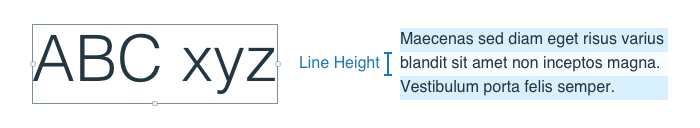
In the example above, the right paragraph has a font-size of 16px and the line-height value could be written as 24px, 1.5, or 150% in CSS.
We’ve established that native and web environments are going to measure typography differently and some folks will have opinions about which way is the right way. Both are valid for their own reasons. There are three approaches from here:

This is a decision you’ll need to make for your company and/or product based on your constraints and goals. The scale of your web experiences vs. the scale of your native experiences, the number of contributors, and core competencies of the team should be factored into this decision. The larger the team size, the harder it is to pass specific context and follow rules.
How can you reduce the number of decisions your team has to make?
Keep in mind that a consistent system for thinking about typography measurements will always be better than none. You can always iterate on the system but wrangling one-off decisions will be costly.
“Achieving consistent vertical rhythm is the most important part of the design” — Joel Beukelman
Using the 8pt grid to space the height of your elements into consistent patterns is a great place to start creating vertical rhythm. Anthony Collurafici’s original post about 8-point soft grids does a really good job of explaining a system of laying out blocks of content in Sketch. He also points out the Google Material Metrics & Keylines docs has some great visual examples.

Image From Material Metrics & Keylines
One common question I get relating to 8pt grid is how I setup my grids in Sketch or Illustrator. Truth is, I don’t usually use those features when I’m laying out my UI elements. I’m generally a fan of soft grid layouts and respecting the code as a source of truth. I will use spacing elements in my files to help layout a baseline grid but I generally just measure element to element. I use the 8pt grid as a relative spacial system, not a strict grid.
These are some of the articles and resources that helped me answer a few tough questions.
Thanks for reading, if you have any other links or tips on how you create and maintain a vertical rhythm, share them in a response or hit me up on Twitter.

Change is the only constant, so individuals, institutions, and businesses must be Built to Adapt. At Pivotal, we believe change should be expected, embraced and incorporated continuously through development and innovation, because good software is never finished.
AI-driven updates, curated by humans and hand-edited for the Prototypr community


