Build Design Systems With Penpot Components
Jul 21, 2:15 AM
Penpot's new component system for building scalable design systems, emphasizing designer-developer collaboration.
smashingmagazine.com

uxdesign.cc – User Experience Design — Medium | Kevin Wu
The work in this article is a joint effort between Kevin Wu and Rodney Edwards. Fascinated by the benefits of meditation and mindfulness, we conducted several design studies over a 4 week period. These studies uncovered large gaps within the premise regarding immersion, habit building, and positive feedback loops. The following article delineates our process and proposed solutions from the findings.
Disclaimer: we are not affiliated with Headspace in any way, just two designers working on a passion project.
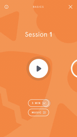
 Image credit: Headspace
Headspace is a guided meditation application that is dedicated to improving the health and happiness of people all over the world. These guided sessions, led by the Narrator, Andy, span across a vast number of topic “Packs,” ranging from Health, Happiness, Sports, and Work.
Check out their site here: https://www.headspace.com
Despite having no prior knowledge with meditation techniques, or even the general practice, we were immediately captivated by Headspace’s vision and the benefits that could be achieved by taking 10 minutes a day to meditate.
We wanted the opportunity to flex our design muscles in a live project — a challenge for us to potentially identify hidden-gems that those at Headspace, or other designers, might find beneficial.
Thus, we set our goals to develop one implementable feature that followed (to the best of our ability) Headspace’s existing brand assets and ecosystem.
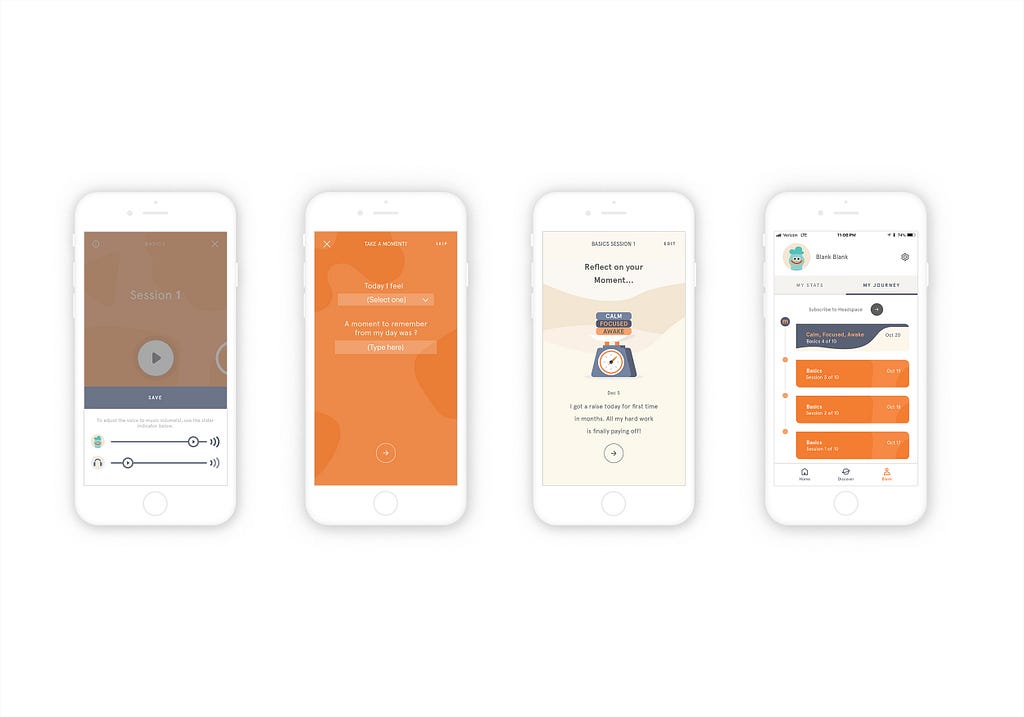 Glam shot!
Our solution, “Taking a Moment,” provides a quick self-reflection on your current state-of-mind while tracking the evolution of your emotional state.
We focused on understanding the 10-day trial to give us a breadth of users to interview.
For our project, we prioritized conversion rate and retention rate as our key metrics to optimize for as we assume they correlate most with Headspace’s bottom line.
We generated 3 primary problem statements that informed our research approach.
Because a new user’s perception of an experience is quite capricious in nature, we determined that a diary study spanning the duration of the 10-day trial, with follow up interviews, would best fit our needs.
Capturing how perception evolved over time served as great feedback to answer our original problem statements.
Other important factors for the study included the participants’ position, setting, and distraction levels.
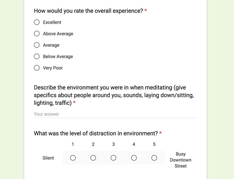 Sample questions of from our Diary Study
Our study revealed some big insights into how each participant’s perception of the 10-day trial experience had developed over time. The study was conducted with 7 participants each with little-to-no experience with meditation and guided meditation.
We placed heavy importance on completing one session per-day, but if a session was missed the participant could substitute a diary entry explaining the rationale for skipping.
This information provided a lens into major friction points within the application’s feedback loop.
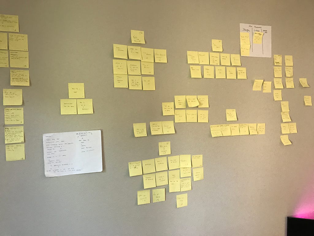
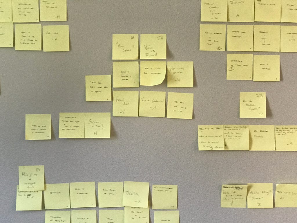
 Affinity mapping exercise
Many participants felt like it was necessary to meditate in the exact same location, light candles, dim the lights, or play soft music to be fully immersed.
56% of the 26 diary entries ranked the session at an “Average” rating over the duration of the study. Our follow up interviews revealed that participants felt that instances within the sessions were polarizing: equal parts distracting and equal parts immersive. These moments were mostly filled with a disconnect with the Narrator’s voice, or when the Narrator broke immersion by interjecting with a jarring statement when the user was already focused.
Almost every participant praised the positive effects the session had on their overall psyche. However, those effects were incredibly fleeting — participants felt a sense of regression by the next day.
Participants expected the process to be personalized to their own experience, but they were let down when they realized that “their” journey was actually a boiler-plate generic path.
By day 4, participants began to indicate difficulty staying on schedule. Often times participants would rather continue working, watching tv, or simply do nothing over starting the session.
It was interesting to see how effective taking 10-minutes a day to meditate was in improving an individual’s mood/feeling for others as well. Yet, despite the clear benefits, participants still showed a clear difficulty with consistency. Our hypothesis was that participants placed unrealistic expectations on how quickly they should “feel” the long term benefits of meditation.
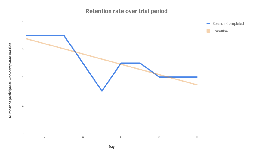 Total of 7 participants — individuals began dropping off by day 4 of the study
“I missed the session for the given date. I had completely forgotten to perform a session and instead spent the evening working on my homework assignments”
A study found that forming new habits take an average of 66 days, the real range being anywhere between 18 and 254 days.
This information begged the question:
How might we reinforce the long-term benefits of meditation?
We kicked off brainstorming by framing the discussions around 4 major design challenges:
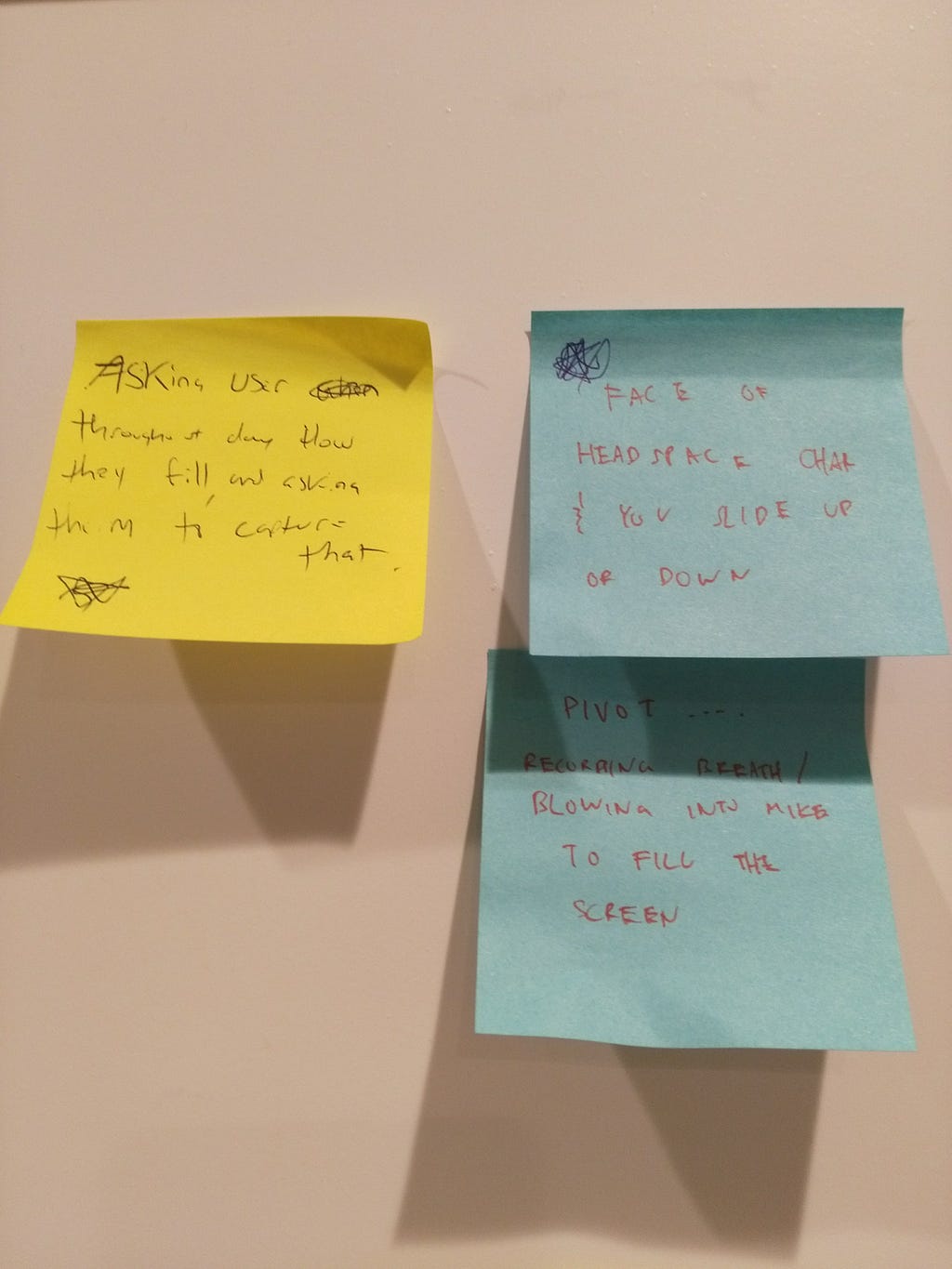
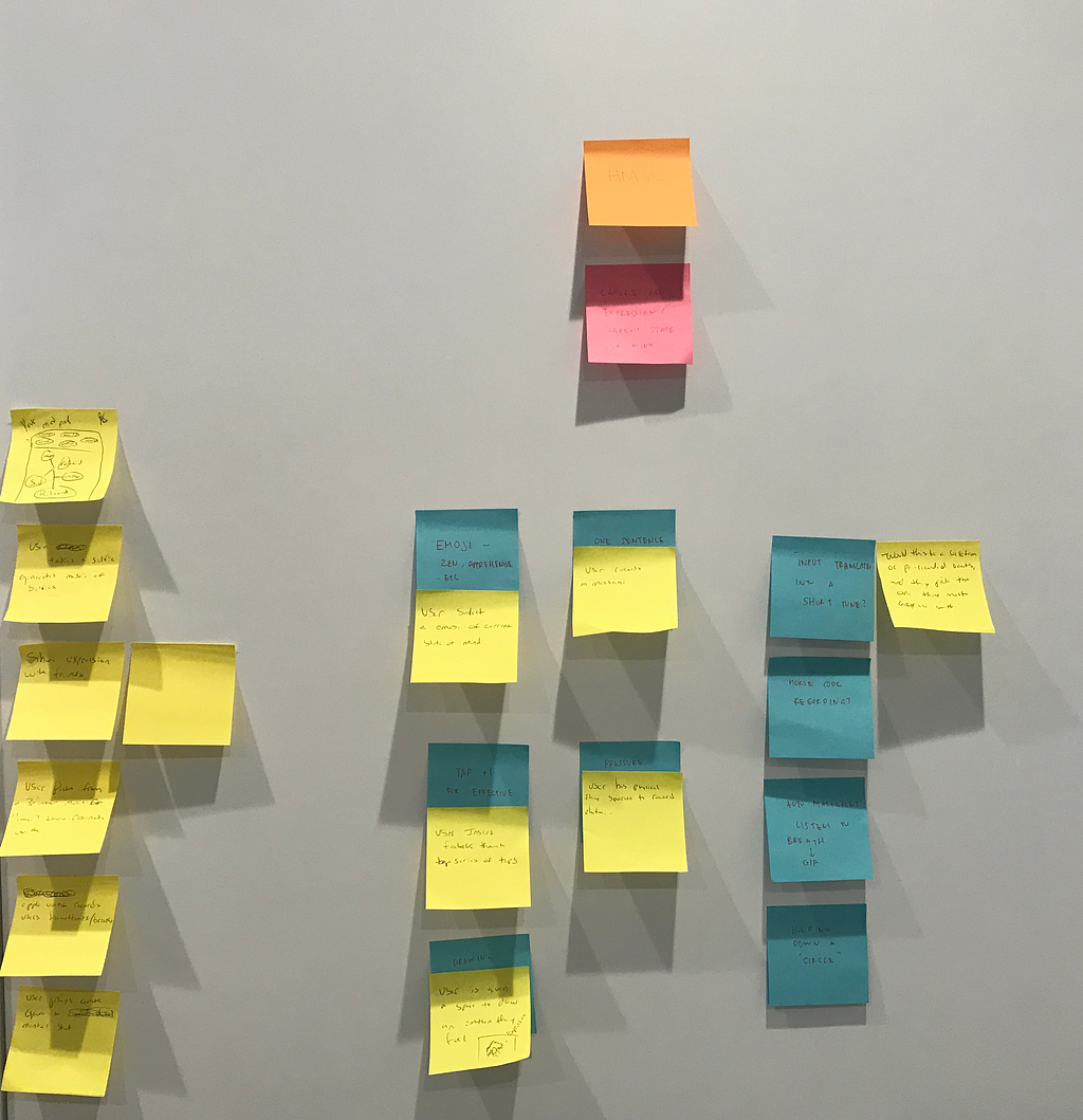
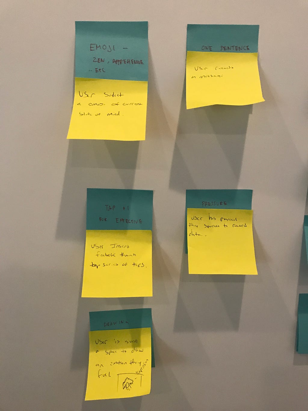 Example of brainstorming
Our ideation session resulted in a myriad of ideas: from chatbot, buddy systems, audio-centric experiences, to mood-based experiences and optimized push notifications. After much deliberation, our priorities naturally revealed themselves as we had a predilection for ideas that centered around habit building and ideas that could potentially improve a user’s focus during the session.
We found that supporting functionality, such as “My Journey,” appeared to be a place for users to revisit their session in the context it was completed in — a place to track and monitor progress. The existing experience however, felt rather disconnecting. It seemed to serve as merely a log, rather than an indicator of true progression, and the cherry picked quote from their session some days/weeks/months ago did not seem to resonate with users beyond the initial day.
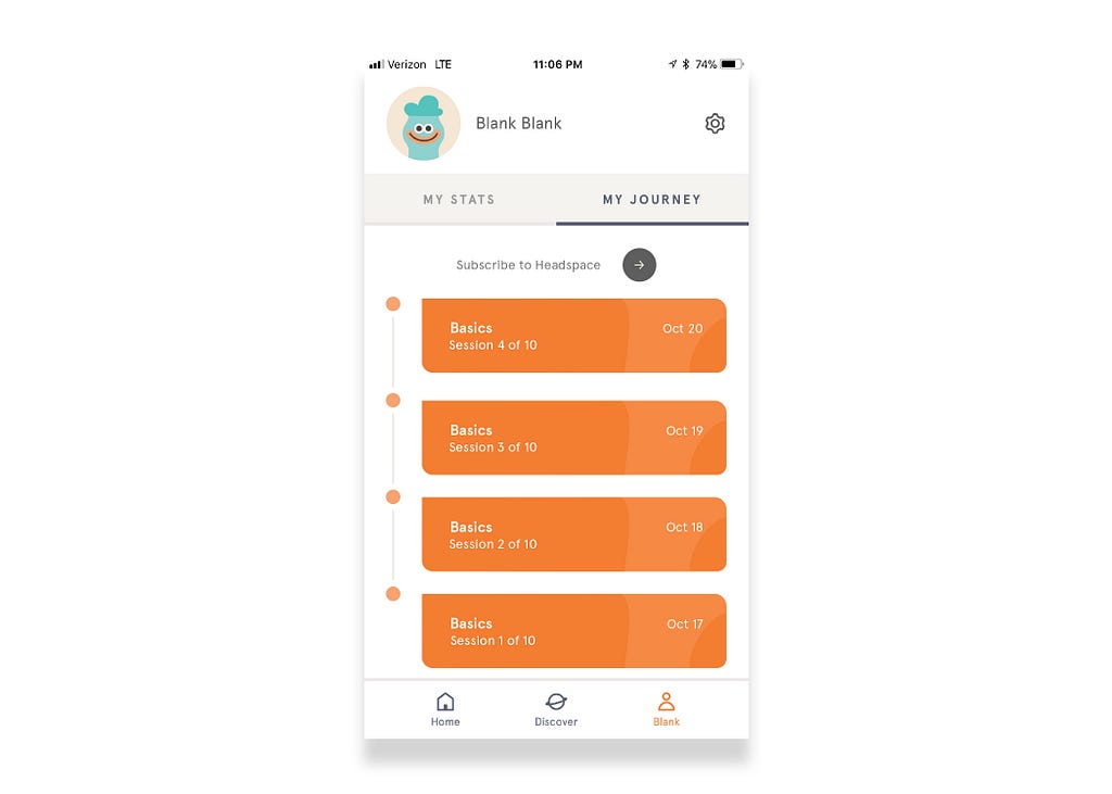 Example of Default Journey
This provided enough ammunition to catalyze our version of a more immersive, personal experience — a journey that truly felt like your own.
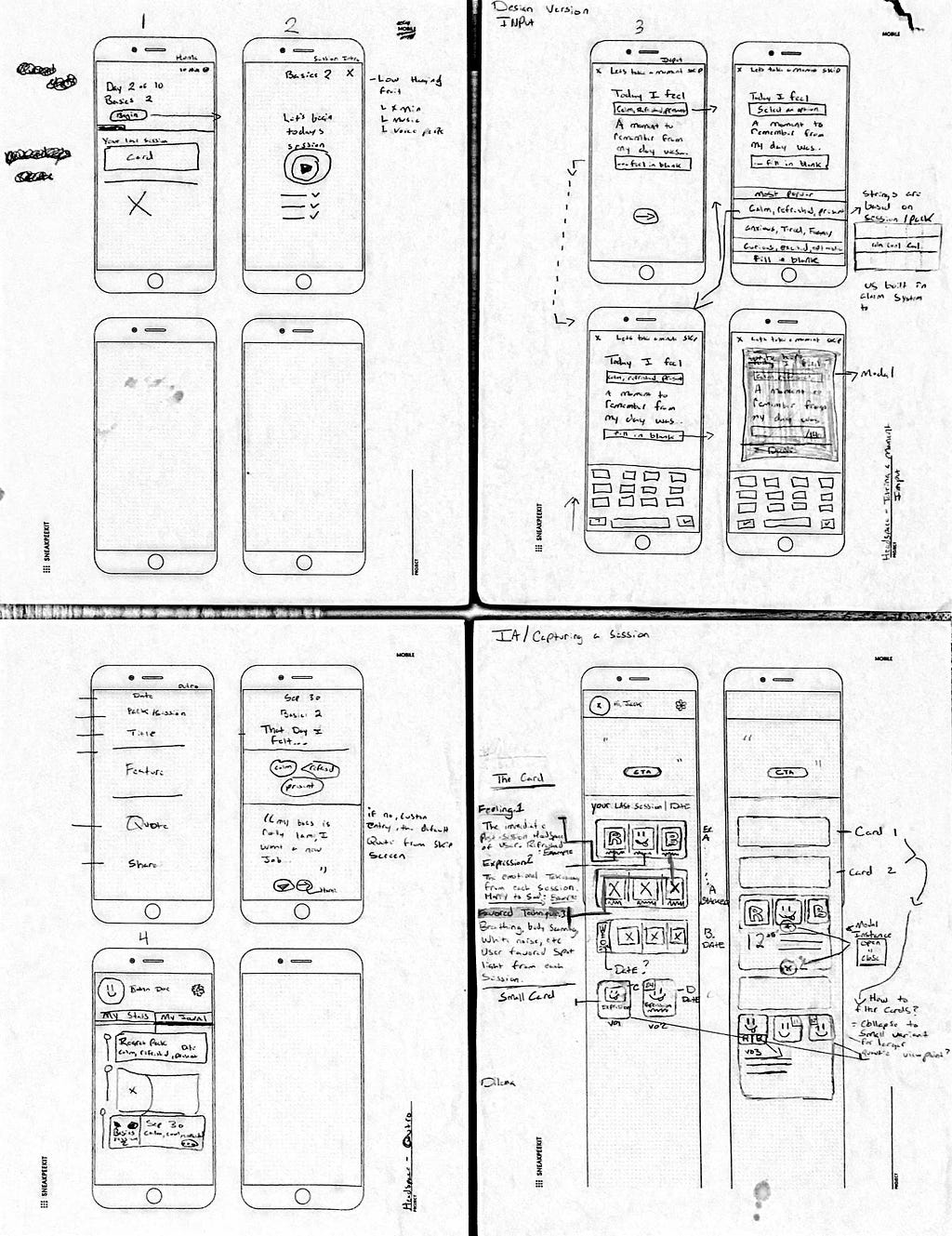 Examples of early stage wireframes
Currently before the end of every session, the narrator (Andy) highlights the importance of reflection in meditation and requests that the user examines how they feel.
This sparked our curiosity. If reflection is such an integral part to meditation and the individual’s growth, why is there no place to document it for posterity? Our hypothesis was that by physically capturing the user’s current state-of-mind, coupled with the ability to revisit it any amount of time later via “My Journey,” users would be further inspired and motivated by the benefits of meditation. Those feelings of clarity and calmness that were previously fleeting, would now be inscribed within the application indefinitely.
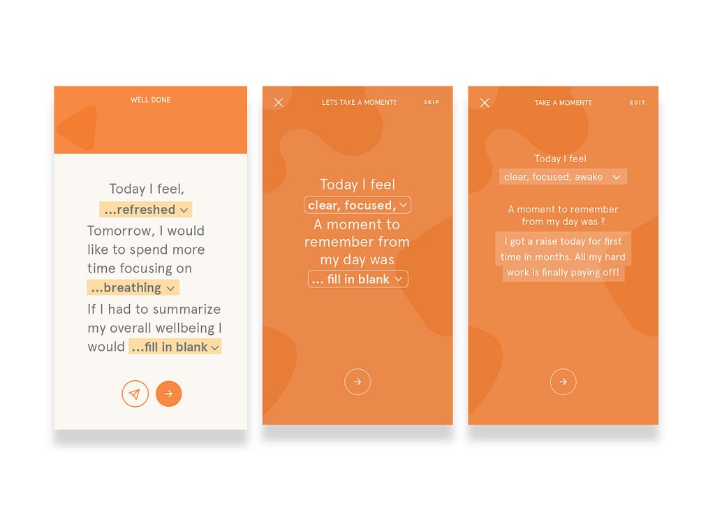
The days are long, but the years are short. “Taking a Moment” guides you through examining your state-of-mind, while providing a deeper lens into your growth and mindfulness journey.
Feature 1–4, reads left to right
Integrate your own music, or leverage Headspace curated pack basic music to further immerse your experience.
Taking a Moment elicits your state-of-mind through a curated string of words that are relevant to the pack you chose.
Take pleasure in capturing all the good that’s happening each day in a quick, concise sentence.
See the evolution of your journey by reliving your best moments over and over again.
It felt natural to insert “Taking a Moment” at the end of a session, and right before the current “Well Done” screen, which provides a quote relevant to the session and some personalized statistics.
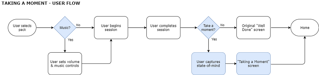 User flow with insertions in blue
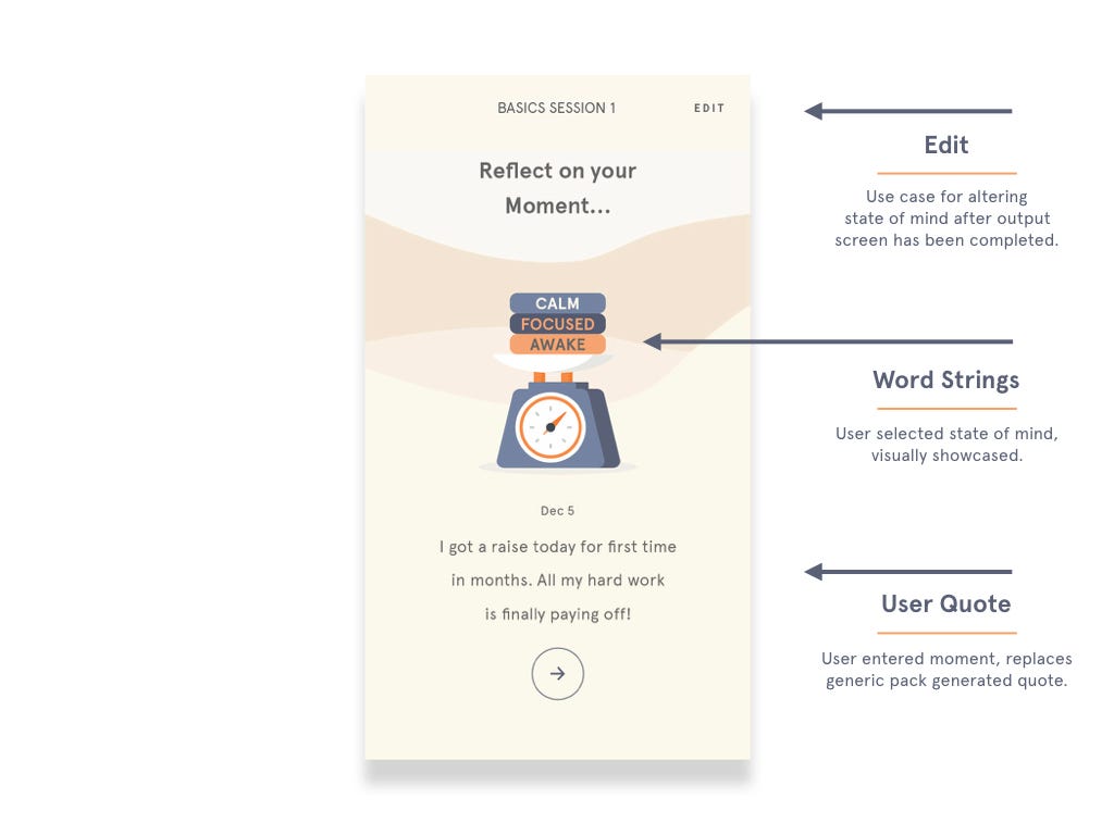
A critical part of reflection lies in evoking the proper set of emotions from the individual. In order to do so, we had to carefully pose the question in the right way. We favored copy that felt simple and unrestrictive, eventually landing on two questions:
This phrase was concise, yet broad enough for our needs. A simple question that engages the user to enough begin the self-reflection process.
 Evolution of the input screen (V1 left, Final right)
The answer choices provide word strings that subsume a set of related emotions. To accommodate for the range of emotions a user might feel, we decided that three word strings would provide enough flexibility and better representation. Despite our research only focusing on the 10-day trial, we felt that word strings should be related to the selected packs from the subscription model(Regret, Focus, Etc), that way we could better predict how a user feels at the end of a session.
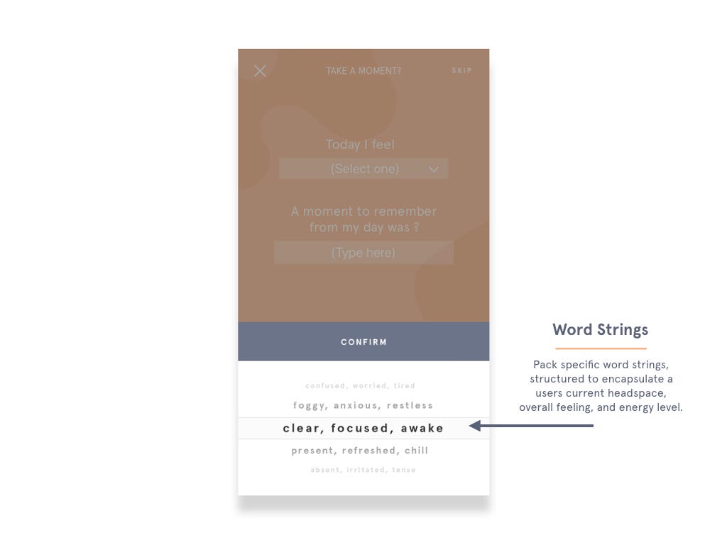 Contextualized word strings based on the pack
Drawing inspiration from the hedonic treadmill and the one sentence happiness journal, a user could input a quick sentence documenting a delightful moment from their day. By doing this repeatedly and demanding a focus on the good, this would slowly become a prodigious record that the user can enjoy at a later point.
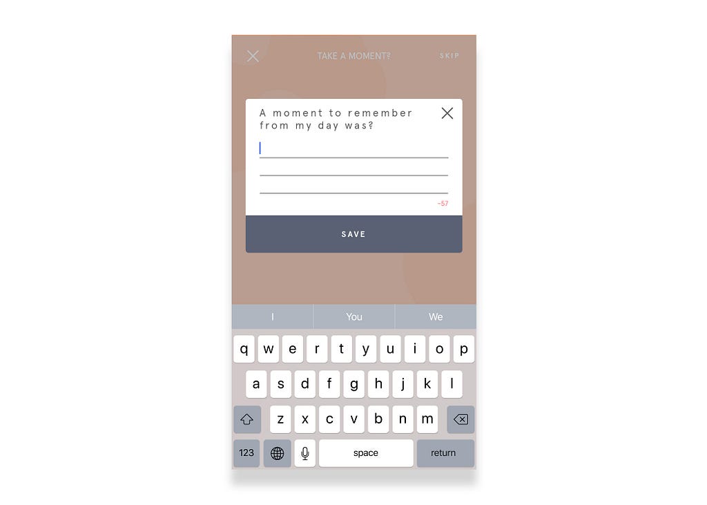 “A moment to remember” modal screen
Similar to the existing “Well Done” screen, we wanted to summarize and contextualize the end of the session while providing positive reinforcement for the user.
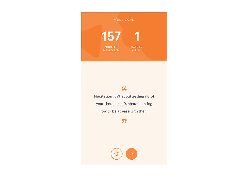 Current “Well Done” screen after session completion
The existing screen was competing for real estate with our feature. Discussion around whether to sunset the original quote was a long and tortuous process. In our follow up interviews with the participants, we had received positive feedback regarding the quote at the time of completion. However, our data showed that users’ feeling towards older session quotes did not resonate with them to the same degree, as they had somewhat forgotten the lessons learned.
These insights were enough signal to go ahead with our design decision to replace the quote.
 Final version of the output screen
In order to illustrate the level of intimacy and personalization we were aiming for within the app, we redesigned the current card within “My Journey” to include a sample of the word strings previously chosen.
We drew inspiration from corner flip-book comics. The vision was to have users similarly scroll (or flip!) through the timeline and observe how their own behavior and attitudes have shaped over time.
This led to challenges around fitting enough context in each card, and what we should emphasize, without overloading and congesting the limited real estate. In the end, propagating and highlighting each word chosen in the string felt the most important and would resonate the most with the user on a passing glance.
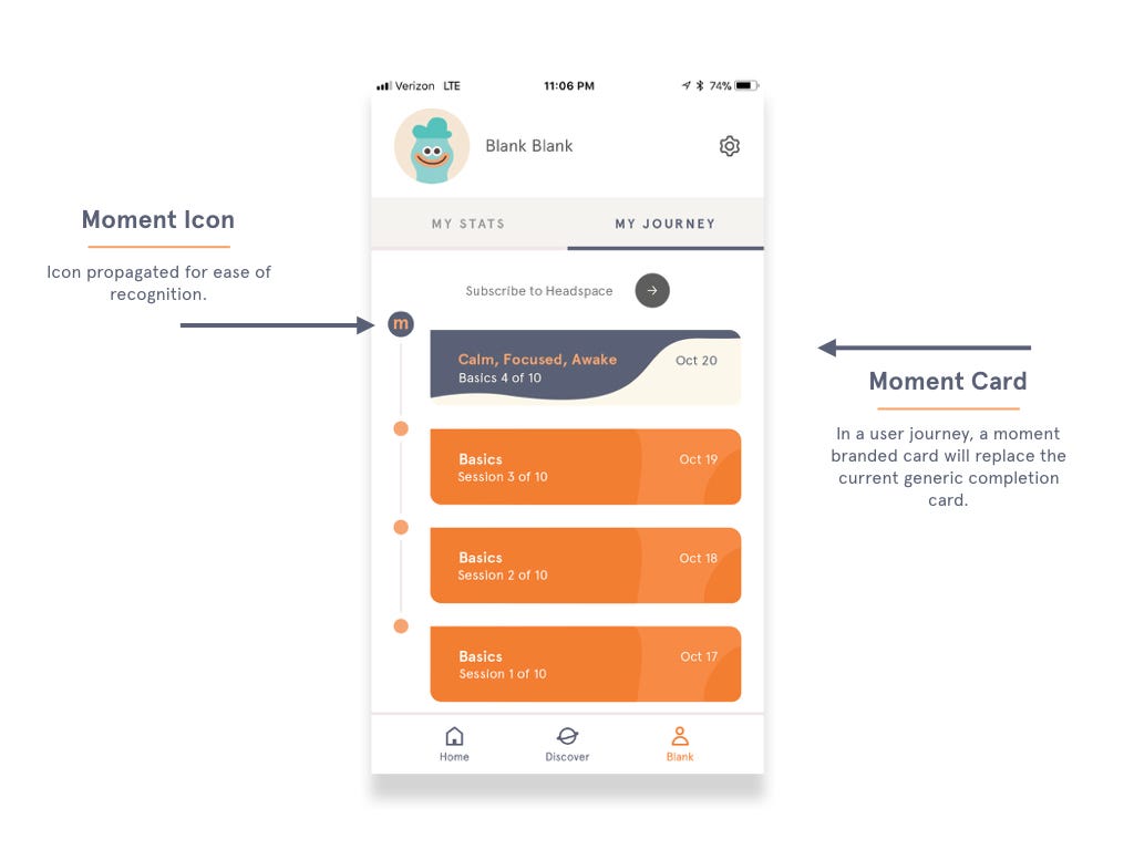 “My Journey” section with the new moment card
This feature was born of the importance we placed on having an additional feedback loop of reminders of previous moments. Since the “Home” screen is the first viewport for the user, we believed that a having a quick overview of a previous moment would provide positive reinforcement.
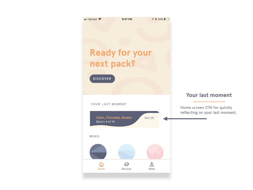 Moment card as the star of the existing “Home” page
Our data revealed the importance of music and mood were in achieving an immersive state. Headspace can leverage their recent partnership with Spotify for ambient sounds, or create custom ones similar to the Sound: Sleep singles.
The inclusion of the sliders were aimed to solve for jarring interruptions during the session breaks. Users can tweek the volume of both the Narrator’s voice and music to a balance of their liking.
 Two sliders for maximum flexibility: controlling both narrator and music volume
Due to the natural constraints we placed at the outset of the project, we de-prioritized a set of tasks to meet our deadline.
If we had more time, we would have:
Thanks for reading! Feel free to visit our websites below to learn more:
–Kevin Wu and Rodney Edwards.
A feature proposal to Headspace was originally published in UX Design Collective on Medium, where people are continuing the conversation by highlighting and responding to this story.
AI-driven updates, curated by humans and hand-edited for the Prototypr community


