Build Design Systems With Penpot Components
Jul 21, 2:15 AM
Penpot's new component system for building scalable design systems, emphasizing designer-developer collaboration.
smashingmagazine.com

UX Planet — Medium | Motaz Al-Thaher
 Sketching and Exploration
Propose variations for A/B & multivariate testing in order to optimise the conversion rate of the Sony PlayStation Store. The design variations were done with keeping the UX process and UX principles in mind and approaching the design variations from a user-centric perspective.
Sketch, Principle, Juxtapose JS, my trusty sketchbook and a lot of Post-Its
This case study is not a concept redesign on its own, it is mainly focussed on heuristically tweaking certain areas on both the PS Store page and the main PlayStation page, in an effort to improve metrics such as the conversion rate.
Throughout this fun engagement, I had to act as both an empathetic problem solver and a gamer to be able to formulate suggestions without having access to metrics.
There are specific elements I will focus on throughout the case study, in the following order:
For this study, I focussed on the PlayStation landing page, the PlayStation Store landing page and the Playstation Store product page.
Let’s take a look at what areas of the PlayStation Landing Page and the PlayStation Store Pages we can potentially improve through testing:

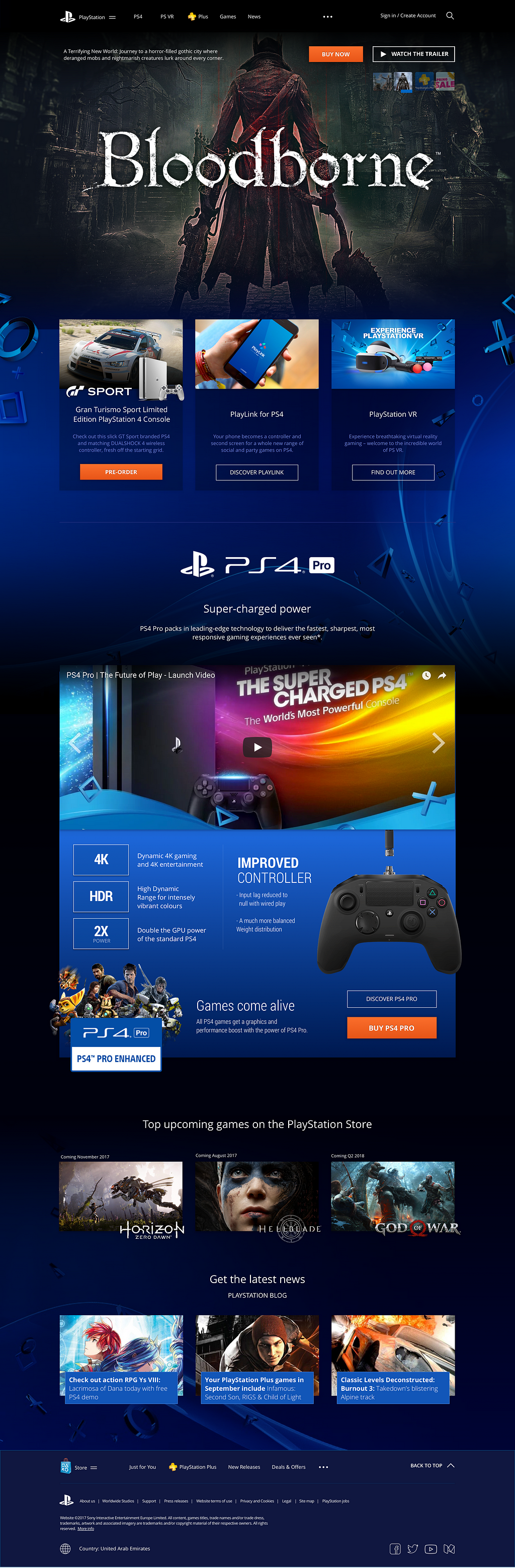
On the landing page of the PlayStation website, the hierarchy of the Calls to Action could use a bit of improvement.
Things like “Join Today” Pre-Order” and “Get Started” need a bit more weight; but here is the thing, more weight doesn’t mean we need to make them more prominent by changing the strength of their appearance. Users’ attention when browsing the web is very short and all these elements are competing for real estate, taking away prominence from other elements. Equalising the visual hierarchy is therefore an item I’d like to test out.

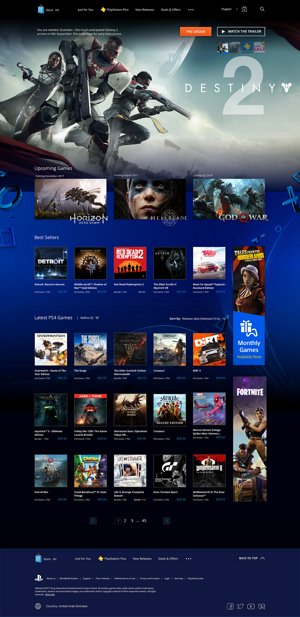
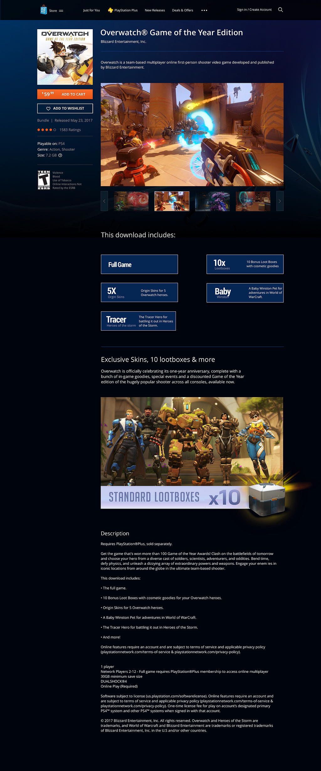
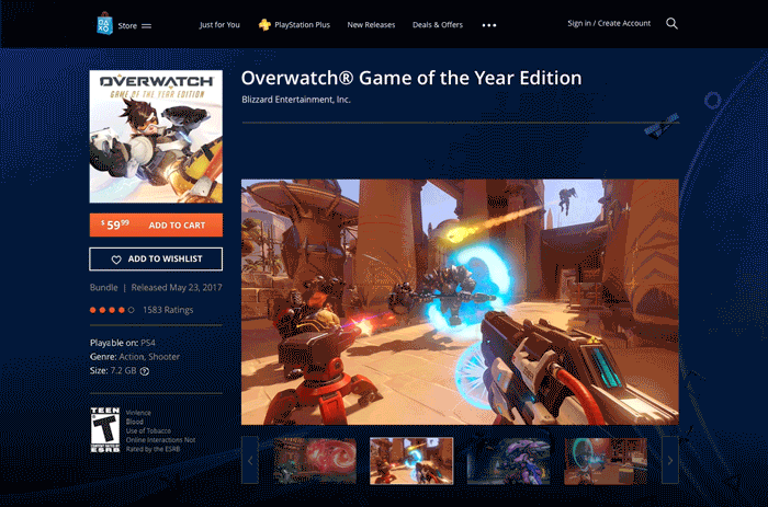
This card is performing its function, it has all the information (Name, Platform, Category and Price, Add to Cart), though the CTA could be more prominent.
However, The add to wishlist icon (heart) isn’t something you’d need to do at this stage, looking at various games at the same time and adding a few to wish list is a functionality known for products like Pinterest, but for this one, gamers, as user interviews indicated, would most likely interact with an item from its own page.
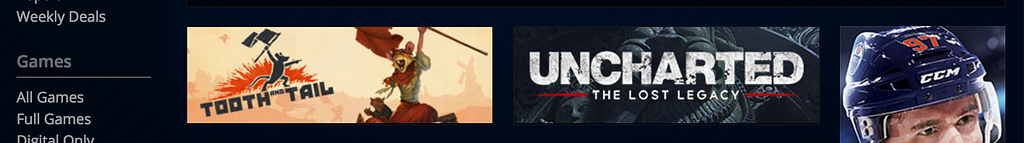
This part isn’t performing its function. This area is consuming valuable real estate, it shows what seems to be a featured game image, but what are these games? This area can be utilised a bit more efficiently.
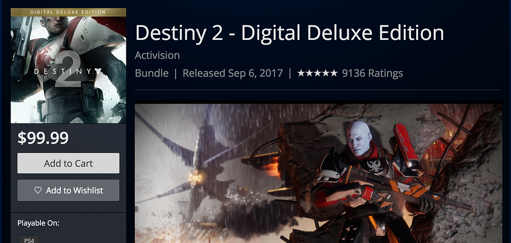
The Call to Action (Add to Cart) is not inviting nor prominent, as it blends into the background. Additionally, the price feels disconnected from the action which needs to be taken. Lastly, the information on the game (bundle, release date and rating) are apart from the CTA.
Understanding the users’ needs is key to any attempt at design variations. A quick card sorting activity with fellow gamers (target audience) was done in an attempt to:
1- Achieve unity, making sure all the PlayStation related products can be accessed globally by users, and most importantly: subtly say “all us pages belong together”.
2- Achieve improved online conversions. For example, The “Just for You” Tab already exists, it isn’t something I came up with, but I realised it’s a great way to upsell relevant products to a user who is already logged in. As long as the algorithm knows what games I own, what my friends are playing and what I should be getting, why not expand to consoles as well? The website should be able to know if I have a VR or not, or if I have a PS4 Pro or not, all of this information, paired with my wish list, should create a fluid first navigation item that keeps learning about me, and as a result shows the user relevant products to buy.
3- Rearrange the first and second levels of the IA to make it more inviting. For example, PlayStation Plus weekly deals and discounts on the current store are hidden under a tab called “$ave”. Being a Plus member means the user should get more, and be able to easily see what they get. Furthermore, a large portion of avid gamers are high school or college students who most of the time wait for a sale, and as long as they are getting Plus anyway (to be able to play online with friends) it would be great if they see what else they are getting for being members upfront.
After the user research, (and conversations on when Destiny 2 is coming out) this was the result:


In the IA, I introduced the global site hopper. The idea behind the hopper is a simple way to jump between all PS products, through a persistent menu. Imagine fast travel from and to all PlayStation related websites from a singular spot on all sites.
For the PlayStation Store landing page, I introduced new tiers of information, displaying the most important at the top and gradually moving down the page with the hierarchy in mind:
 Ensuring a logical order of information makes sure the user sees the most important thing you want to show first.
User testing the hierarchy is important to understand what the most relevant information for users, in order for us to put that first.
User testing & research, IA, structural hierarchy: done. Time to sketch stuff out. My focus was mainly on the PlayStation Store product page when I started sketching. I wanted to make sure the information is easily scannable and ensure CTAs were the most prominent elements on the page.
Here is an initial sketch of the product page:

But then I realised changing less helps a lot with optimisation when it comes to multivariate testing, and the more I looked at the existing page, the more I felt it should be preserved and only tweaked subtly.
 Small changes, large impacts
Even though the existing product page on the PlayStation Store looks a bit dull visually — structurally speaking — I found it to be solid. While I was making tweaks I kept the existing elements in terms of their placement as is, in most areas of the page:

 The Golden Ratio in UI Design
Turns out, the existing structure seamlessly adheres to The Golden Ratio. The Golden Ratio is a rule which dictates the most pleasing, natural and symmetrical relationship between proportions.
Once I completed sketching out new ideas for the product page, I moved to the Playstation Store landing page.
I decided to reimagine it completely, however, ideally changes should be tested out gradually. For the sake of the study, I changed it in one go:

The main thing I introduced on my sketch of the revised landing page are the tiers I discussed in the Hierarchy of Information, wit the most important information at the top, and the least important information at the bottom.
It’s time for the full-page design work! I’ll go through some specific variations afterwards, which are highlighted for multivariate testing.
Let’s take a look at what the pages look like now:
 The current PS landing page, PS Store landing page and PS Store product page
And after the proposed enhancements:
Most of the choices I made here were mainly based on increasing clarity for the user and conversion, as well as establishing a cross selling and consistent connection between the Store and the main PlayStation website.
What I had in mind here, is to preserve the existing slider but tweak it a little bit to reduce clutter over the image, as well as giving the “Converting” button the most prominent element on the page, and on top.
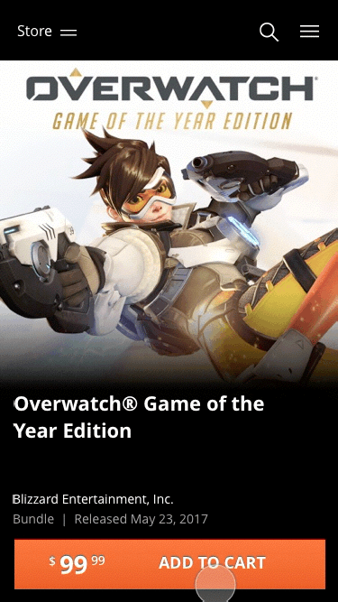
I’ve kept the same structure, but tweaked it for quick information consumption, and specification slots. What usually happens when you want to learn more about a game on the item page; you’ll have to scroll all the way down and read the bullet points under “This download includes” Well not anymore, you still have to scroll down but by quickly scanning the page you’ll have an idea of you’re getting yourself into immediately.
Let’s get a bit granular. I’ve highlighted a couple of comparisons between the sections of the current website and my proposed enhancements.
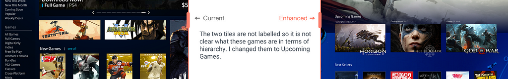
The unlabelled tiles (tooth tail and samurai showdown) are given context in the enhancement:
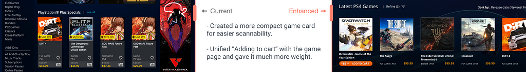
The game cards are reduced in size and the Add to Cart is now in orange and appears on hovering over a card .Based on user research, gamers do not tend to interact in detail with games on the store page. They would rather go to the product page of the game itself, so the wish list icon is removed:
The current Add to Cart button is pretty hard for the user to locate when you are scanning through the page. The grey colour fades into the background nor is it very inviting to click on.
So I spiced it up with some orange:
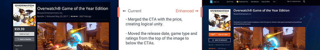
By combining both the price and “Add to Cart” into one prominent button, I aimed at achieving sensible unity, where things that belong together are integrated as a whole.
Adding it as a sticky for good measure? Sign me up! But don’t be fooled, this is not going to follow you as you scroll down, we’re way past that era. This is going to appear subtly on your way up, making sure you can interact with the elements anywhere on the page, giving the “Add to Wishlist” CTA a bit more weight in the process.
 Focal point, persistent CTA (it follows you like a creepy stalker)
Micro-interaction on the CTAs
The number one fear I have when paying for items online is whether or not my payment went through as I painstakingly wait for the confirmation screen to load.
Generally speaking, getting feedback after you’ve clicked on a CTA is always a good thing, especially for those who suffer from slow internet connections (*stares at the router with disappointment*).
Here’s a quick animation of feedback on the Add to Cart CTA, which shows what happens after you click on the button. The example is of the redesigned mobile screen, but behaviour is the same on both desktop and mobile.
For the PS landing page, the featured items needed a bit more visual context. What I mean by this is that the images did not really speak for themselves. I’ve chosen more relevant images that explain what each item is, as well as added prominence to the CTA which could potentially result into conversion.
Use the slider to see the difference:
I’ve used the same real estate, but added context. This improves scannability when the user quickly scrolls through the page.
The beauty of enhancements driven by metrics is that it ends subjectivity. There is no right or wrong: there are the control and variation(s) with the winning variation(s) as long as numbers are there; they should be the decisive factor.
In his book Landing Page Optimization: The Definitive Guide to Testing and Tuning for Conversions, Tim Ash sheds light on a few points that would transform a web experience, one of them reads as follows:
“Identify mission-critical parts of your website and their true economic value”
I kept this in the back of my head while exploring design varieties for this case study as its key to keeping yourself focussed on selecting specific elements for testing.
I hope you had fun going through this case study, you can check out another I’ve put together for the United Arab Emirates government portal right here:
New United Arab Emirates Government Portal — Setting a Regional Standard

A Gamer’s Perspective: How UX Design Can Increase Conversion in the Sony PlayStation Store was originally published in UX Planet on Medium, where people are continuing the conversation by highlighting and responding to this story.
AI-driven updates, curated by humans and hand-edited for the Prototypr community


