Build Design Systems With Penpot Components
Jul 21, 2:15 AM
Penpot's new component system for building scalable design systems, emphasizing designer-developer collaboration.
smashingmagazine.com

medium bookmark / Raindrop.io |
Please, note: this is an exercise. Its purpose is not to create business solutions, but to practice creating them in a simulated environment. The power of guessing is applied to form business goals and metrics.
You will find links to the prototypes and other parts of the exercise at the end of this article.
In the previous articles we experimented with checkout navigation and tried to improve shopping cart experience. This time we are going to put our hands on two most input-heavy features: shipping and payment information. This is still a story of an unregistered user, but to make the prototypes truly usable, we’ll need to implement a small data management system too. But first, the input.
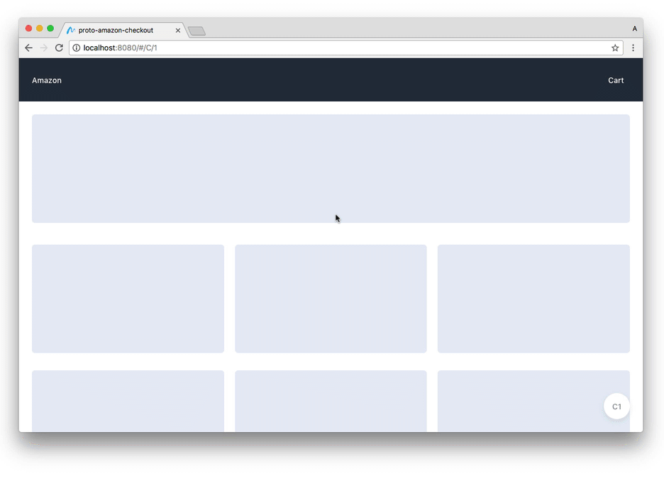
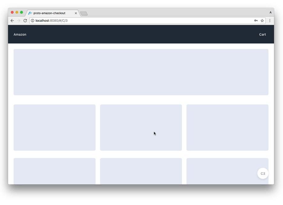
Amazon has a whole bunch of screens for managing shipping and payment information:
If you’re a designer, you probably look at all these different font styles, layouts and UI patterns, and you see a mess. If you are seasoned with maintaining huge long-lasting projects, you will define this mess as technical debt. Anyway, even knowing none of the actual business goals for this part of the checkout experience, it’s clear that this workflow has a lot of room for improvement, which makes it a perfect feature for us to exercise with.
Let’s start with something basic.
Form design is art and science with a side of some dark magic. We don’t want to go too deep into creating the most appropriate forms in this exercise, but they must be usable in order for us to test them as a part of the overall experience.
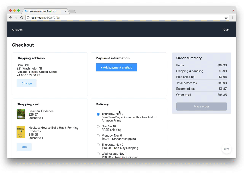
Let’s create a better layout, add a very basic validation (input fields should never be empty) and allow users to save their info:
Everything is straightforward, except for one thing—editing happens in overlays. Modality is arguably not the best UX pattern, but when it comes to focused experiences like filling in a form, it provides an appropriate isolated environment with a limited amount of actions for users to take, which is great. Showing modal view as an overlay here provides sense of context: “you’re still here, on the Checkout page, you can see it behind the curtain. Just focus on this new shiny dialog for now.”
And now for the most interesting part.
Amazon allows saving multiple shipping addresses and payment methods, so our prototype should have this feature as well. We start off by quickly sketching two designs we want to test. One option is to list entities with all controls in line with each one of them. Another one is to separate entity selection from its editing and deletion features.
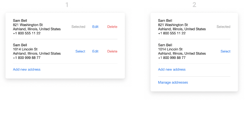
First approach is more straightforward: all controls are there, waiting for you to choose one. Second one hides some features under “Manage addresses” menu—presuming they are rarely used—and makes the UI cleaner and easier to use for main tasks: adding a new address and choosing one from the list.
So it’s time to build, test and see, which one works better for us.
Everything seems to work well here, with two exceptions:

This version looks cleaner and it’s easier to use: it’s a pretty basic popover selection with stand-alone management and editing views. It’s worth noting though, that proper testing could reveal some issues here: for example, many users may have problems finding editing controls, or expect to see them when clicking on an address in a list.
Option “b” looks and feels better than “a” to me, and quick testing did not reveal any problems with it, so we’ll continue with it. Feel free to share your thoughts with a response below, and your suggestions might make it into the final part of this exercise!
The prototype works pretty well already and can be a source of valuable data when properly tested. But to make it even more useful, let’s make a couple more improvements:
This exercise is nearing to an end. We have done so much already without a single mockup: we experimented with navigation, explored ways to improve shopping cart experience, compared different approaches to managing payment and shipping information.
There’s almost a temptation to recreate the entire checkout experience, but for us it would be an impossible task. Experience can never be complete without collaboration with business people and developers, without proper understanding of all the tasks UI has, and all other experiences it has to productively co-exist with. So we’ll stay humble, and finish the exercise for the sake of exercising, while learning something along the way.
Go ahead, give prototypes a try and hit me up with your thoughts on Twitter and responses here below.
You can find the prototypes here:
Previous parts of this exercise are:
Don’t forget to subscribe and I’ll see you in the final part of the exercise.
AI-driven updates, curated by humans and hand-edited for the Prototypr community


