Build Design Systems With Penpot Components
Jul 21, 2:15 AM
Penpot's new component system for building scalable design systems, emphasizing designer-developer collaboration.
smashingmagazine.com

medium bookmark / Raindrop.io |
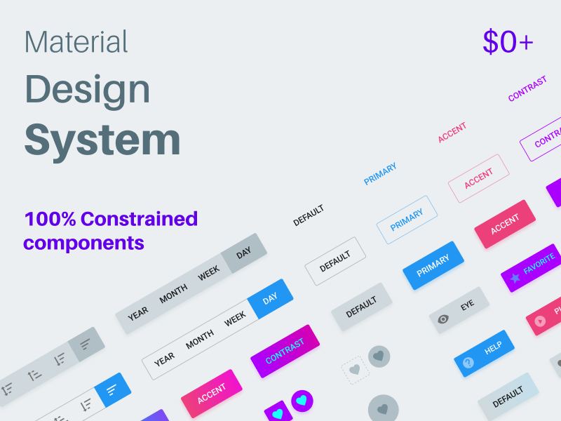
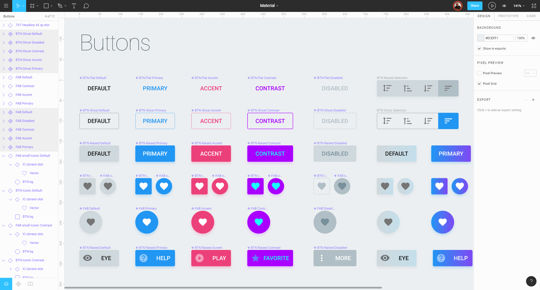
I started to build free (but I appreciate donations) design system kit based on Google Material guidelines (“based” can’t be considered as ‘the must’ here:) for Angular / React / Web / Mobile. Default elements + custom elements 100% Constrained symbols / components. Customizable within few clicks.
This system fits those popular front-end frameworks: https://material.angular.io ● https://material-ui-next.com
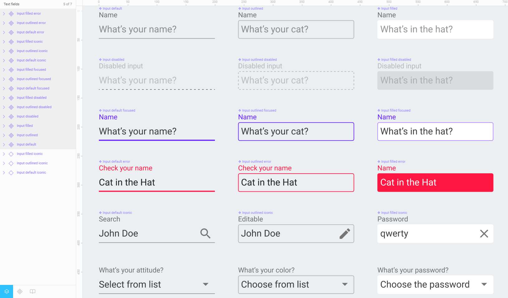
I let myself also include custom buttons in this system. Really curious about absence of ghost buttons in classic Google material guidelines. Now it’s fixed! Shadows also fixed with opacity and reflex effect. Custom inputs will be available either, more accessible for desktop instead of classic material stroked textfields.
Any suggestions with custom components you wanna see in this pack?
STAY TUNED FOR RELEASE! $0+
AI-driven updates, curated by humans and hand-edited for the Prototypr community


