Build Design Systems With Penpot Components
Jul 21, 2:15 AM
Penpot's new component system for building scalable design systems, emphasizing designer-developer collaboration.
smashingmagazine.com

uxdesign.cc – User Experience Design — Medium | Sally Chen Zhen
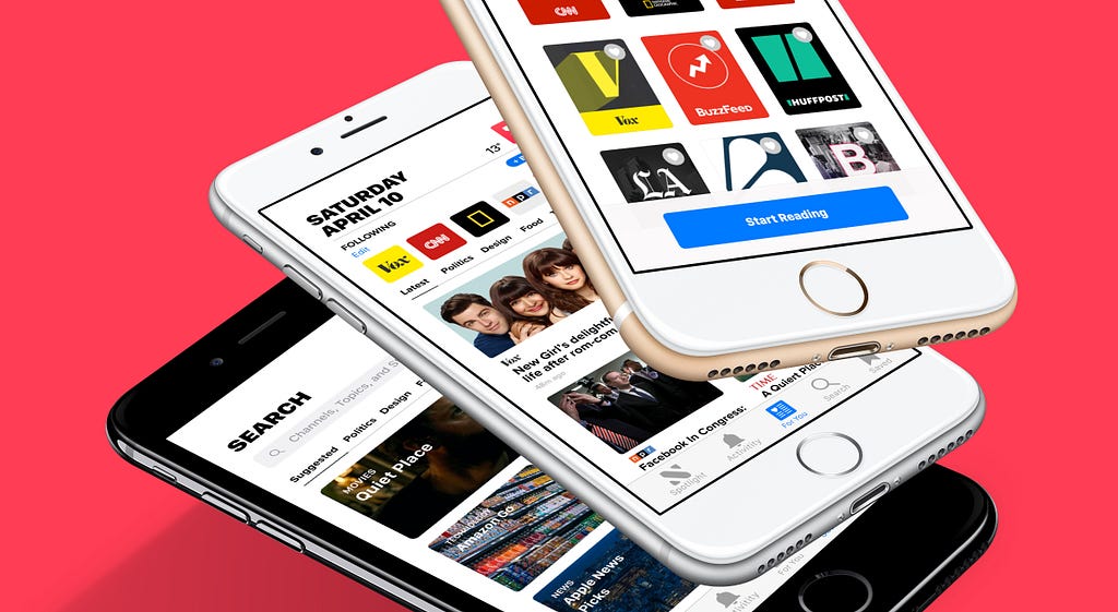
A year ago, I became an avid news reader when I decided to delete all my social media apps on my phone. In the beginning, it felt quite freeing. But, suddenly after a week or so, at this point I was craving to read and check updates about something, ANYTHING. Since I couldn’t see updates on what my friends and other people (I didn’t know) were doing anymore, I decided to check out what was going around the world. That’s when I decided to open the Apple News app for the first time since I bought my iPhone three years ago. Don’t get me wrong, I did read the news (…headlines), but only two or three times a week on my computer. But, now ever since I started using the app, I read the news (full stories!) every day. But, the constant influx of information and stories can be quite overwhelming.
As a frequent user of the Apple News app, I liked it for a whole year. It wasn’t amazing, but it got the job done, and I was too lazy to download a new app. But then suddenly, two months ago, it just became too much. Waking up every day and seeing those sad and negative headlines, it wasn’t the best way to start the day. Then, I decided not to check the news in the morning and do it around noon, but sometimes it would just ruin my lunch. Later, I changed it for the nighttime, and I couldn’t sleep because I felt like the world was going to end.
“Can’t news publishers write or post something more cheerful ?” — I thought to myself. I kept thinking that it was the publishers fault for giving us all these depressing headlines on the daily basis. But, then I realized, it was the app itself.
The world and our country are going through some crazy times and it’s fair that the news publishers are covering all these stories. It’s not entirely their fault. But, as a user I know I can’t control what the Washington Post or the Guardian are publishing, but I think I should be able to control my own news reading experience.
Redesign the app to solve current user pain points and improve their reading experiences.
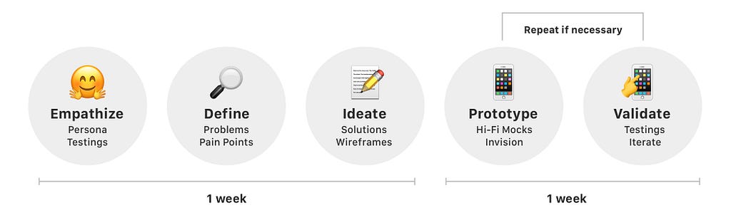
It was essential for me first to do an in-depth analysis of the app. I wanted to understand the different functionalities and the app’s overall architecture and navigation.
Here, I did an app audit to fully analyze and understand the app’s features and its usabilities. Throughout this process, I was able to identify some clear usability issues and pain points. Thus, in order to validate these observations, I needed to perform some user interviews and testings.

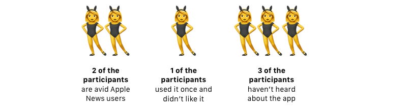
A total of four interviews were conducted, where participants had to answer questions regarding their news consumption habits and what motivates or demotivates them from reading the news. Two of the participants are Apple News users, and the other two weren’t.
Needs and motivations
Throughout the interviews, I noticed that even though users are indeed overwhelmed by what’s happening in the country and in the world, there’s no doubt that for them it is still important to stay aware and to read the news. Because of it, they are able to understand others’ point of views and opinions, which is essential for building a more open minded society.
Thus, with such insights, I was able to create a persona for the Apple News app.
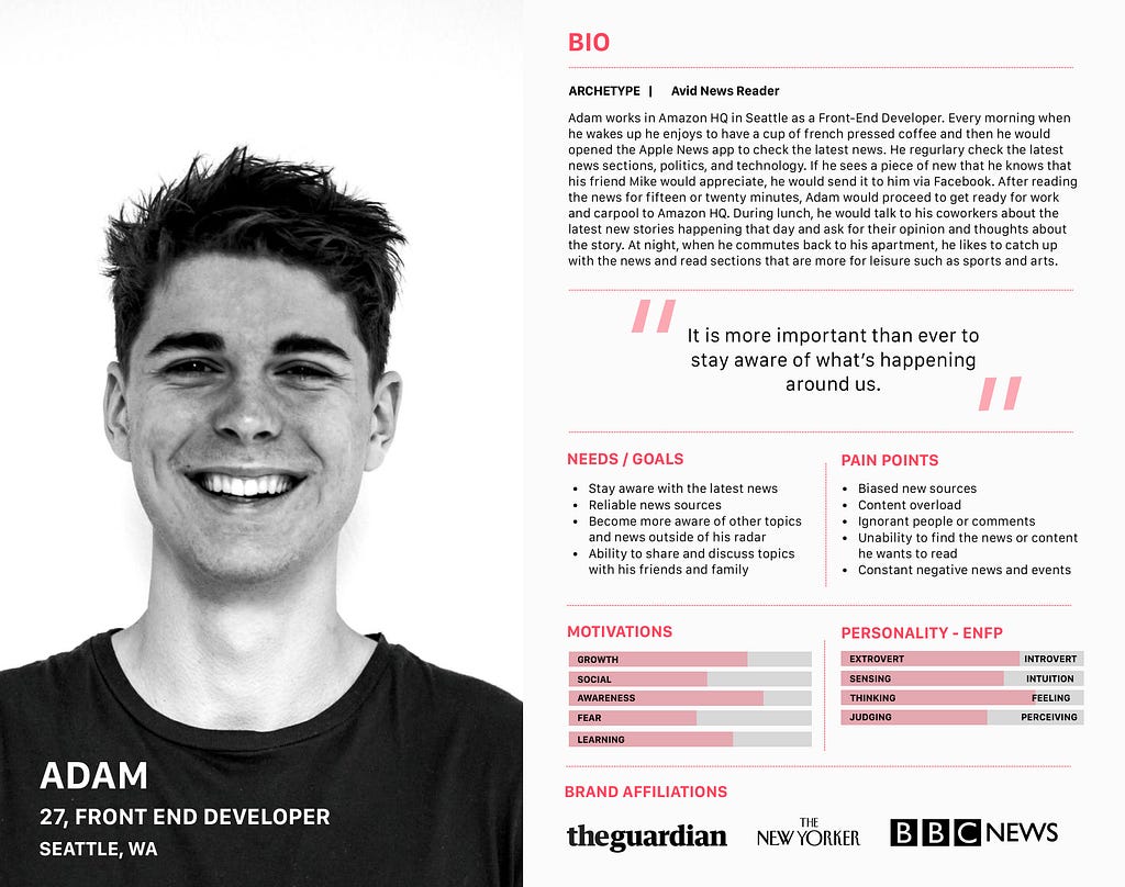

By the end of each interview, I asked the participants to test the Apple News app. I wanted to observe their interactions and how they would personally use it. As a result I was able to identify key pain points and problems. (Note: two of my participants had use the app and other two haven’t)
After identifying and analyzing users’ pain points, I define the following common ones that most users were having trouble.
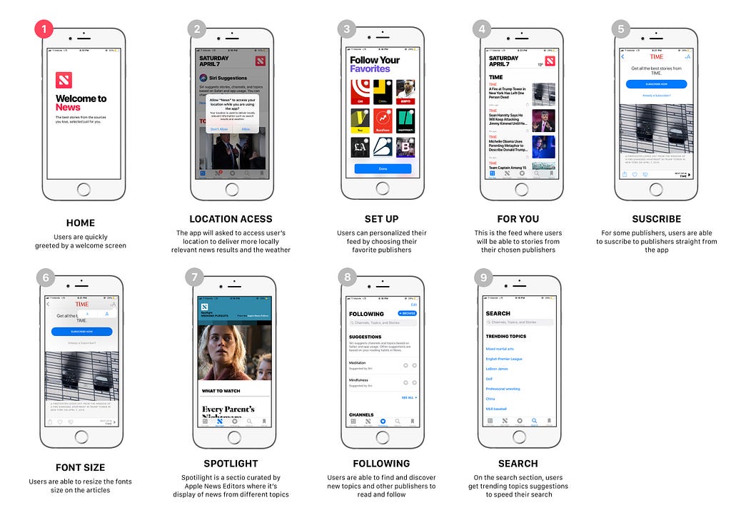
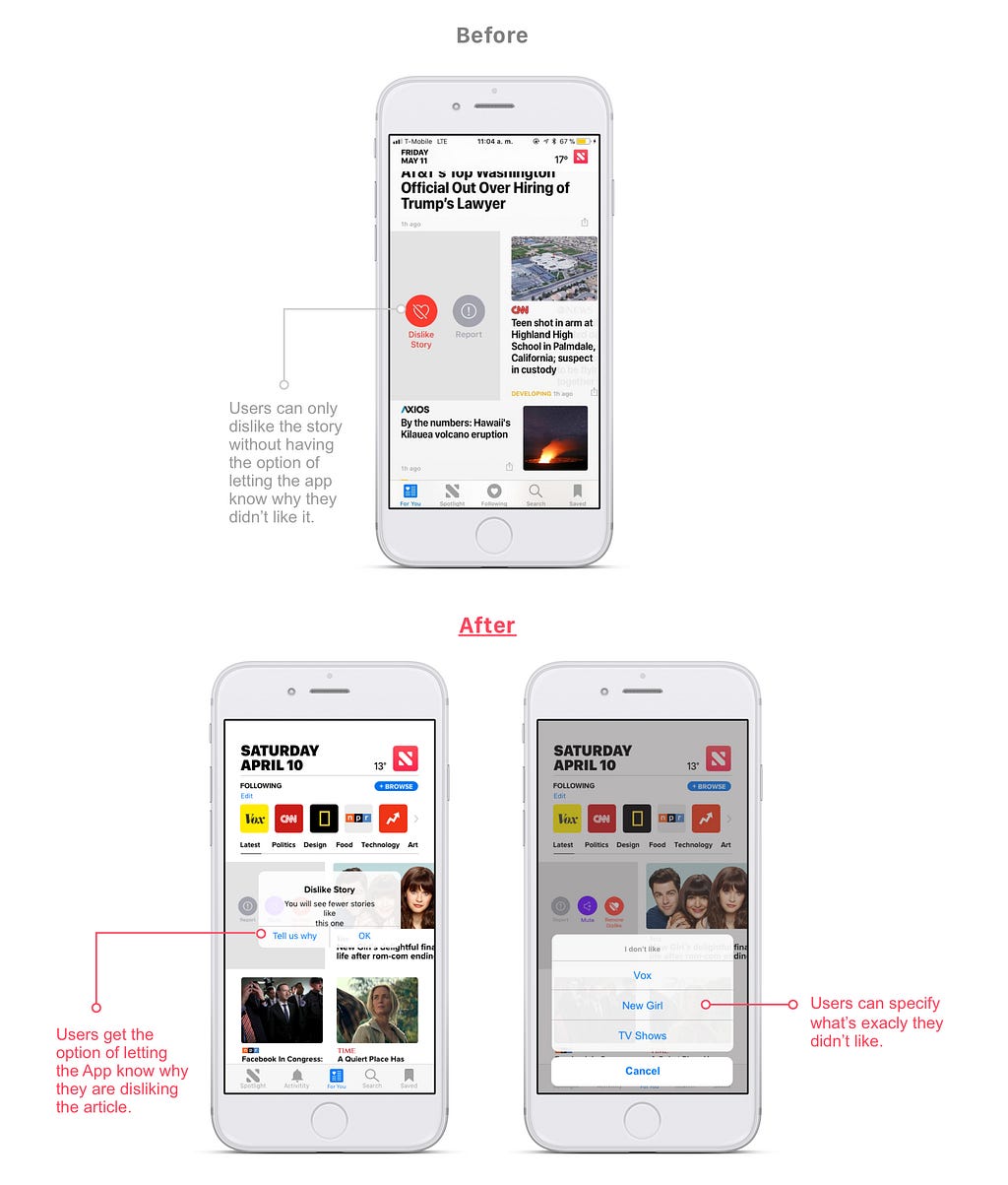
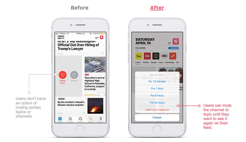
The “For You” page is where users are supposed to get news recommendations based on their preferences. However, users were still unsatisfied with the suggestions, and it was hard for them to customize this page. Also, they had to scroll through the page to find a topic or a story that they wanted to read.
Every time I don’t want to receive a particular story on my feed anymore, the next few minutes the same type of story would appear, but from another publisher. It just feel like this page is not really “for me”.
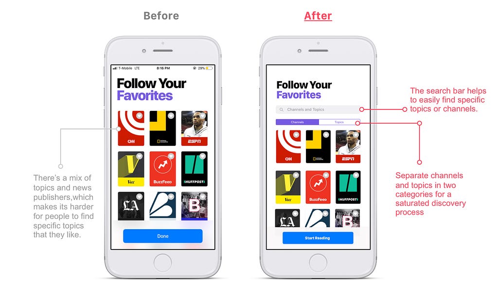
This is part of the onboarding process, where users have to choose what they like in order to receive news suggestions based on their interests. However, during testings, some users skipped this step in which I asked them why?
It’s just a lot of work to scroll through this endless list to find all the interests and I topics I like. I just can’t be bothered by it.
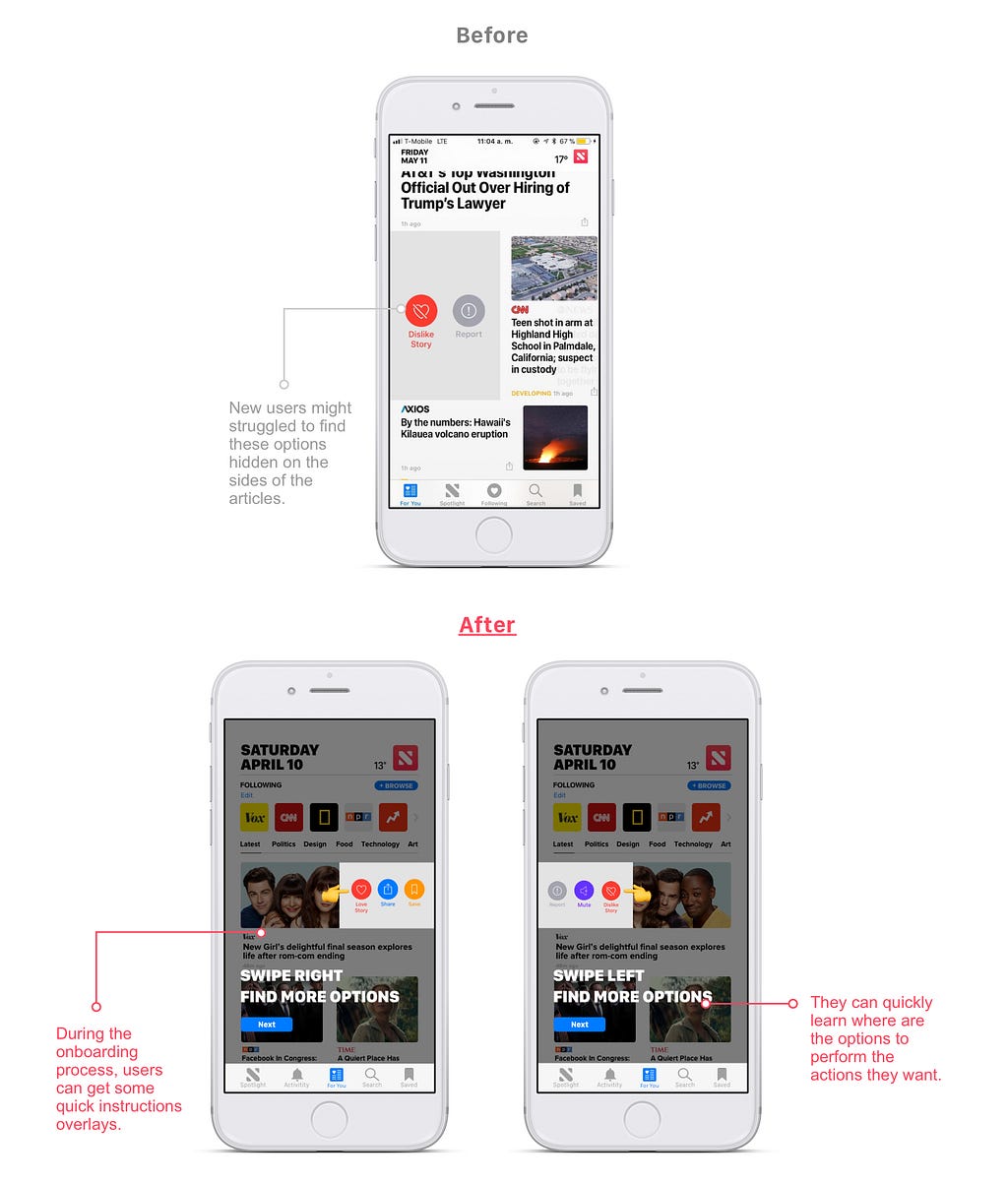
Non-Apple News app struggled with finding simple options such as saved, like, or share a story. Even current Apple News users recalled having a similar experience.
Trying to figure out how to save an article and realizing that I just had to swipe right on it to find that option, it made me felt inadequate to use the app.
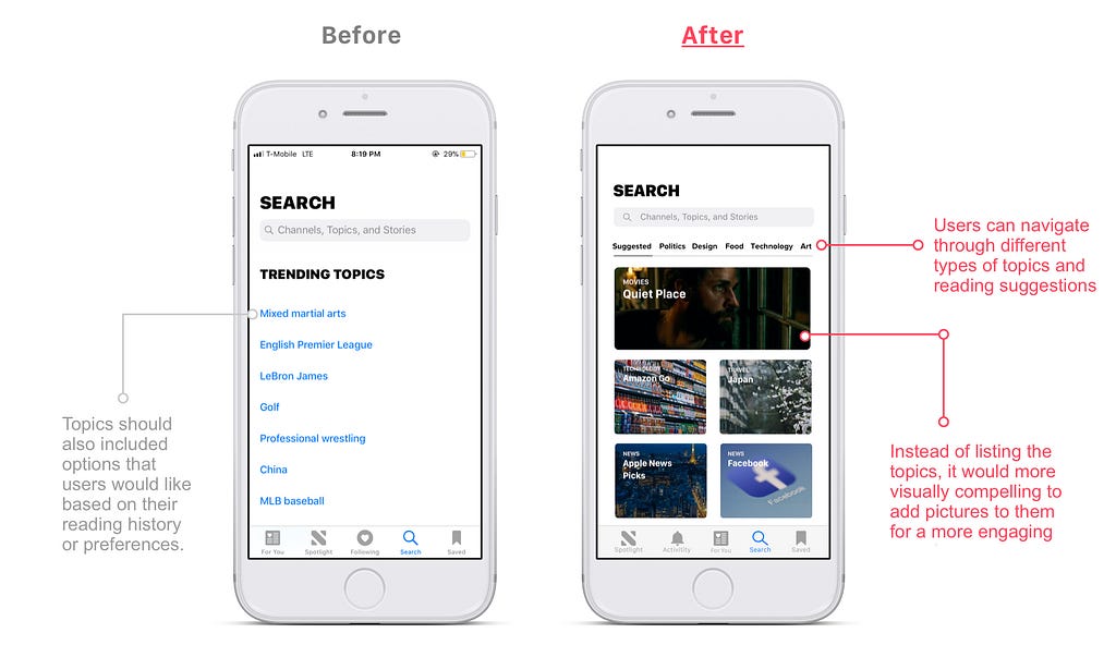
The search page was a place where the user would want to discover new topics and stories to read. But, the current layout makes this task a little more challenging.
When I go to the search page, I want to find new things to read. Since the homepage is so saturated with information, I tried to discover new things to read somewhere else. But, the search page always suggests sports topics, which is something I’m not into.
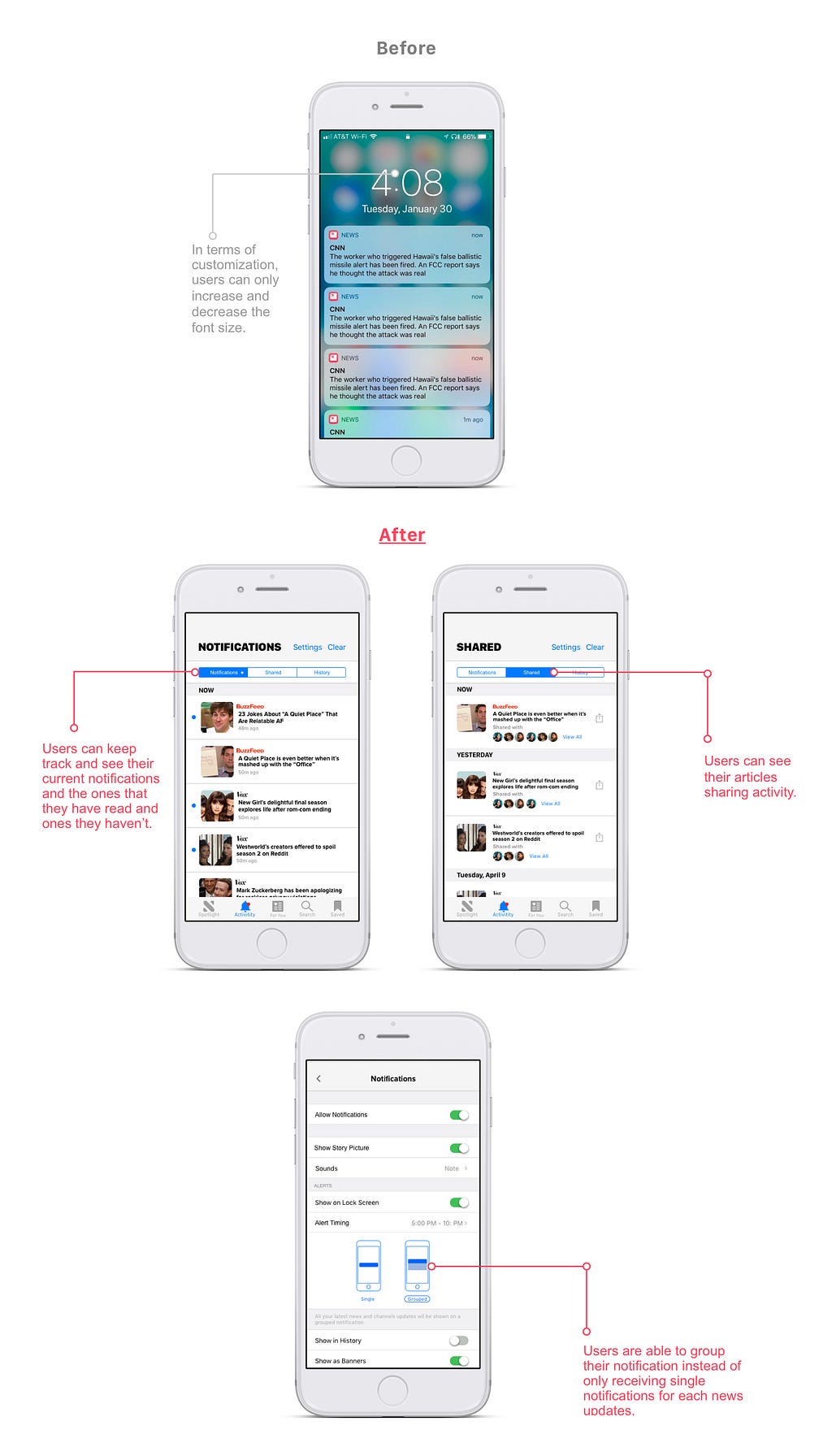
Users received so many notifications, which it can be really tough for them to keep track of all the news updates they get every hour.
I want to have a place where I could go and see all my Apple News notifications without getting distracted by other notifications from other apps. I just want to catch up with my news peacefully.
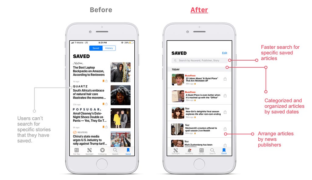
One of the Apple News users had a ton of articles saved to read later. However, sometimes he will forget about them, and then he would want to read that one article that he saved, but he knew it was going to be a long scrolling journey for him.
Why there’s not a search bar on this page? I don’t want to scroll!
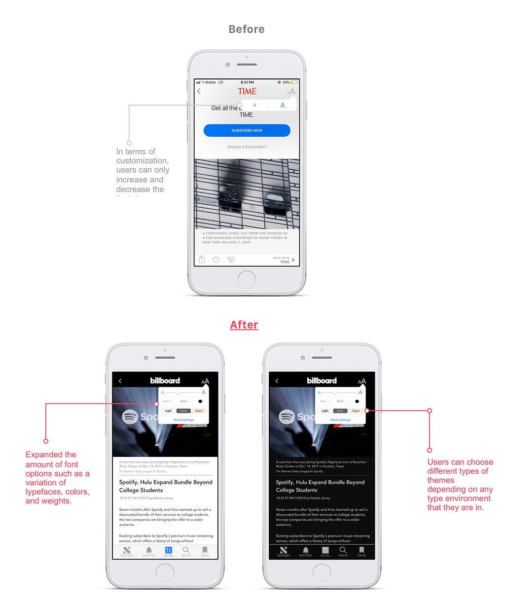
Testers expressed that they wanted to be able to have more customization options. They wanted to be able to change fonts or to choose a theme.
I’m a nighttime reader, so I would like to have a dark mode theme so it wouldn’t hurt my eyes.
After defining the problem and analyzing each pain point. I was ready to come up with solutions.
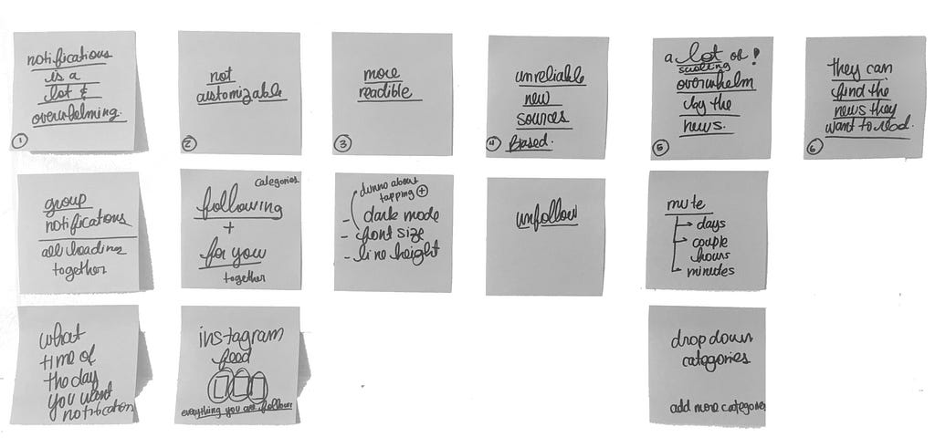 Initial round of affinity map analysis
The affinity map helped me to brainstorm and come up with potential ideas to address and alleviate each of user pain points.
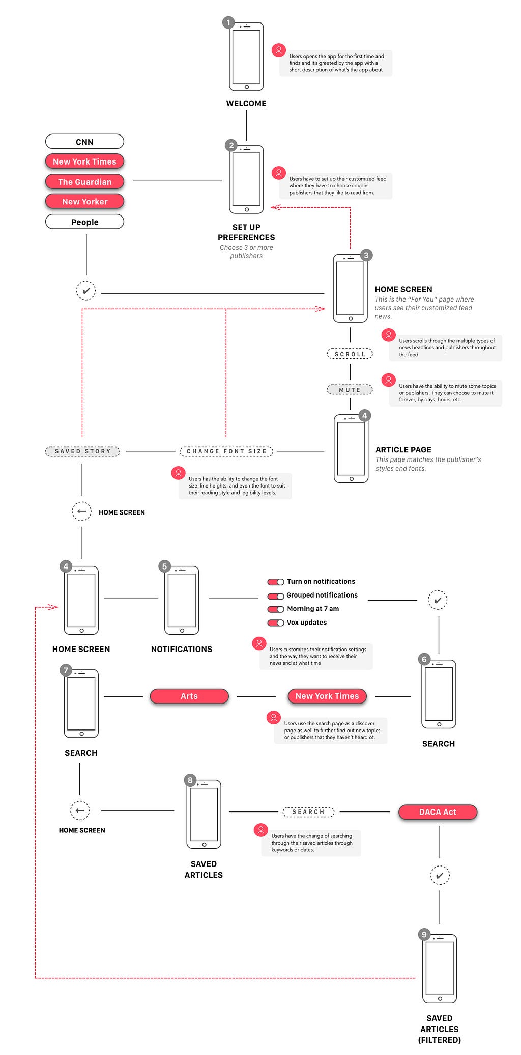
Before I started sketching the wireframes, I created a user flow of how the newly redesigned features would connect with each other and how the users would navigate and use them.
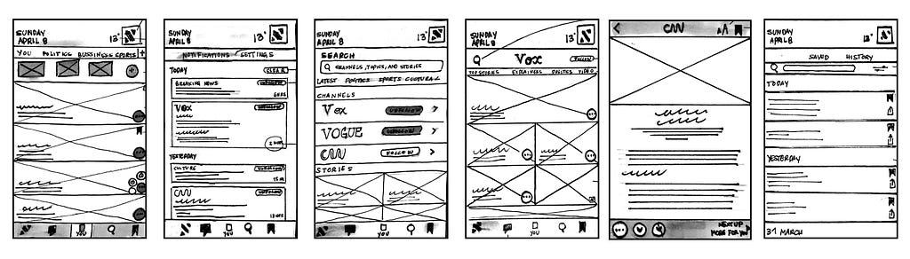
Once I had a good set of solutions that I wanted to explore more in depth with, I proceeded to sketch them out.
Based on my peer feedback, I decided to wireframe most of my sketches.
Proposed solutions
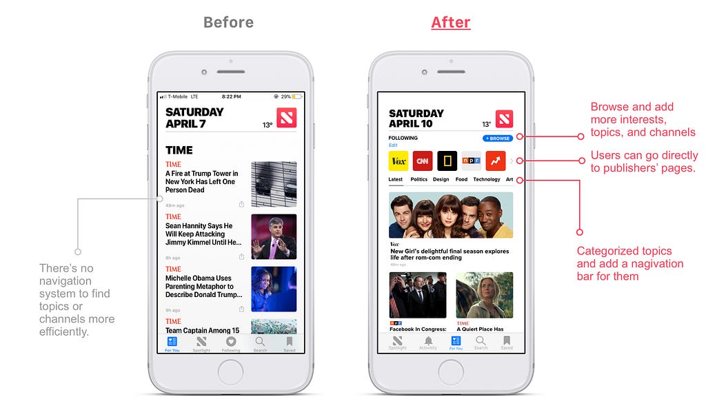
Proposed solution
Proposed solution
Proposed solutions
Proposed solution
Proposed solution
Proposed solution
Proposed solutions
Proposed solutions
By the end of designing the high fidelity screens, I kept thinking about what one of the tester was saying:
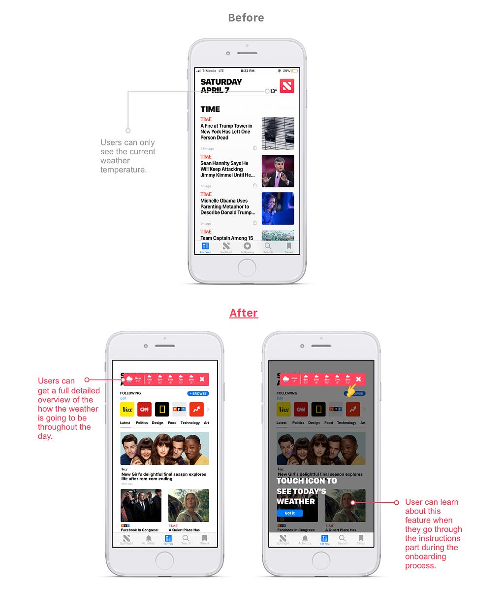
I would like to see how the weather is going to be like throughout the day without having to open another app.
Since the weather is another reason why people watch, listen, or read the news, I felt that it would be a nice detail to add a feature to the app and see what people have to say about it during the usability testings. Thus, if users click the icon next to the weather, they can see a full breakdown of the weather conditions and temperature of the day.
To test the prototype, clicked the link below 👇
Click here to view the project `Apple News `
In order to validate my app, I asked them to complete certain tasks on each of the features to test the redesigns performance and usability.
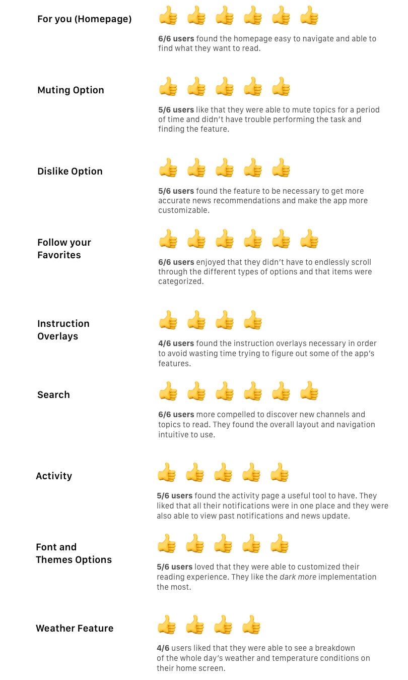
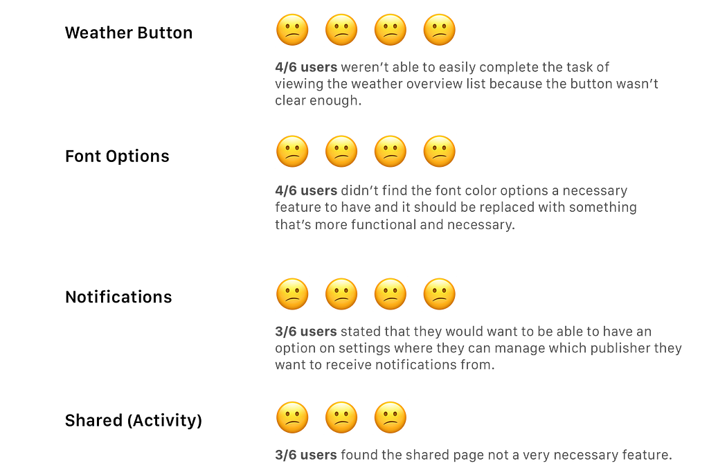
I analyze all my users’ recommendations and pain points in order to improve some of the features. Once I was done with the iterations, I conducted usability testings with other five participants to gather more feedback.
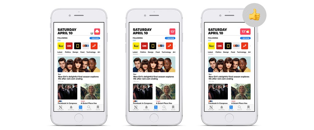
On the previous redesigned version, I left the Apple News icon as it was since that’s how the current app looks like. However, since I decided to add the weather feature, I can see why it was confusing for users to click that previous icon to see the weather details.
Thus, I redesigned the icon and made it more clearer. I made three version of the button and…
5/5 users like the third screen because they could see the weather temperature and condition and they were also able to tell that it was a button.
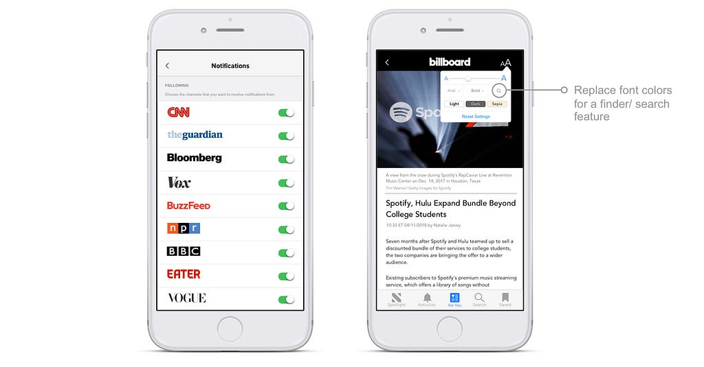
Finder: Based on peer feedback, I chose to change the font colors for a finder because users would be able to easily find specific keywords on the article.
Notifications: I added a new section on the notification settings in which users can update and manage their followed channels’ notification alerts. They easily choose which ones they want to receive updates.
Redesigning this app and doing this case study reminded me that users are always the center of every design decision. It was amazing how little changes such as adding a search bar could create such a big usability impact.
Feel free to leave comments or suggestions. You can also email me at [email protected]. I’m always open to meet and talk to other designers. 😀
Thanks for reading!
Apple News: A Usability Case Study was originally published in UX Collective on Medium, where people are continuing the conversation by highlighting and responding to this story.
AI-driven updates, curated by humans and hand-edited for the Prototypr community


