Build Design Systems With Penpot Components
Jul 21, 2:15 AM
Penpot's new component system for building scalable design systems, emphasizing designer-developer collaboration.
smashingmagazine.com

uxdesign.cc – User Experience Design — Medium | MarcoSuarez
The primary value of a design system is scalability.
Where there was once crippling technical and design debt, design systems enabled teams to be agile. This is primarily done through building systems of reusable blocks called components that can be easily assembled to create any interface you desire. This reusability means you’re able to do far more while having far less to maintain. But what about all that happens leading up to the point of putting mouse to artboard or keystroke to editor? Design systems address the way we build, but what about the way we design?
When the topic of design systems is brought up, we often assume we’re referring to an artifact: a body of code, documentation, or a Sketch file. Sometimes we assume we we’re referring to a team that maintains those artifacts and advocates for their use. But rarely do we refer to the way we design. I believe systems can include more than just output, they can include decision-making. One of the biggest challenges of a design team is velocity. How do we remove friction, create alignment, eliminate subjectivity, and organize highly specialized silo’d teams around a holistic consistent experience? To do this we need something that exists outside of someone’s head, that isn’t lost when someone leaves, and scales easier than headcount. A design system can be a comprehensive, repeatable, teachable, refine-able program for the entire process, as well as the output, of design.

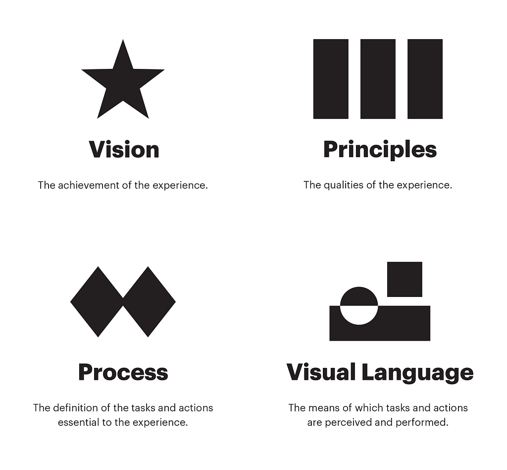
First, we need to get out of the weeds. If we don’t know where we’re going, we’ll never know if we get there. This requires thinking abstractly about what it is we’re attempting to accomplish, which can be difficult when so much of our time is spent constructing the concrete. Vision is the achievement of the design experience. It’s our north star. Every project requires an assessment to gauge whether we’re closer to realizing the vision or if course correcting is needed.

Principles are the qualities of the design experience. In design critiques at Etsy, we try to not use subjective words or phrases but words everyone understands. This helps remove ambiguity so we communicate clearly and provide feedback that’s helpful. But even with that, every designer brings their own values of design into the room. A shared standard of design creates alignment and an end to circular design debates. Design principles offer a ruler to measure work. They are the guard rails that keep you on the path to achieving your vision.
One of the most popular design principles is Dieter Rams’ 10 principles of good design. I’m personally a fan of Massimo Vignelli’s Canon. But it has become popular for tech companies to create design principles, and Anton Badashov has assembled a comprehensive list. At Etsy, we developed our own design principles. I was fortunate to have been able to contribute to their creation. With them, we’re given a language to use when assessing each other’s work. As a team, we’re now in alignment on what we’re all aiming to achieve.

It is only in the repetition of the craft that he or she masters the art.
-Samuel Avital
At some point, the tasks and actions essential to the design experience must be defined. But we cannot expect to see artifacts of a designer’s explorations if there is not the expectation to explore. It’s difficult to improve the output of something if there is no expectation of how to arrive at an output. Just as designers develop their own values in design, they develop their own process. And to advocate for something like user research when there is not first an understanding of when and where user research is useful is a difficult task.
Where the designer is in their process is critical to providing helpful feedback in critiques. Comments on spacing aren’t helpful when the designer is attempting to understand the user journey. And questions about business goals aren’t helpful when the designer is refining production ready code. Simply having or following a process does not ensure quality work, but it does set expectation. In order for teams and team members to work well together, there must be a shared understanding of how user experience decisions are made.
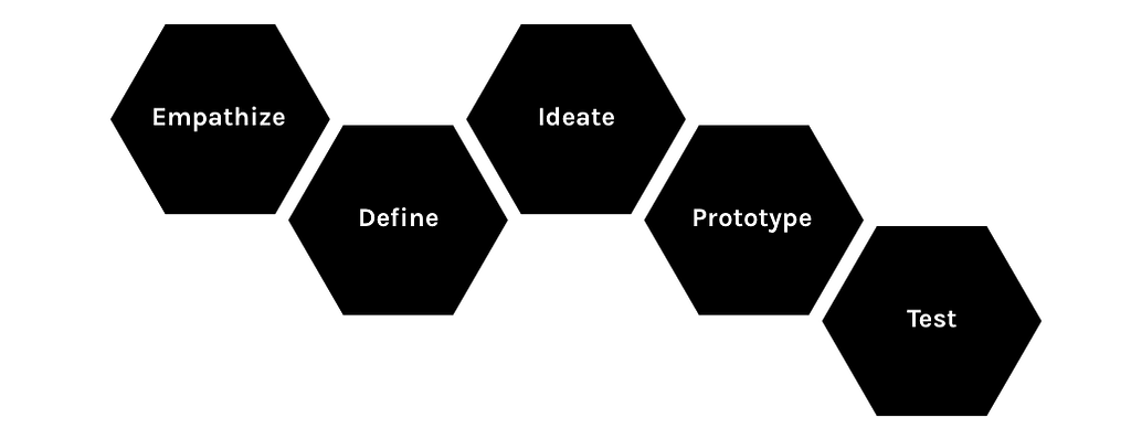
A popular process for design is the Institute of Design at Stanford’s Design Thinking process. It begins with understanding and defining the problem to be solved then moving onto developing prototypes to test your solution. You learn from your findings, repeat, and refine.
 d.school design thinking process
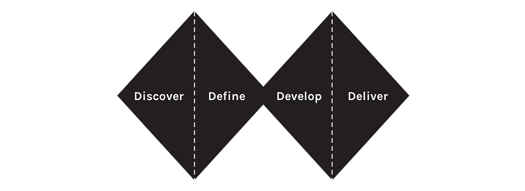
Another popular process is the British Design Council’s double diamond. Similar to the d.school’s method, it first begins with understanding the problem to be solved then converging on a definition of the problem. Second is iterating and testing solutions then converging on the final solution. Discover, Define, Develop, Deliver.
 British Design Council’s double diamond process
For digital product design, the interface is our product. It is the means of which tasks and actions are perceived and performed. This is where the value of our work and our company is realized. Where the design process defines the tasks and actions of the design experience, the tasks and actions themselves derive from the visual language. Though you may have a pattern library you may not have a visual language, which is composed of three parts:
Vocabulary — What we say
Syntax — How we say it
Semantics — What we mean
Vocabulary is the objects of design. Most often, this is where design systems begin and end. These are all the “words” one needs to form a sentence, or components one needs to build an interface. They include things like buttons, inputs, colors, text, drop-downs, etc.
Syntax are the rules that define the structure, order, and assembly of objects. At Etsy, we call these guidelines. Guidelines are the documentation of rules for things like color, typography, iconography, accessibility, localization, and the documentation for patterns such as navigation or filtering and sorting. It also includes guidelines for the use of each component such as when it’s appropriate to use a button versus a text link.
Shopify’s Polaris includes well documented guidelines.
Semantics are the meaning given to the objects and their behavior. A button is an object, whether to use a primary or secondary button is directed by the syntax, but the meaning given to this point of action, and how it looks and the way it behaves is found in the semantics.
These aesthetic decisions are most often decided arbitrarily. This becomes a problem when more than one person contributes to a system because these decisions only exist in the mind of the creator. Why is a button given a shadow on hover? What is the purpose of animation? When do I use this color? It’s difficult to understand these decisions and debate their qualities if there exists no purpose behind them.
Meaning for the aesthetic of objects is found in their purpose and brand personality. Interface design is a conversation–speaking, listening, and responding with and without words. Interfaces speak through the way they present content and abilities. They respond in the way they react when acted upon.
A good starting point, is defining the purpose and personality of shape, color, type, time, space, and motion. These elements are found in nearly every component in your system.
Google Material has done a fantastic job of defining the semantics of their visual language. Pinterest also has their semantics defined.
Building the vocabulary or objects of your visual language is an achievement in and of itself. But in order to scale a system, defining the syntax and the semantics of those objects will be necessary.
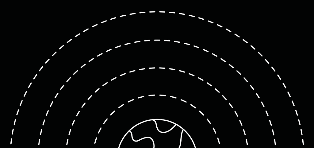
On a simplistic level, our earth is made up of dirt and water. But life on earth would not be possible without the layer of gas that surrounds our planet–the atmosphere. As I mentioned earlier, design systems is often thought of as an artifact. Which like the dirt and water of our planet, is tangible and visible. But just as the atmosphere is an integral part of our planet’s makeup, design systems should also include the invisible layer of how we design–vision, principles, process, and visual language. That’s why I’ve come to call these things, Atmospheric Design.
Our atmosphere is made up of layers, each alone offering a great value, but together they form something comprehensive and effective. Vision, principles, process, and visual language are no different. Together they create a scalable system where each layer can be critiqued, refined, and taught. Layers that build upon each other making the others more effective.
Just as technical and design debt slows down product development, not having a defined atmospheric level of design will slow down design teams. By including the way you design in your design system, you’ll be able to benefit from design systems greatest value: scalability.

Atmospheric Design was originally published in uxdesign.cc on Medium, where people are continuing the conversation by highlighting and responding to this story.
AI-driven updates, curated by humans and hand-edited for the Prototypr community


