Build Design Systems With Penpot Components
Jul 21, 2:15 AM
Penpot's new component system for building scalable design systems, emphasizing designer-developer collaboration.
smashingmagazine.com

UX Planet — Medium | Moses Kim
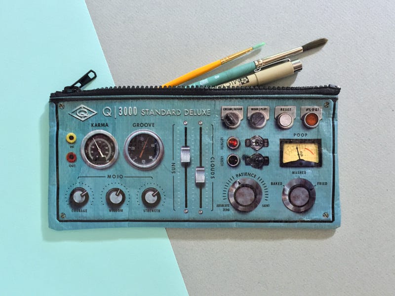 Image credit: Chelsea Wirtz
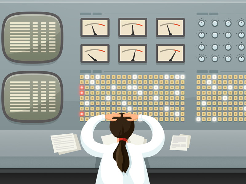
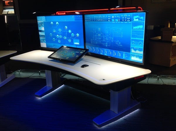
In 2012, when working as a tech writer at a production company, I made a business trip to one of Henkel’s manufacturing facilities with a task to study their logistical business process formal description and documents. I won’t remember a word from those docs but what I will always remember is what I was later. After doing what I was supposed to, I was taken on a highlight tour all across the facility, including the chemical production site where I saw heavy machinery operating on robotics, long multi-level conveyor bands transporting thousands of bottles of chemicals and I also was let in the control center where all the numerous processes were being operated from.
What I saw there blew my mind. I felt like got into a spaceship. All the displays with weird pipelines and digits beaming all over the place. The incredibly low amount of legible information intensified the feeling of intimidation before those massive UIs and added a notable sense of importance to whatever they were producing. Later, I found out I was in the washing-up liquid production block. But holy shit, it looked far more significant. The point of this long introduction being,
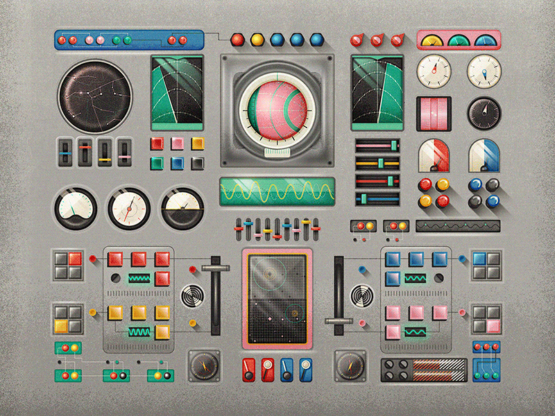
The user interfaces that I saw in that Henkel washing-up liquid production unit, were functional as hell but aesthetically presented a cognitive threat and a mental block to my attempts to understand them.
There is a reason why professionals UIs are traditionally not very attractive. The root of purpose-driven user interfaces lies in the origins of functional production which is engineering, as opposed to art that comes from the sensual aspect of human nature. Even though we tend to find beauty everywhere we want, it just has to take a little time and soul-searching, there are general principles of fashion in digital sphere that purely functional UIs don’t seem to be too fond of.
Beauty is subjective. Aesthetics is often intended to compensate for something or appeal to the sensual aspect of perception. A rational approach to production doesn’t really tolerate any of those things and that’s why the utilitarian design or the lack of one is a habitual attribute of any important functional UI.
The recreational use of functional interface design principles, however, allows us to tap into the realm of professional UIs and experiment with a hybridization of beauty and functional restrain.
Whenever we think looks don’t matter, we are fibbing a little, as aesthetics is always exuding from everything we’ve ever made. From the shape of a razor to the lines of code, we know pretty from ugly and unwillingly gravitate towards the more beautiful thing. Ergonomics has a lot to do with this desire, as it’s natural for us to enjoy useful things. Our enjoyment, then, makes us perceive those things as our “near and dear”, thus making them beautiful in our mind. Fair to say this affects productivity.
Aesthetics for the sake of beauty comes to disrupt this paradigm. The problem is it can’t be formalized and assembled into a somewhat digestible set of requirements. Does this mean designers are free to roam when dealing with a professional interface or it’s better not to involve any designers at all and let the functionality shape some design, and then hope it will make its way into our soul. If so, do we allow people to intentionally ignore the effect beauty produces on people and the impact it has on the product?
Can people operating professional UIs benefit from a better UX by being more productive and appreciative of the tools they are given?
Let’s see.
The cool thing about beauty and aesthetics is it’s subjective. In order to tell a pretty thing from a-not-so-pretty, you need to see and feel it, that’s true. But if we are talking about a bridge between functionality and appeal, there are some things that have to be accomplished. Among those are:
Now imagine how unwholesome the experience would be if it was built by a team of specialists with different backgrounds and purposes, and not brought to a common standard. It’s better for the entire product that this standard would be calculated and holistic.
User interfaces have their specific laws and purposes. First off, it’s a visual representation of the actionable organs of a digital (or analog) product. Different products want different outcomes for you and in relation to that, they look a certain way. If we are talking about an action a product has to provoke you to, this means certain positioning of elements in a way that makes this action logical and enticing.
With most technical interfaces, the task, however, is not marketing-based. Utility and engineering being the head of the corner, technical performance is the purpose. Consequently, most functional UIs are created by the creators of that functionality — the programmers, developers, and engineers. The developer’s perception of an interface is dictated by their deep and profound knowledge of the product’s architecture and its performance as a part of the mechanism.
The developer knowledge is not available for the conventional UI users, which means it builds up a discrepancy between the functionality intended and the ways to get there.
The more complicated the software or web application, the more business processes it entangles and the more data it covers, the wider the discrepancy and the more dramatic are the problems led by it.
If there’s one thing any developer-made design can be attributed to is the imbalance. Once the imbalance kicks into action, users tend to fix it on their terms. They find workarounds which might not affect the performance on a large scale but are crucial in terms of productivity, onboarding, and long distance operation.
If you are present on the market even being a highly specialized solution, chances are there will be competition, which means on the business side of things, you will have to consider the end user appeal.
The aesthetics of your product speaks out for you just as much as the functionality, because if the functionality is no longer unique, guess what steps in? The beauty.
Visually appealing systems are emotionally attractive to us even before we get the first experience with them. More importantly, the appealing interface can help you hold a user longer even though there might be technical deficits. This means professional interfaces have to be beautiful in order to speak better to its users on multiple levels other than just plain utility.
A poorly designed product often resembles a cheap product which invokes neglect, and as a result, does not help build a long-term following and endorsement of that product.
The other side of the coin is the user’s desire to be in control, to make an impact, to be a significant member of the team behind the smooth operation of the system. An over-designed interface can rid them from that feeling and sort of water down the experience they’ve accumulated. If a UI is clear and understandable by an outsider, why even bother learning it?
The sense of exclusiveness has to go along with a fairly complicated interface in order to create a satisfaction from being in control.
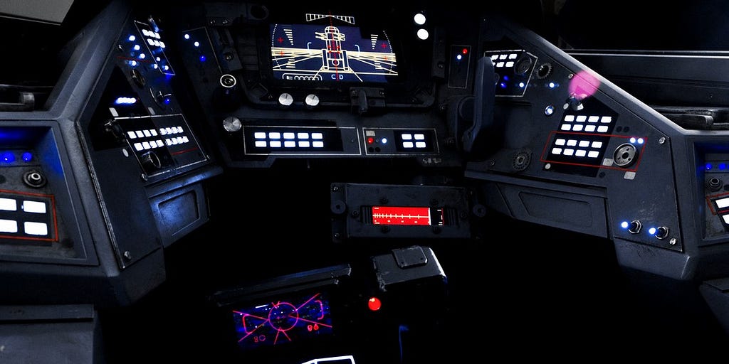
With a certain design system in place, you can also tap into the cultural aspect of your industry. A good example would be the Star Wars franchise that for over 30 years has been managing to keep the original spacecraft interfaces and turn it into a cultural phenomenon.
The visual aspect of any mechanism including a digital one is a potential leverage point for better user engagement or internal productivity. By employing a strategically selected design paradigm, we can dilute the toughness and inauthenticity of functional and professional interfaces in favor of quality both in the performance and the output.
The face of your business, the indicator of its trustworthiness, and the possible phenomenon it creates on the market is first brought to a user through its visual part — the UI. No problem if it honestly depicts all the strengths and weaknesses of your system, but there are hidden opportunities in something that most tech folks are used to neglecting. And it’s the professional and industrial design.
Beautiful and functional interfaces was originally published in UX Planet on Medium, where people are continuing the conversation by highlighting and responding to this story.
AI-driven updates, curated by humans and hand-edited for the Prototypr community


