Build Design Systems With Penpot Components
Jul 21, 2:15 AM
Penpot's new component system for building scalable design systems, emphasizing designer-developer collaboration.
smashingmagazine.com

UX Power Tools – Medium | Jon Moore 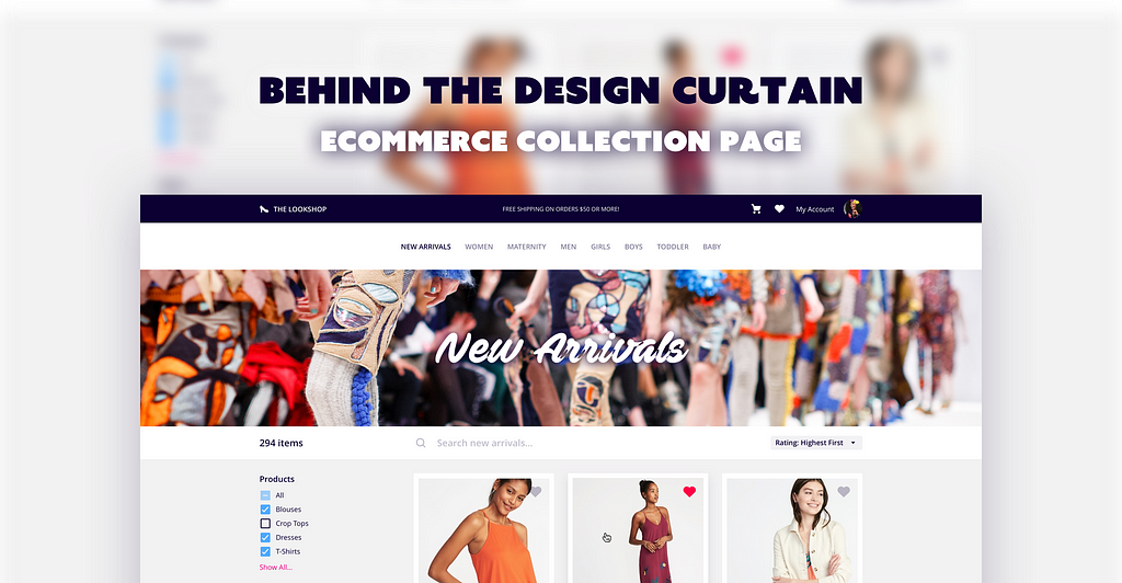
How did you design that? What techniques did you use? How are you so fast? How do you know what to include in a concept screen?
I pull back the curtain to show you exactly how I design screens — translating requirements into designs, hinting at future feature functionality, and revealing Sketch best practices. Every edition will have a freebie so you can see exactly what my file looks like. Monkey see…monkey do!
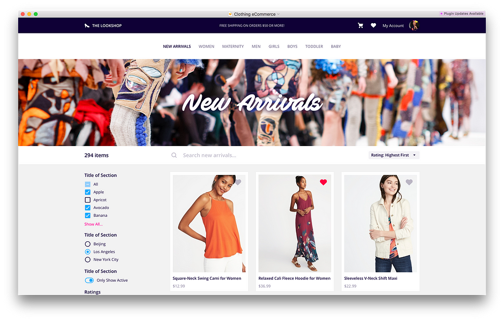
(Note: You can download this screen at the bottom of the article.)
An eCommerce collection page. It’s simple, but there’s lots going on here, and lots to talk about!
Wow. Amazing. Simply incredible. 🤓
 Thanks for the dummy content, Old Navy!
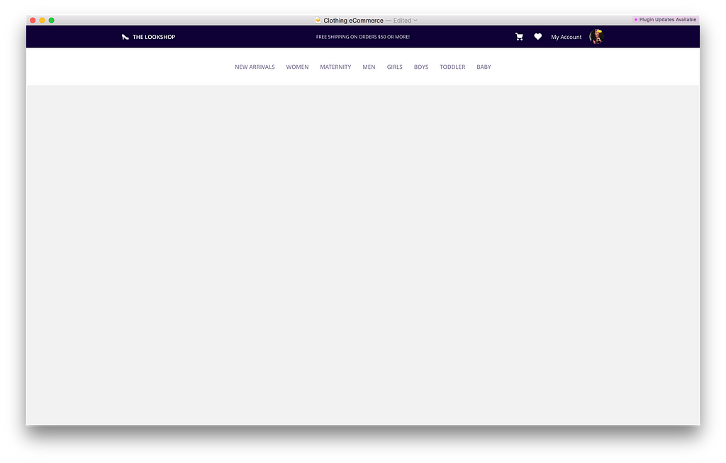
I pretty much always start at the top and work my way down. In 90% of UI designs, that means starting with the navigation.
In this case, I knew I needed: shop branding, a shopping cart, a user profile, and site navigation.
I had to decide whether or not I wanted to squeeze everything into one horizontal bar, or split it in two. A single nav bar saves about 80–100px of vertical screen real estate, but things would be getting pretty tight.
To future-proof the site navigation against new product categories (which would grow wider and wider), I opted to split the nav in two: a kicker nav and the product nav.
Sha-blam-o:
The kicker nav is where site branding and user account information lives. It’s simple and compact because it’s going to be on every page of this eCommerce site. The kicker background is dark for the same reason…it’s there, but you might not notice it unless you’re looking for it.
Contrasting the kicker nav, the product nav is taller and brighter — users will be flying around this site searching for the perfect summer dress, and we don’t want to get in the way of that with a teeny-tiny, not-so-clickable-or-obvious product nav.
Quick tips for designing faster and more effectively.
Designing a Top Nav in One Symbol
Ways that you can present this feature to various stakeholders.

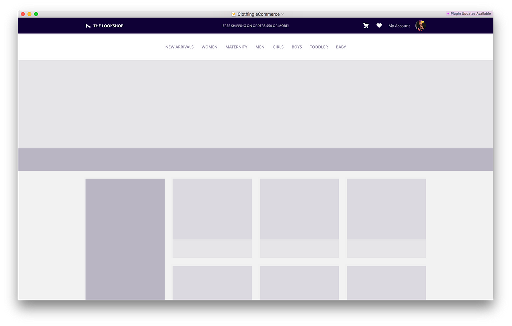
Continuing down the page, I decided that I wanted to support product marketing by introducing a page banner that would be custom to each product category or collection.
This section wasn’t explicitly in the requirements, but since the purpose of this screen is for pitch, I tend to always push about 10–15% beyond the base essentials to help strengthen the story. I knew that this section would end up being highly visual and eye-catching, so I knew it would be a welcome addition.
I don’t have any philosophical reason why I tend to flesh out the nav in full fidelity. I just do. For the rest of the page, I’ll spend about 10 minutes blockframing a bunch of potential layouts before settling on the final one.
Quick tips for designing faster and more effectively.
“Blockframing” and 31 Free Sketch-Ready Layouts Using Auto Layout by Anima App
Ways that you can present this feature to various stakeholders.
The page layout is pretty well baked at this point, so I feel comfortable starting to add detail and explore the visual design:
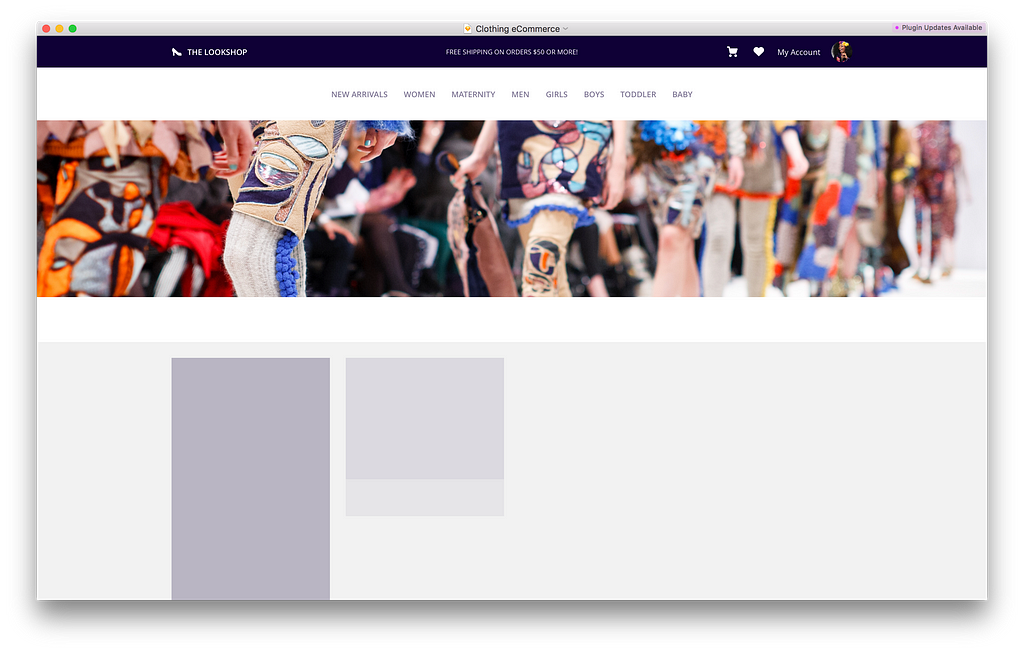
After browsing around on Unsplash for a couple minutes, I found an image I was happy with to give the design some character.
Candidly, most UI is pretty boring. It really only has one job, and that’s to help the user accomplish a task. The content of an interface is what gives it life. Maps, photos, illustrations, products…if anything else on the screen is overly flashy, it’ll probably end up competing with the content. You don’t want that, particularly if you’re trying to sell something.

The beauty of a page like this is that there really aren’t too many unique sections that you have to design. Your job is really all about layout and UX, because we’re letting the content shine, remember?
On pages with lots of repeated content, I find it advantageous to design a single item and duplicate it, effectively “completing” a large chunk of the UI in one fell swoop.
If you have the patience for it, I’d also recommend filling your repeated items with unique content so you can see get a feel of how the design will appear and perform out in the wild. The sooner you identify a line-wrapping or readability issue, the sooner you can correct the design to accommodate it.
Quick tips for designing faster and more effectively.
Ways that you can present this feature to various stakeholders.
The design is really starting to come together now, and the last big piece that needs some TLC is the page filters.
Left-hand filtering is an extremely common design pattern for everything from eCommerce to “big data”, so I actually have an entire column of pre-designed filters in the design boilerplate I made for myself:

I tried to think of every possible filter control I could think of and just have them ready and waiting for whenever I would need them.
The screen above, and many more, are included in UX Power Tools.
Now obviously it’s not going to be perfect as-is, but I’d much rather spend 20 minutes customizing it to fit the mockup instead of 2-hours battling with checkboxes and star ratings.
Dropping the left-hand filters into my design gets me pretty close:
I spent a little time coming up with some more realistic filter sets, and added an interaction state to show how items could be added to the cart:

It’s a really subtle addition, but it satisfies the requirement for adding items to a shopping cart, and will give developers a better idea of your UX vision.
Quick tips for designing faster and more effectively.
Ways that you can present this feature to various stakeholders.
Thanks for the dummy content, Old Navy!
Not too terrible! Product pages like this are fairly rudimentary, and there is so much more that I can do with it (ad banners, product details, hover states, search workflow), but you can see how each section can be constructed and presented thoughtfully so as to maximize effort and minimize push-back.
Wanna poke around in this file? You can download it for free by putting $0 in the price box below:
This page, those fancy filters, and all kinds of other symbol goodies are included in the UX Power Tools Web System and our premium bundle.
You can save $8 off your order right now with the discount code ECOMM8:
When I’m not spending my paycheck on clothing, I’m working on Sketch design tools at UX Power Tools to make you a better, more efficient designer.
Follow UX Power Tools on Twitter
Follow me on Twitter
Say hi on LinkedIn
Learn some stuff from my agency’s blog
Behind the Design Curtain: eCommerce Collection Page was originally published in UX Power Tools on Medium, where people are continuing the conversation by highlighting and responding to this story.
AI-driven updates, curated by humans and hand-edited for the Prototypr community


