Build Design Systems With Penpot Components
Jul 21, 2:15 AM
Penpot's new component system for building scalable design systems, emphasizing designer-developer collaboration.
smashingmagazine.com

uxdesign.cc – User Experience Design — Medium | Moe Abdella

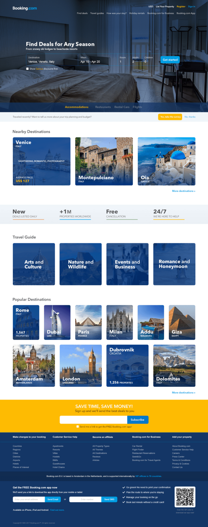
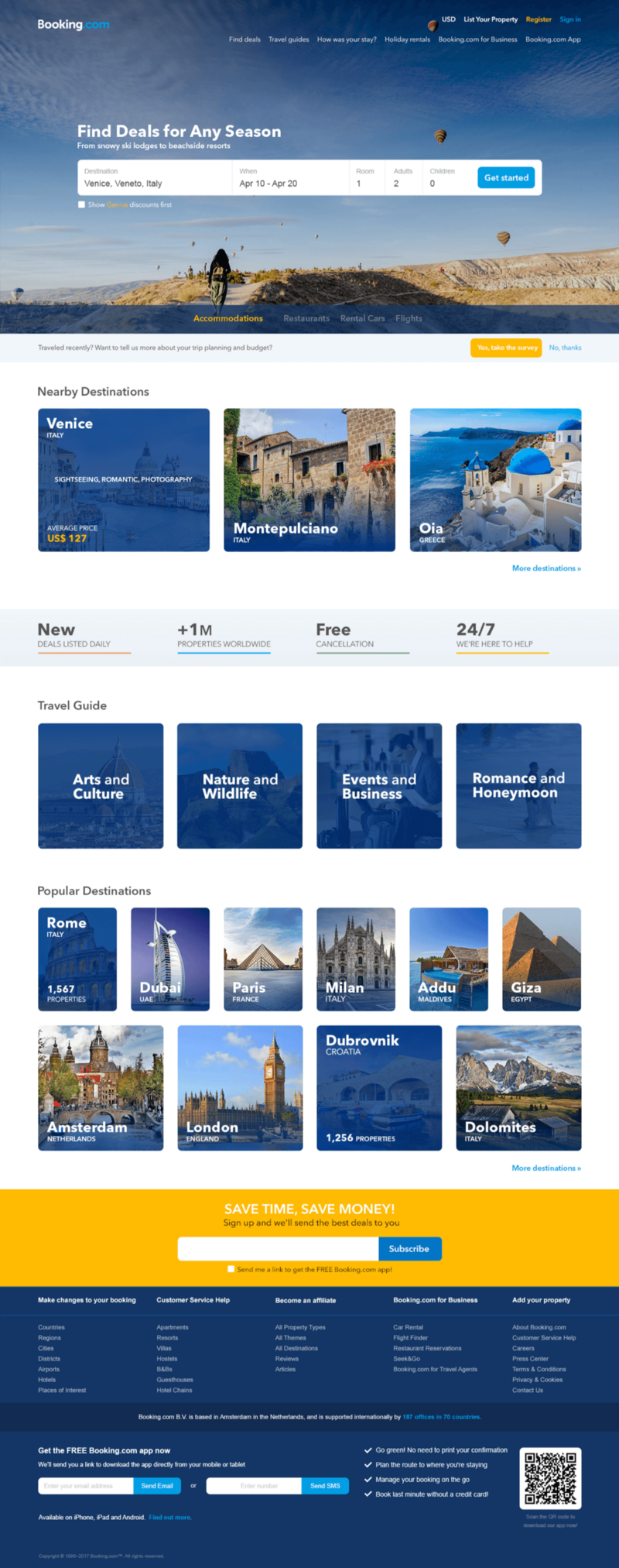
This idea might have crossed the minds of every UI designer, but still booking is keeping its well-known design. Why? Simply because as we think of re-skinning Booking.com, we are only considering the artistic feel and look of this web portal, without considering the underlying process that is aiming at increasing customer satisfaction and loyalty in the first place. The best design – if there is ever something as such- might not be the most suitable for the user or the business.
Forget about the UI Design and everything related to the digital world.
Just imagine you are working as a stocker at Walmart and your job is to sort the products from the backroom and take them to the sales floor. Your supervisor asked you to relocate the French bread stand from the bread aisle to the alcoholic beverage aisle, just next to red wine. You started wondering to yourself “Why am I moving French bread from the bread aisle to the Alcoholic beverages aisle? That makes no sense”. So you you decided to go ahead and ask your supervisor, who responded: “We are doing this because we want to speed up the process.”
 Whaaaaaaaaat!!
How come! French bread simply belongs to the bread aisle. This is where shoppers expect to find it! But your supervisor continued explaining that they could observe that the majority of people would buy French bread with the red wine, meaning those items are complementary goods and must be placed in close proximity, a concept known as a Cross-selling.
So putting French bread in the Alcoholic beverage aisle, although it sounds a bit illogical but it will speed up the process and consequently increase the customer satisfaction.
I guess now you get it.
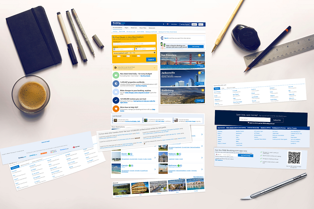
Booking.com was founded in 1997. In 2002, Expedia was not tempted enough to purchase it -for their bad luck-. Yet in 2005, the company was acquired by The Priceline Group for USD 133 million. Booking has then become one of largest e-commerce platforms in the world with a market cap of over USD 64 billion, covering over 1 million hotels worldwide.
Because Booking.com believes that “Customers Drive the Product”. So their portal looks that way because customers have told them this the product they want.
Why does it have a better design and look? Are their customers from Mars?
Well, this might be because of the different business model of Airbnb.
How about redesigning the homepage of Booking.com as a proof of concept while also considering the user experience?
Our mission is to redesign the homepage while following the UX design process.
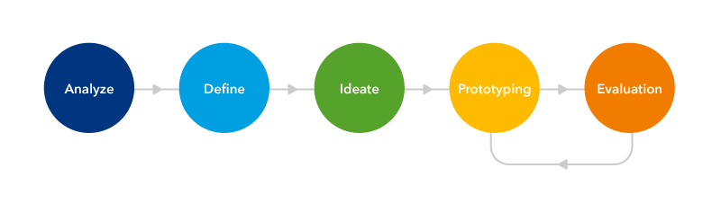
We will start with analyzing the current IA.
Operation Code Name: Slice and Dice.
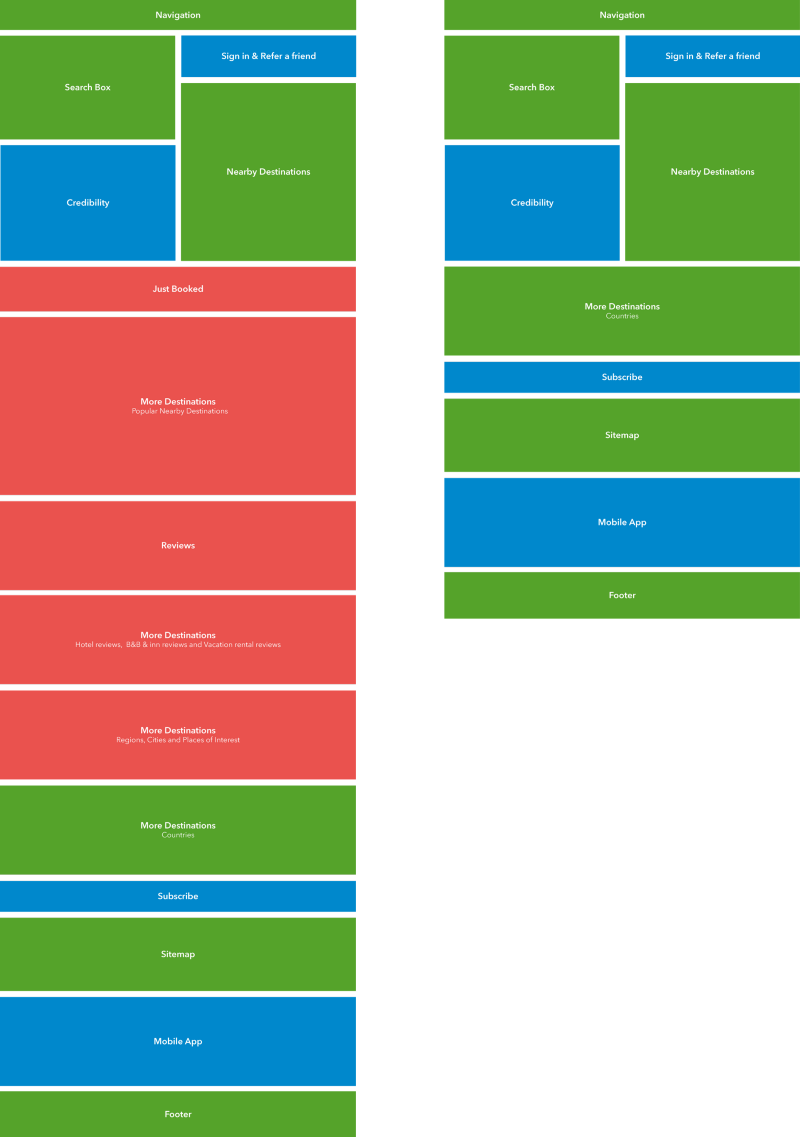
 Current AI OF Booking.com
Now we have 15 cards/blocks and now we are ready for the interviews and card sorting.
Wait a second! Isn’t card sorting the designer’s job?
Yes, but we agreed that “Customers should drive the product”.
I want to engage the users in that phase so I sliced the home page into 15 images.
 Slice and Dice
Before starting the interviews, I took my chance to re-sort the cards in order to check my hypothesis later on with the interview results.
I didn’t have access to a usability testing lab, so I just picked 5 of my friends with different backgrounds and mentalities, yet they have one thing in common: they travel a lot.
I did most of the interviews online and they were so helpful. So thank you guys!
The following points are based on the current UI of Booking.com
One of them mentioned a new feature he would love to have in the reviews section which is ‘Auto Translate’.
 Auto Translate
Interviewees were asked to assign weightage for each card.

And here is the result:
 Card Sorting Result
Remember you can always test your hypothesis at any phase. So we will test it using the low fidelity prototype.
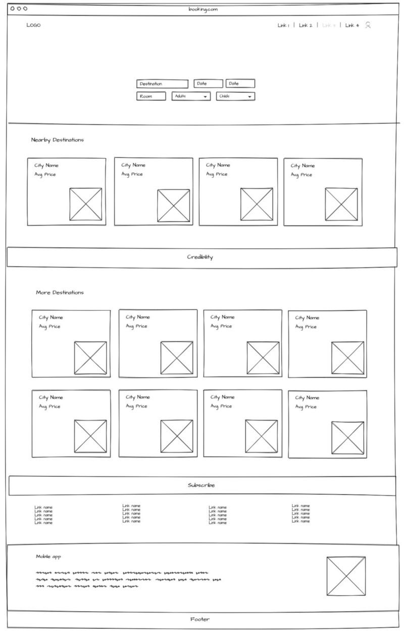 Booking.com wireframe using MockFlow.com.
Stop Wondering and Start Testing.
 They will love it… They won’t.
Actually, they love it. Yet, they think it would be simpler and more intuitive if data was better categorized with less repetition. And now we are ready for the next step.
While designing the high fidelity prototype, I decided to divide the “More Destinations” section into 2 distinctive sections:
 First High Fidelity Prototype.
 Simple cards animation (Show less .. Love more).
Now let’s test the prototype!
“Testing leads to failure, and failure leads to understanding.” — Burt Rutan.
The feedback was quite encouraging. They loved the cards and the simplicity, but they didn’t fall in love with the search section because it was not so clear and they needed it to stand out more. So, I went for a tiny modification.
 Second High Fidelity Prototype.
Now it is a bit clearer and finally they loved it!
 Oooh They love it!
Remember, I did the whole study based on my friends’ experiences. So if you think this is a great UX, I’m sorry to tell you that we aren’t yet sure about that.
Yes It might be a great UX but, did I A/B test It?
The Answer is NO. So our next step should be the A/B test because Booking.com has data-driven culture.
So all I have to do now is to run the A/B testing and it will probably fail.
 After the A/B Testing.
Well, Booking.com has a creative team of around 150 designers. Chances are, they have all tried to modernize the current UI but the A/B testing matrix simply told them: NO.
“Booking.com doesn’t look that way that it does because I decided it should look that way”
Stuart Frisby – Director of Design at Booking.com
So it’s all about A/B testing now I will not gonna do it because it requires a lot of data and high traffic on the webpage. And this is just a UX Case Study.
The whole idea here is not about creating the best artistic UI for Booking.com. It is more about practicing the UX processes and documenting the effect of UX on the interface and users’ preferences on deciding how the front-end would be constructed.

Booking.com: A UX Case Study was originally published in UX Design Collective on Medium, where people are continuing the conversation by highlighting and responding to this story.
AI-driven updates, curated by humans and hand-edited for the Prototypr community


