Build Design Systems With Penpot Components
Jul 21, 2:15 AM
Penpot's new component system for building scalable design systems, emphasizing designer-developer collaboration.
smashingmagazine.com

Design + Sketch App — Medium | Rahul Chakraborty
Color is one of the most important element in the design language system of a brand/product. Our brains are programmed to reject both under and over stimulating information, so it’s very important to create a color palette that delivers both visual interest and a sense of order. 🎨
I believe, building a defined set of system/rules is important when you start designing something. Colors are a subset of a brand’s DLS (Design Language System), and it is one of the major areas, where designers miss out on building a defined set of rules for their usage of colors.
“Design systems provide a convenient, centralised, and evolving map of a brand’s known product territories with directional pointers to help you explore new regions.” ~Chris Messina, ex-Uber
In this article, we will discuss some techniques to define a set of rules to generate color variations, that can scale to a larger spectrum of usage and also could be applied across any brand palette in future. You can choose any of these techniques or combine them to create your own.
Here’s a list of few color properties that we will be harnessing to its full potential to create color variations:
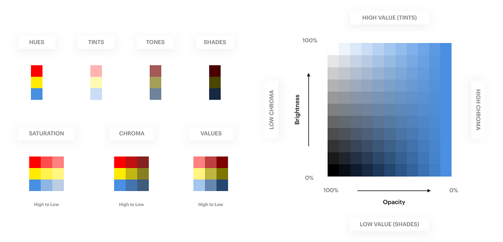 Summary of color properties. We will use a combination of these properties to generate color variations. Download print version
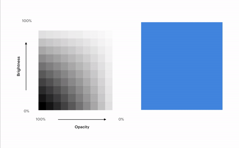 10-point scale Framework grid for understanding color properties
The above graph shows the relation between Brightness, Opacity, Tints, Tones, Shades & Chroma for a particular Hue. This graph was built using a 10-point scale. What it means is, the Opacity of color varies by 10% across the X-axis and the Brightness varies by 10% across the Y-axis.
We will be using simplified version of the above graph, using a 25-point scale to build our Base Framework Grid. This grid will serve as our playground with multiple possibilities to generate colors.
I have used Sketch App 💎 to create the framework grid but one can create the same in other design tools like Photoshop/Illustrator/Figma/Gimp/etc. We’ll be using the popular HSB Color system all across.
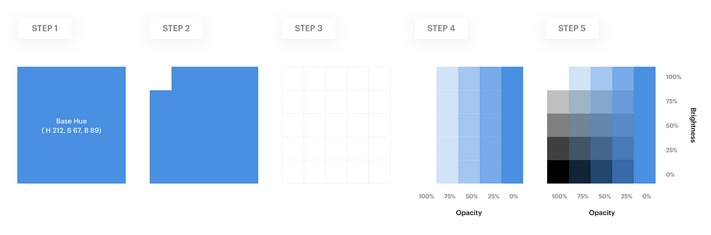
⚓️ Refer to the image below while you follow the steps below:
Step 1. Select a Base Hue. Create a 50 x 50 px square with this Hue. Here for example, I chose a blue Hue (H 212, S 67, B 89).
Step 2. Create a 10 x 10 px white square tile (H 0, S 0, B 100).
Step 3. Duplicate these white tiles (5 rows, 5 columns) so that it covers up the entire base square of Step 1.
Step 4. Reduce the Opacity of each column of white tiles by 25% from left to right.
Step 5. Reduce the Brightness of each row of white tiles by 25% from top to bottom.
 Here’s the Sketch file of the above mentioned steps
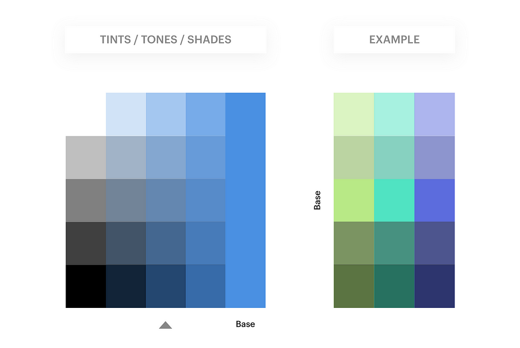
So now, you have the Base Framework Grid. If you followed the steps correctly, you will have a color grid similar to the one shown in the image above in Step 5. We will use this framework grid to learn some methods of generating new colors. 👨💻
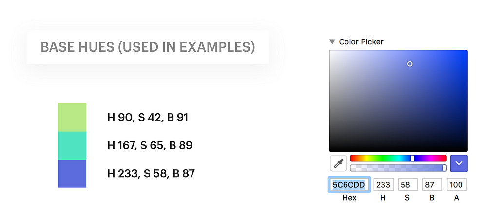
To better visualise the color variations, I used 3 more base hues as examples in the methods below. You can obviously choose your own colors.
This method is the most commonly used, due to its simplicity. The Base Framework Grid you created above was generated using this method. The Opacity & Brightness of the white tiles above your base Hue, runs from 100% to 0% (left to right) and 0% to 100% (bottom to top) respectively.
The Color theme on the right side was created using our 3 base Hues (mentioned above) and picking the Opacity & Brightness values from the centre column on the left side (indicated by arrow).
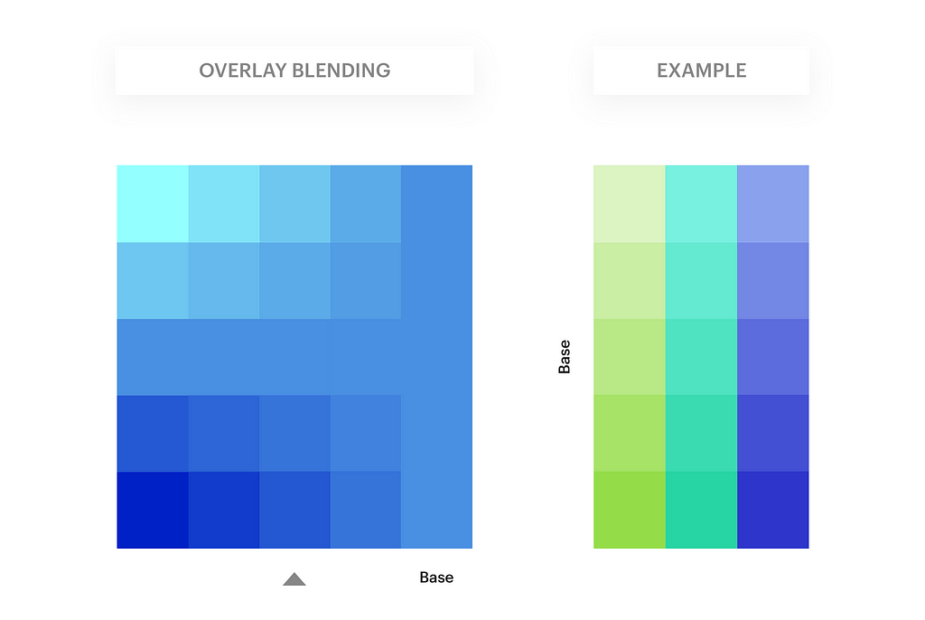
In this method, we use the same base framework, and change the Blending mode of the white tiles to Overlay. This creates a beautiful Hue difference across the grid.
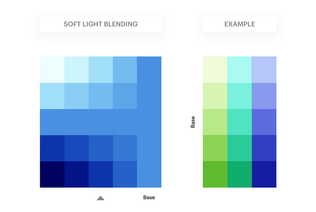
Similar to #2 Overlay Blending method, here we change the Blending mode of the white tiles to Soft-Light. This creates a beautiful Saturation difference across the grid. We then select all these white tiles, and duplicate them twice. This creates a stronger Saturation difference, and hence better color vividness.
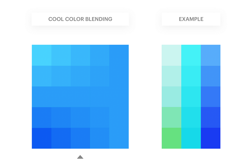
This method uses the grid framework we created in #2 Overlay Blending method. We then choose any Cool color (blue, for example). Create a Rectangle of this color and place it across the entire grid. Change its Blending mode to Overlay. The resulting color grid has a Vivid cool effect to it.
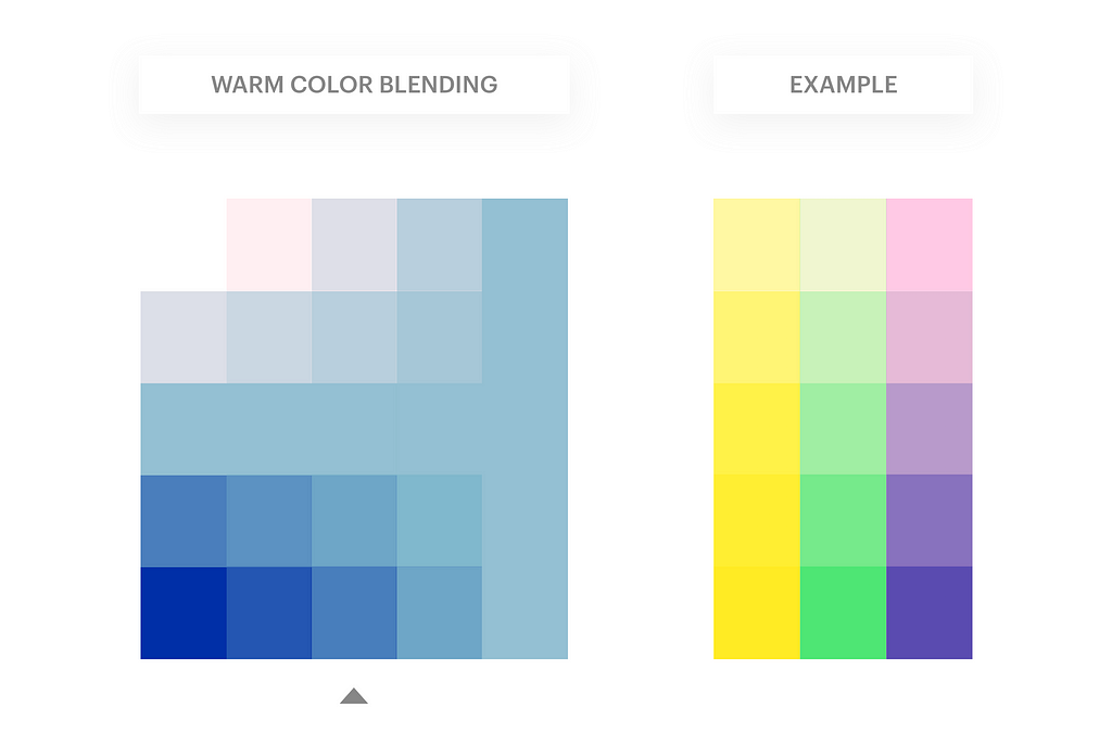
Very similar to the #4 Cool Color Overlay Blending method, here instead we choose any Warm color (orange, for example). Create a Rectangle of this color and place it across the entire grid. Change its Blending mode to Overlay. The resulting color grid has a Dramatic warm effect to it.
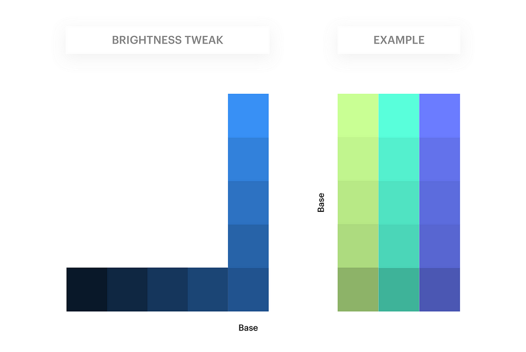
This method is a little different & easier from the above mentioned methods. The white tiles above the base Hue are not present in this grid. Instead, we create tiles of the base color (as shown in the image below), and create a range of Light & Dark color by increasing & decreasing its Brightness value respectively.
The Color theme on the right side was created using our 3 base Hues and then simply increasing & decreasing the Brightness values to create Light & Dark variations respectively.
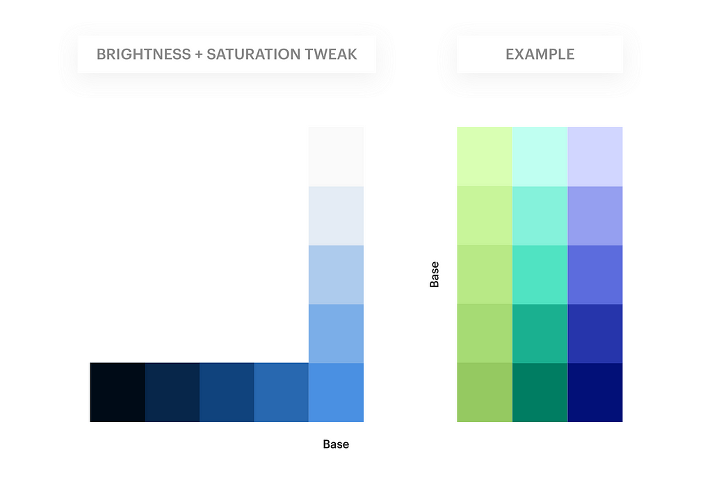
This method uses the same grid of #6 Brightness Tweak method. Here, we tweak the Saturation values alongside the Brightness values. We create a range of Light & Dark color by increasing & decreasing its Brightness value, and simultaneously decreasing & increasing the Saturation values respectively.
Rule 1: Lighter Color variation = Lower Saturation + Higher Brightness.
Rule 2: Darker color variation = Higher Saturation + Lower Brightness.
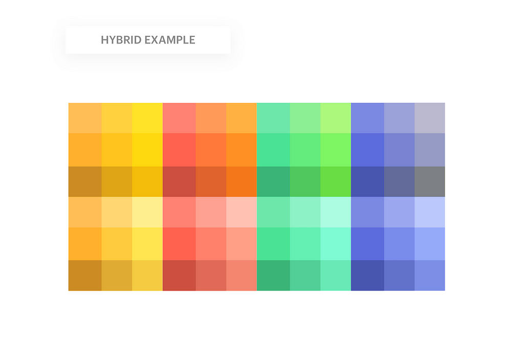
Here’s a hybrid example that combines method #1, #3, #4 and #5 to generate a beautiful palette of colors. This was inspired by one of the articles on Sketch Tricks to build a color system quickly in Sketch App.
It’s all about using your tools and harnessing the basics of design elements. Combination of different elements/techniques often opens up a door to infinite possibilities.
There are even more methods to generate color themes. As you see, creating a Base Framework Grid was the most important part. The grid served as a playground to your imagination to generate color systems. You can combine multiple methods to create an entirely new set of colors from your base Hue. (try Gradients instead of solid base Hue 😉).
You can also use Justin Mezzell’s Adjustment Layers Method to create Vintage color sets.
I will soon write about another interesting (and complex) method to generate a set of color themes, using Gaussian Distribution function. Thanks to Nishant for the tweet which gave me the inspiration to look into this method. You can Follow me to stay updated. 🔥
Hello, I’m Rahul Chakraborty, building experiences & crafting solutions at India’s largest e-commerce platform, Flipkart. 🛒
I Tweet design & tech related stuff regularly, and my work-in-progresses on Dribbble. You can find the other side of me on Instagram.
✏️ Finally after much procrastination, this is my first article on Medium. Feedback is most welcome. If you liked or learnt something after reading this, do recommend it to others. (Play the clap game 👏)
Thanks for reading! ❤️


Building a Color Palette Framework was originally published in Design + Sketch on Medium, where people are continuing the conversation by highlighting and responding to this story.
AI-driven updates, curated by humans and hand-edited for the Prototypr community


