Build Design Systems With Penpot Components
Jul 21, 2:15 AM
Penpot's new component system for building scalable design systems, emphasizing designer-developer collaboration.
smashingmagazine.com

uxdesign.cc – User Experience Design — Medium | Kevin C. Kupillas 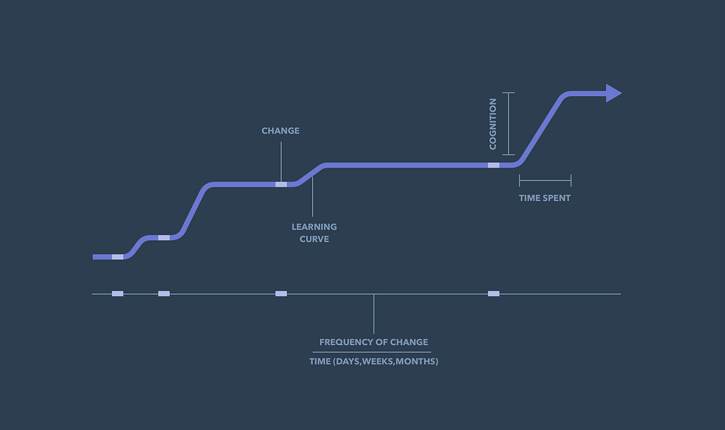
It’s hard not to think that people hate change in general. Even though our goal is to make changes that help our customers make progress, there’s plenty of times our changes aren’t received well 🙁. The change might fall short of actually providing value, or maybe the change has a bugs, usability issues, or aesthetics that the customer doesn’t appreciate. There’s a number of reasons and causes for why change isn’t well received. This post explores the learning curves that are generated by change itself. And how the attributes of a curve (time/effort, timing, frequency) impact the experience and adoption of the change. The catch is that if we want to build better experiences over time, introducing changes and learning curves is necessary.
Some of us are making changes to daily usage software, and some to occasional usage software. Some of us are making changes to mission-critical software, and some to nice-to-have software. We might be asking people to learn something new, or maybe we’re asking people to relearn a newer way of doing something old. It could be a new customer activity, behavior, or skill. A new navigation menu, interaction pattern, flow, page architecture, visual element, etc. It might even be the removal of any of those things too.
Sometimes our customers have the time and energy to get through learning curves the moment we introduce them, but sometimes they don’t. Sometimes people expect the change, but I’d say most of the time they don’t. Sometimes the change rate of a product over time is minimal but sometimes it’s a little too frequent. And when people are using our product for the very first time, everything can be a change compared to their old way.
Many, many years ago I walked into my (unnamed) bank to cash a check. This was when I still walked my checks into a bank, spoke with a human behind a cage, and exchanged my check for an envelope of cash. It was something I’d done twice a month for years before and like every other bank-goer, I had it down and knew about how long the process took. In fact, I would say I was an expert at cashing checks. I remember that I was in a hurry to meet my friends so I wasn’t particularly excited to stop at this very moment. As it turned out, the bank had a new thingy they wanted to introduce me to, with the promise of it changing my life for the better…The Video Teller Machine! (VTMs). They’re basically ATMs but with a video display that allows you to talk with a real teller located someplace other than the branch.
The scene begins with me walking in the first set of doors where the row of ATMs were. A tall gentlemen in a suit greets me.
“How can I help you today?”, the tall gentlemen in a suit said.
“Hi.”, I said with a smile and a wave. “I’m just here to cash my check.”
He steps in front of me, like directly in front of me. He extends one arm out and points to the new row of machines next to us. He then extends his other arm towards me as if to use it to guide my physical self to where he was pointing.
“Ok, you can do that right here. These are our new Video Teller Machines. You talk to the tellers through the video display and you’ll save time from waiting on line. I can go ahead and help you use it.”
At this point, I didn’t know how long it was going to take to learn how to use this new machine of the future. And to be real, I didn’t know how weird it was going to be. I wasn’t freaking out or anything, but it was a new thing that was asking me to do my old thing in a slightly new way and I didn’t want it in my life at this time. Didn’t ask for it, didn’t want it.
“Uhh no thanks…I’m just going to use the normal tellers and get going.”, I said…politely of course.
“Well, these are our new video teller machines which will help you…”
Although I appreciate that this guy wants to help people get banking done, I’m pretty sure he just wanted to ask if he can introduce me to this new thing.
“No thank you sir.”, I said a little more firmly, pointing to the 3-dimensional human tellers beyond the next set of doors. “I’m in a hurry and I’m going to use the normal tellers over there.”
[End scene]
In that moment I didn’t care that the new machine would save me time now or in the future. I cared about this time and this moment, not my next one. I was in a rush and I didn’t want to go through the learning curve or have this guy walk me through it. Even if the activity of waiting on line and interacting with the flesh and blood teller would be slightly longer, it was what I was used to and I preferred it. It’s not that the product experience was good or bad, I never made it that far to actually judge it. It was that I was in a hurry and just wanted to do the normal routine. A side-effect of the VTM guy trying to change my behavior was that it felt a tad pushy since I was in a rush. I mentally deducted a few points on the overall bank experience that time.
At HubSpot, there’s an old-ish saying told from the voice of our customers — “No time. Too hard”. It’s a simple phrase but a huge reminder that our customers are very busy people. In fact, they’re very busy people in busy businesses doing all the things that people do to help their businesses grow. They’re relying on our tools everyday, and spend time optimizing working habits, flows and tools to maximize their speed and efficiency. Minutes gained/reduced over here, can translate to money gained/lost over there. So, it’s no wonder that pop-ups and modals are closed immediately, long text is hardly read, and even a slight change to the flow feels so much bigger and more painful to them at first. Their bottom line is that they have a ton of shit to do and they are in our software to get that shit done, not learn something new in that moment.
Looking back at that VTM bank moment, I was like our busy customers saying “No time, too hard!”. The tall man in a suit trying to get me to try the new VTMs was our messages and modals we use to introduce new features the next time you log in. I appreciate the fact that he wanted to help, but it wasn’t a good time for me to learn. Change and learning curves created in daily, mission-critical software are especially tricky to introduce. No time. Too hard. Not now. The VTM experience wasn’t that bad of course, and not even close to disrupting business operations or as painful as Nigel Tufnel’s mini bread experience. But, none the less, it was a little annoying.
Even when the learning curve is small and the change will make people’s lives easier moving forward, it’s still a learning curve. Patterns are one of the ways to help reduce or eliminate learning curves in Ui. “Platform over product” is, in part, about using patterns from platform guidelines. Google’s Material system can make it easier for someone to learn your app because your layouts and interaction patterns were learned from the other apps that use Material.
Onboarding, in essence, is about helping users get through the learning curves that stand in the way of seeing value and making progress. When we make those curves smaller or obsolete, we increase our chances of delivering the value we’ve built. And although learning how to operate an app isn’t the only piece of the adoption puzzle, it can obviously make an impact.
Other considerations are things like using simple, common and consistent language in marketing and product content/copy. Using familiar and consistent iconography, affordances and other Ui elements can help reduce the need to learn too.
Capitalizing on knowledge, skills and ability previously gained can help you meet people at their current ability level for the sake of not requiring anything more from them. Or maybe you want to meet them where they are for the sake of a more gradual (and pleasant) increase in effort, sort of like a personal trainer would do with running or weight lifting.
The frequency of introducing curves, when we introduce them and how we introduce them are other interesting things to think through. When is the best time for people to spend the time learning the new way? And in a larger product, shipping multiple times a day, by multiple people, how do the moments of change get orchestrated with each other? When people encounter them, when they log in, when we send a notification, etc?
Knowing that change is our path to improving the user experience, let’s spend a little more time and energy around how we build and introduce the change. Questions to ask ourselves are “ How can we minimize the time and energy needed for people to get through the learning curve of this change?” and “What’s the best moment to introduce this change? What works best for their ability to spend the time, cognitive resource and energy?”
Here’s a few other articles I’ve written that you might be interested in:
“Customer struggles vs. Solution struggles” — solving for the greater motivational context of a customer’s Job-to-be-Done and solving for the usability struggles of a given solution.
“Designing for Anxieties” — connections between anxiety and how it relates to JTBD, Onboarding, behavior change, perception and product adoption.
“May the forces diagram be with you, always” — how we can use the “forces diagram” from JTBD switch interviews to help uncover struggles and propose change in every day life.
Change generates learning curves was originally published in UX Collective on Medium, where people are continuing the conversation by highlighting and responding to this story.
AI-driven updates, curated by humans and hand-edited for the Prototypr community


