Build Design Systems With Penpot Components
Jul 21, 2:15 AM
Penpot's new component system for building scalable design systems, emphasizing designer-developer collaboration.
smashingmagazine.com

Design + Sketch App — Medium | Pavel Kuligin 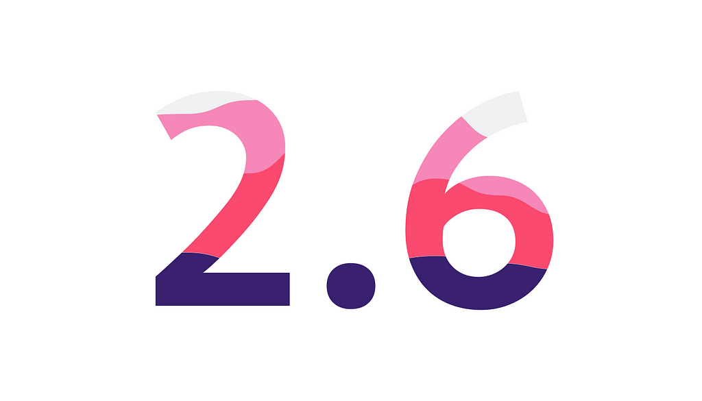
Since the first public launch of the Chart, 2 months have passed and I came to you with some new features and plans for the future. I’ve worked hard on some new types of data visualizations and I’m glad to introduce them, in Chart 2.6 you can see:
Also, I’ve fixed issue with artboard restriction: now you can create Chart everywhere, not just on artboard. The first release of Chart didn’t have full support for negative values and flexibility in Parameters.js, but I fixed it too! Let’s go deeper 🙂
You already know about very basic types of visualizations in Chart, but in real work, data designers wants to have all these staff: http://datavizproject.com. And I brought you some new useful data visualizations!
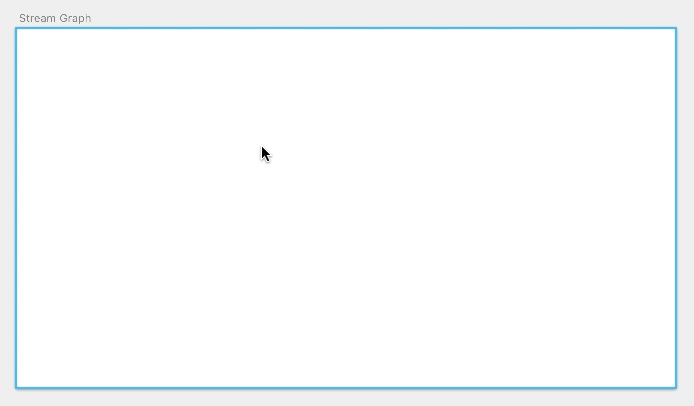
Stream Graphs are ideal for displaying high-volume datasets, in order to discover trends and patterns over time across a wide range of categories.
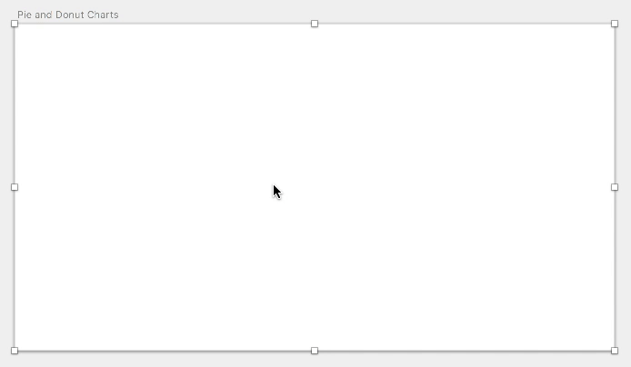
Pie and Donut Charts are ideal for giving the reader a quick idea of the proportional distribution of the data.
These charts are very useful for indication of index of whether something is good/bad, high/low, above average, etc.

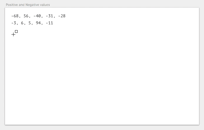
Data can’t be only positive. Real data can contain negative values or even consist entirely of them. Until now Chart hasn’t worked with negative numbers very well, but I’ve done some work, and now it’s fixed. Let’s see examples.
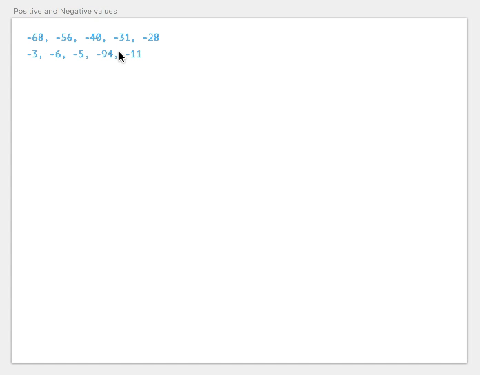
Remember: Stacked Area, Stream Graph, Stacked Bar Charts don’t work with positive + negative data sets, but they work with only negative values. Pie and Donut Charts, Solid Gauge Chart and Progress Bars don’t work with negative values at all.
Chart is a framework created to solve problems with data visualization for designers around the world. It means that each parameter must be configurable. File with all the customizable parameters is called Parameters.js. Let’s see what it consists of.
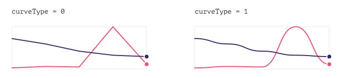
// Type of line: straight — 0, curved — 1
var curveType = 1;
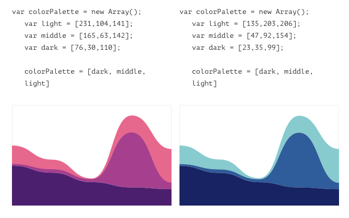
// Set of colors for lines
var colorPalette = new Array();
 var red = [244,67,54];
 var pink = [233,30,99];
 var purple = [156,39,176];
 var deepPurple = [103,58,183];
 var blue = [33,150,243];
 var cian = [0,188,212];
 var teal = [0,150,136];
 var green = [0,200,83];
 var yellow = [255,235,59];
 var amber = [255,193,7];
 var orange = [255,152,0];
colorPalette = [red, green, blue, yellow, purple, pink, amber, cian, deepPurple, teal, orange];
// Parameters for Lines
var borderThickness = 2;
var endWidth = 8;
var dots = false;
var cuttedCenter = false; // false — color of dot the same as line color; true — you can choose color of dot and dot border below;
var dotFillR = 255;
var dotFillG = 255;
var dotFillB = 255;
var dotBorderR = 255;
var dotBorderG = 255;
var dotBorderB = 255;
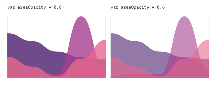
// Parameters for Areas
var areaOpacity = 0.8;
// Parameters for Bars
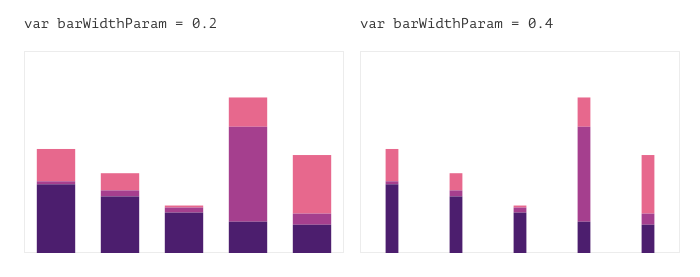
var barWidthParam = 0.2; // The larger the parameter, the thinner the bar;
// Parameters for Donut
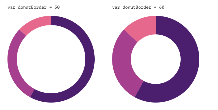
var donutBorder = 30;
// Parameters for Progress bar
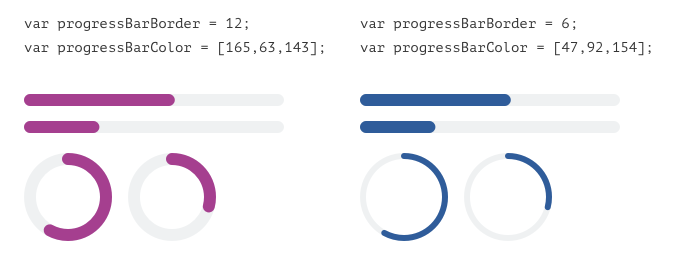
var progressBarBorder = 12;
var progressBarColor = [244,67,54];
// Parameters for Gauge chart
var gaugeChartBorder = 30;
var gaugeChartColor = [156,39,176];
var gaugeChartBackcolor = [236,236,236];
// Parameters for Sparklines
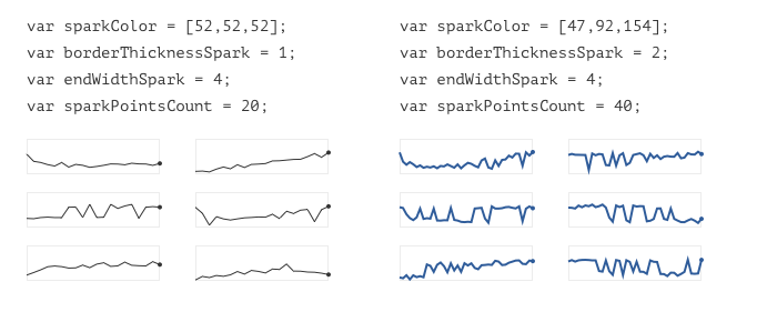
var sparkColor = [52,52,52];
var borderThicknessSpark = 1;
var endWidthSpark = 4;
var sparkPointsCount = 20;
 Use only RGB colors.

In the next few month I’m going to add three new data visualizations: Bubble chart, Scatter plot and Candlestick chart. I believe, that Chart can be a must have plugin for all designers working with data.
And next big thing for Chart can be the Table. Yes, you heard that right — Table. I believe, that the creation of the table shouldn’t take more than 2 seconds, and the redrawing is more than 1 second, isn’t it? Tell me in the comments what plugins and tricks you are using now and what you don’t like about them.
To try Chart, download and install Sketch plugin from Github.
Chart is a free and open-source project. If you find any bugs or have suggestions, feel free to contact me or fork the repository to add additional functionality.
Chart 2.6 — a lot of new visualizations, negative values and more flexible parameters was originally published in Design + Sketch on Medium, where people are continuing the conversation by highlighting and responding to this story.
AI-driven updates, curated by humans and hand-edited for the Prototypr community


