
Build Design Systems With Penpot Components
Jul 21, 2:15 AM
Penpot's new component system for building scalable design systems, emphasizing designer-developer collaboration.
smashingmagazine.com

medium bookmark / Raindrop.io |
Hey, how’s it going? Have you’re heard of charts? Charts, diagrams, and pies are crucial design elements allowing anyone to visualize data in eye comfortable manner, as well to be used in thousands of dashboard shots around Dribbble. Designers and other folks produce a lot of them, sometimes from a scratch sometimes automatically generating them based on certain values.
Every time you say “big data” in public — somewhere, a chart was given birth.
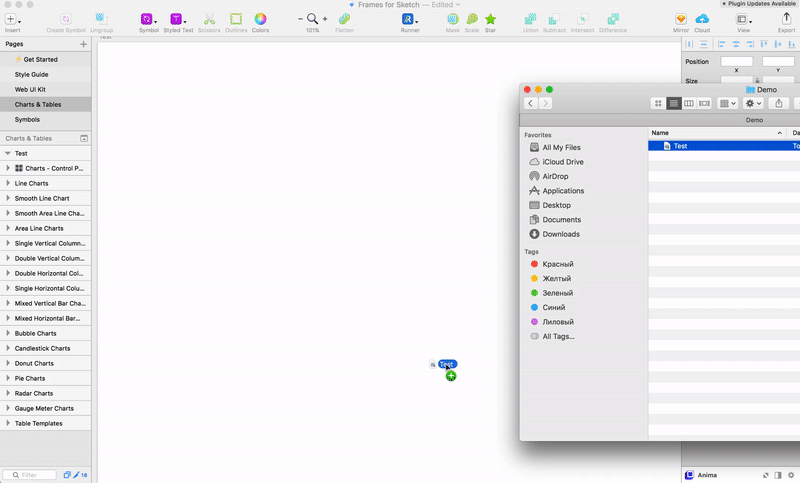
In the latest update of Frames for Sketch v.1.6, we have added Charts components to the master file, so be sure to check them out. And in this episode, we will take a look at data visualization features and extensions that can be helpful in your daily work with these graphics.
The vector (V) tool has some tricks for certain chart design use cases, this are some examples:
But, working with vectors points can be very time consuming, and maybe I want to generate lines and pies based on the data that is already accessible to me, this is a computer age already? 🤔
So here some extensions that may come in handy:
You can use Frames toolkit (or any other shared styles collection) to quickly assign your brand color and stroke properties to the vector paths and shapes from the PDF you just imported — this is may be a real time saver sometimes.
There are also other tools out there that maybe you want to mention, but many of them have their own drawbacks when it comes to resizing or customization, which eventually forces you to work with vectors or go through the modal window scenario of creating a chart time after time. 💭
Customization always important when it comes to visuals. There is always an open room to play with fonts or colors as well as the need to adjust the assets to look perfect within different interface states, and what may look great on a web dashboard may probably look terrible on mobile.
To achieve more automated customization we use a separate artboard to make a Control panel for storing shared styles that can be easily overwritten with just [⌘+LM], which is probably one of the most basic / popular key combination.
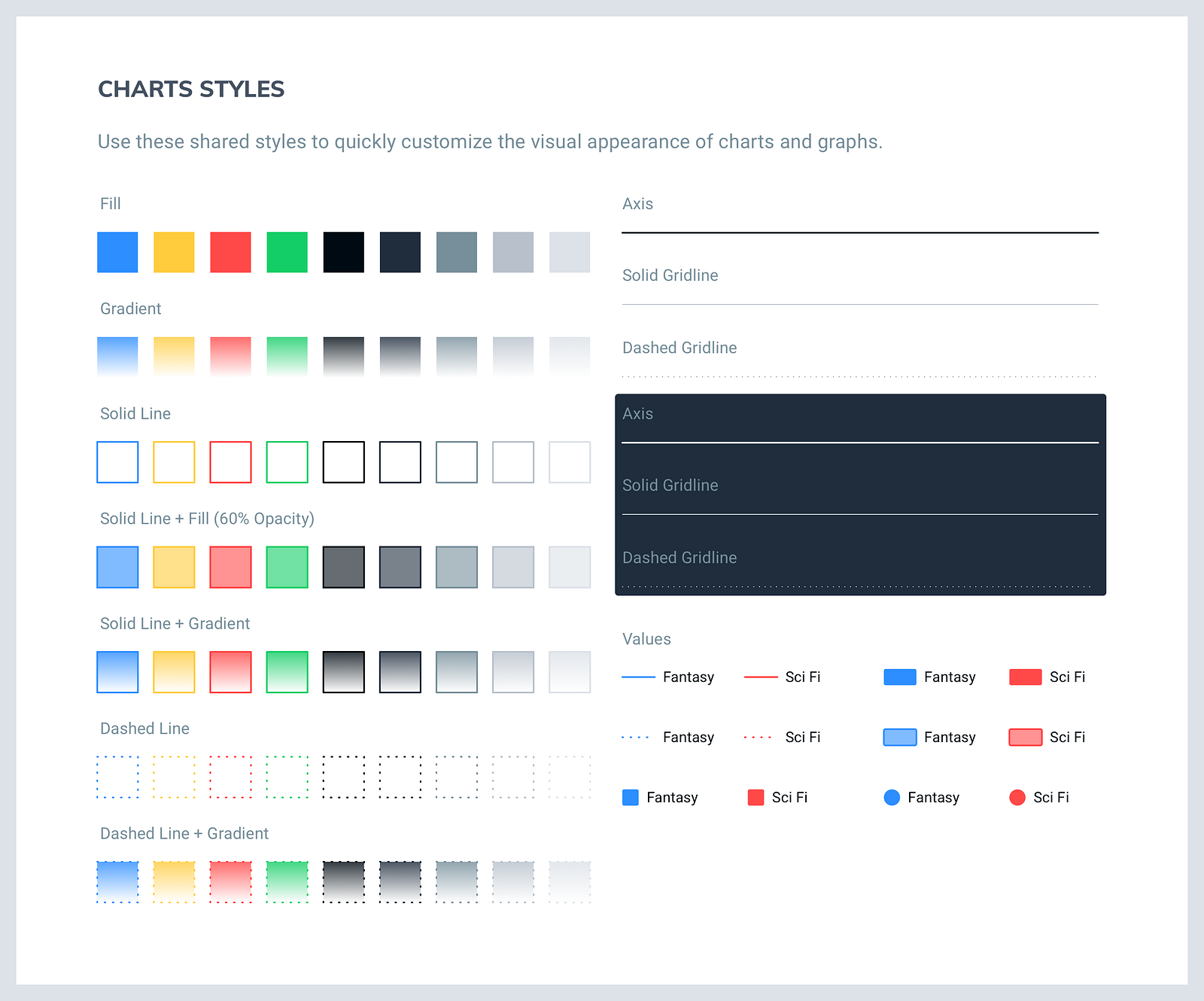
The Control panel contains different colors and border properties stored as shared layer styles that can for values, grids line, and axis.
This panel allows me to quickly restyle graphics for different tasks and brand, controlling multiple Borders and Fill properties from a single place of truth to not get a mess of styles.
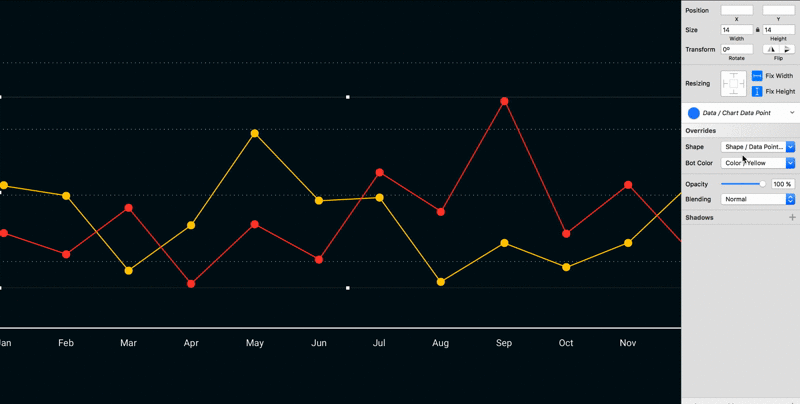
Use symbols for a Data point components with different shapes and color properties which can be auto-update via global colors from the Frames style guide or a any other symbol library.
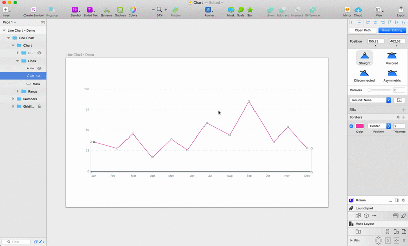
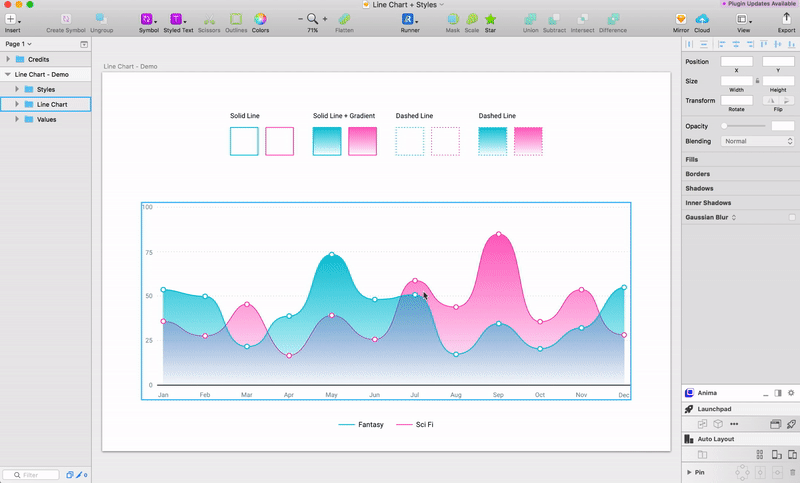
To ensure that your graphics are fit into always new skinny jeans, you need to correctly use the resizing options for certain layers groups, here is a demo file with a simple Line / Area chart that you can see single chart layer structure.
Press the Image to Download
Line chart folder is divide into tree groups: Chart (lines and data points), Numbers (Y values) and Gridline (X Values), to make everything work well and stretch, set:
Test it to see the best amount of values or points for your chart to have, and have a good day. 🎶
Hope it comes in handy, and if you interested in more advanced sketch design approach — get your self a copy of Frames Design System and instead of spending time aligning shapes and playing with layer groups use our premade collection of Charts.
Stay tuned now that we have tables, charts and every other component synced through our UI library we can move to the next stage of complex dashboard design. 🏃
AI-driven updates, curated by humans and hand-edited for the Prototypr community


