Build Design Systems With Penpot Components
Jul 21, 2:15 AM
Penpot's new component system for building scalable design systems, emphasizing designer-developer collaboration.
smashingmagazine.com

Design + Sketch App — Medium | Anna Huang 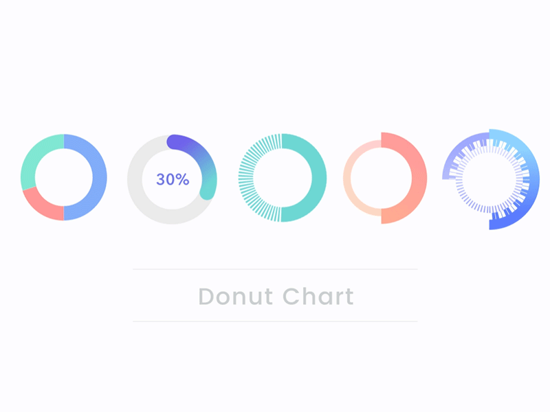
Donut chart is one of the most common measures that we use to show data. If you are a UI designer, there are chances that you might need to drew and design it. However, you certainly don’t have much time to draw and cut it piece by piece. In order to work smarter and faster, here are some clever tricks can help you to make a donut chart rapid and flexible on sketch. Via using some simple mathematics formulas, you don’t even draw it but only typing some number. Let’s see how to do it!
 A formula of calculate circumference
As this above image, we knew that 2 times π times r (radius) equal to C (circumference). If we have a 200×200 circle, we can easily to calculate the circumference is 628.

For the first sample, we have a donut chart with three layers. First of all, you have to draw a 200×200 circle for the green one. Then, duplicate one more and change its color to be blue. Calculate and get the 628 as the circumference. Now we want to have the blue as 50% of the circle, so 628 times 0.5 equal to 314. Typing 314 on the Dash text box, another 314 of 628 will be left as the gap. Typing 314 in Gap text box.
The third part, just like I described above, duplicate another one more circle and change color to be red. Now we want to make it 30% of the circle, so 628 times 0.3 equal to 188. Typing 188 in Dash text box, and typing the 470 in Gap text box. Last, using the rotate tool to turn the red piece to the position you like.
If you learned how to make a donut chart from this sample, then you can apply it to many different type donut charts. Let’s see how to make other styles.

First of all, you draw a shallow gray circle as the background. Then, duplicate one more and giving it a navy to green gradient color. Now we want it to be 30%, so we just typing 188.4 in the text box of Dash and 439.6 in the text box of Gap as we did last one. Then, changing border type to the round style. Done! It’s so quick and flexible. You can change anytime whatever any percentage you like by typing number.

You also can do some different, vivid and interesting background for the donut chart. In this sample, we have the dashed line as the background. First of all, draw a green circle and type 4 in the text box of Dash. Then, duplicate one more and typing 314 in the text box of Dash and Gap. This is about playing on dashed line and the solid line to present the different style.

In this sample, we are trying to play on its border thickness of the donut chart. Now we already knew how to quickly have a half circle. After we got it, we choose the center as the position option and type 40 in the text box in Thickness. Then, duplicate one more, and choose inside as the position option and type 20 in the text box in Thickness. Last, choose it and hit Layer > Transform > Flip Horizontally. Done!

If you already comprehend those four samples above, you are able to create this advanced type easily. You can play with the border of thickness, position, color, dash, gap and more.
I screenshot the setting of different layers, you can just try it!
Share with me your creative donut chart!
I created all the samples on Sketch and used Adobe After Effect to have it turn around. If you’d like to check out the sketch file and the aep file, you can download here:
I got the inspiration from this video ‘‘https://youtu.be/M6AS3jPsrII’’, if you like it, give him a thumb up. If you like my article, give me some claps. Thank you for reading 😀
Clever Making Donut Chart on Sketch was originally published in Design + Sketch on Medium, where people are continuing the conversation by highlighting and responding to this story.
AI-driven updates, curated by humans and hand-edited for the Prototypr community


