Build Design Systems With Penpot Components
Jul 21, 2:15 AM
Penpot's new component system for building scalable design systems, emphasizing designer-developer collaboration.
smashingmagazine.com

medium bookmark / Raindrop.io |
Pushing the boundaries of user experience as Lead Product Designer at Narvar.
Wouldn’t it be great if instead of dummy text you have real-like text that brings life to your designs? Wouldn’t it be easier for stakeholders to understand what information goes where? Would it even make sense to show dummy text during user testing?
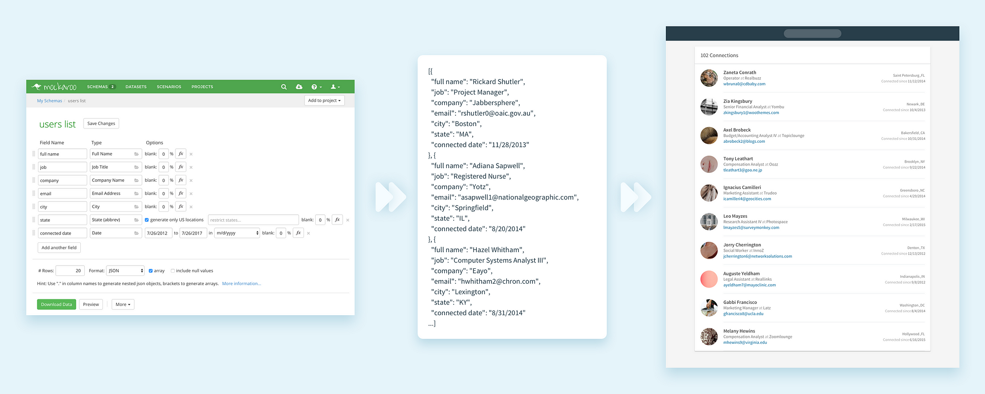
From Mackaroo to your Designs.
Mockaroo is a very simple, yet extensive random data generator. The tool allows you to generate thousands of rows of data with over 100 field types to choose from. We’ll get to the details in a sec, but I just want you to be as excited as I was when I first heard about it.

Mockaroo interface to generate your data.
Wait a second, you may say. There are many solutions out there that do the same. Data from Craft plugin for instance. True. But the greatest value of Mockaroo is its versatility.
A simple example, would be to create a users list with a name and an email. How weird would it be if the email didn’t match the name right? Mockaroo takes care of that. For each row of data, it will make sure that the values are relevant. Cities are linked to States to give you another example.
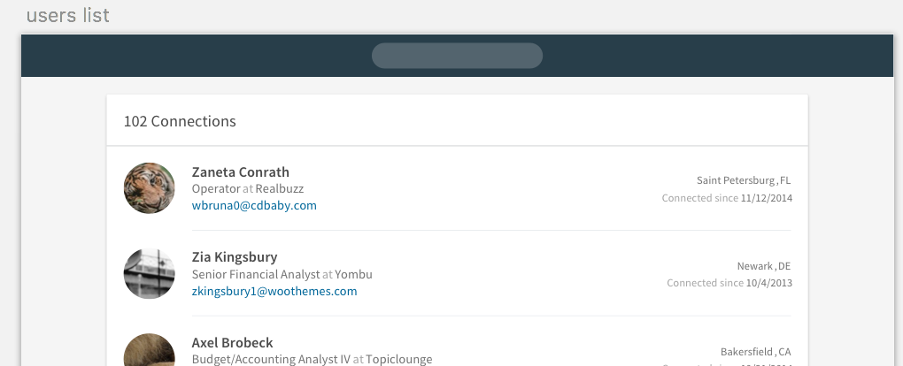
One of the 2 examples you’ll build by the end of this short tutorial.
But the real killer feature, in my opinion, is functions. You can transform the randomly generated data at will. Or even mix different fields. For instance, in the example of metrics table shown below, you can actually get the real value for the “Total” column from the other columns.

The “Total” column uses a function which sums all the other columns’ value.
You could also use more manual solutions, like Sheetsu. Here is a tutorial I wrote about it. But this approach might be cumbersome for long lists of content.
You should by now be pretty pumped up by the potential of Mockaroo. So let’s dive into 2 examples. A list of user profiles and a list of weekly metrics. All the files used in these examples are available in this Dropbox.
The first step is to define the kind of values you want in your designs.
For the Users list example shown earlier, we need field types like: full name, email, job title, company name, etc.

Add as many fields as you need.
So you need to add fields and select the right type you need from the huge list of options.
Sidenote: Mockaroo offers you a lot of types categories to choose from: Location, Commerce, Personal, IT, and so on. It goes from texts, to numbers, and even images. I let you explore all the possibilities.

Mockaroo offers an extensive list of field types.
In the metrics table example, I played with the functions feature. Very simple use case, where the “Total” field is the sum of all the other ones.

Functions allow you to customize even more your data.
Don’t forget to preview how your data is generated before exporting.

Preview how your data is generated.
Now that the heavy work is done. Select JSON as the exporting format. And click on the green button “Download Data” to get the JSON file on your computer.
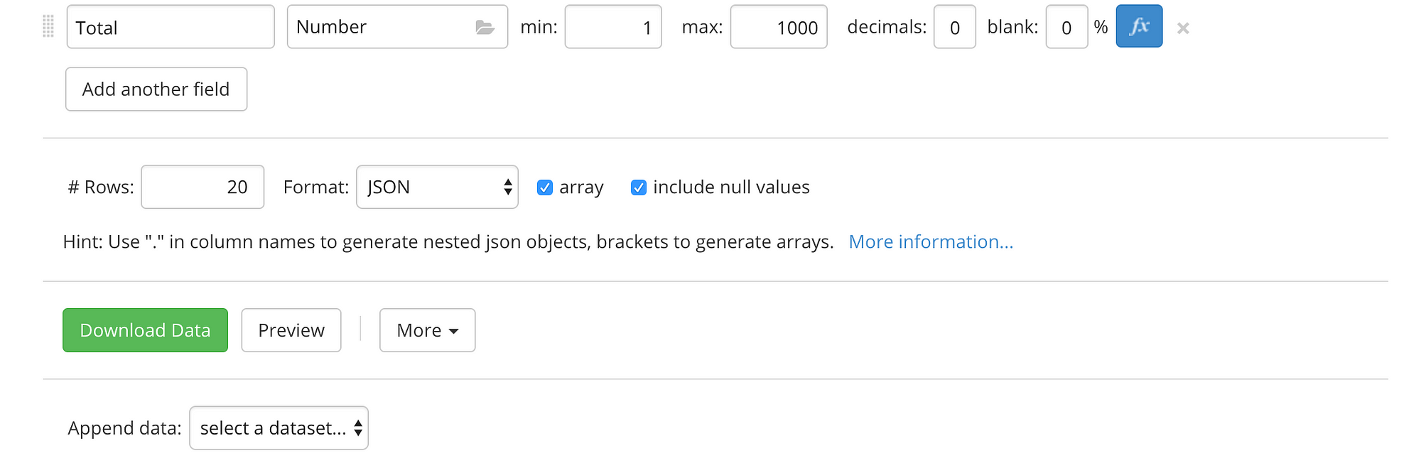
Click on “Download Data” to … download your data.
Make sure to toggle the panel of Craft plugins to see it on the left of the Inspect sidebar in Sketch. Click on the Data section, JSON tab, and select the JSON file you just exported.

Access the JSON tab in Data, a Craft plugin.
Now, link the different fields from your JSON to the different text layers you want to populate.

Map your JSON keys to the text layers in the “example 1 / row” Symbol.
Disclaimer: for the avatar image, I used portrait images from Unsplash. Check the “Photos” in the “Custom” tab.
Click on “Duplicate Content” at the bottom of the box. Check “Vertical” and pick the number of rows you want. In this example, no spacing is necessary so keep the second value to “0”.

Use Duplicate plugin to create different versions of the “example 1 / row” Symbol with the content in the JSON.
Well done! Do the same with other example and you now have 2 different lists with lifelike data.
I hope that this short tutorial gives you the motivation to experiment with this awesome tool. Really! Try it out. It’s totally free for export with less than 1,000 rows.
Feeling adventurous? Look at the other features the tool offers, such as Datasets, Scenarios, and projects (Youtube tutorials).

Many more features to try out.
If you enjoyed this article, please help out your friends with a 👏 or a share.
Raffaele Gesulfo is a Product Designer at Narvar. Narvar helps retailers champion their customers at every step of the journey. Connect with us on LinkedIn or say hi on Twitter. By the way — We’re hiring, check out our careers page.
AI-driven updates, curated by humans and hand-edited for the Prototypr community


