Build Design Systems With Penpot Components
Jul 21, 2:15 AM
Penpot's new component system for building scalable design systems, emphasizing designer-developer collaboration.
smashingmagazine.com

medium bookmark / Raindrop.io |
My first contact with CSS Grid was at a talk from Rachel Andrew and I was fascinated by the problems it solves and possibilities it creates. I played around with it a bit and today I want to show you a layout scenario that wouldn’t be trivial to implement without CSS Grid — a layout with intertwined sections.
I will not explore in depth each CSS property, considering this is not meant to be an exhausting tutorial. Instead, I’ll leave some links at the end so you can check more detailed documentation about the properties we use here!
For the layout example, we’ll use a fictional social network for dogs (doggos want to meet new doggos every now and then). For each profile, we want to see a name, some info about the pupper, a photo (obviously! 😍), a bio and achievements (like trophies 🏆, they deserve it).
Let’s say that for some reason, the designer behind this very useful platform wants the profile page to have this strange arrangement. Meet Lola, our volunteer doggo:
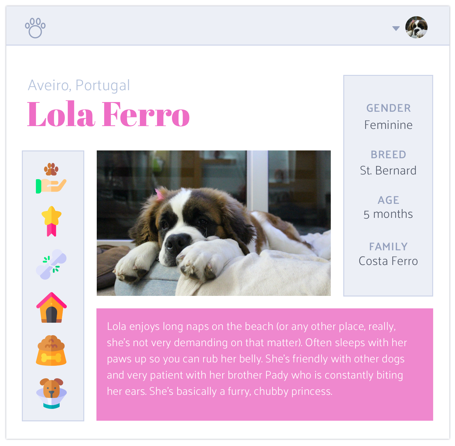
Icons made by Freepik from www.flaticon.com.
By now, you might have realised this blogpost is just an excuse to show off my cute pupper, but give me some leash! If you don’t like dogs (you cold-hearted cat person 😒), I brought you some CSS as well.
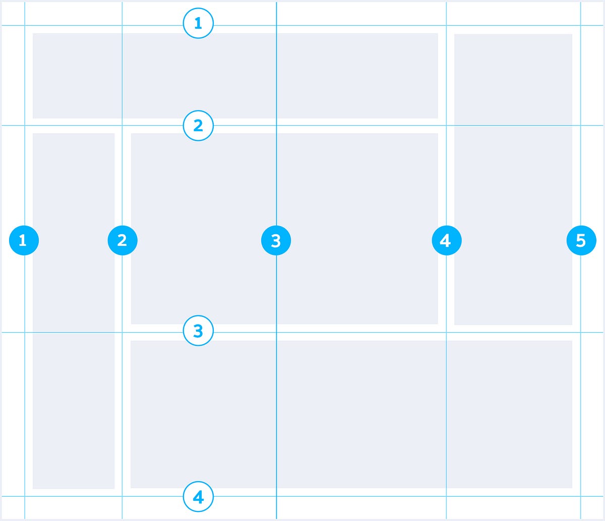
There is, of course, a huge number of ways you can define a grid to structure each page or component, accordingly to your needs. Here we want a simple example, so I’m going to use the following structure:
Very easy to do with Sketch, also easy to do with CSS Grid. 😄 How would you do this without CSS Grid? Let me know if you find some interesting solution!
The first thing you need to do is set your container. That container is where you define the grid itself — columns, rows, gaps, areas, and so on. Only then are the items placed on the grid. This is different from what we‘ve been doing until now — we are used to setting sizes and margins to the items in order to create the aspect of a grid.
So, first things first: display as grid. You won’t see any changes right away because by default the grid only has 1 column. Let’s create some columns and see the changes:
By default, each grid item is orderly placed in one cell.
The frunit indicates the fraction of the remaining space that that item occupies. You can combine it with other units such as % and px.
It’s great because you no longer have to make calculations with percentages while considering the number of columns, amount of margin between items, etc. It adjusts to the overall space you have left and to the spacing you set between the items.
Also, I’ll set the rows to a minimum of 100px (so you can see the grid better when we start placing the elements). But I want the rows’ height to grow accordingly to the content size — in case some dog decides to write an entire book on its bio!
For this result, we use the minmax() function, with 100px on the min value and max-content on the max value. By using max-content, the div will expand to accommodate the content.
Max-content: Represents the largest max-content contribution of the grid items occupying the grid track. [1]
The intrinsic preferred width. [2]
Now, the gaps. We don’t want everything to be so close together, it’s claustrophobic! 😵 I’ve set all the gaps to 10px, but you can specify different values for grid-row-gap and grid-column-gap.
You might have also noticed that gaps only appear inside the grid, they don’t add space around it. For that, you can set margins (that’s what they are after all). And remember, you cannot insert elements into the gaps, not even if you set them to 500px! They are gaps and they are to help. Just add more columns if you need them.
Now that our container is all set up, it’s time to distribute our content.
But first, you need to know that the items’ placement in the grid is based on the grid lines, not the tracks! Our grid, which has 4 columns and 3 rows, has 5 vertical lines and 4 horizontal lines. If a section occupies an entire row, it goes from line 1 until line 5 of the columns.
We can place items with these properties:
grid-column: column-start / column-end;grid-row: row-start / row-end;Or this, for a shorthand:
grid-area: row-start / column-start / row-end / column-end;And many other ways, which you should definitely explore. I’m not going to delve too much into the ways you can place items on the grid, but you can read this for more details. There are several “tricks” that might come in handy.
Here’s an example, take a look at how I placed the trophies ⬇️
You can count the lines backwards, which is super useful when you don’t know how many rows/columns you have! In this case, I want the trophies section to always go until the last row, even if I were to add more rows to the grid.
Alright, now we can start inserting the content!
You can now see how the rows stretch to accommodate the content (thanks to that minmax() function with the max-content value).
And for the trophies and info sections, I’ll use the Flexbox layout. Grid is not a replacement for Flexbox, they are meant to be used in different situations, though they have some features in common. CSS Grid is designed for two-dimensional layouts (which is our shiny new toy and it’s awesome), but CSS Flexbox is more powerful for one-dimensional layouts (or layouts that would be one-dimensional, if our screens were infinite).
Here are some cases in which Grid works better than Flexbox:
Making literal grids. 🙃
fr and grid-gap are your best friends. width: calc(100%/7 * 2 — 10px) nightmares!Page layouts.
minmax(), repeat() and the auto-fills. Lots of bonus points here, way to go Grid! 🙌So, you can combine them. Grid items can be Flex containers and the other way around. Please note: yes, you could achieve the 1D layout of trophies and info using Grid instead of Flex, but I really want to stress that both can coexist since they have different purposes and strengths.
Here’s what we’ve covered so far. If you want to read more details about it.
That’s all for now! Let me know your thoughts on this layout example and what other cases you found where Grid rocks. 😎 If you’re not here for the CSS at all, here’s a picture of Lola. Thank you for staying with us!

Deemaze Software is a digital agency developing products for web and mobile. Keep track of our work through Twitter, Facebook and Instagram.
See you around! 🐶
AI-driven updates, curated by humans and hand-edited for the Prototypr community


