Build Design Systems With Penpot Components
Jul 21, 2:15 AM
Penpot's new component system for building scalable design systems, emphasizing designer-developer collaboration.
smashingmagazine.com

medium bookmark / Raindrop.io |
Hello again! 👋 Today we’re going to talk about how to build responsive layouts while using CSS Grid. If you’re just starting with Grid, I recommend that you read my first blogpost before this one. Baby steps!
In this post, we’re going to build a photo gallery (on our fictional social network for dogs) and I’m going to show you how I organize responsive layouts in two different scenarios:
Of course we’re sticking with puppies, so let me introduce Pady, Lola’s brother. 🐶 He’s quite helpful when he’s not too busy trying to eat his toys, so here he is:
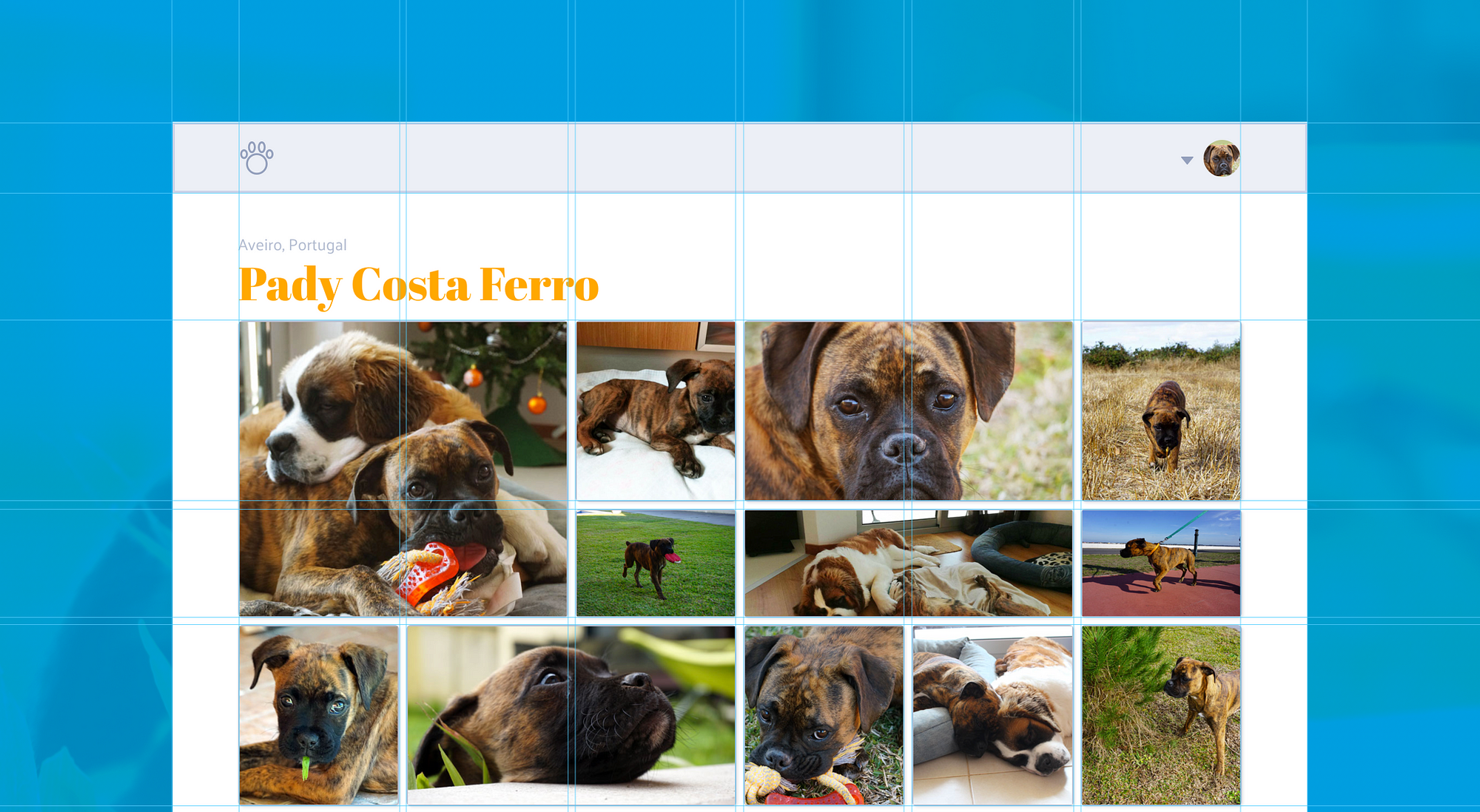
Our volunteer doggo!
Without further ado, let’s dive into those layouts.
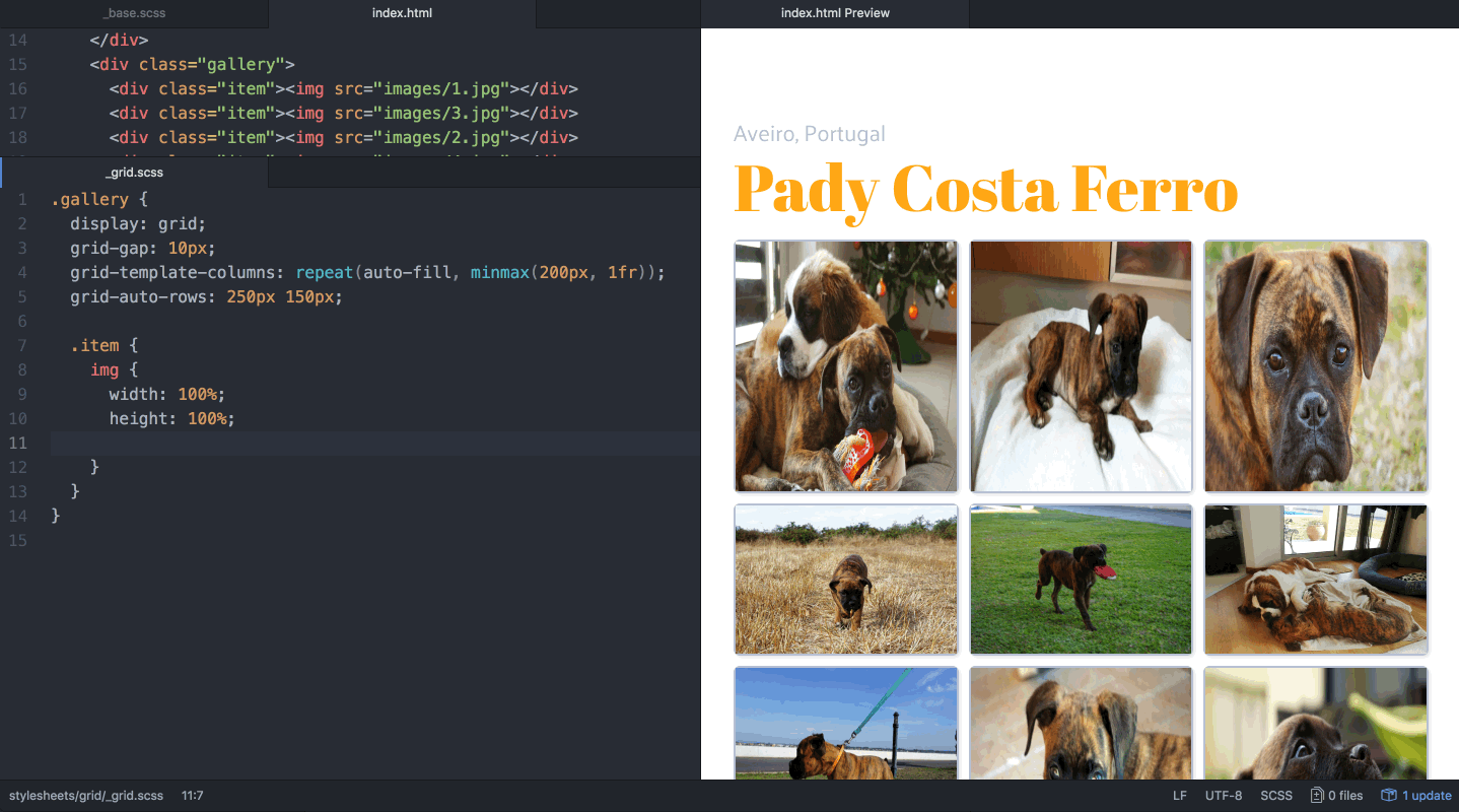
You know the drill. The first thing you have to do is setup your grid with display: grid; so you can start working on it.
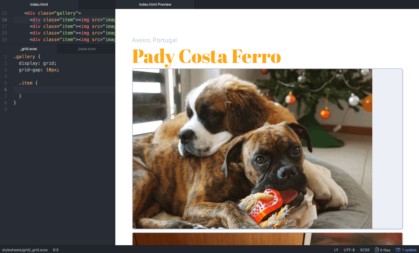
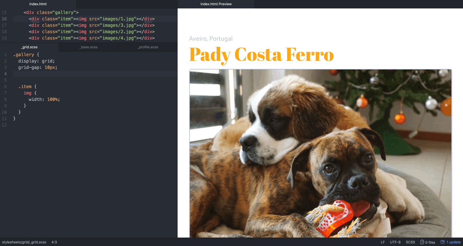
The HTML structure for the gallery is a div, the container where we’ll set the grid properties. Inside, several div items with images inside (so we can see the cells well).
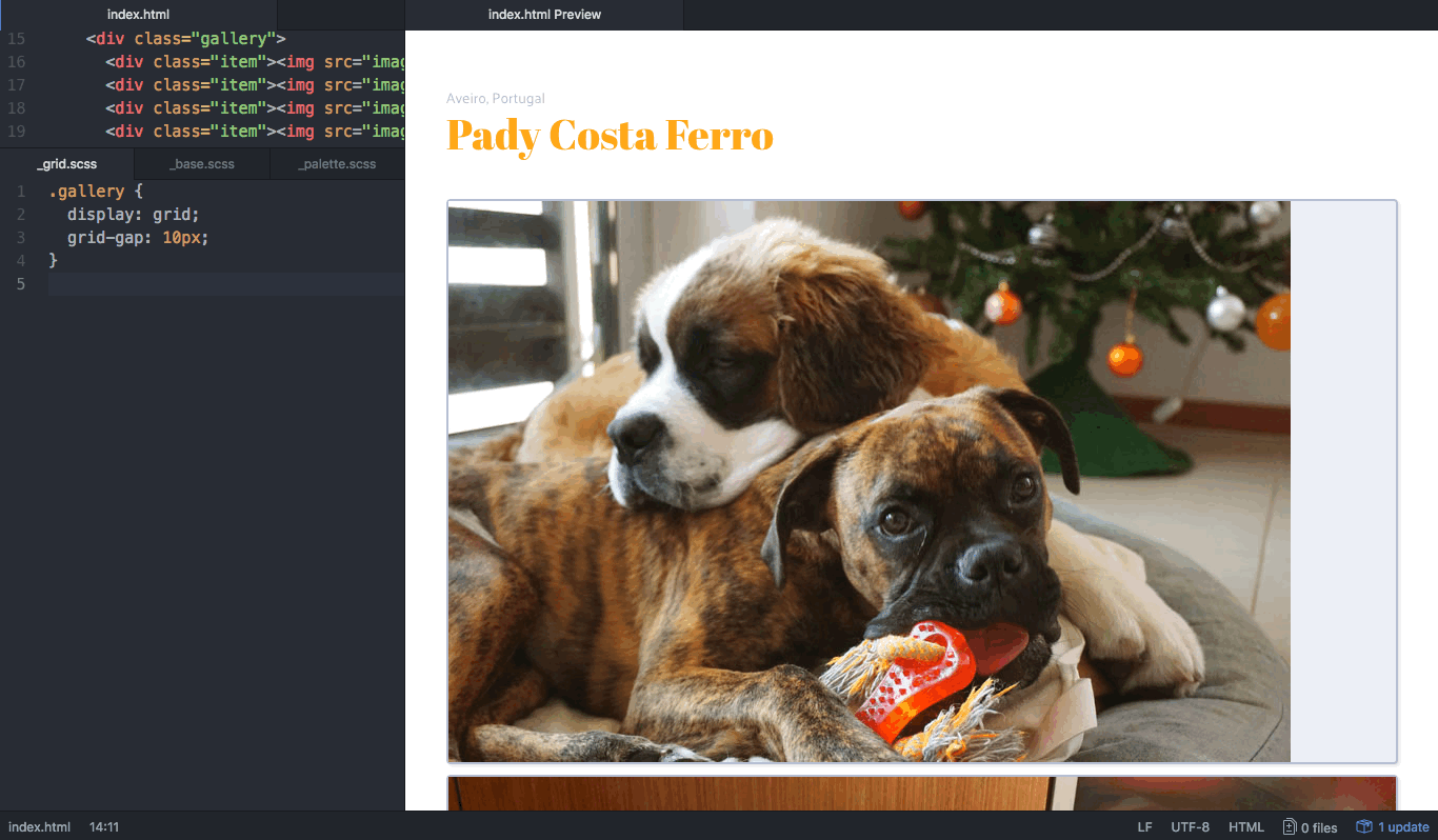
As you can see on the preview above, we have a grid with one column and a gap with 10px. The items on the grid get their heights from the images inside them, and when needed will stretch to occupy the full grid width.
When it comes to alignments, the default value is always to stretch (whether we’re talking about grid items, grid tracks or the grid itself). You can change this with properties that are very similar to the ones used with CSS Flexbox. We’re not going to explore that here, but you can check CSS Tricks Guide to Grid, which explains this in a very organized and visual way!
For now, let’s give images 100% width and we’ll deal with them once our grid is all set up.
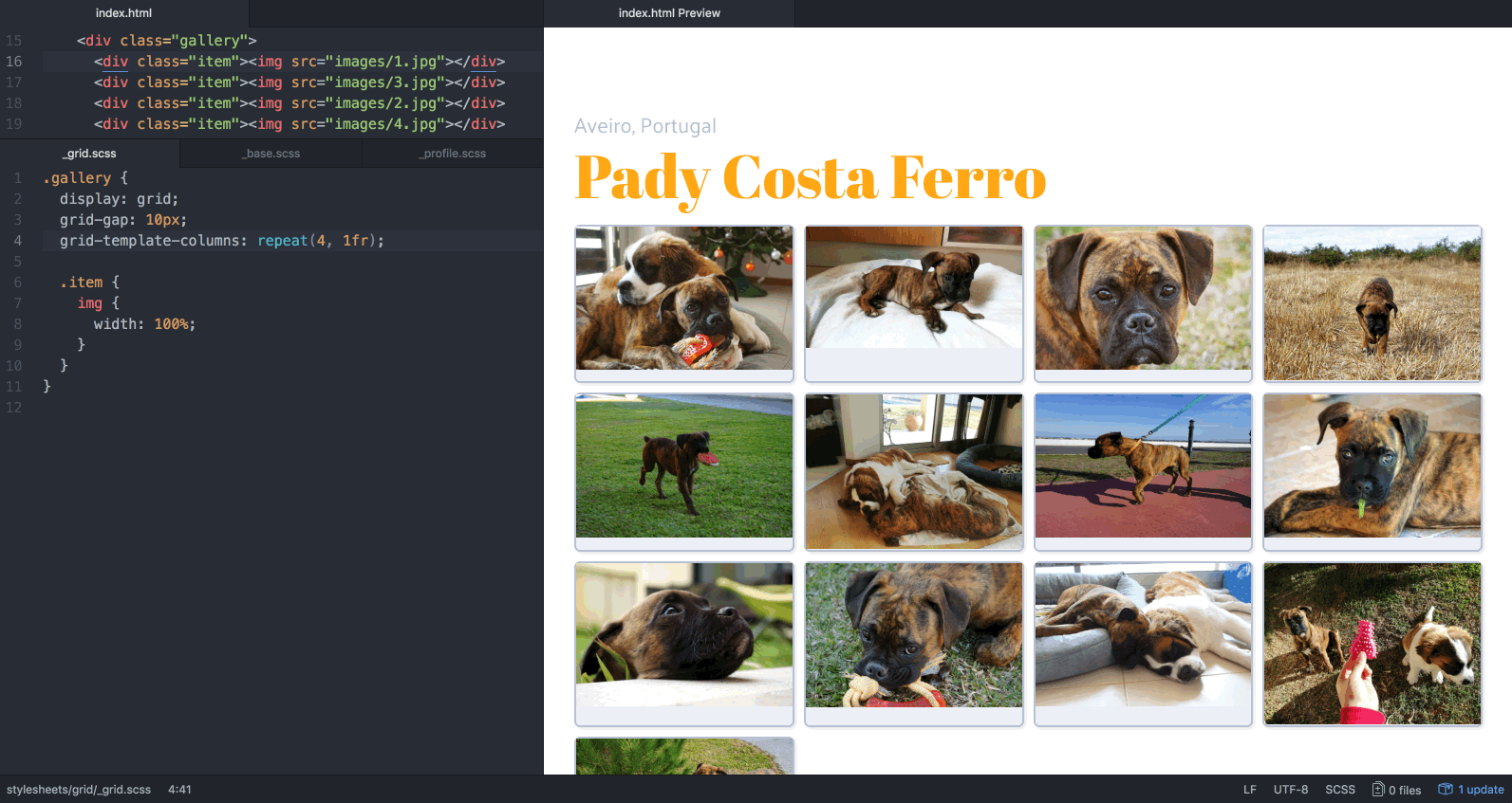
Pady is so adorable that we want to see lots of pictures of him as soon as we open the page! That means we need to create a few columns. So let’s try to make a layout with 4 equal columns and see how it works.
Images still have different heights, yes, but we’ll deal with that later, I promise! 🙏
Not very flexible, is it? I mean, it looks great. Until someone opens the website on their cellphones and sees an apparently ant-sized Pady. No es bueno.
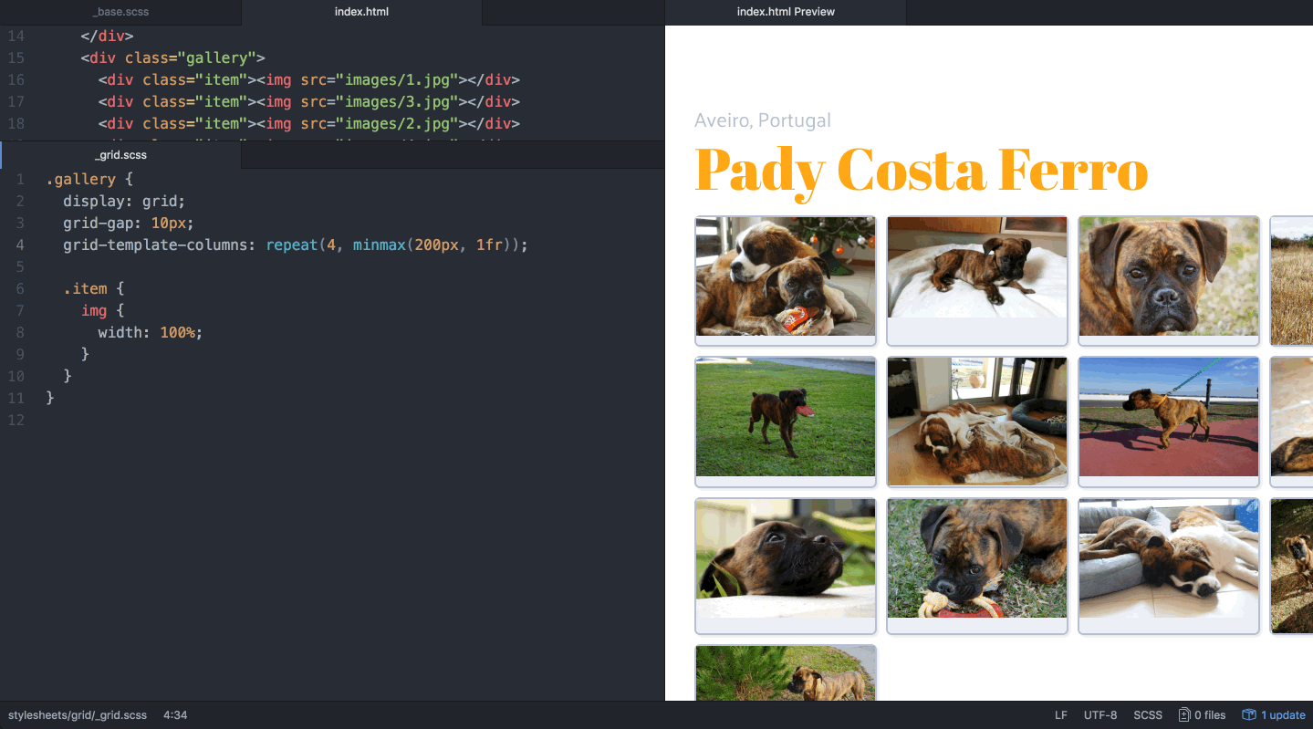
We can try to mend this by using our old friend minmax(), making sure the photos won’t shrink to less than 200px.
Oh no, we lost him. 😨
Overall it looks better, but suddenly photos are hiding behind a horrible horizontal scroll. What we want is for images to move to the next row once they no longer fit (in this case, when there’s no longer 200px available on that row). Then, once an image passes to the row bellow, have all images stretch to occupy the newly available space.
Sounds like we have some work to do with percentages and media-queries!
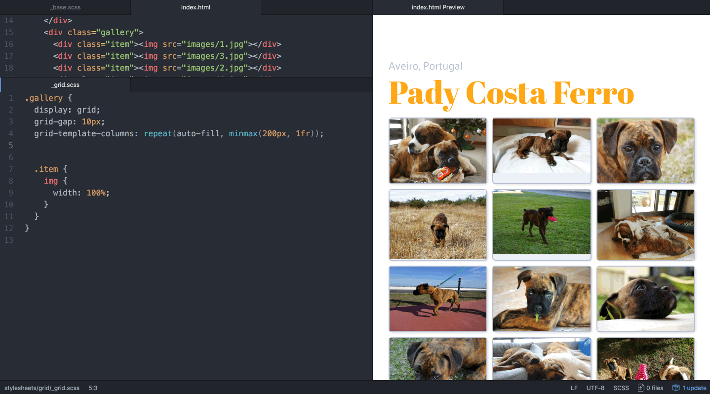
Here’s the good news: Grid has magic words that do all that for you! 🙌 Instead of specifying a finite number of columns, we can define sizing properties for the tracks and let the grid calculate how many fit the available space. If you’ve never heard about auto-fill and auto-fit, prepare yourself because you’re about to fall in love. 💕
auto-fill
With a given minimum track size, the number of track repetitions is the largest possible that does not cause the grid to overflow the container.
auto-fit
Initial behaviour is the same as auto-fill.
After all items are placed, if there are any empty tracks, those tracks are collapsed. This means those tracks are treated as having a track sizing function of 0px and the gutters (or any other automatic spacings) around them are collapsed as well.
What this means, in practical terms, is: if you use auto-fill as the repetition number, you can end-up with empty tracks, because it will create as many tracks as possible in the available space. If you use auto-fit, those empty tracks disappear, allowing the others to expand and occupy the remaining space.
Now we have a nice responsive behaviour for several screen widths, without using any media queries!
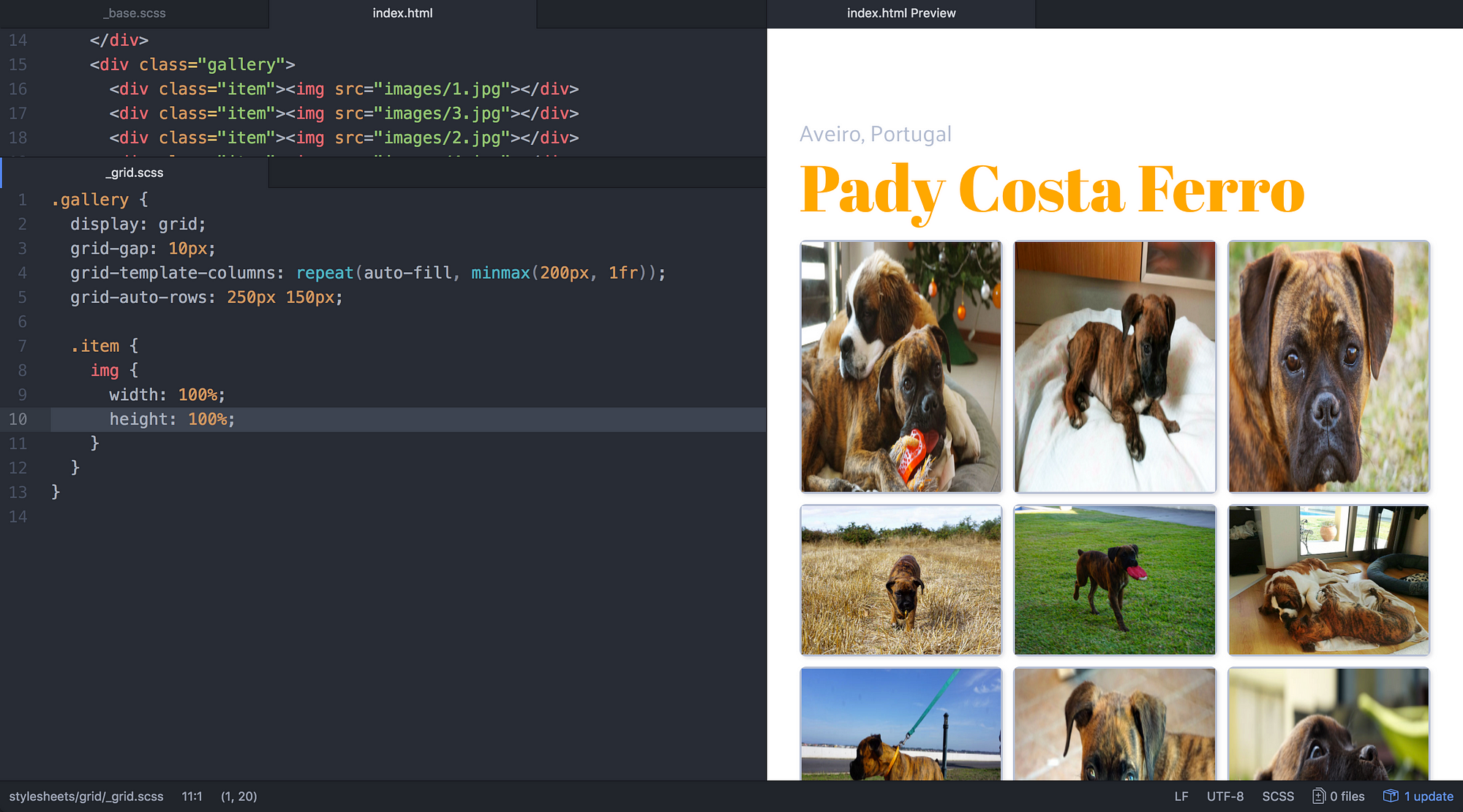
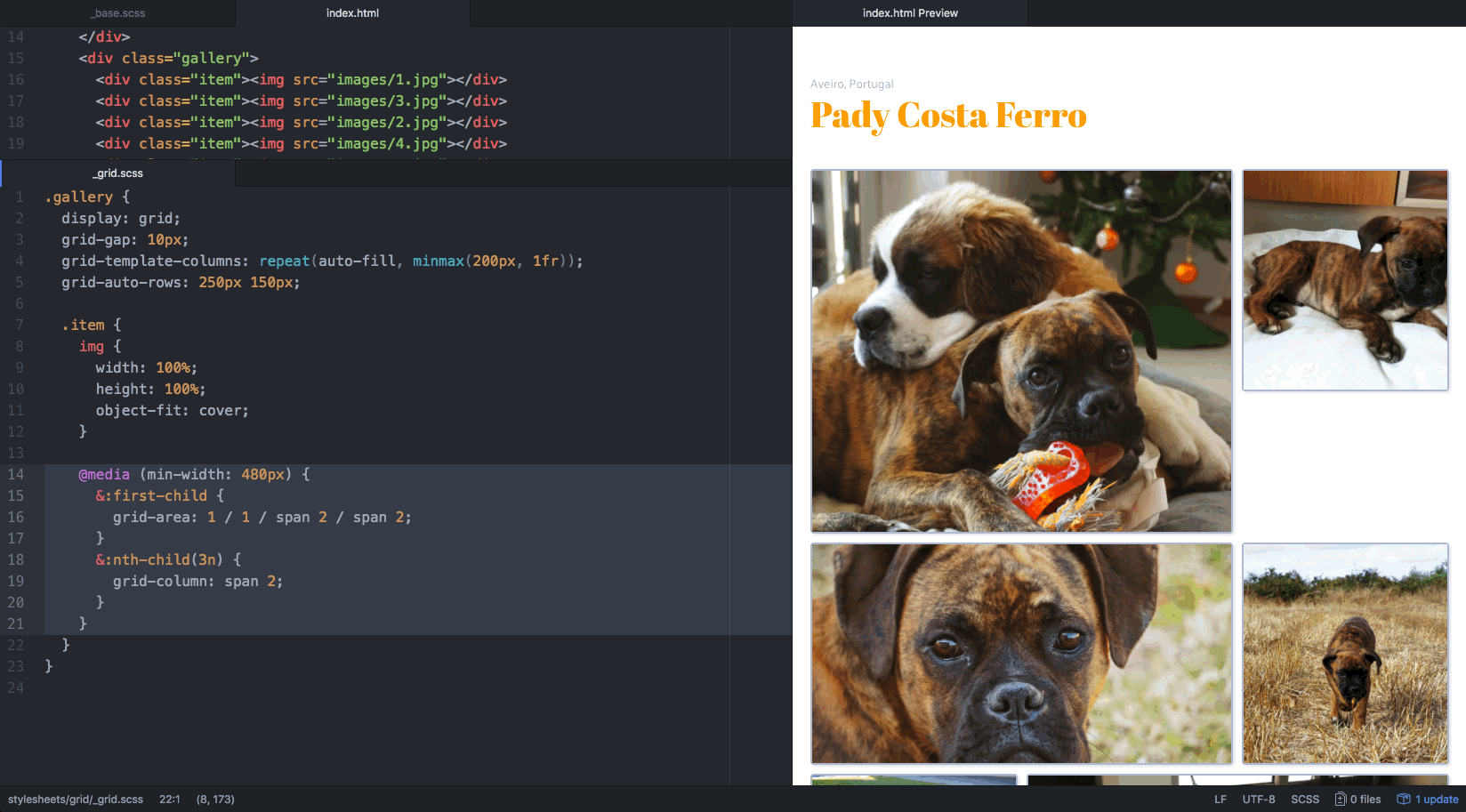
However, you might have noticed that images with different proportions leave empty spaces inside their container. Before we can fix that, we have to set heights to the grid rows. (I’ll tell you why in a minute.)
But we don’t know how many rows we have. 🙀
In the previous blogpost, we talked about defining the explicit grid; which means, defining the rows and columns we know exist. This is great when you have a defined amount of tracks. But because the web is flexible and filled with endless surprises, most times we can’t predict the amount and shape of content provided by its users. We have no idea how many photos Pady will upload, so we can’t set up a finite number of rows! 🐾
When we have more items than template cells, Grid creates auto-tracks. Thankfully, we can specify the behaviour for those tracks (rows or columns) that are generated automatically, using grid-auto-rows and grid-auto-columns. For the purpose of this post, we won’t dig much into it. Lets simply give them two different px values, so we can see how the pattern is repeated along the created rows.
Now the images leave even more empty space in the container and we can’t stretch them. Actually we can, but we don’t want Pady looking like this:
This is pure evil.
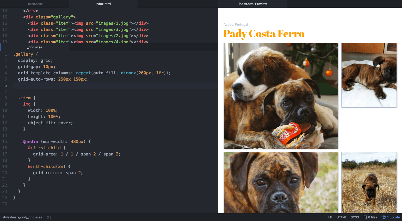
We can’t use the grid items alignment properties directly on media elements, but we can use the object-fit property to specify how an <img> or <video> should be resized to fit its container. If we set it to cover, the images will fill their entire container without leaving blanks nor being distorted. This is why we defined heights for the tracks; we want the photos to adjust to the container and not the other way around!
When it comes to responsiveness, this is awesome. We don’t need to worry about images having different proportions, nor about the containers having varying proportions as the screen size changes. We don’t have a care in the world!
Wow, so flexible.
This is it. We have a very responsive layout without any media queries, and using very few lines of CSS! ⚡️
But if we want to spice things up, we can change how images are distributed along the grid. For large enough devices, let’s make the most recent picture stand out by making it occupy two lines and two rows. And then make every third picture use two columns, to make things even more interesting!
This just got cheesy. 🧀
Ok, yeah, we’ve added a bit of spice to our photo gallery, but we’ve also added a lot of holes that don’t look so great. 😐
The grid-auto-flow property allows us to change the order by which the items are placed on the grid. You can set its value to row (default) or column, making it fill the grid horizontally or vertically. And you can also set it to dense. By making so, the grid will attempt to fill in the holes if smaller items come up later. Keep in mind that this might cause the items to appear out-of-order.
Now we have a gallery that it’s not boring at all, fully responsive, full of puppies and using only 25 lines of CSS!
What more could you possibly want? 🎁
We’ve seen a scenario where a layout has similar components repeated. Now we’re going to see how we make a responsive component without any repeated sections.
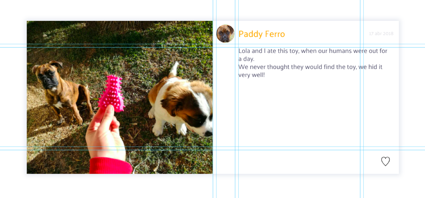
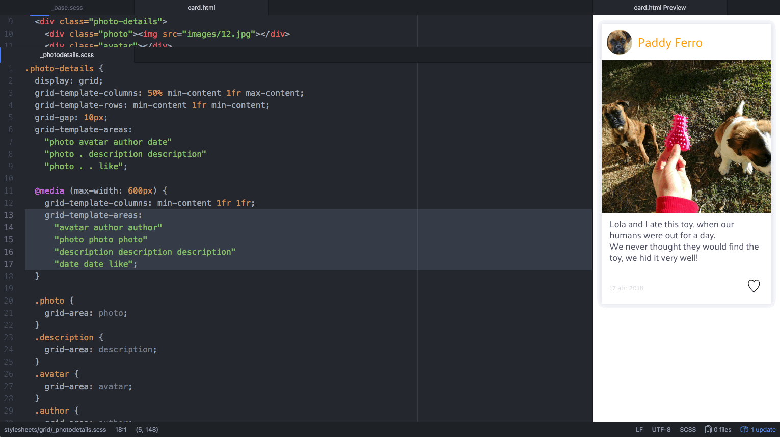
For this example, we’re going to make a card with more details about a certain photograph: author’s name and avatar, the photo description, date and a like button.
Have I mentioned Pady enjoys eating his toys? 🏈
Lets start by building a grid for this horizontal layout, which works on tablets and desktops. Afterwards, we’ll adapt it to mobile by making its content distribute vertically.
I’ve already taken care of the basics (columns, rows and gaps), because I know that by now you’re already an expert!
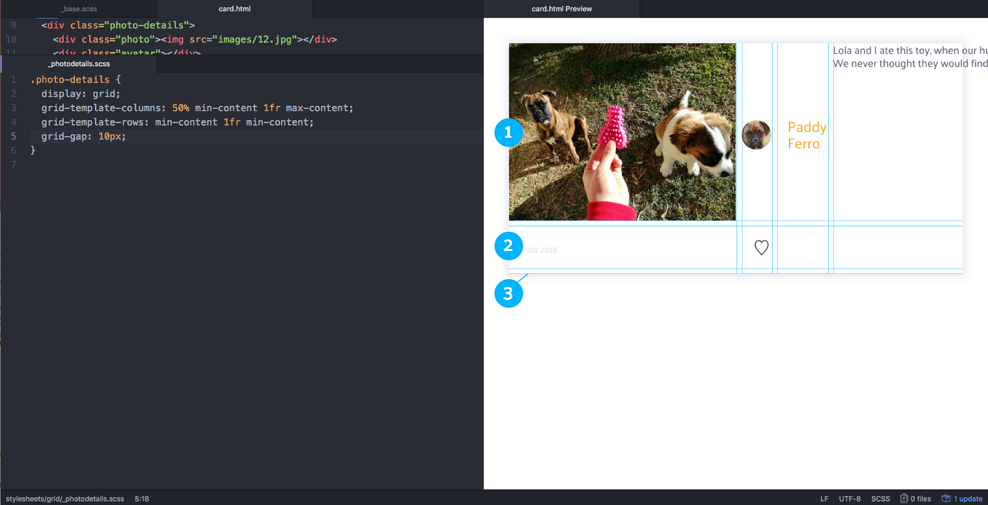
Right now, we’ve only told our container how many rows and columns we want, and their sizing functions. The items have been distributed automatically, one in each cell. We have more cells than items, because some of the items will occupy several tracks. That’s why right now we’re seeing empty cells and a collapsed row at the bottom.
Ok, lets place the content!
The photo should have grid-column: 1 / 1 / span 3 / 2 , the avatar should have grid-area: 1 / 2 / span 1 / span 1; , the description grid-area: 2 / 3 / span 2 / auto …
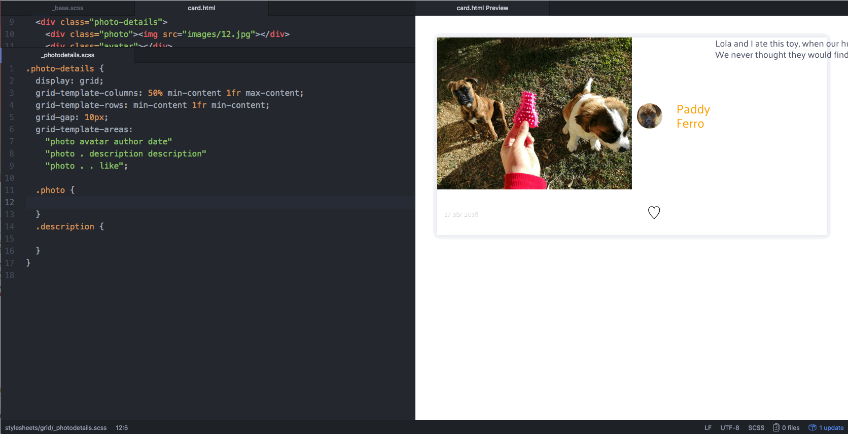
That’s a lot of work! 🙈 And then we’d have to re-write it all for the vertically layout! I’m tired already. What we’re going to do is define areas within our grid.
For that, we use the property grid-template-areas . This let’s you give names to the cells of your grid. If you name several cells with the same keyword, you’re creating an area in your grid that uses several tracks. We have 4 columns and 3 rows, so let’s name areas accordingly. For the cells we want to leave empty, write a fullstop. When we start placing things, nothing will go into those cells.
Please note: grid areas can only have linear or rectangular shapes. You can’t make L or T shaped areas, it won’t work! Grid would be very confused trying to place a photo on a T, let’s cooperate.
Here are the areas we need for this component:

We named the grid areas according to our sections but nothing moved yet, I know. Now we have to match each item to an area.
Remember that grid-area property? It doesn’t take just numbers and spans as values. It takes words! The words we’ve used in grid-template-areas.
As soon as we match an item to an area, it occupies the rows and columns that are reserved for that area.
This is how it looks once all items are placed:
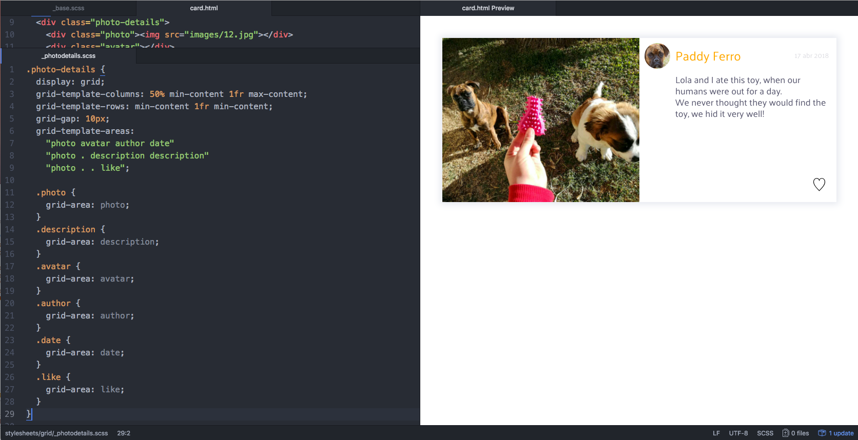
Note how there are empty spaces below the avatar and left to the like button, where we left the fullstops.
Well, that was easy! 😅 Everything is in its place and we didn’t even have to count line numbers to place the items. Now we just have to make it responsive. There are two steps to achieve that:
Here we go:
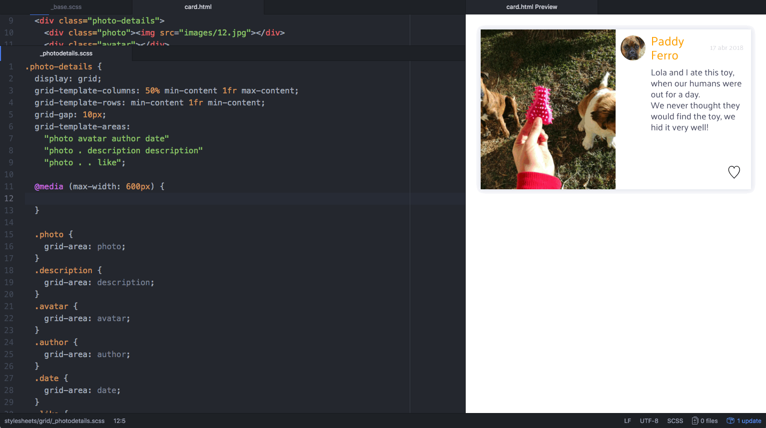
We’ve defined a grid with 3 columns for screens smaller than 600px. You probably noticed that the photo disappears. Which is only the worst possible thing that could happen on a card about a photo! 🚒
This is happening because the placement of the photo item is based on the grid areas defined for a grid with 4 columns, not 3! We have to finish the second step: adapt the grid areas to its new structure.
Tada! 🎉
When the screen shrinks, the grid structure and areas are changed; but items are always matched to an area, so they reposition themselves without us having to give specific instructions to each. Imagine writing media queries for every single item… 😴
Not only that, but have you noticed we also didn’t have to make any changes on the HTML? We are often forced to write two different HTML structures for each component. A great thing about Grid is that we can place items in any order, no matter how they’re ordered on the DOM.
Using grid areas works well on everything that has sections, including page layouts (which often have header, footer, sidebars, main content, etc.). And of course, you can combine the two techniques to achieve a fully responsive layout without much effort! 🌴

Who was a good boy? 🐾
That’s all for now! Thank you for reading through the whole post.
There are, of course, many different options for defining your desired responsive behaviour. This photo gallery was used as an example to show a few of CSS Grid’s properties and values, demonstrating its potential for solving these problems quickly and efficiently. Share with us what challenges you’ve encountered and which solution you used!
If there’s something you’d like me to cover regarding CSS Grid, just let me know! I have more puppies to show off. 🐶
Deemaze Software is a digital agency developing products for web and mobile. We don’t usually share pictures of puppies, but you can follow our work on Twitter, Facebook and Instagram. Also, here’s my Dribbble.
See you soon! 😎
AI-driven updates, curated by humans and hand-edited for the Prototypr community


