Build Design Systems With Penpot Components
Jul 21, 2:15 AM
Penpot's new component system for building scalable design systems, emphasizing designer-developer collaboration.
smashingmagazine.com

UX Power Tools – Medium | Evan Tank
This is part of a series of short tutorials about specific elements, components, or interactions. We’ll cover the UX, the UI, and the construction inside of Sketch. Plus, there’s a freebie for you at the end!
A system modal to convey information, errors, simple prompts and warnings.
Whenever you need to grab the user’s attention after they attempted to:
• Perform an action with serious consequences
• Perform an action that is irreversible
• Perform an action with unknown consequences***
***Ideally, the flow leading up to this modal would make the action clear and the application wouldn’t need a modal to explain what the user just attempted to do. But hey, we get it, sometimes you can’t touch the flow due to budget or time constraints and clarity through a system modal is the best thing you can do in a particular situation to accommodate the user’s needs.
Yes, these little modals can be annoying but are necessary in many cases — it’s not uncommon for me to design a dozen of them for a SaaS product. The point of a modal is to intentionally break the user from their flow (which is also why designer’s should only use this pattern when it fits the above criteria). This cognitive break increases the chance the user will absorb the information they need to proceed or fully understand their actions. So it’s intentionally in your face, flow-stopping, and invasive.🚨
Let’s see them in action:
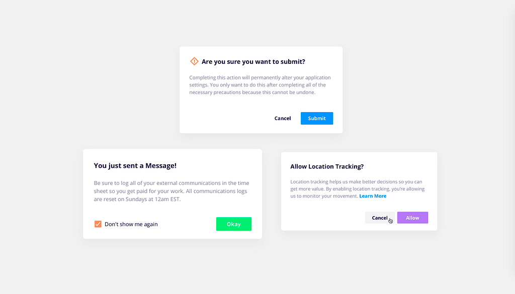
Warnings: There will be consequences of an action trying to be performed. Using an icon or changing the color of text are choices that can be made to imply severity.
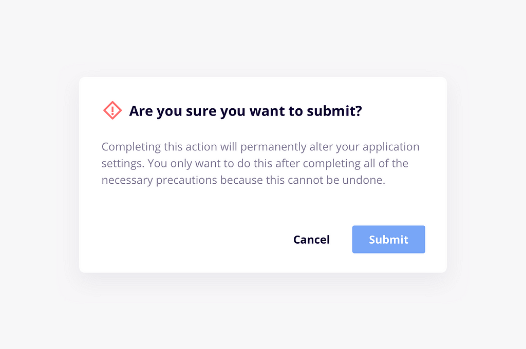 This has an icon so you know it’s serious. PAY ATTENTION, EVAN!
Prompts: When the user needs to make a deliberate choice that can’t be implied or when you want to suggest some hesitation. Asking the user to make a decision that will affect any future actions within the application, agreeing to terms and conditions before continuing on to the rest of the application, etc.
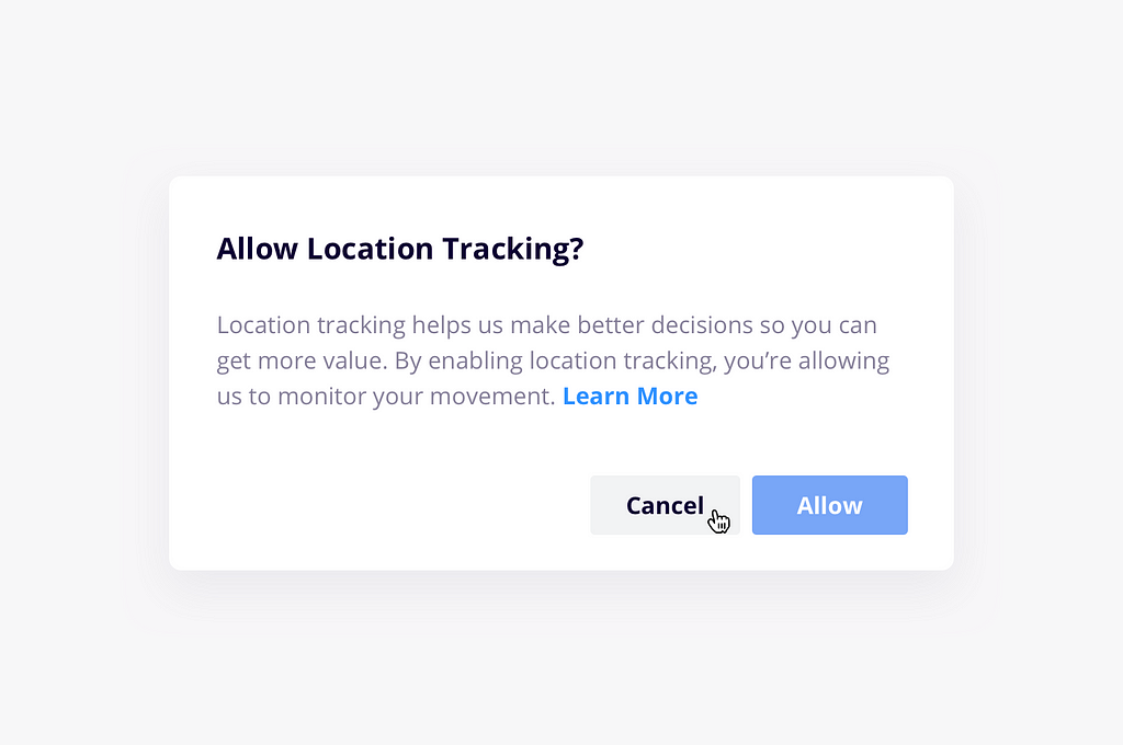 Who doesn’t want to allow location tracking? Surely nothing can go wrong with that!
Informational Pop-ups & System Errors: These can be particularly useful as a just-in-time discount onboarding technique where you may explain something to a user that they may not be familiar with. In this case it’s helpful to give the user a “Don’t show this again” option if it will be something that is rare but you want to be repeated a certain number of times.
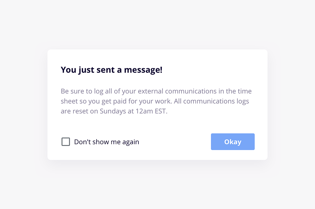 The software is not only a tool, but a helpful friend.
The system modal can be built to be adaptable using Sketch’s nested symbols & overrides. Here’s a couple of tips to help you out:
Before you leave, don’t forget to:
Design a Reusable System Modal was originally published in UX Power Tools on Medium, where people are continuing the conversation by highlighting and responding to this story.
AI-driven updates, curated by humans and hand-edited for the Prototypr community


