Build Design Systems With Penpot Components
Jul 21, 2:15 AM
Penpot's new component system for building scalable design systems, emphasizing designer-developer collaboration.
smashingmagazine.com

UX Power Tools – Medium | Evan Tank
This is part of a series of short tutorials about specific elements, components, or interactions. We’ll cover the UX, the UI, and the construction inside of Sketch. Plus, there’s a freebie for you at the end!
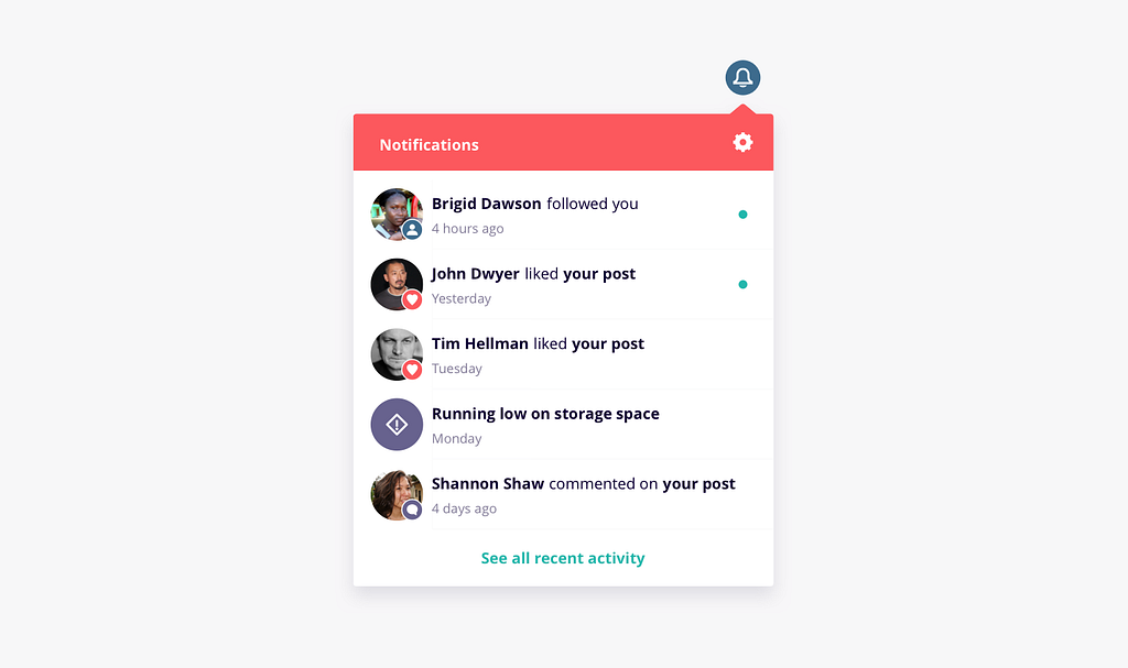
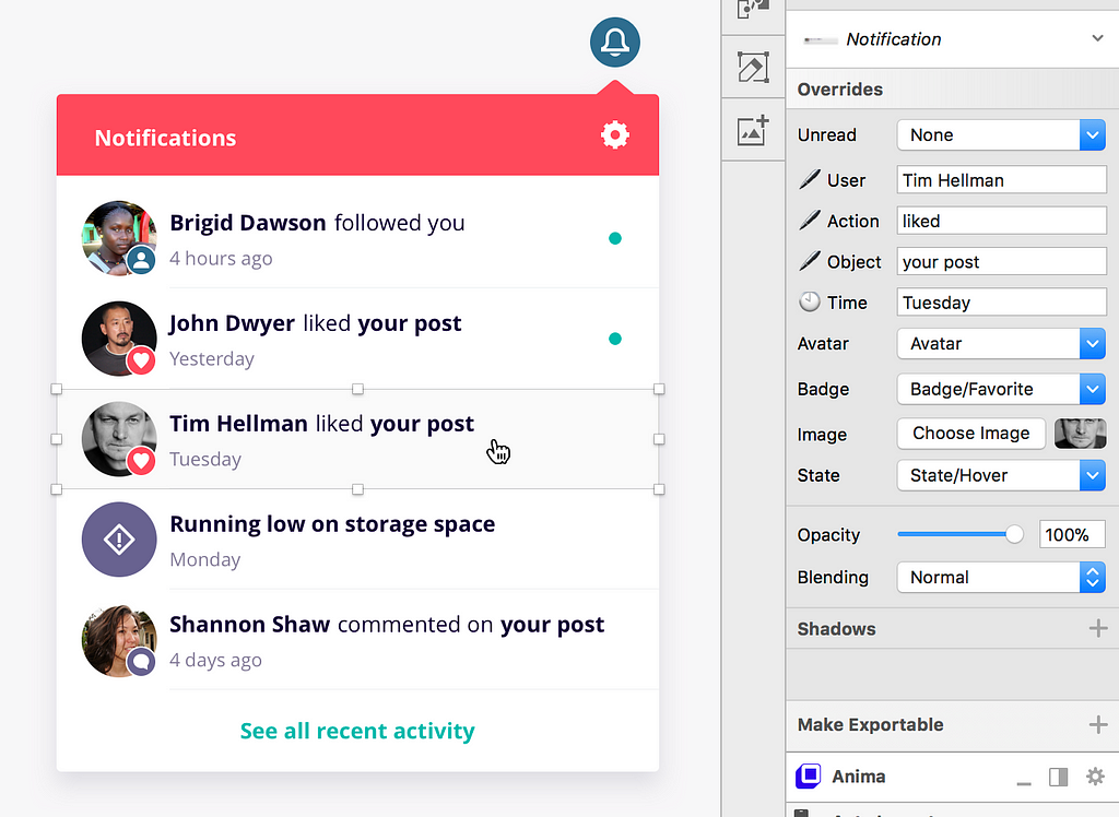
The dropdown underneath the notification icon that is used to collect notifications happening in a web app.
To inform a user whenever something they should know about happens within the system.
There are thousands of use cases where a notification might be necessary, but here are just a few of the most common ones:
• New followers
• Interactions with your content or profile (likes, favorites, etc.),
• Changes that other users have made within a system
• Invitations
• New task assignments
As always, we encourage designers to understand what is most valuable to the user and allow that inform their designs. Try to think outside the box and do the same when designing notification use cases. Extra points for ideating on notifications that the user might not know they need to know (i.e. avoiding future mistakes in your system by identifying trends and alerting the user that something may go wrong unless their behavior is corrected).
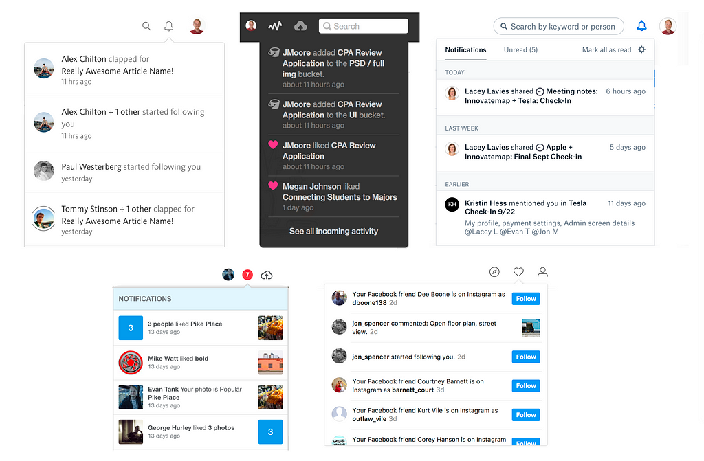 Can you name all of the apps that these belong to?
I have to admit, when someone says the word ‘notification’ my mind immediately goes straight to that sharp buzzing in our pockets that is constantly tempting us to look at our phones and killing our attention spans one vibration at a time. But believe it or not, notifications don’t have to be the almighty enemy of productivity!
In their most basic form, they work because they are a step in the right direction of not having the user need to actively search for things that would be helpful for them to know. If I want to check to see if I’ve been assigned any tasks in Trello I wouldn’t go through every board I’m in, one by one, and look at the assignments. The system will simply let me know any relevant assignments via a notification at the exact moment that it happens.
I know, I know, I realize that I just explained the now seemingly ancient concept of notifications like they are some kind of novel innovation and that all of this is very basic information. But hey, sometimes it’s necessary to go allllll the way back and think about where they came from in order to really do something innovative with them.
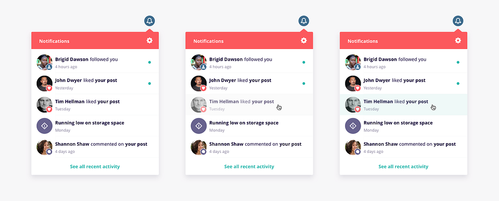 Depending on the design system you’re working with (or lack thereof), you may need to design for the hover & pressed states as well
The notification dropdown can be built to be adaptable using Sketch’s nested symbols & overrides. Here’s a couple of tips to help you out:
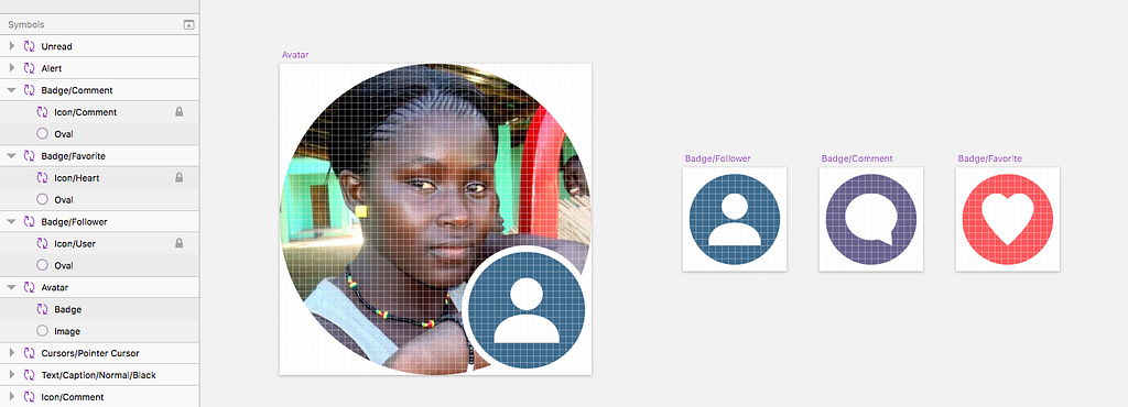 Different symbols for each badge, nested inside the Avatar symbol.
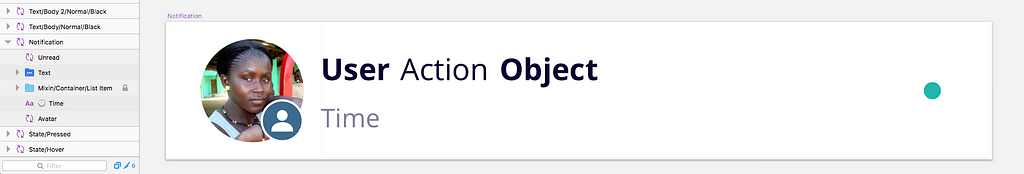 P.s. lock a layer within a symbol if you don’t want it to show up as an option in the inspector panel 🔒
Before you leave, don’t forget to:
Design an Adaptive Notification Dropdown in Sketch was originally published in UX Power Tools on Medium, where people are continuing the conversation by highlighting and responding to this story.
AI-driven updates, curated by humans and hand-edited for the Prototypr community


