Build Design Systems With Penpot Components
Jul 21, 2:15 AM
Penpot's new component system for building scalable design systems, emphasizing designer-developer collaboration.
smashingmagazine.com

UX Planet — Medium | Virginie Nesa 
How many time do you think an average person logs in per day ? At least 15 times! Seems a lot right? However, registering on a website is still painful and frustrating for the user and can represent a business loss for companies.
Having recently moving in another country, I found myself having to fill a huge amount of forms and I’m not going to lie to you, it was painful. That’s why I wanted to think about how can we make registration easier and more focused on the user.
Here are some advices to improve registers forms.
“Making passwords doesn’t even increase security, but it does cost you business, due to login failures.” Nielsen Norman Group
About 82% person forget their passwords on an average website. It’s impossible to remember every password we use. Our needs changes endlessly, websites/app we are using today will shortly not be useful anymore to us, and when we will need them again we will have completely forgotten our login and passwords.
But more than being user friendly, improving log-in forms will definitely help business to save their actual loss. Indeed, according to an NNG study, 75% of people who try to recover their passwords won’t complete their purchase after all.
Therefore, it’s not surprising to see new actors on this market like “1Password”. But some solutions exist to improve log-in forms. On mobile, it’s now common for the users to simply use Touch ID/Fingerprint to access their accounts. Many companies also allow to sign-in through social media forms, making the registration faster. Others go further, offering their customers the option to checkout without registration.
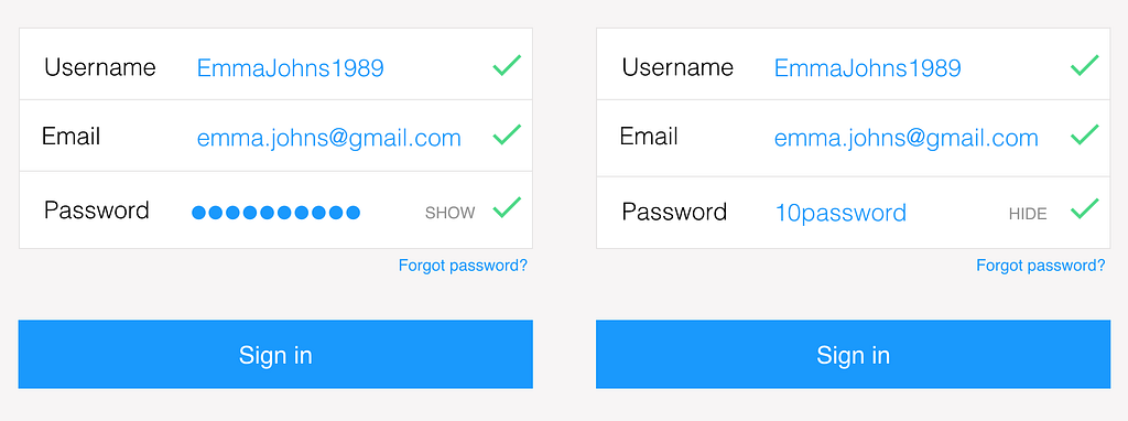 Show/Hide Password Feature
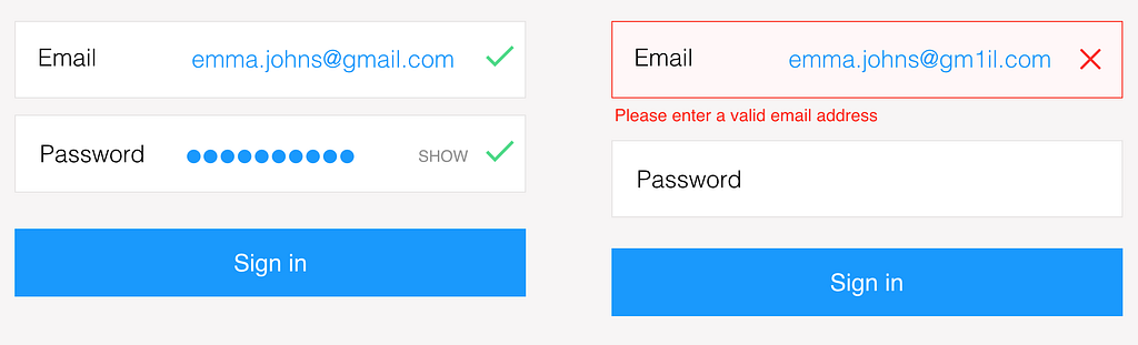 Show the user where and why an error occurred
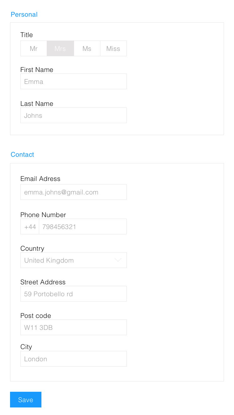
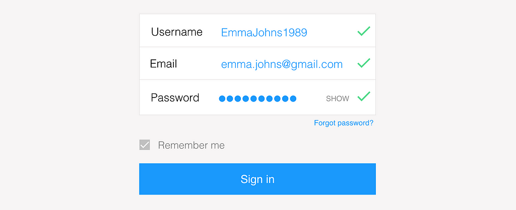 Remember your customers’ information
“Design engagement, not forms.” Luke Wroblewski
Having worked for different companies, I made the same observation : every time you cut a field from a form, the conversion rate increases. Filling a form is time consuming and painful for the users. Moreover, they are mostly afraid to give us all their information like address, phone number or credit cards. That’s why registration forms must be short, user-friendly and not data focused.
Instead of always requiring from the users all their personal information at the same time, we should think about creating engagement gradually. Users shouldn’t have to create an account to use a product/service. They should be able to choose sharing their information once they already trust and use the website or app. They will decide by themselves to go further and give their personal information.

Forms are often the first thing that the users discover while using a product/service. And everybody knows how painful filling out a form is. The truth is the first feeling we give to the customer is a bad experience.
If we focus our work on the user and the engagement instead of databases we could offer a better experience to the user.
Try some of these advices on your registration form and login access to make your user happier next time he/she will have to sign in or fill in a form.
And please share your feedback!
Sources : Nielsen Norman Group, Luke Wroblewski “Mobile and Multi-Device Design”
Design better Forms and Log-In access was originally published in UX Planet on Medium, where people are continuing the conversation by highlighting and responding to this story.
AI-driven updates, curated by humans and hand-edited for the Prototypr community


