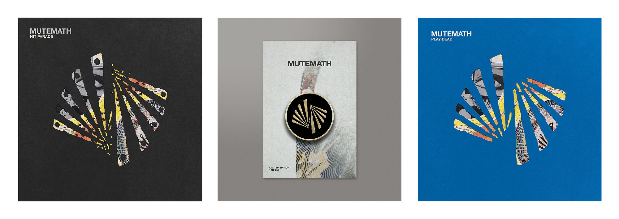
<img class=”progressiveMedia-noscript js-progressiveMedia-inner” src=”https://cdn-images-1.medium.com/max/1600/1*t3NkKKs5Dj4Lei4rklEZvQ.gif”>
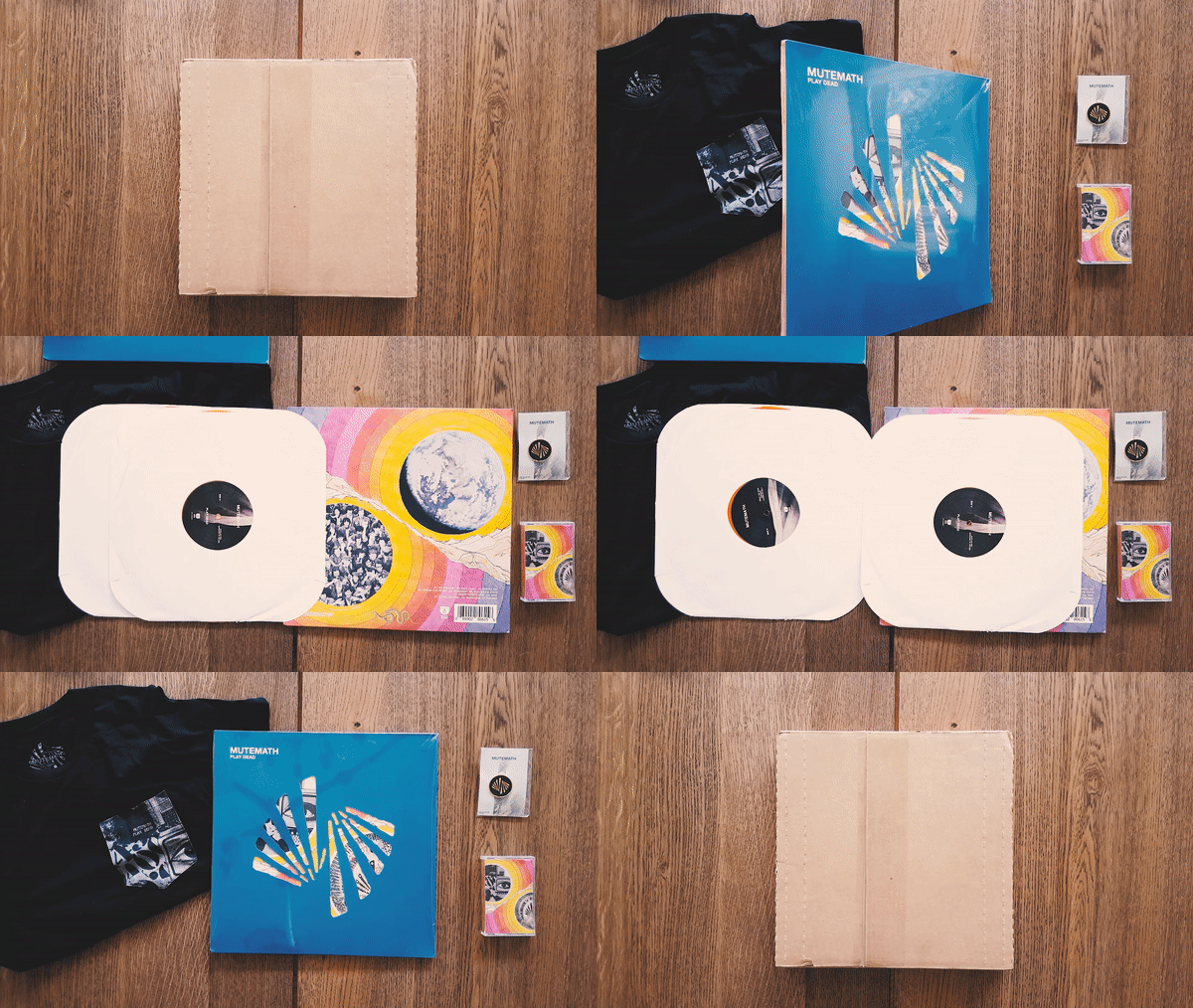
Video by Jake Bartlett
I remember seeing one of my first MUTEMATH shows like it was yesterday. The venue they played at was called The Proletariat, and though it likely had a max capacity of 100 people, there were probably 150–200 people crammed into that small room. The energy was real, the band was electric, and the fans felt like family. I had never experienced a fan base that cared so deeply about a band before, and that night we all felt like we would follow this band to the ends of the Earth. We wanted MUTEMATH to be the biggest band in the world because it felt too great of a thing to hoard to ourselves — Everyone should listen to MUTEMATH.
One of the values MM has held is taking risks — even when the cards are stacked against them. I believe this is why they continue to put out their best albums and best tours with every subsequent release. An artist who is willing to do a 180° every time they approach an album or a tour is one worth studying.
A few years ago as my band was writing for its first album, I took a chance and tweeted at MUTEMATH about Paul doing mix and mastering hoping they would respond. Sure enough, what started as a tweet then lead to emails that then lead to phone calls which ultimately lead to Paul being a co-producer, co-writer, and an honorary fourth member of Forenn. Coincidentally-enough, Forenn’s self-titled and MUTEMATH’s Vitals came out just weeks apart from one another, and there is definitely a shaker track in “Existence” that was an organ donor from the chorus of “Joy Rides” — a fun discovery I made while I was going through audio stems after the record was complete.
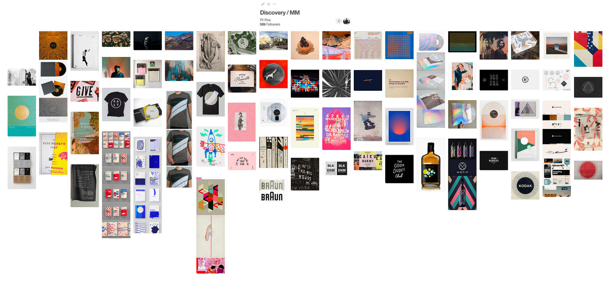
So, fast forward a couple of years as the band is wrapping up tracking on Play Dead. I knew I wanted to do artwork for MM, but it wouldn’t be without considering the legacy of their art including heroes of mine — JT Daly (Paper Route), Boyd DuPree (Eisley), and Darren King. On a whim after hearing samples of the album through Instagram, Vine (RIP), etc, I put together a Pinterest board inspired by what I was hearing. To quote the email I sent to Paul:
One consistent idea that seems to be prevalent throughout is the idea that the branding would be simple enough for a fan to recreate (example: simple shapes, lines, etc.) and the packaging would be highly interactive (example: using die-cuts and/or printing [the packaging] on reflective rainbow foil). Said simply by my friend, Dan Simmons — “Make it memorable, simple, inviting, and fun.”
<img class=”progressiveMedia-noscript js-progressiveMedia-inner” src=”https://cdn-images-1.medium.com/max/2000/1*9ql7AjFfU_ixGmjOSzJ_2g.png”>
The Pinterest board sent to MUTEMATH
After I sent the email, Paul sent me a short message back saying, “Thanks man. We’re still trying to figure that part out so really appreciate you reaching out. Will let u know.”
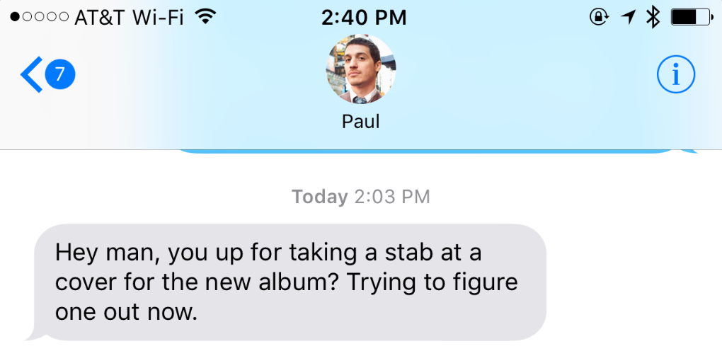
Two months later I receive this text:
<img class=”progressiveMedia-noscript js-progressiveMedia-inner” src=”https://cdn-images-1.medium.com/max/1600/1*s97KTS1JrSUqwRnisB5gHg.png”>
The band was already behind schedule, and time was not on their side. What proceeded next was basically a spitfire of cover ideas in a 12–24 hour window. I wasn’t given much in the way of direction other than the album title and the tracklist. One idea that Paul had involved incorporating Gulliver’s Island into one of the designs. Another idea was to incorporate an oil painting that Jonathan Allen (MUTEMATH, Club of the Sons) had made. Beyond that, anything was free game.
Aside: One thing that is incredibly important when working on album artwork is to genuinely study the legacy of an artist’s past. Even if you decide to give it a middle finger, you need to know why you’re doing so. In this case, I spent a good few hours at various phases of this project to dig through Instagram, Google, Facebook, et al. to see what the band put out, what fans had made, etc.
<img class=”progressiveMedia-noscript js-progressiveMedia-inner” src=”https://cdn-images-1.medium.com/max/2000/1*UinZ6AaX7HzLuMOrzqOv5w.png”>
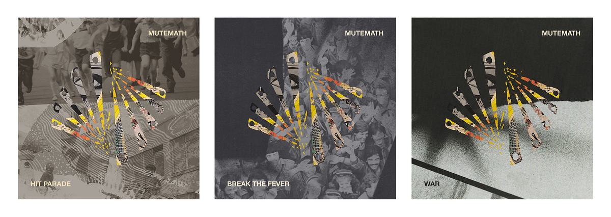
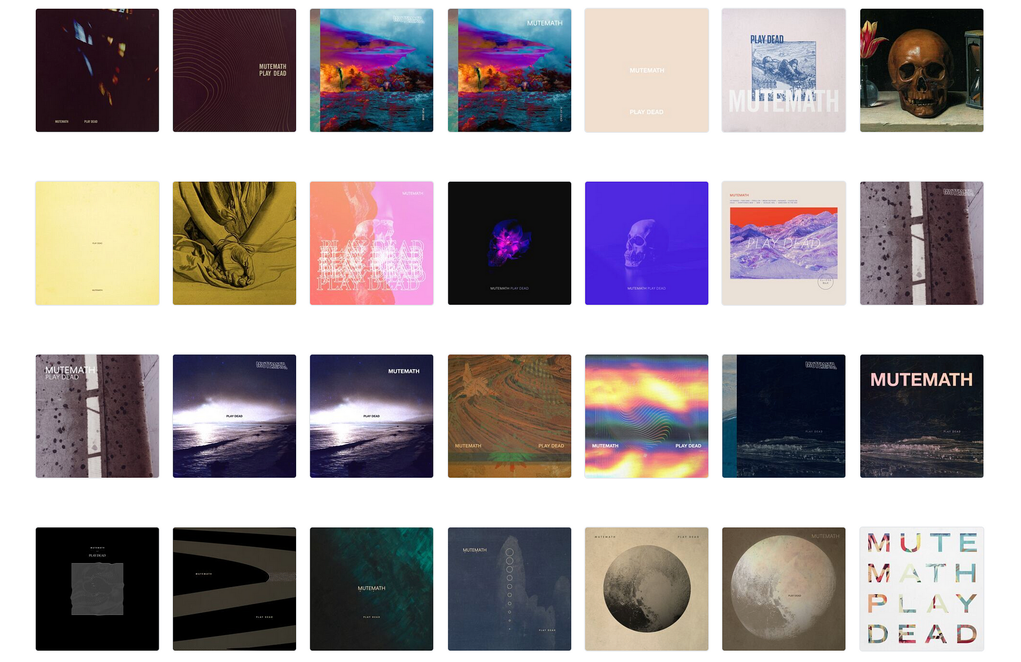
Some of the covers created aiming for a blitzkrieg.
<img class=”progressiveMedia-noscript js-progressiveMedia-inner” src=”https://cdn-images-1.medium.com/max/2000/1*Plnr1HeLP7Gq7yBmIbBtoQ.png”>
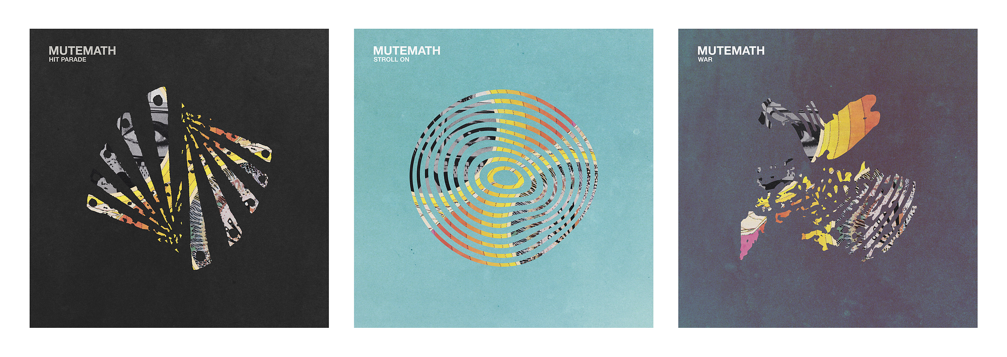
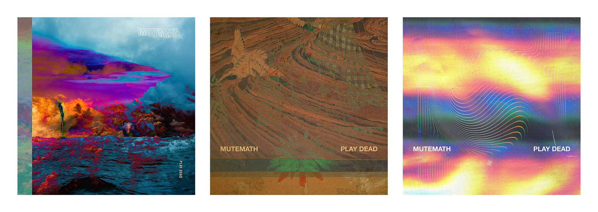
A few of the covers that stood out to me the most from the batch. Left being a heavy departure from the brand legacy of the band. Center honoring legacy while also incorporating some old Japanese art that was inspired by life and death. Right playing heavily into the rainbow foil idea I had.
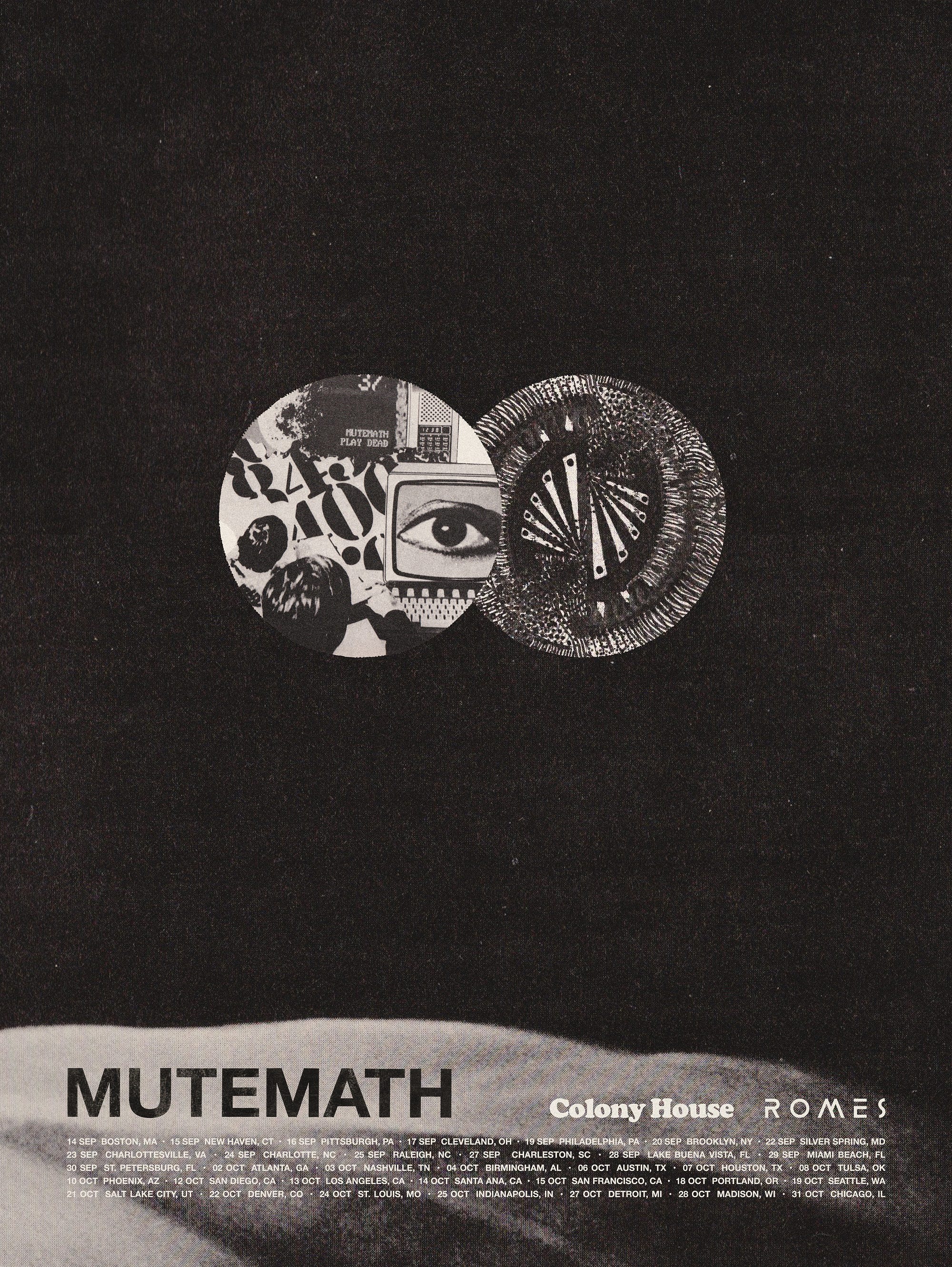
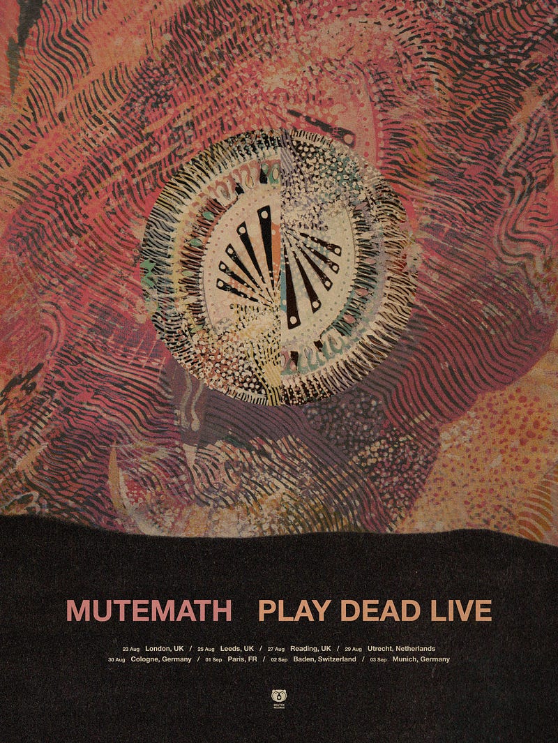
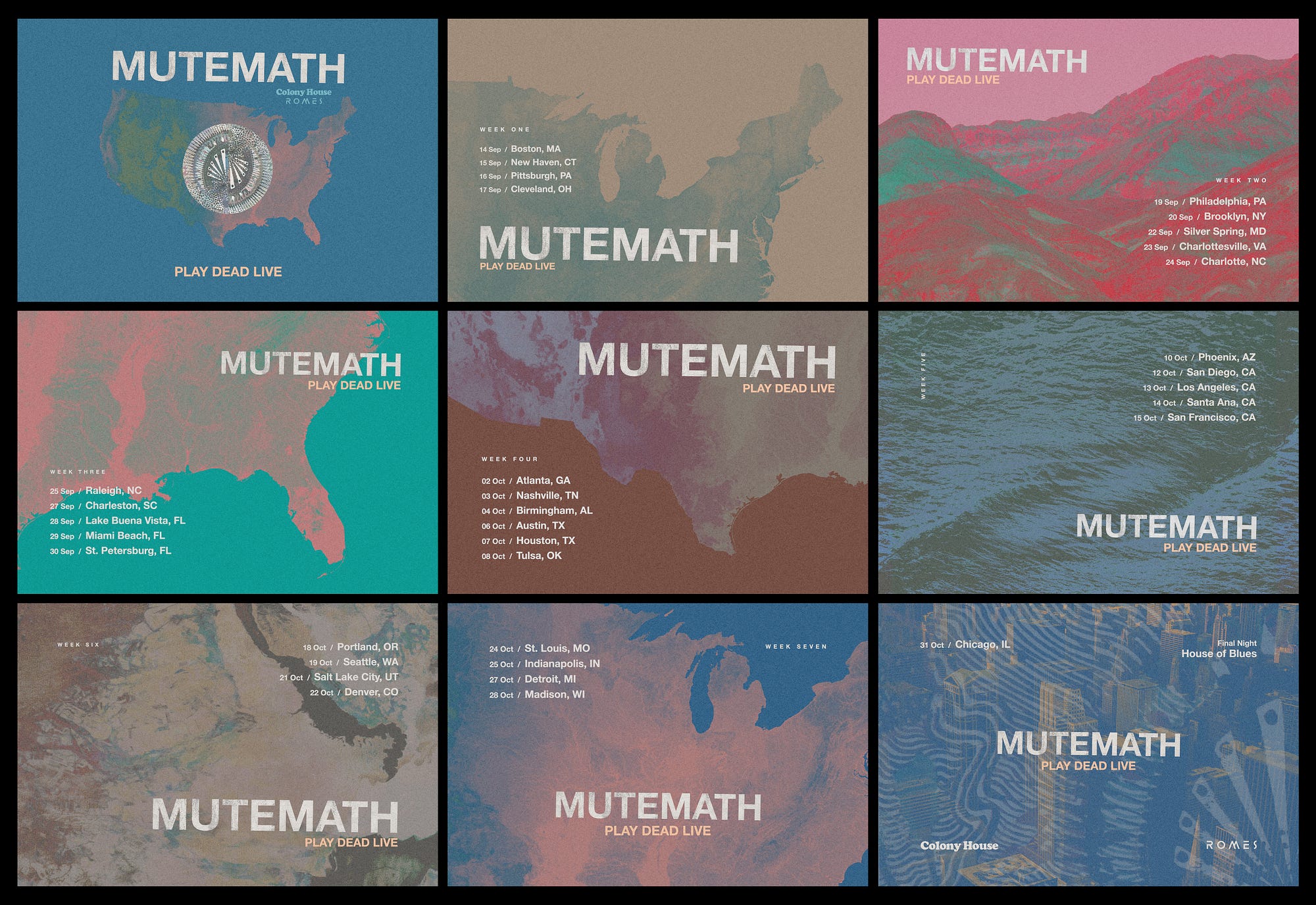
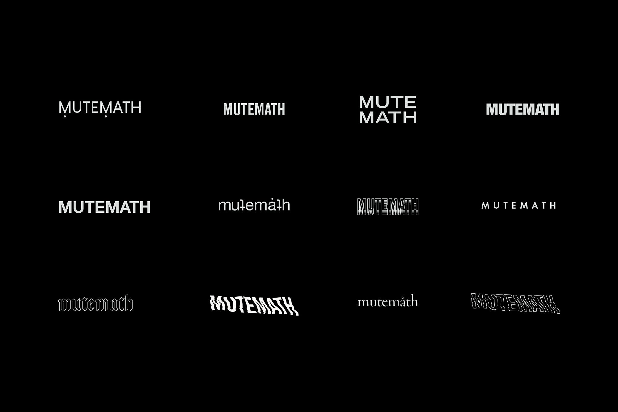
One of the things that really helps me when creating album art is getting some sense of identity as soon as possible. As I was working on covers, I also created a number of logos — some based on legacy and some deviating from legacy. One of the things I’ve learned from Brandon Rike is that it’s hard for people to replicate a style that comes from a person’s hand. While I would have loved to have tried out a few hand-drawn ideas, I knew their legacy well enough to know that something like that likely wouldn’t fly at this stage in the project. That thought didn’t leave me, though, and I worked it into some of the tour work I did (more on that later).
<img class=”progressiveMedia-noscript js-progressiveMedia-inner” src=”https://cdn-images-1.medium.com/max/2000/1*ABz1x27KLXRM3Qo_0psT2g.jpeg”>
Logo explorations for MUTEMATH.
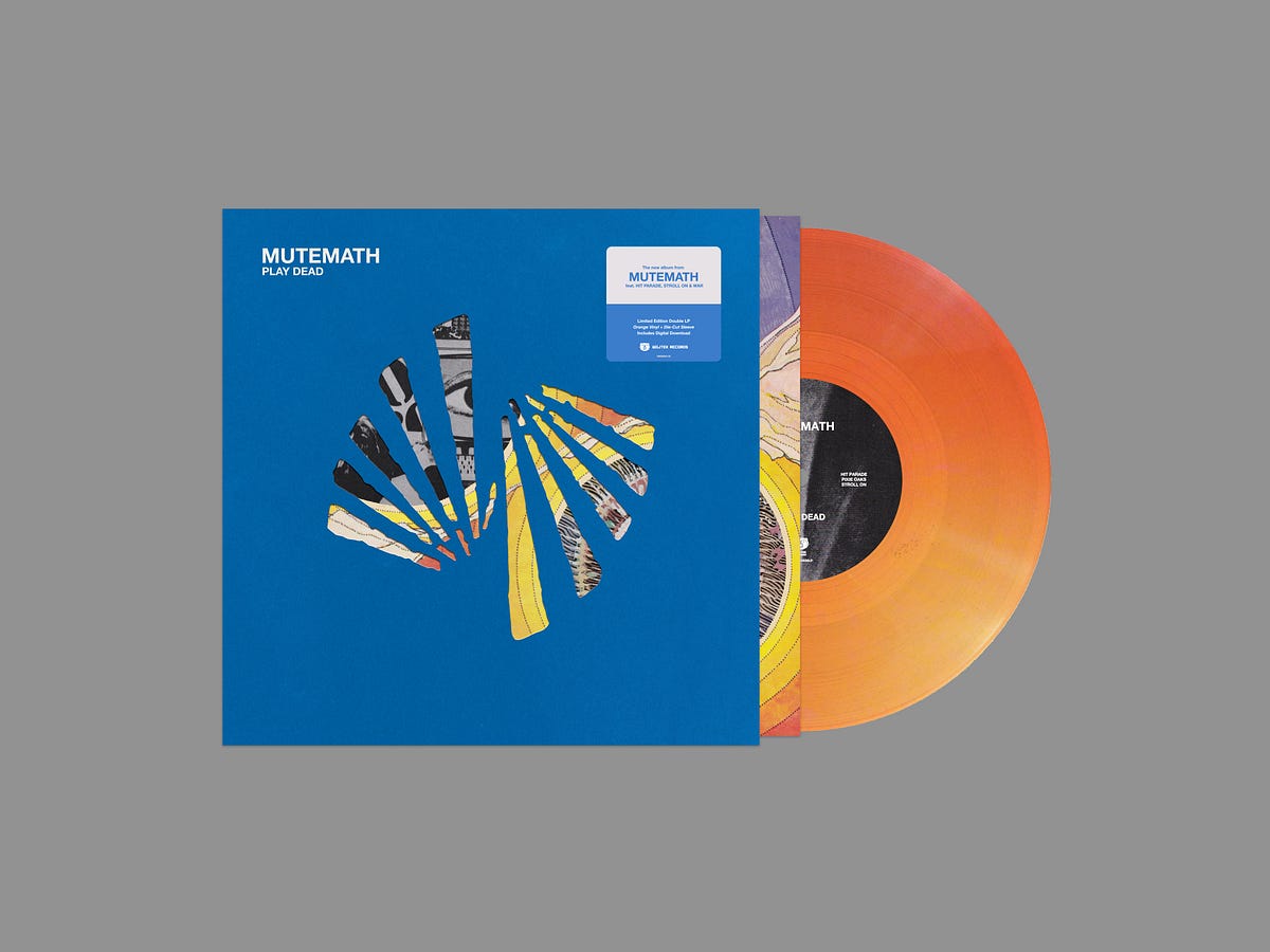
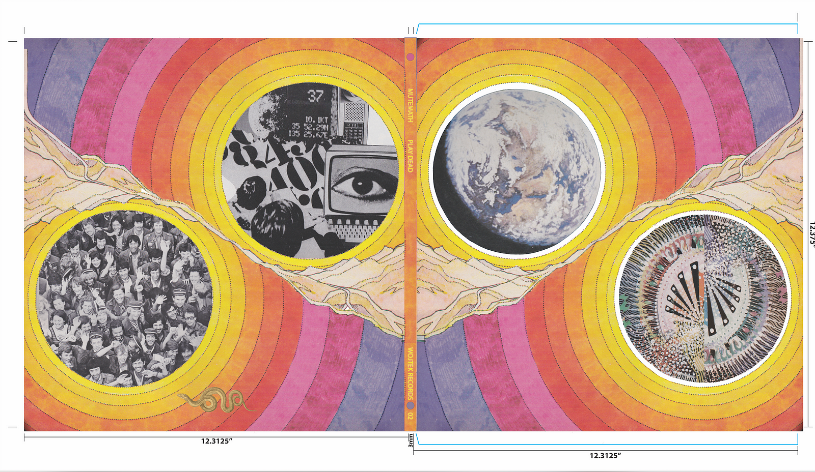
Once the band had a moment to sit with everything, Darren, in a moment of brilliance, came through swinging with this:
<img class=”progressiveMedia-noscript js-progressiveMedia-inner” src=”https://cdn-images-1.medium.com/max/1600/1*tq5P8pbapC1BRBZOThbwcA.png”>
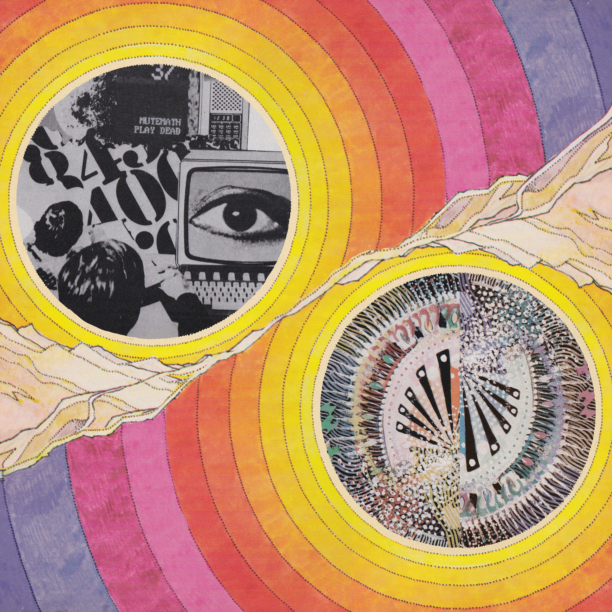
Original Vinyl Exterior for Play Dead by Darren King
Brilliant. Right? We all agreed—this felt like Play Dead.
At this point, I knew I needed to “complete the vision” as it were. A half dozen image swaps and other various things later, we have the TV on the cover. And then Paul sends us an email — “…Yeah I like this cover. Got me dorkin. Home run idea coming next.” (I have a growing collection of Paul-isms, in case you were wondering)
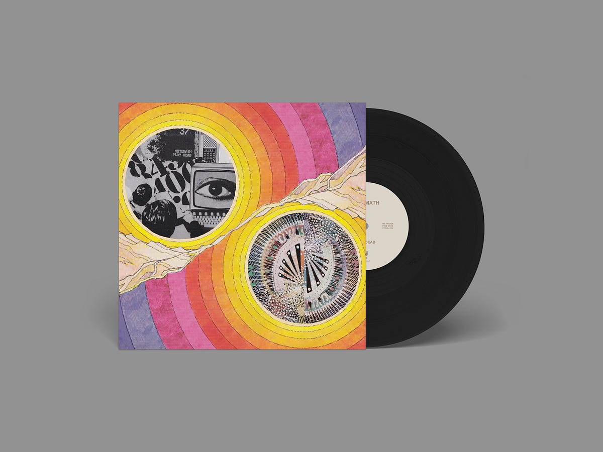
Paul’s idea was simple in theory: take the nautical reference out of the TV and swap it out with “MUTEMATH PLAY DEAD”. After a bit of testing in Photoshop, I decided to take a photo of the text alone with my phone and bring it back into the design. Another couple of hours of tweaking later and we had our cover.
<img class=”progressiveMedia-noscript js-progressiveMedia-inner” src=”https://cdn-images-1.medium.com/max/2000/1*1WijGU7ymUoo5MOgwgYOGA.jpeg”>
Official cover for MUTEMATH’s Play Dead
Another aside. So many times, we as artists tend to let pride get in our way and think that our way is the only way so help us God. It was very obvious that the best work on this project was coming out of the collective whole. There were times throughout the project where MM’s management (Lindsay and Andrew) also came to the table with stellar ideas. It is absolutely important to foster an environment that ensures every voice at the table is heard and respected.