Build Design Systems With Penpot Components
Jul 21, 2:15 AM
Penpot's new component system for building scalable design systems, emphasizing designer-developer collaboration.
smashingmagazine.com

UX Power Tools – Medium | Christian Beck 
Designers are continuing to break out of the grid. It’s been a great evolution from the early days of responsive web design. 5 years ago, responsive simply meant that your content block would resize infinitely. But it was always within the confines of a rigid grid. In fact, responsive web design had a negative effect on how designers used grids because it was so difficult to figure out how content should react.
Not any more.
Today, improvements in media queries and technological advancements like flexbox have given designers more grid capabilities. The way designers do this takes on a few different forms in web design, with different qualities for different situations:
Let’s take a look at some examples:
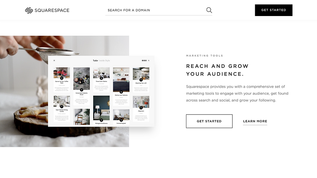 A little site called Squarespace
 Design by Giga Tamarashvili
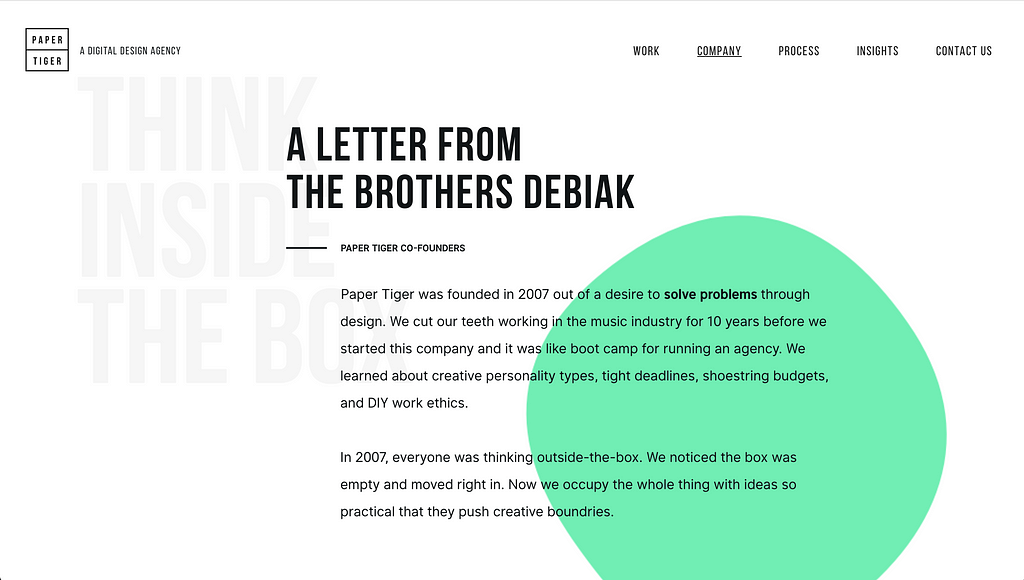 Paper Tiger
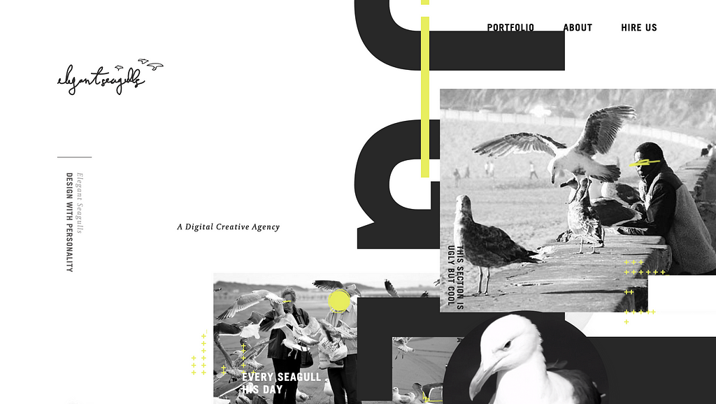 https://flayks.com/
 https://flayks.com/
When I’m not offsetting my design work, I’m working on Sketch design tools at UX Power Tools to make you a better, more efficient designer.
Follow UX Power Tools on Twitter
Follow me on Twitter
Design Trend: Offset + Overlapping Content Blocks was originally published in UX Power Tools on Medium, where people are continuing the conversation by highlighting and responding to this story.
AI-driven updates, curated by humans and hand-edited for the Prototypr community


