Build Design Systems With Penpot Components
Jul 21, 2:15 AM
Penpot's new component system for building scalable design systems, emphasizing designer-developer collaboration.
smashingmagazine.com

medium bookmark / Raindrop.io |
UX Designer, Product Hacker and Human-Computer-Interaction Obsessive who loves to create ingenious software and daring interaction concepts. Currently @Amazon
This is the third article of the “Designed” series.
Check out the other articles:
There’s an old joke about single-engine airplanes in the aircraft industry. People call them “air conditioners.” When they stop working, just wait and watch: you will see how the pilot starts to sweat…

An Air Conditioner?
This joke is just oral tradition about something that it’s a fact. Single-engine aircrafts are not as reliable in emergency situations because when their engines fail the only existing source of propulsion is effectively gone.
The pilot is only left with a certain amount of hydraulics control (sometimes even none) and his ability to use the hydraulics to glide to a landing location safely.
This is one of the main reasons why the aircraft industry has avoided exploring any kind of single engine design for jet airliners.
Although modern propulsion technologies can easily be tailored to generate enough thrust to lift a passenger jet airliner with a single engine (which will result in massive maintenance cost savings), such kind of aircraft will eliminate one of the concepts that make air travel one of the safest forms of transportation: engine redundancy.
Two engines not only increase the safety of the aircraft concerning engine propulsion availability but also help to create backup emergency strategies like asymmetrical power, which is an essential support for the pilots to balance an airplane when hydraulic control is partially lost.
The concept of redundancy, however, is not exclusive to aircrafts. Many digital and technology products rely on particular redundancies to improve their final user experience.
These are what I call “Designed Redundancies.”
Designed Redundancies are usually a set of two (sometimes more) user flows or interface mechanics that allow a user to achieve the same result.
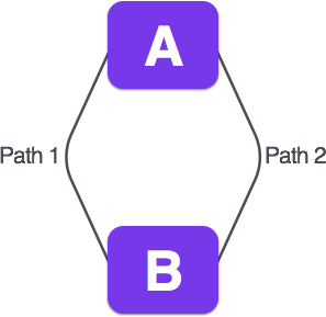
1 Single Endpoint. 2 Different Paths.
Designed Redundancies can be helpful with some troubling aspects of software design. For example, a Designed Redundancy can aid discoverability or be a good fallback system to increase accessibility.
Some of the most common Designed Redundancies are the ones that exist with computer peripherals, in particular, mouse and keyboard. These two peripherals share a wide range of input functionality. In many cases, mouse left clicks and return keystrokes are interchangeable.
Also, the arrow system of a keyboard can often traverse and scroll a screen user interface the same way a mouse does.
But as beneficial and evident as they sound, Designed Redundancies can be very complicated and sometimes critically harmful to the user experience. Learning how to design useful and helpful redundancies can make a huge difference when it comes to solving tough design problems.
One example of poorly Designed Redundancies are the ones you can find in text processing software like MS Word.
MS Word comes with hundreds of layout and formatting options. Many of them are actually duplicated functionality that aims to address two different use cases that have the same endpoint.
With the right scrutiny, this can be beneficial for the user since the software is capable of adjusting to different behaviors. However, in the case of MS Word, most of these redundancies are the consequence of a malformed product backbone that increases the difficulty of deprecating old features.
This is a critical aspect when it comes to designing practical and useful redundancies. Many people try to defend the idea of concurrently keeping two competing features in a product since this can help existing users with change.
There’s a fear that by introducing sudden and binary change you will annoy and lose your existing customers (newsflash: if you’re adding change is because there’s something wrong in the first place).
New features that are created with the intention of replacing old ones, should do exactly that. Despite the potential backlash from completely replacing a legacy feature, is better to deal and address this individually, than keeping two redundant features for the sake of avoiding confrontation with your user base. Doing this creates confusion for new users and alienates existing ones.
Redundancy should never be a product delivery strategy. This is the most critical difference between a harmful redundancy and helpful Designed Redundancy. The former is created as a response to undesirable product evolution effects, while the latter is consciously designed to increase the performance and delightfulness of the product.
Designed Redundancies have been around for quite some time, but only in the recent years became a prevalent user experience concept.
As modern technology has become more complex, learning these technologies has become an equally complex task.
Many modern technology products rely on well thought Designed Redundancies to increase their performance, ease of use and overall satisfaction. Here is a list of Designed Redundancies examples in modern software and tech:

Spotify: Skip Song Redundancy
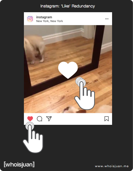
Instagram: ‘Like’ Redundancy
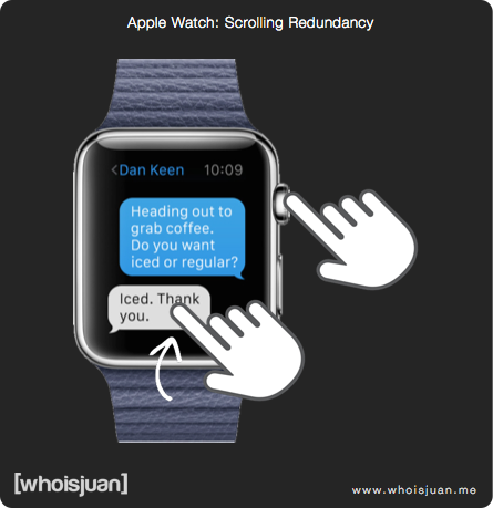
Apple Watch: Scrolling Redundancy
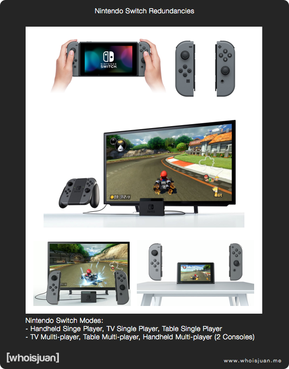
Nintendo Switch Redundancies
A Designed Redundancy can be a powerful mechanism to enhance the speed, discoverability, and learnability of your products. In some cases (like in the Nintendo Switch case) they can be a core component of how your product delivers an experience.
However, redundancies are usually seen as a bad design paradigm. I can’t recall the number of times that I have been on a design review or critique in which someone presented a redundancy unsuccessfully.
Redundancies are seen as a contradiction to other more prominent paradigms like Simplicity. It’s easy to see how a not very well thought redundancy can make a product exponentially harder to understand and use.
But this shouldn’t discourage designers and product professional to explore and design useful redundancies. When created and used correctly, they can make a significant impact on the final user experience.
The concept of Designed Redundancies can be a beneficial resource to unblock design issues related to the general flow progression of a product. Although they can be misunderstood and many times they can be the source of confusion, when designed mindfully and implemented correctly they can become an essential differentiator of the product itself.
One excellent way to identify the difference between a harmful redundancy and helpful Designed Redundancy, it’s to determine its primary driver and how it fits contextually in a product.
If the redundancy feels and sounds like a band-aid solution or it emerged from a non-user obsessed reason, it’s very likely that the redundancy is harmful.
On the other hand, a positive Designed Redundancy will feel contextually as an integral part of the design, and by removing it or altering it, the product will likely lose its perceived performance/delightfulness.
Think about something like the wireless charging capabilities of the most recent iPhones and modern Android devices. Wireless charging is a redundant feature, but its addition improves the usability of the product and allows the product to be more adaptable to the user’s behaviors.
Not every Designed Redundancy needs to feel as crucial and important as having two turbine engines in a jet airliner, but at the very least they should feel useful enough to be noticed if they are gone.
If you have ever designed a helpful Redundancy (or maybe a harmful one), or do you have some other examples of common Designed Redundancies, I’d love to hear about it in the comments!
Follow me on Twitter: https://twitter.com/whoisjuan
AI-driven updates, curated by humans and hand-edited for the Prototypr community


